Visualizing Features Extracted from Data Capturing Communicative Touch on The Hand
MAT 259, 2022
Stejara Dinulescu
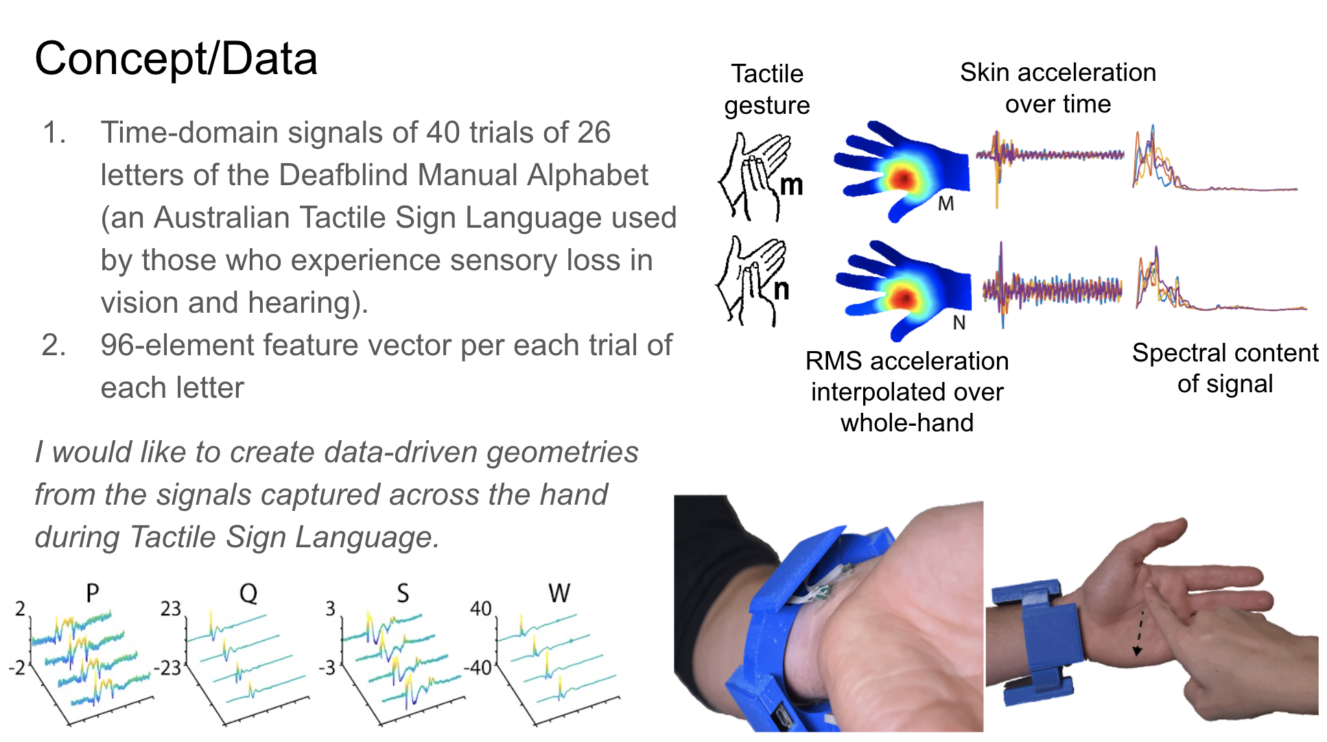
Concept
My recent research involves the development of a haptic device for transcribing or translating communication that occurs in the tactile domain. Those with varying degrees of sensory loss of both vision and hearing (i.e. Deafblindness) use systems of touch gestures (known as Tactile Sign Languages, or TSLs) signed on the hand for interpersonal communication. By using sensors placed at the wrist, my colleagues and I captured a dataset of touch gestures found in the Deafblind Manual, an Australian Tactile Sign Language where each unique touch gesture corresponds to each letter of the English alphabet. We extracted temporal and spectral features from these captured and processed signals, which represent RMS acceleration of the skin, elicited from each touch gesture.
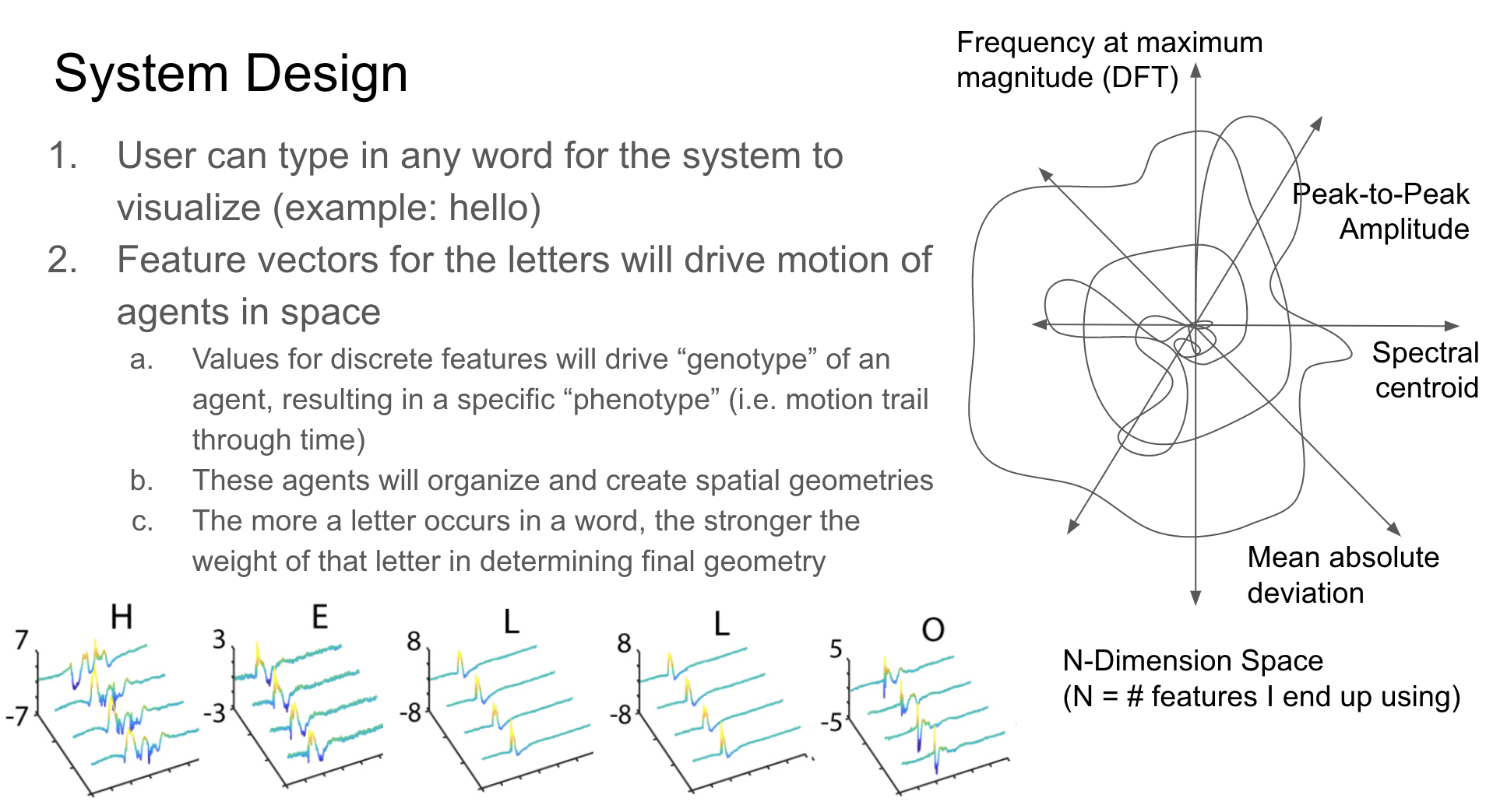
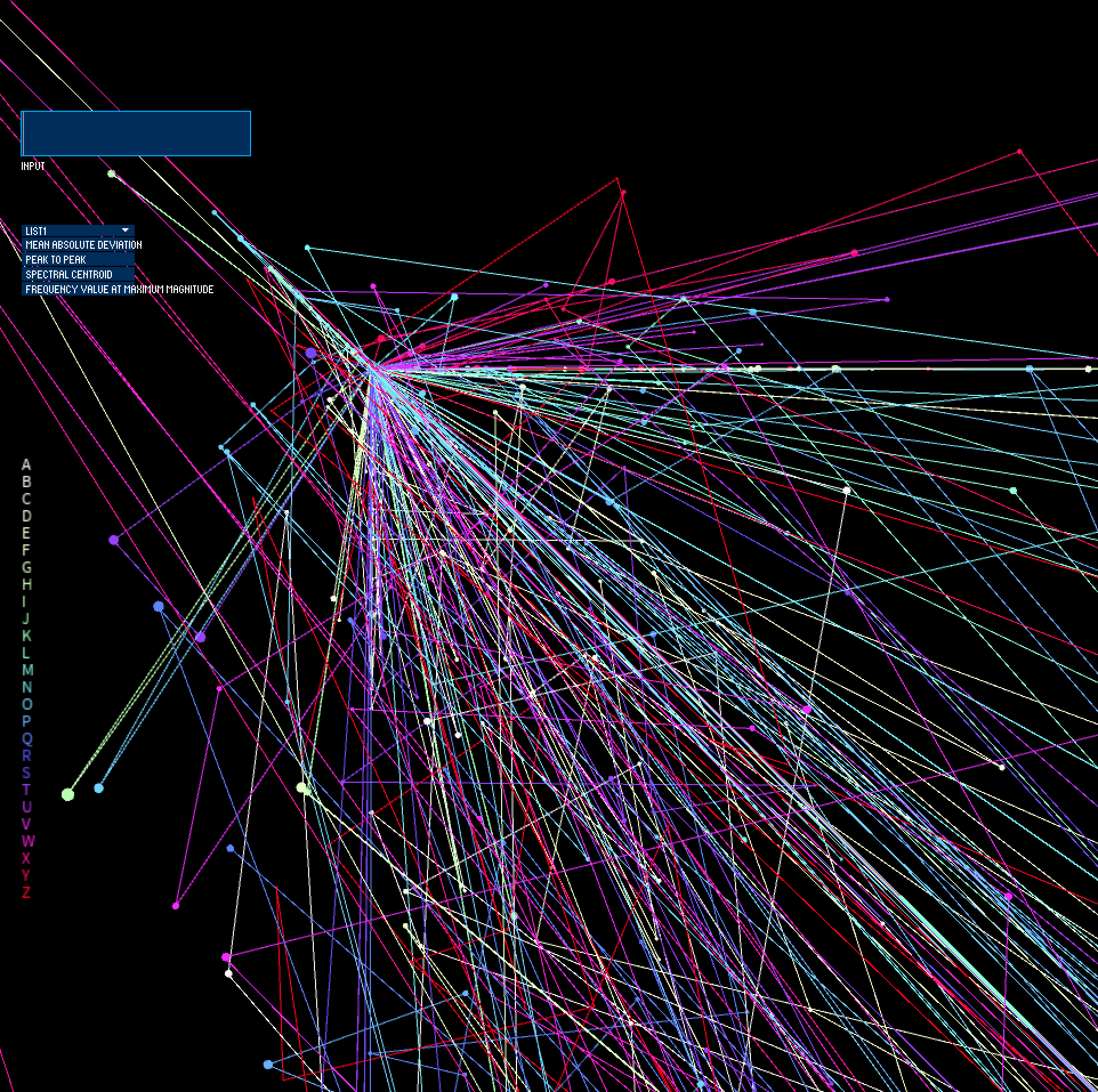
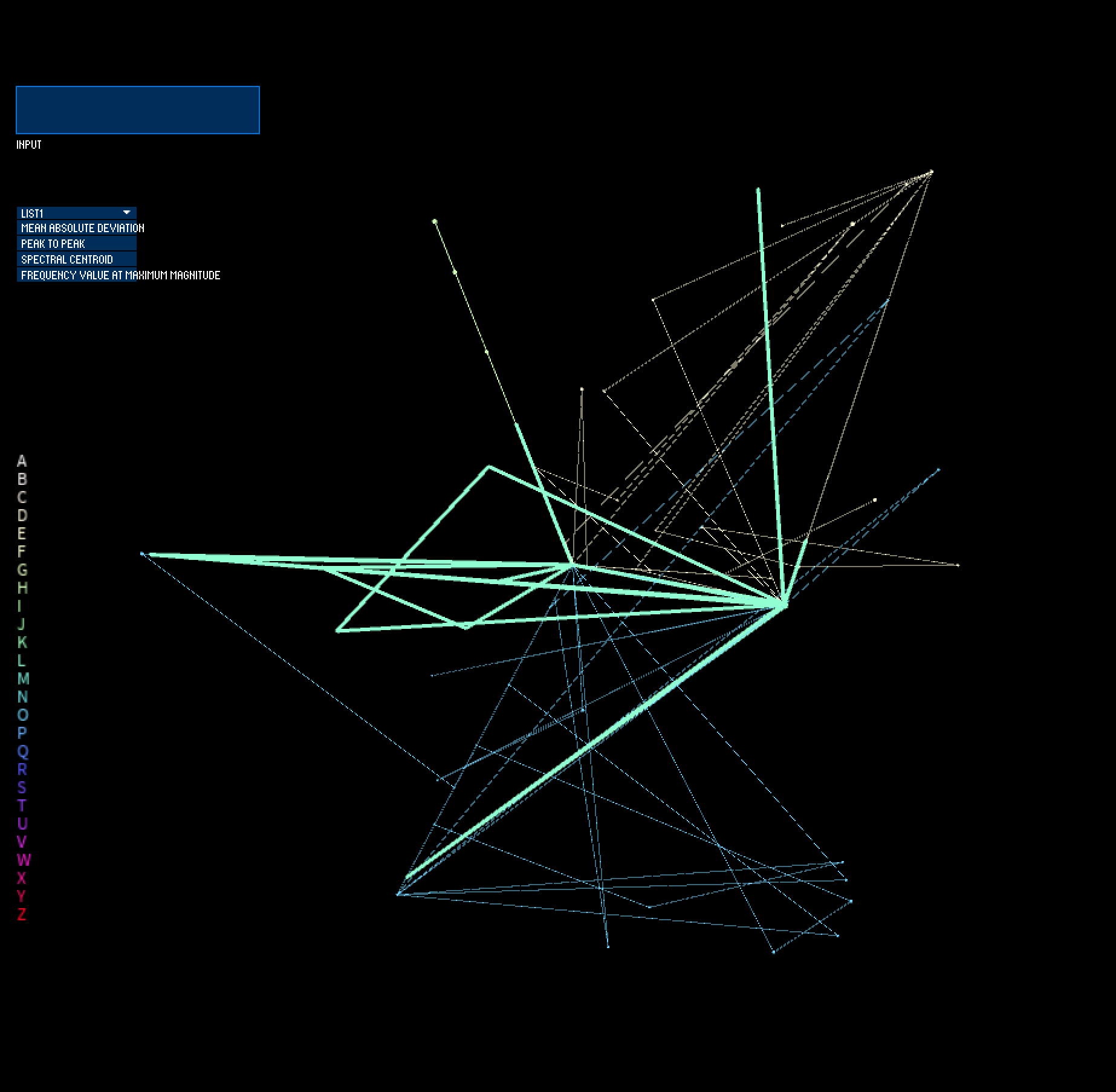
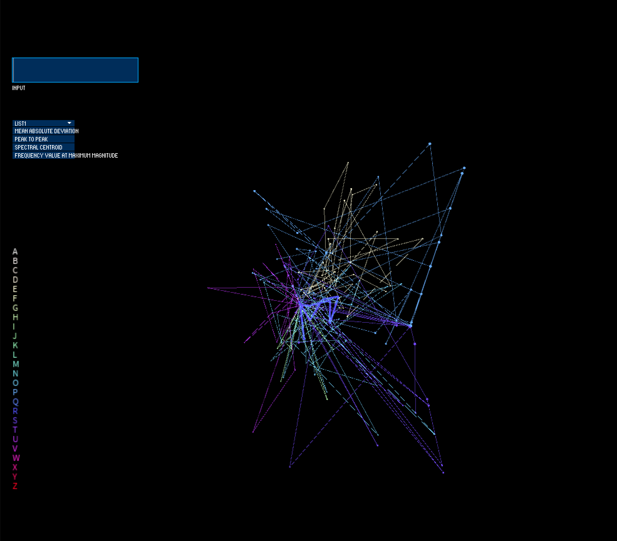
I use this dataset for my visualization, where I treat each data point (i.e. a unique performed touch gesture) as an agent moving through space. Its size, position in 3D space, and movement within that space are mapped based on the feature data extracted from that tactile signal (where x position & velocity = feature value over time from sensor 1, y position & velocity = feature value over time from sensor 2, z position & velocity = feature value over time from sensor 3, and size = feature value over time from sensor 4). The visualized feature can be selected via a dropdown menu element, and users can input text that they would like visualized. The unique letters of the input word, in addition to how often they occur, will make up the geometry of the resulting form, where multiple instances of a letter will exhibit greater influence of that letter in the structure/architecture. In this way, the "genotype" of feature values yield a specific "phenotype" (or generated 3D form) for each letter, which, when used as building blocks and chained together to form words, become forms. Communication via the tactile sense thus becomes digitally inscribed into geometry.
More context about my recent research, A Smart Bracelet Supporting Tactile Communication and Interaction, can be found here: https://www.youtube.com/watch?v=TGoQa0vjbp4.
Concept Slides
Data
This dataset consists of 26 unique features (spectro, temporal, or spectro-temporal features) extracted from captured RMS acceleration signals across 4 accelerometers from 40 repetitions of all 26 letters of the Deafblind Manual TSL--> [ 26 features x 4 sensors x 40 repetitions x 26 letters = 99840 cells of data ].
Preliminary sketches
At first, I envisioned that each computed feature (26 features x 4 sensors) would act as an axis, creating a 96-dimensional coordinate system. The use of data compression algorithms such as Principle Component Analysis (PCA) or t-SNE to compress my 96-dimensional feature data into 3 axes (X, Y, Z) to visualize in Processing.
Process
As I built up my system in Processing, however, I realized that it would make more sense for each sensor to act as one axis in 3D space, since each individual sensor is a picture of how fast the skin moves over time at the wrist, based on what tactile gesture is occuring on the palm or finger regions of the hand. Furthermore, to give a clear representation of the data and to provide a window into the inter-trial variability of the letters in the dataset, I decided to visualize one feature at a time rather than using dimensionality reduction methods on the extracted features.
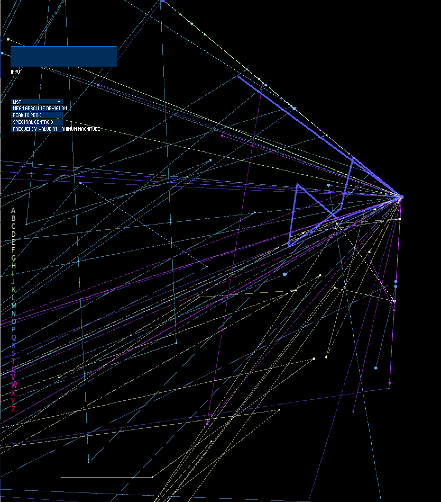
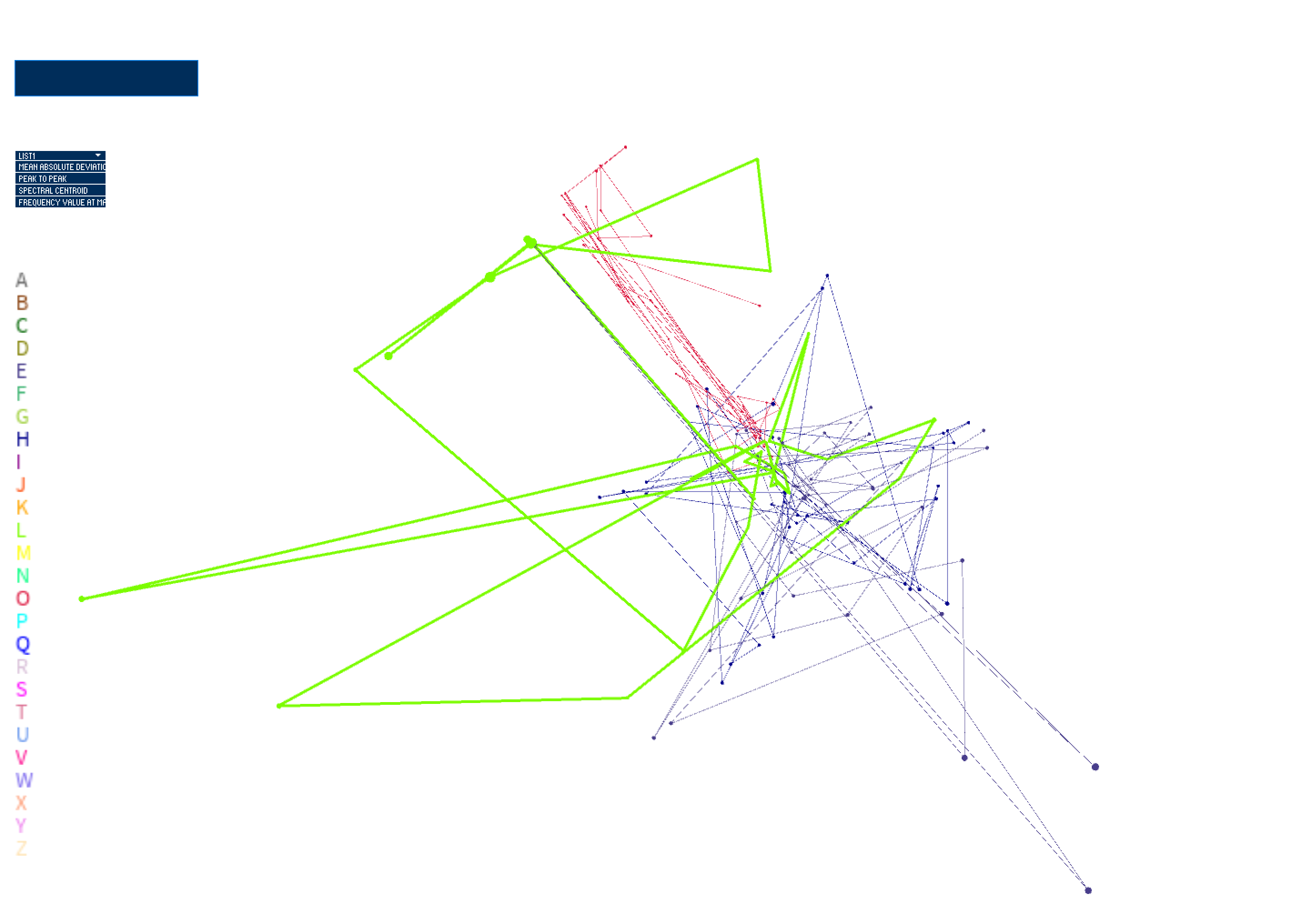
I started developing my visualization by bringing in my feature data, saved in a .csv file. I then started to plot each of the data points in space based on the first feature in the file (mean absolute deviation --> absolute mean of how each sample of the signal differs from the mean of the signal over time). I start visualizing in a 2D space, moving onto visualizing the points in 3D space and integrating movement. In these stages, I was using mapping position on screen to each point's value of feature 1 (mean absolute deviation). Feature 2, which was peak to peak deviation (absolute max of signal - absolute min of signal), was set as the velocity of each point.
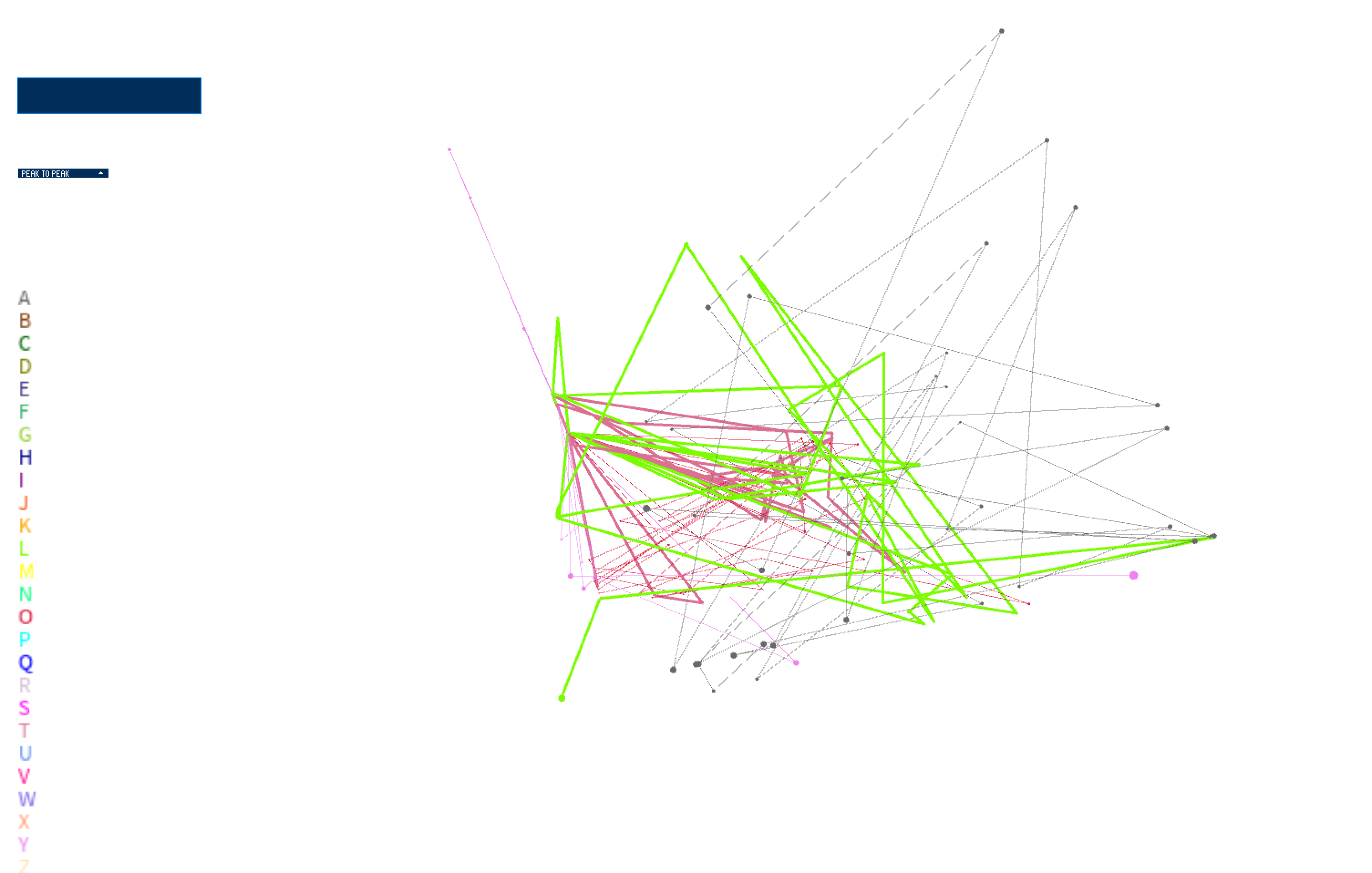
I then introduced the UI elements of the system, which includes a dropdown menu to select which feature is informing the position and velocity of each point. The input box enables textual input, which gets parsed to choose which data points are visualized. When nothing is input, all letters are visualized. When the user types, only the letters included in the input string are visualized.
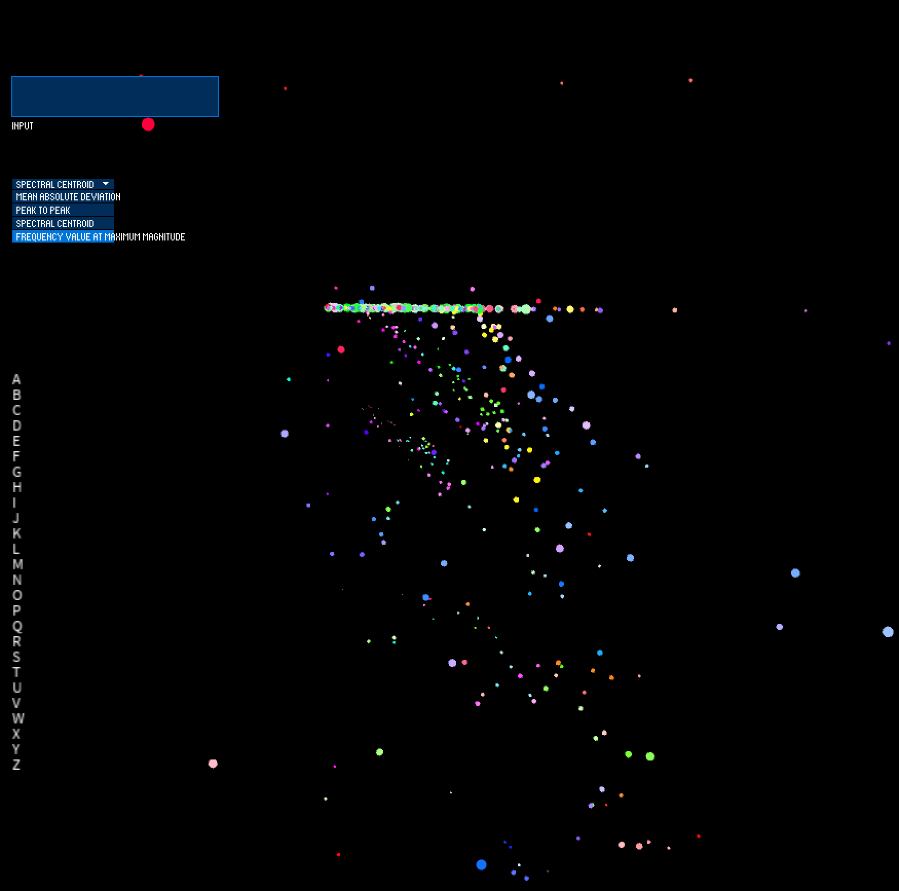
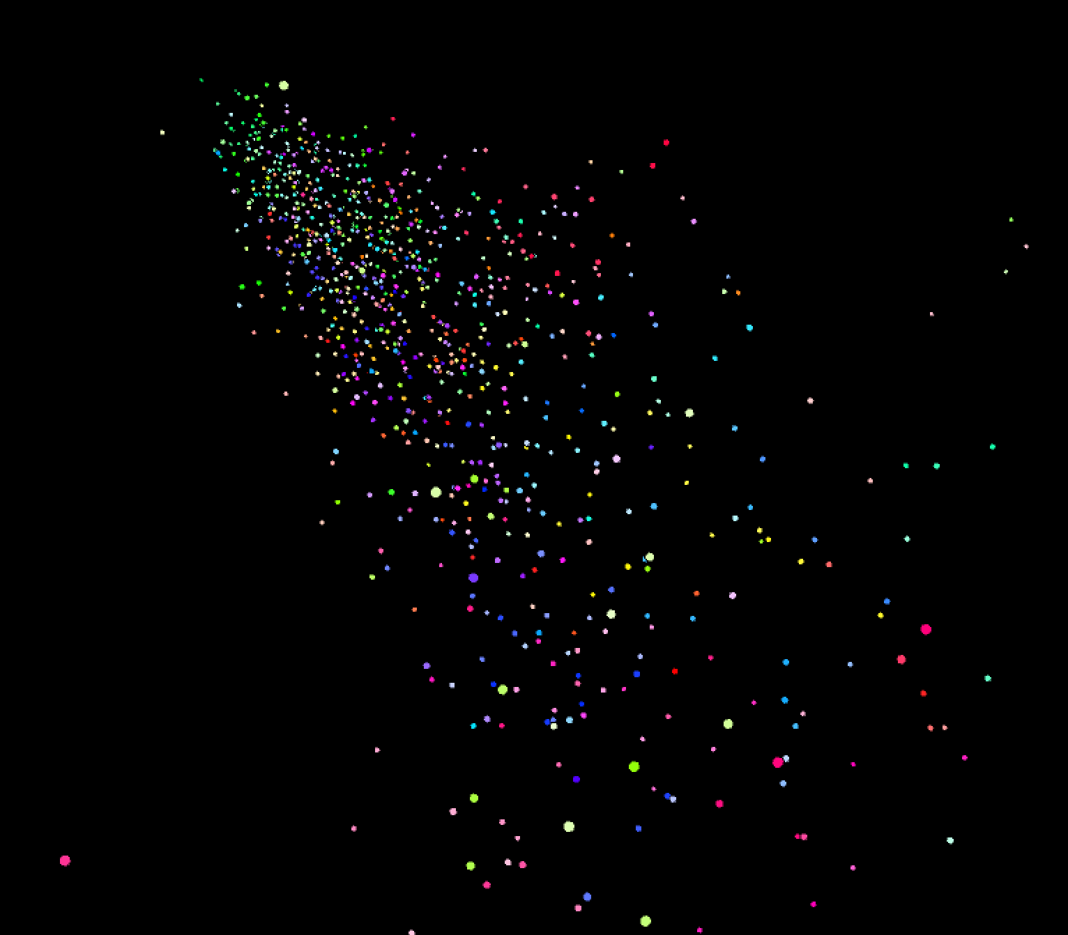
In these next stages, I spent time on the movement of the system to ensure that I was only using data to inform the movement of the points on-screen, rather than influence the relationship of the points based on an arbitrary variable that I introduce. I therefore map the x position and velocity to the selected feature value from sensor 1, the y position and velocity to the selected feature value from sensor 2, and the z position and velocity to the selected feature value from sensor 3. The selected feature value of sensor 4 informs the size of the point on-screen. Position of the point is incremented by its velocity every frame, which yields movement of the points in 3D space. I constrain the points to a bounding box in order to prevent points from infinitely exploding outward; this enables a visual depiction of which sensor has the feature value of most magnitude for each performed gesture trial.
I additionally added a colorized legend to show which letter is being visualized on screen. However, my use of color (where hue is mapped to letter and saturation is mapped to trial/gesture iteration) is not very clear.
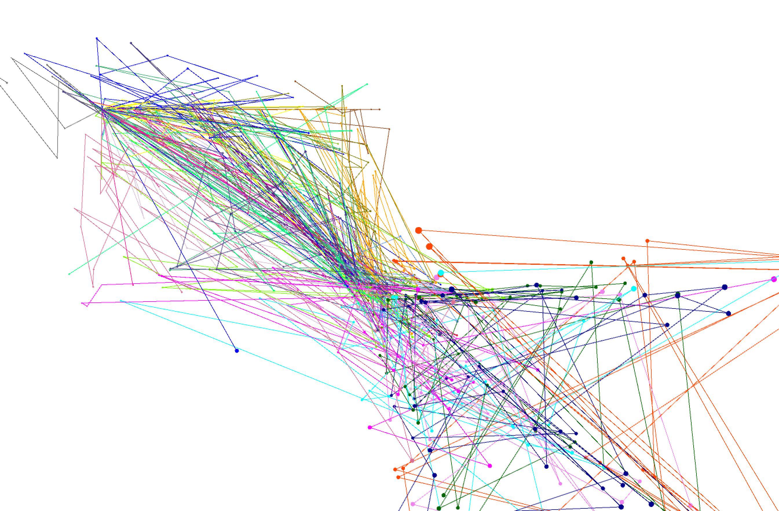
I then spent time refining my use of color. One approach I used was to try to pick from a color palette using an app that gave me RGB color values when I hovered over the color swatch with my mouse. However, finding 26 unique colors that were visually distinct on screen was extremely difficult. I ended up settling with a white background (to be less harsh against lighter colors) and generating my color palette using a tool that makes use of Machine Learning for generating colors with specified user parameters. The tool can be found here: https://mokole.com/palette.html.
I started developing my visualization by bringing in my feature data, saved in a .csv file. I then started to plot each of the data points in space based on the first feature in the file (mean absolute deviation --> absolute mean of how each sample of the signal differs from the mean of the signal over time). I start visualizing in a 2D space, moving onto visualizing the points in 3D space and integrating movement. In these stages, I was using mapping position on screen to each point's value of feature 1 (mean absolute deviation). Feature 2, which was peak to peak deviation (absolute max of signal - absolute min of signal), was set as the velocity of each point.
I then introduced the UI elements of the system, which includes a dropdown menu to select which feature is informing the position and velocity of each point. The input box enables textual input, which gets parsed to choose which data points are visualized. When nothing is input, all letters are visualized. When the user types, only the letters included in the input string are visualized.
In these next stages, I spent time on the movement of the system to ensure that I was only using data to inform the movement of the points on-screen, rather than influence the relationship of the points based on an arbitrary variable that I introduce. I therefore map the x position and velocity to the selected feature value from sensor 1, the y position and velocity to the selected feature value from sensor 2, and the z position and velocity to the selected feature value from sensor 3. The selected feature value of sensor 4 informs the size of the point on-screen. Position of the point is incremented by its velocity every frame, which yields movement of the points in 3D space. I constrain the points to a bounding box in order to prevent points from infinitely exploding outward; this enables a visual depiction of which sensor has the feature value of most magnitude for each performed gesture trial.
I additionally added a colorized legend to show which letter is being visualized on screen. However, my use of color (where hue is mapped to letter and saturation is mapped to trial/gesture iteration) is not very clear.
I then spent time refining my use of color. One approach I used was to try to pick from a color palette using an app that gave me RGB color values when I hovered over the color swatch with my mouse. However, finding 26 unique colors that were visually distinct on screen was extremely difficult. I ended up settling with a white background (to be less harsh against lighter colors) and generating my color palette using a tool that makes use of Machine Learning for generating colors with specified user parameters. The tool can be found here: https://mokole.com/palette.html.
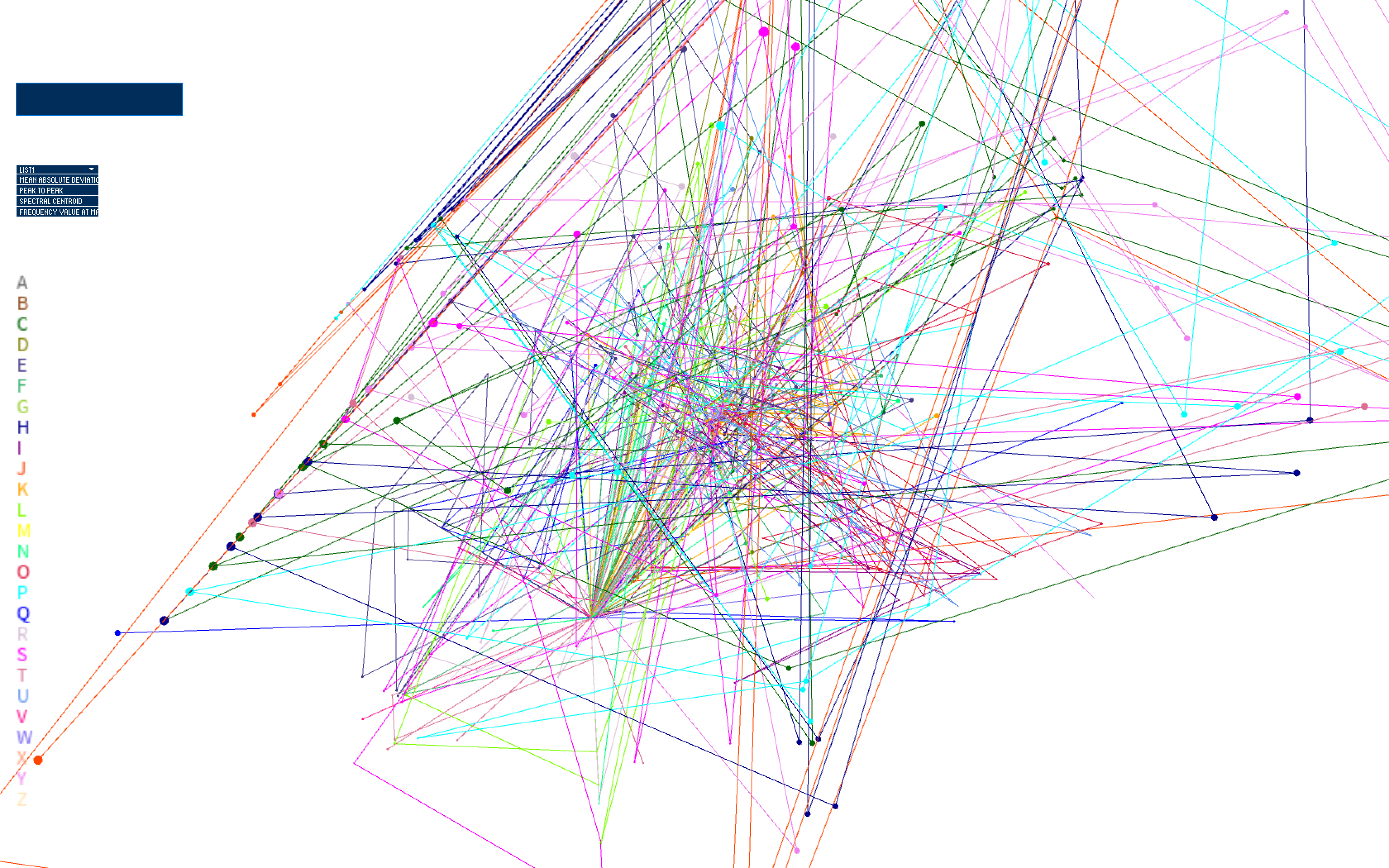
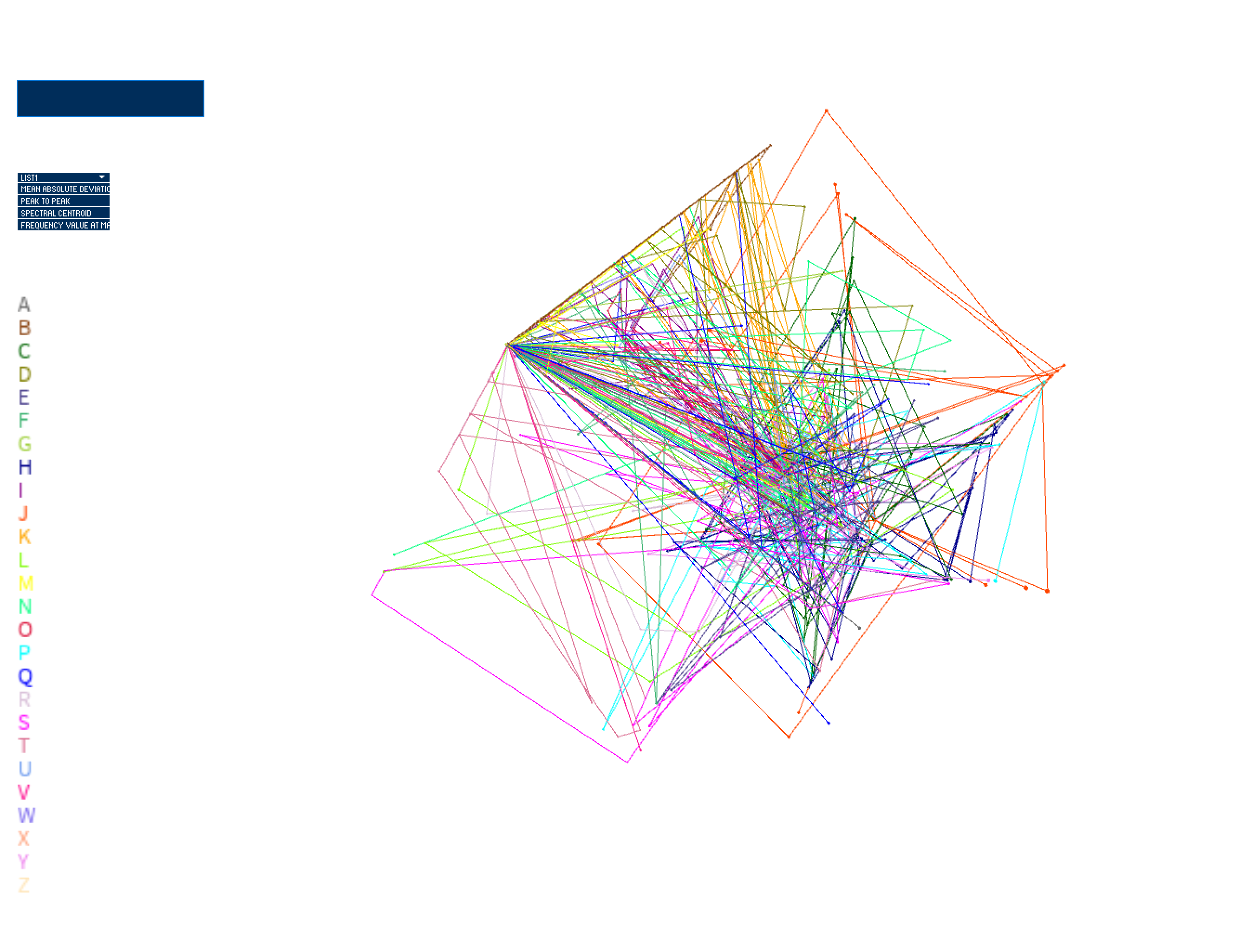
Final result
The final iteration of this work contains smoother movements and better boundary detection, with implementation of acceleration and drag forces influencing movement of the points in the system. Acceleration and drag forces are mapped to selected feature values, and drag is subtracted from the acceleration of the particle per frame, which is added to velocity per frame. Velocity is then added to position per frame to drive movement. The particle stops accelerating when drag force has accumulated (higher feature values = higher drag which means a quicker slow-down rate of the particle). The particle stops moving when it hits the bounding box. This provides a picture of how captured tactile gestures, corresponding to unique letters of the Deafblind Manual alphabet, compare with one another, based on the user-selected feature. Inputting text results in a visualization of the letters occuring in the input text, with stroke weight of connections between trials per letter mapped to frequency of letter co-occurance. Furthermore, the movement and position of the points show us what sensor has higher feature values than others, which influences resultant geometries. I will use my visualization as a tool in my future research when refining features for use in developing a smart bracelet to facilitate tactile communication.
Code
This work (visualization of data) is developed with the Processing environment.
VisualizingCommunicativeTouch.zip
The dataset was collected using Python and Arduino (integration with sensors + microcontroller). The dataset and code is currently closed-source.
VisualizingCommunicativeTouch.zip
The dataset was collected using Python and Arduino (integration with sensors + microcontroller). The dataset and code is currently closed-source.