NBA Stats over time
MAT 259, 2024
Paul Kim
Concept
This idea was inspired by recent discourse on the offensive explosion in the National Basketball Association (NBA) over the past few years. I wanted to do a visualization of the three most common NBA statistics-points, rebounds, and assists-from the beginning of the tracking of these stats to see how these have changed over time. More than this, however, I just wanted to see what it would look like to visualize all NBA players over each season.
Query
The data was taken from the NBA API Python package, a package made to ease access to the NBA API. Below is a screengrab from my Python code used to call the API and download the data:


Preliminary sketches
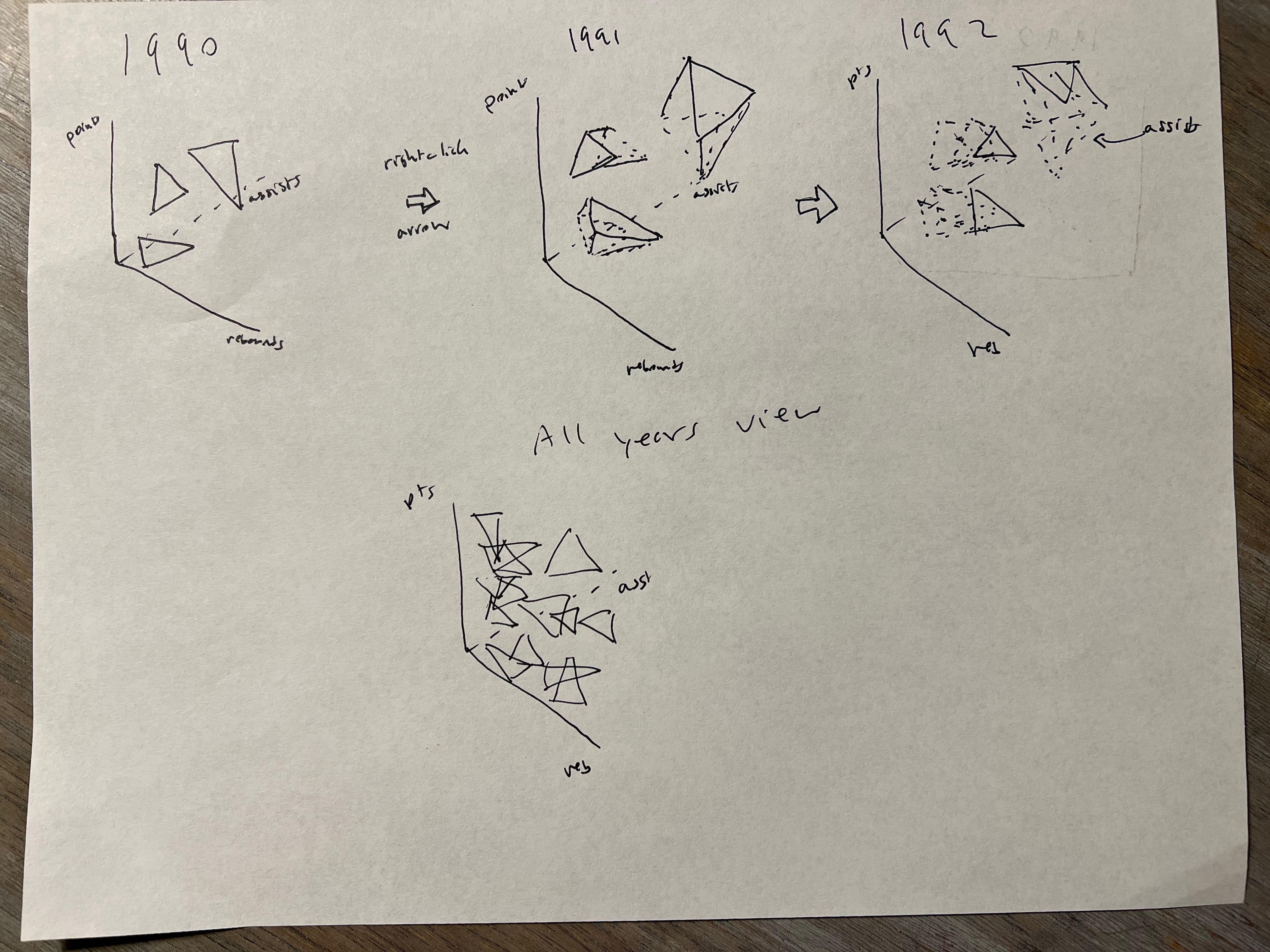
I had an original idea where I'd have triangles with each vertex representing points, rebounds, and assists. I wanted the user to be able to trace historical data for each player and also see the data from each season, using the keyboard to progress through each year. I also wanted there to be an all-seasons view. Below is a sketch representing these initial ideas:

Process
As with last time, there was a decent amount of pre-processing done in Python. Example below:
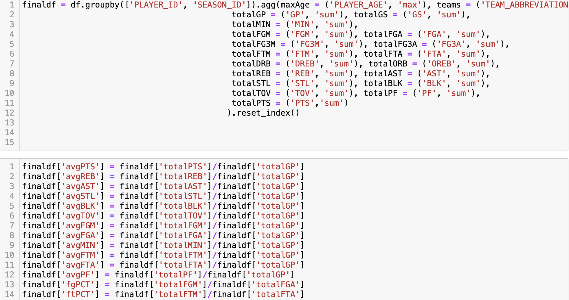
Here you can see me grouping the data by player and season and making averages for each player and season.
Throughout this process, I experimented with some views of the data, how to color each point and then how to connect current data with historical data. Below is a view of this:
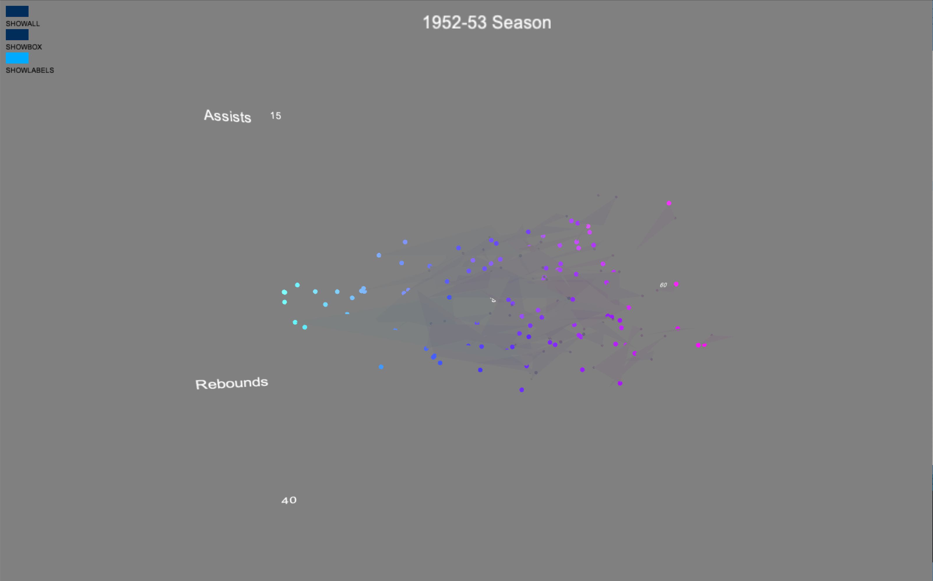
The color of the data wasn't that meaningful, however, so I changed it so that it would reflect the primary color of each team:
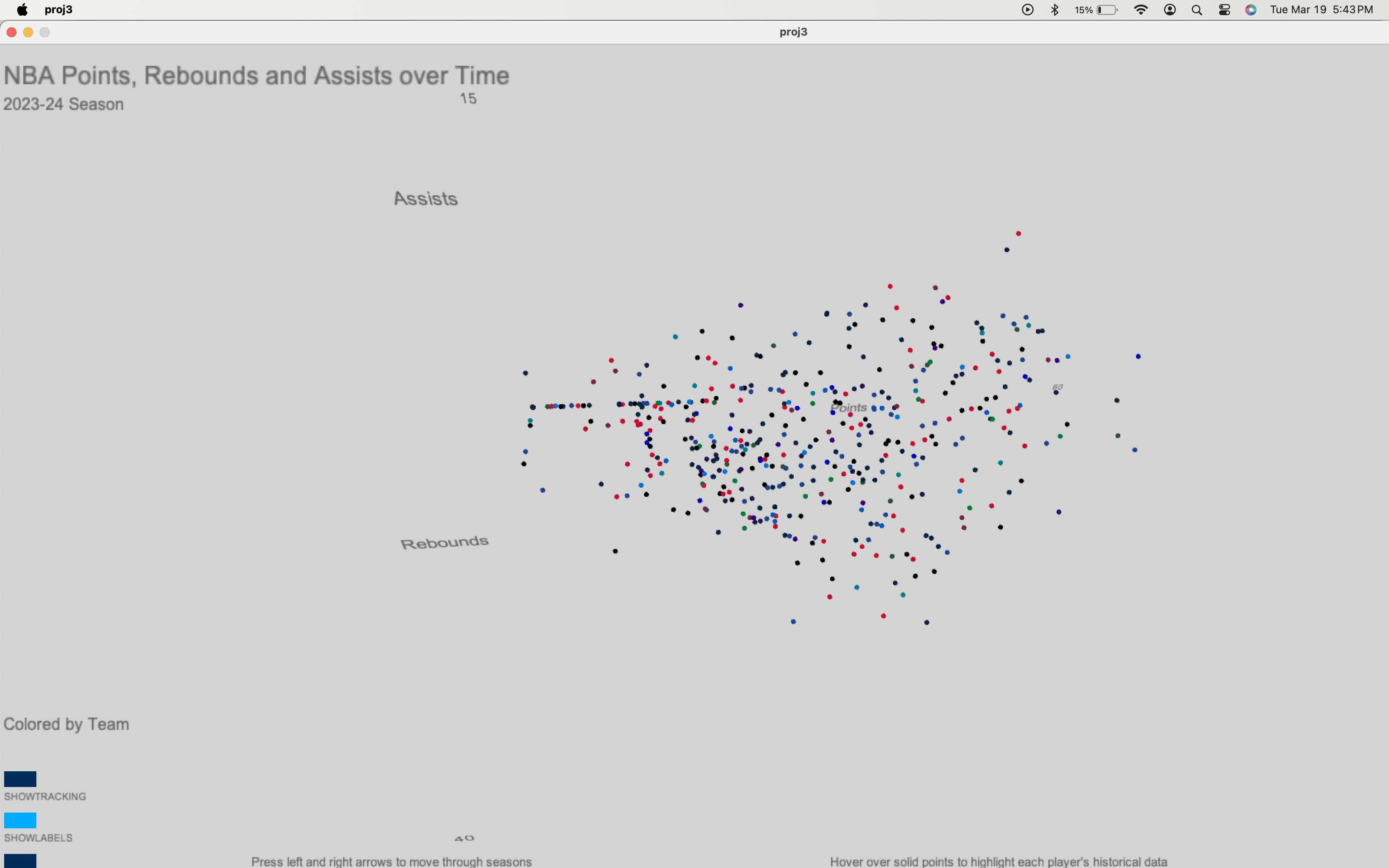
And last to be added was the traces of historical data, which is seen below: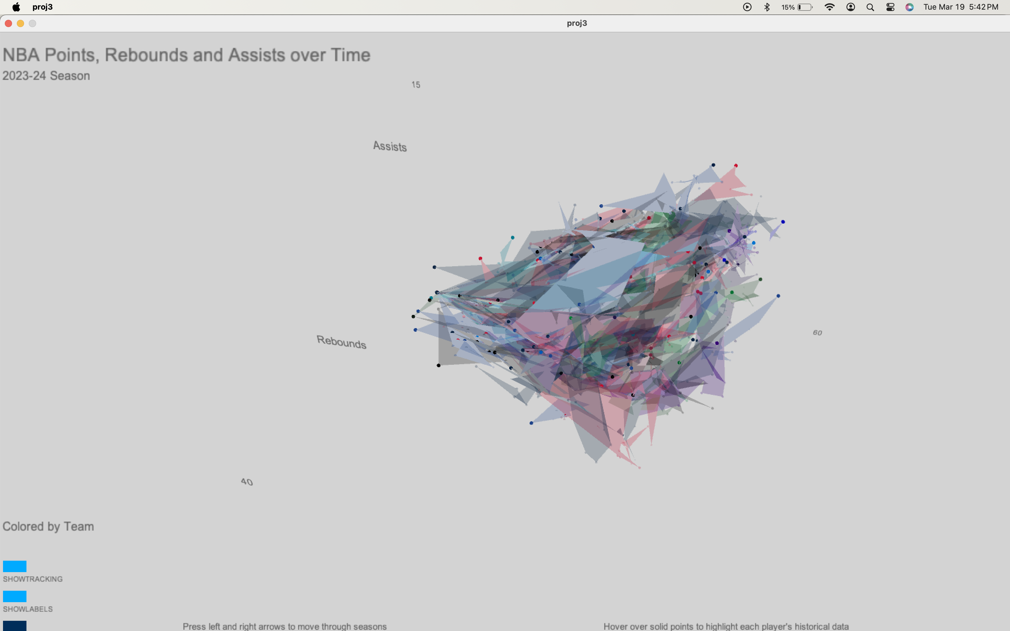
Most of the work done in order to make the historical data was in structuring the data I had. Once I was able to find the right structure, placing the data was trivial. I ended up having four different data structures all with overlapping information so I could visualize everything I wanted to visualize. This was a really good lesson in how important data structure is for the visualization (much thanks to Jenni for her help on this!)

Here you can see me grouping the data by player and season and making averages for each player and season.
Throughout this process, I experimented with some views of the data, how to color each point and then how to connect current data with historical data. Below is a view of this:

The color of the data wasn't that meaningful, however, so I changed it so that it would reflect the primary color of each team:

And last to be added was the traces of historical data, which is seen below:

Most of the work done in order to make the historical data was in structuring the data I had. Once I was able to find the right structure, placing the data was trivial. I ended up having four different data structures all with overlapping information so I could visualize everything I wanted to visualize. This was a really good lesson in how important data structure is for the visualization (much thanks to Jenni for her help on this!)
Final result
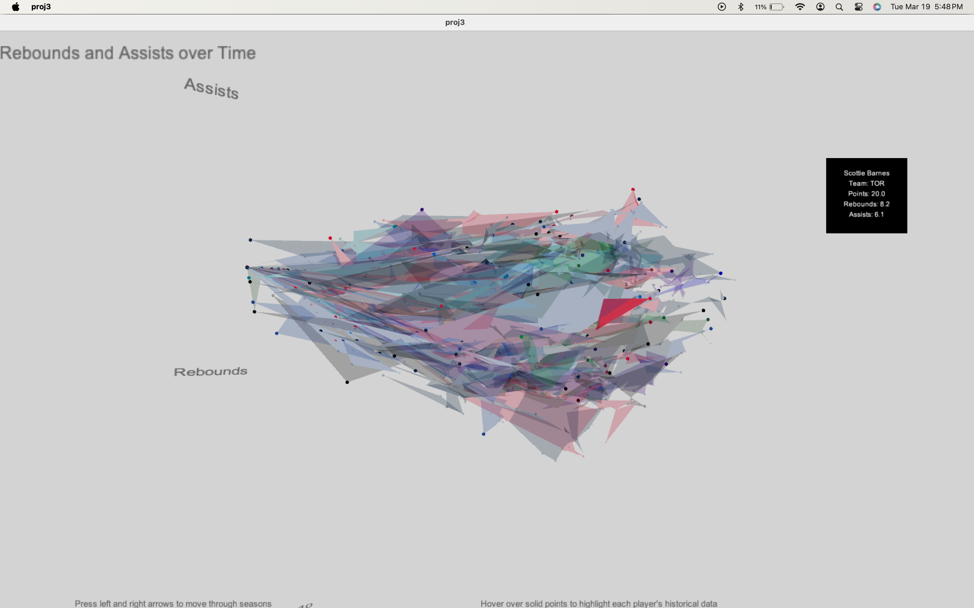
This is the final result! As you can see in the following picture, if you mouse-over a solid-colored point, you will see that player's current and historical data displayed and highlighted. I think this looks pretty nice and is a good solution to the otherwise visual clutter.
One thing I thought might be interesting was to change the color of the canvas and the logic of the point colors when you are looking at the "all seasons" view. I wanted to do this for a couple reasons: first, to make it clear that the viewer should be looking at the data differently (more holistically), and second to make it clear that the points are now colored based on a different paradigm (by season, rather than by team). I'm happy with the end result!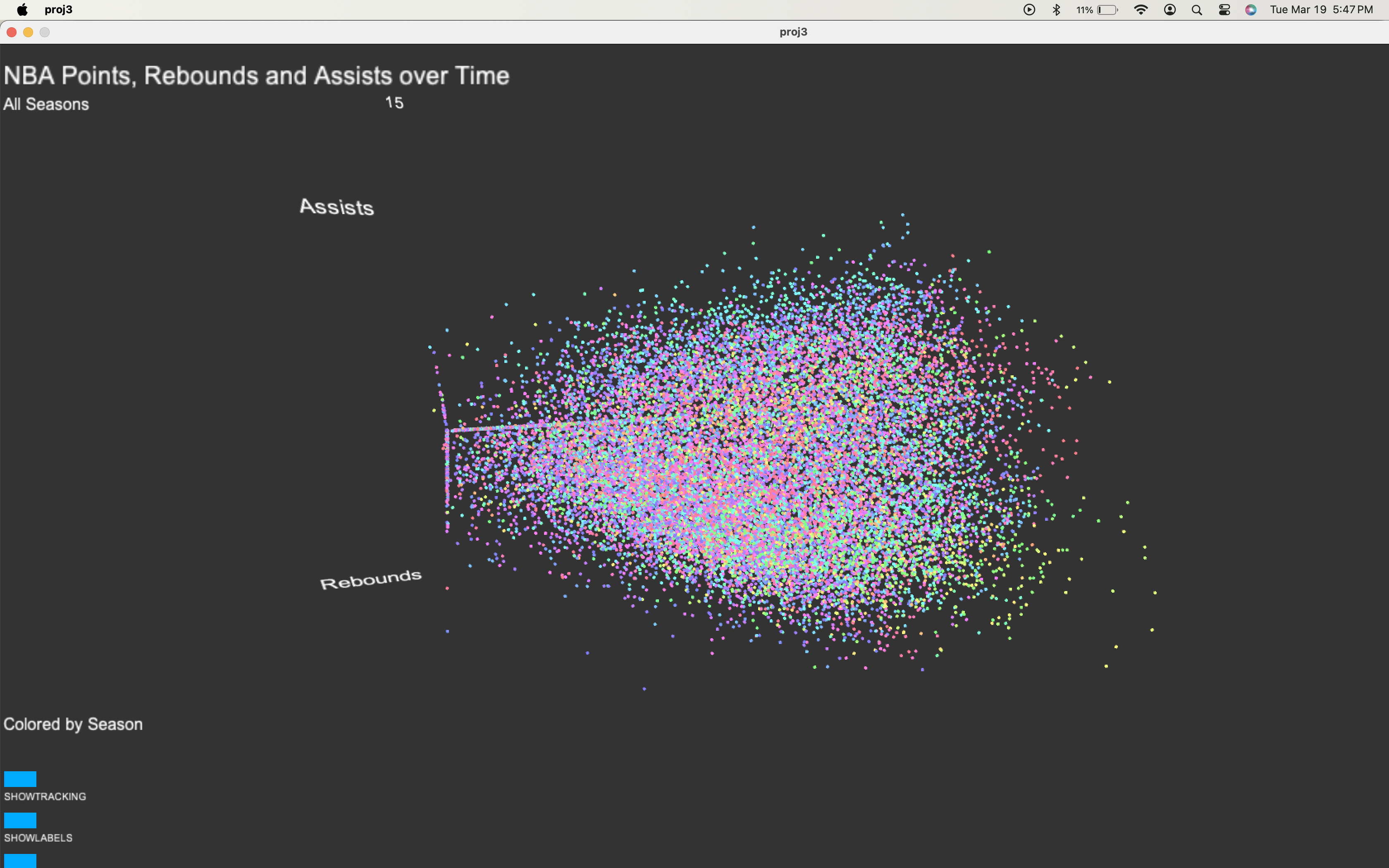

One thing I thought might be interesting was to change the color of the canvas and the logic of the point colors when you are looking at the "all seasons" view. I wanted to do this for a couple reasons: first, to make it clear that the viewer should be looking at the data differently (more holistically), and second to make it clear that the points are now colored based on a different paradigm (by season, rather than by team). I'm happy with the end result!

Code