Library as third space
MAT 259, 2024
Paul Kim
Concept
This project built on the first assignment of this course which was to analyze how the library was being used as a space itself rather than just as a repository. My proxy for this analysis was by looking at which items were checked out and back in on the same day.
Query
SELECT
*
FROM spl_2016.inraw
WHERE DAY(cout) = DAY(cin) AND TIMESTAMPDIFF(DAY, cout, cin) < 1
FROM spl_2016.inraw
WHERE DAY(cout) = DAY(cin) AND TIMESTAMPDIFF(DAY, cout, cin) < 1
Preliminary sketches
My first idea was to show a mapping of same-day checkouts per branch location to see how
each branch was being used as a "third space."
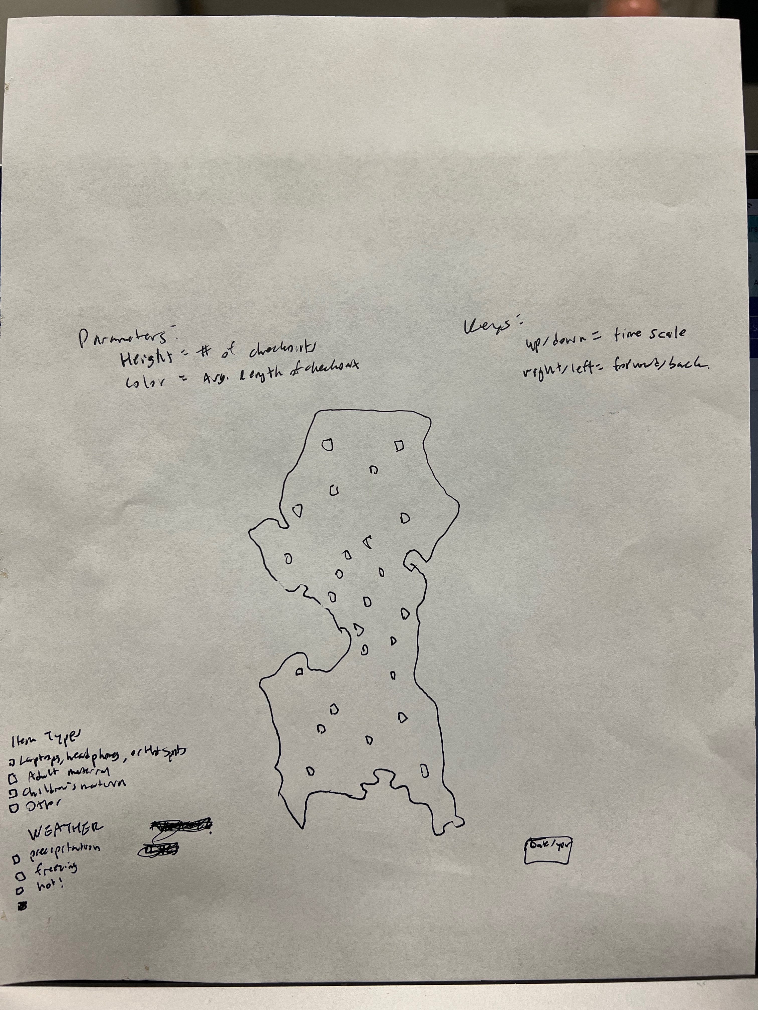
This didn't quite work out for a few reasons. First is the static nature of a map; I wanted to have more flexibility than a map would provide. The second reason is that there actually is no branch data in the library checkin/checkout data! Evgeny in a previous class has shown that this information only exists in the inventory. I went to the inventory to find the branch information, but an additional problem came up: there are no unique identifiers for laptops, headphones, and the like. As a result, I changed my project to analyzing the number of checkouts of these equipment compared to their total inventory by month over time to see how frequently these items were being used in comparison to how much of them the library had. This required a lot of data pre-processing:
A lot of work was done in Python to merge the inventory and checkout data. The tasks were as follows:
- Pull checkout data
- Pull inventory data
- Merge checkout data and inventory data
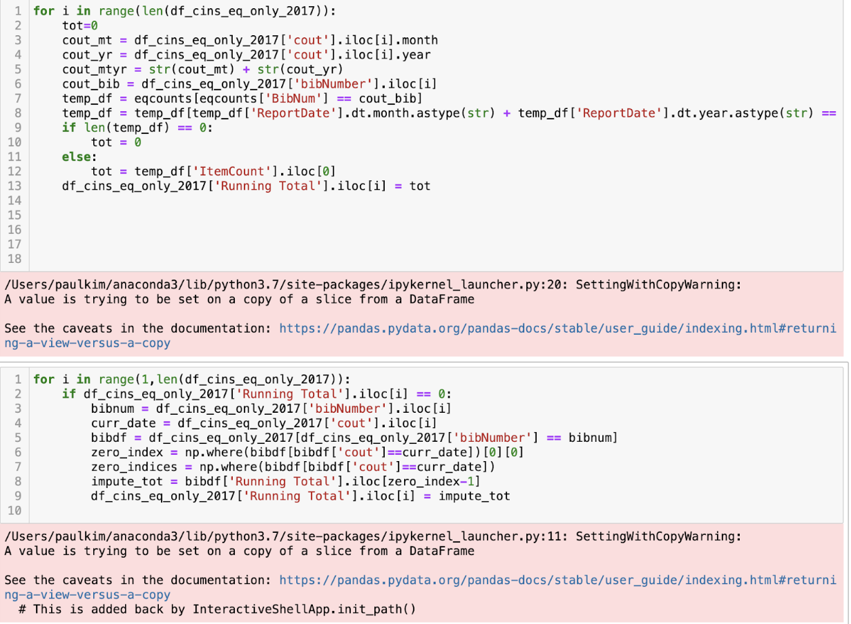
- This was the most challenging part as it required keeping a data column that would keep track of the inventory over time as it updates. So basically, every time the inventory changed, I’d have to have the new inventory reflect in the merged dataset. Additionally, since the inventory was missing some data, I had to impute the missing data. Below are some screenshots of my Python code:
Process
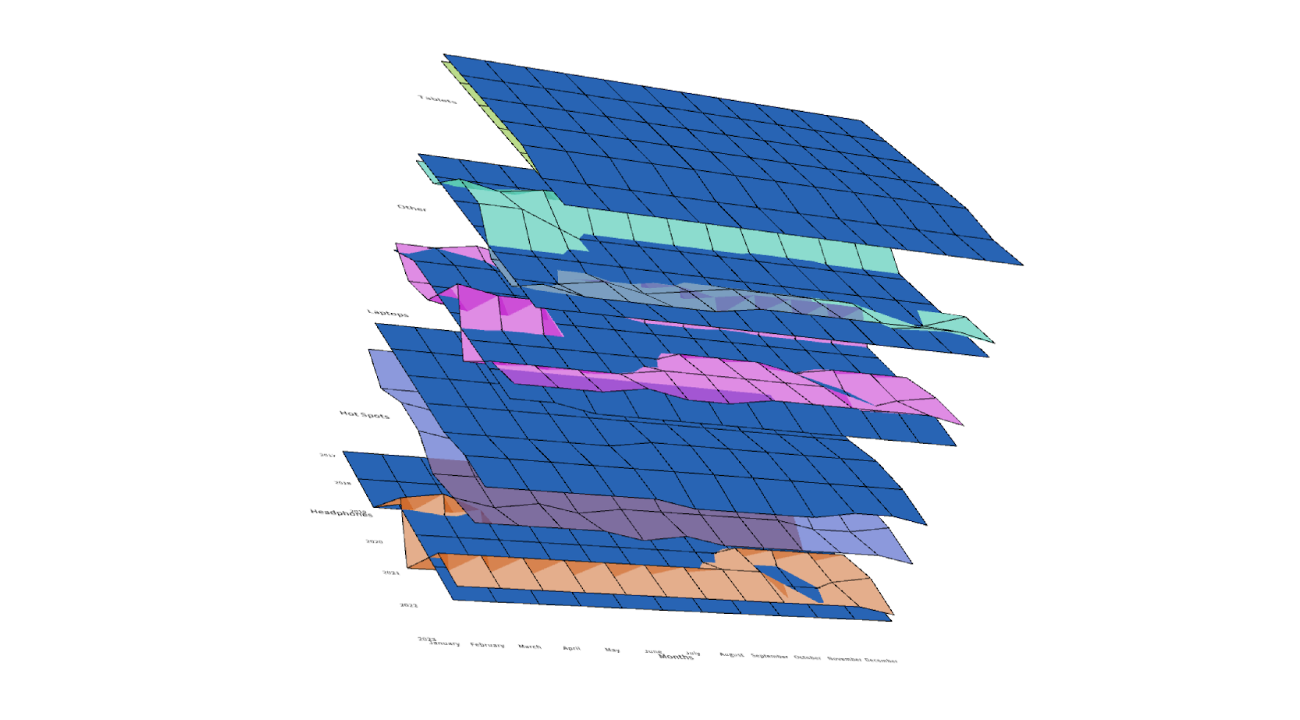
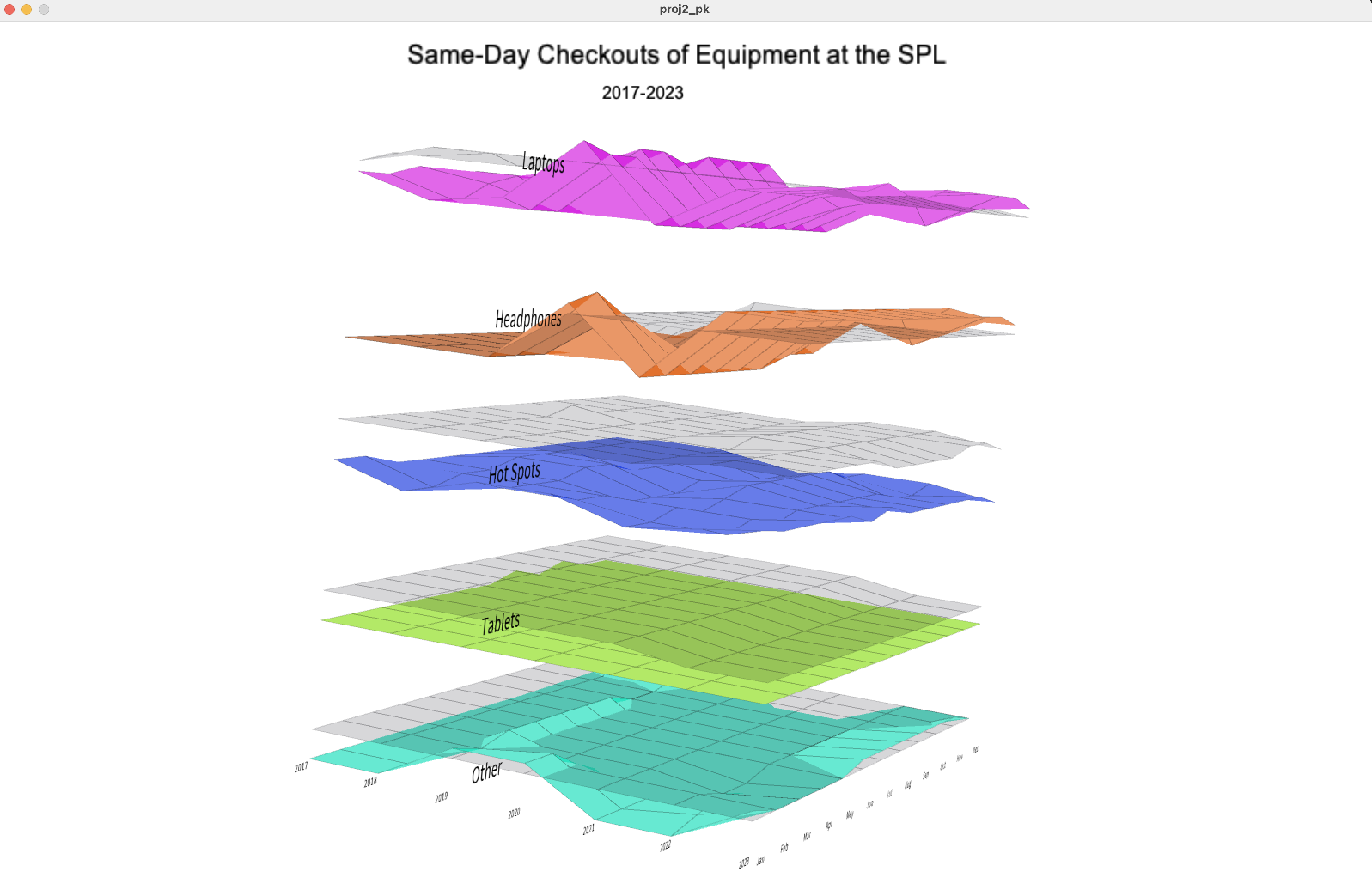
I borrowed a similar idea from Li Zheng in the visualization since it allowed for a visualization of two different things on the same plane. Since I wanted to compare the inventory to checkouts data, I thought this would be a nice way of seeing this comparison.
I split the view into five different layers because I had five different equipment types so one could see the comparison of how many times certain pieces of equipment were checked out vs. how many were available, by month. Every time the non-blue graph goes above the flatter inventory line, that equipment type was checked out more times than the library had in inventory. This makes sense because the data is by month, and each item can be checked out multiple times. Below is an earlier screenshot of my visualization:
Though I liked this visualization, after feedback from George and Jenni, I changed it so that the order of equipment followed an order of checkout frequency. This way, the most information-rich visualizations are at the top. I also changed some colors around so that it was more apparent what the inventory layer was.
Though I liked this visualization, after feedback from George and Jenni, I changed it so that the order of equipment followed an order of checkout frequency. This way, the most information-rich visualizations are at the top. I also changed some colors around so that it was more apparent what the inventory layer was.
Final result
If you mouse over the peaks of each graph, you will see the number of checkouts and the number of inventory at each month for each equipment type.
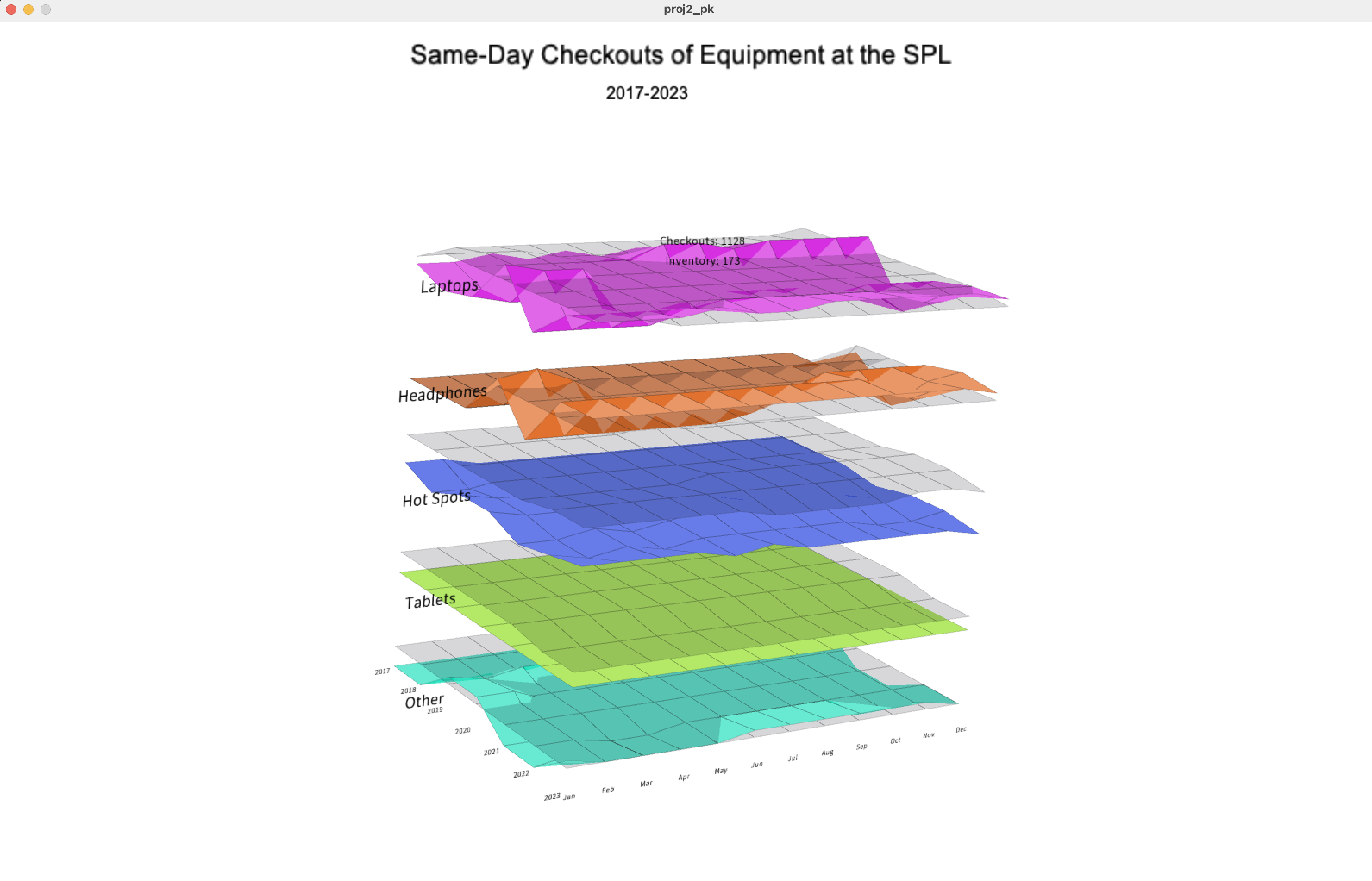
Some insights are below:How the library responds to demand over time. It seems to generally lag, but they also generally responded to demand in some way. One interesting insight is that the library seemed to reduce the inventory of tablets due to lack of interest.
Headphones and laptops are often checked out at high frequencies, whereas tablets and hot spots are hardly checked out at all.
There is a huge number of hot spots available for checkout, but they are rarely checked out.
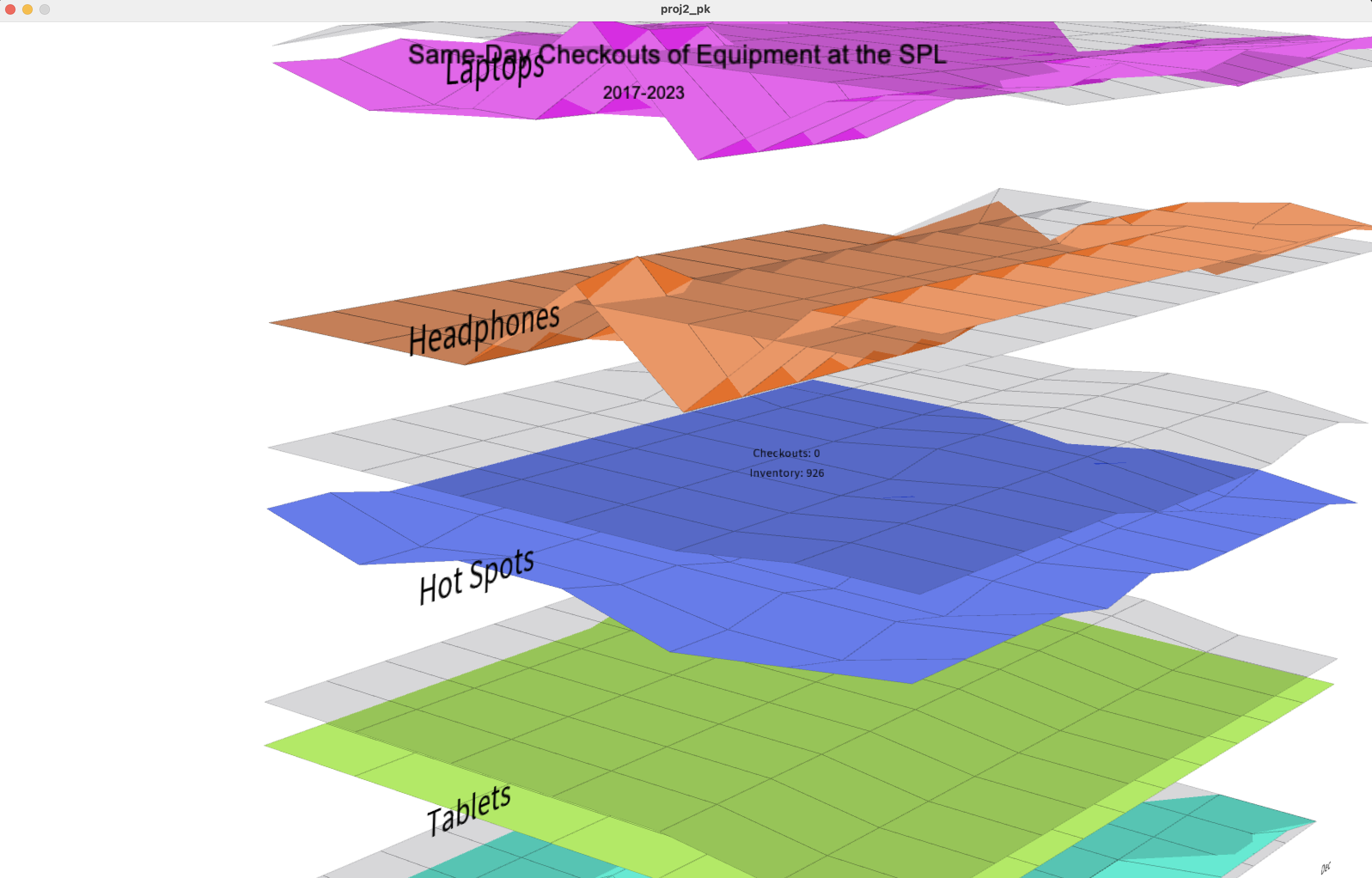
You can see a predictable trough in each of these materials during COVID.
Some insights are below:
Code