The Social Dilemma: User Behavioral Change on Twitter
MAT 259, 2022
Qing Huang
Concept
This program is a data visualization project that creates a 3D environment to display data about user behavior on Twitter that is related to a documentary The Social Dilemma.
In 2020, this documentary became one of the most popular movies on Netflix. The documentary delves into the downsides of social media platforms, revealing how these platforms use algorithms and user data to manipulate user behavior and keep them engaged for longer periods. The documentary highlights the dangers of social media addiction, its impact on mental health, and the potential for misinformation to spread rapidly on these platforms.
The documentary quickly gained traction and sparked conversations on social media platforms such as Twitter, Facebook, and Instagram, with users sharing their thoughts and opinions about the film. The public's reaction to the documentary reflects growing concerns over privacy and security issues related to social media use. Many viewers expressed their fear of the extent to which their data is being collected and used by these platforms, raising questions about the level of control they have over their personal information.
Given the widespread attention that the documentary received, we decided to analyze the sentiment and topics of the social media users' posts about the documentary. Our research questions centered around understanding the types of sentiment elements presented in these posts, the topics that social media users were talking about, and whether the documentary had an impact on people's social media usage. To gain insights into the public's perception of the documentary and its impact on social media use, we employed sentiment analysis and topic modeling techniques.
Using the anonymized 3000 Twitter users’ data, I wanted to create visualizations that would allow researchers to explore the sentiment and topics in a more intuitive and comprehensive way. Through the use of various visualization tools, I was able to generate interactive graphs and charts that displayed sentiment trends over time, identified the most prevalent topics discussed, and provided a detailed view of the sentiment associated with each topic. This enabled us to gain a deeper understanding of the public's response to the documentary and its impact on social media use.
Query
table = loadTable("data-SD.csv", "header");

for (int i=0; i<numRows; i++) {
    int ID = table.getInt(i, 0);
    String date= table.getString(i, 1);
    String time= table.getString(i, 2);
    float  botscore= table.getFloat(i, 3);
    int m1=table.getInt(i, 4);
    int m2=table.getInt(i, 5);
    int sentiment=table.getInt(i, 6);
    int topic=table.getInt(i, 7);
    users.add(new User(ID, date, time, botscore, m1, m2, sentiment, topic));
  }

class User{
  int ID;
  String date;
  String time;
  float botscore;
  int m1;
  int m2;
  int sentiment;
  int topic;

  User(int ID, String date, String time, float botscore, int m1, int m2, int sentiment, int topic){
    this.ID = ID;
    this.date = date;
    this.time = time;
    this.botscore = botscore;
    this.m1 = m1;
    this.m2 = m2;
    this.sentiment = sentiment;
    this.topic = topic;
  }
}
Preliminary sketches
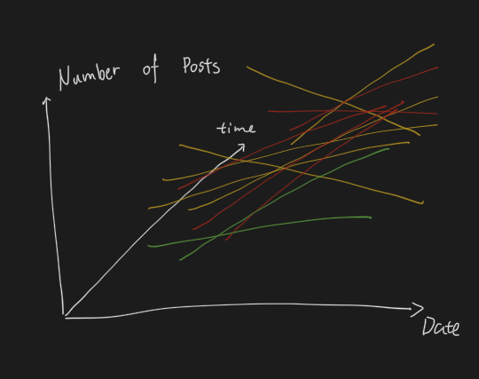
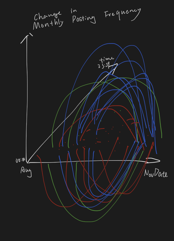
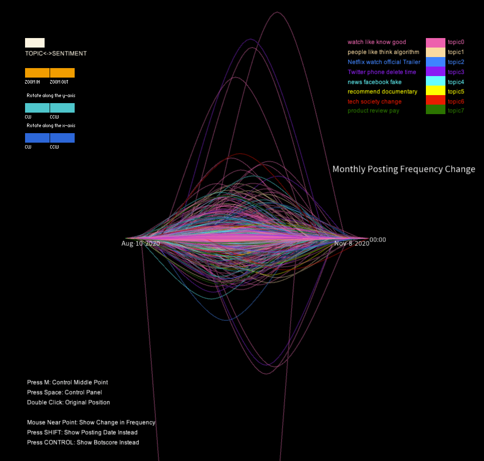
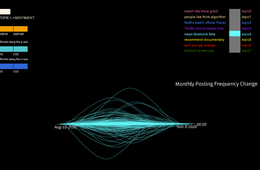
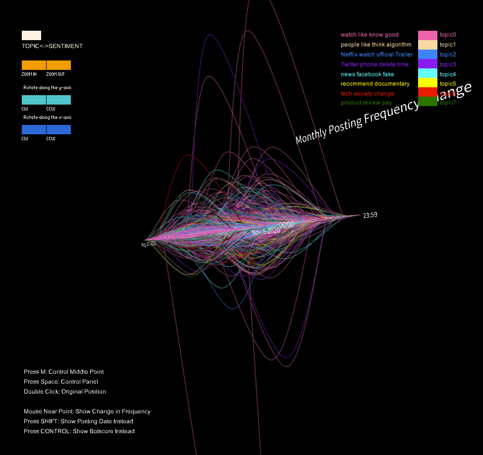
Originally I am planning to use a straight line to represent the change of user’s posting frequency but it is difficult to separate different lines of the initial model. To better visualize the data, I decided to use curves instead of a straight line to show the change. The height of the curve indicate the degree of change in a user’s posting frequency and whether the curve is above or below the surface indicate if it is an increase or decrease.
Process
I use the PeasyCam library to enable the user to interact with the visualization by rotating and zooming in and out. The ControlP5 library is also used to create a control panel for the user to adjust various parameters of the visualization. Originally, I only create 3 sentiment groups and later I added the switch button to enable viewers to select topic groups.
The program loads data from a CSV file, which contains information about users on the social media platform, including their ID, date and time of posting, bot score, sentiment, and topic. This data is then stored in an ArrayList of User objects.
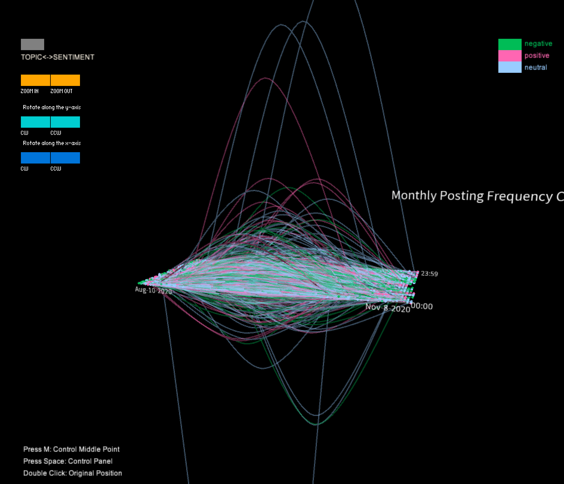
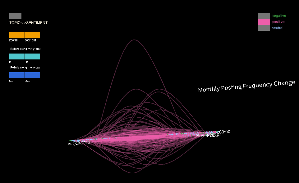
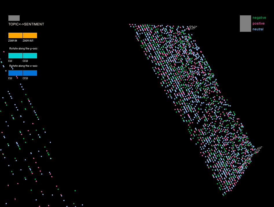
The program contains functions for controlling the display of the data. For example, the SentimentGrouping() function groups the data by sentiment (positive, negative, or neutral) and displays it using different colors (red for positive, green for negative, and blue for neutral). The TopicGrouping() function groups the data by topic and displays it using different colors as well.
The drawLabels() function is responsible for drawing text labels in the 3D environment to provide context for the data being displayed. This function uses the text() function to draw text in various locations and scales. As the viewer’s mouth gets close to a middle point of a curve, the number of change in a user’s posting frequency will show. If the viewer press “shift” or “control” in their keyboard, the displayed text will be changed to the score of robot (the likelihood of a robot account) or the date this user posted the comment for the documentary.
Finally, the program includes a gui() function that creates the user interface using the ControlP5 library. This interface includes checkboxes and sliders to allow the user to control various aspects of the visualization, such as which data to display and the colors used to represent it.
The program loads data from a CSV file, which contains information about users on the social media platform, including their ID, date and time of posting, bot score, sentiment, and topic. This data is then stored in an ArrayList of User objects.
The program contains functions for controlling the display of the data. For example, the SentimentGrouping() function groups the data by sentiment (positive, negative, or neutral) and displays it using different colors (red for positive, green for negative, and blue for neutral). The TopicGrouping() function groups the data by topic and displays it using different colors as well.
The drawLabels() function is responsible for drawing text labels in the 3D environment to provide context for the data being displayed. This function uses the text() function to draw text in various locations and scales. As the viewer’s mouth gets close to a middle point of a curve, the number of change in a user’s posting frequency will show. If the viewer press “shift” or “control” in their keyboard, the displayed text will be changed to the score of robot (the likelihood of a robot account) or the date this user posted the comment for the documentary.
Finally, the program includes a gui() function that creates the user interface using the ControlP5 library. This interface includes checkboxes and sliders to allow the user to control various aspects of the visualization, such as which data to display and the colors used to represent it.
Final result
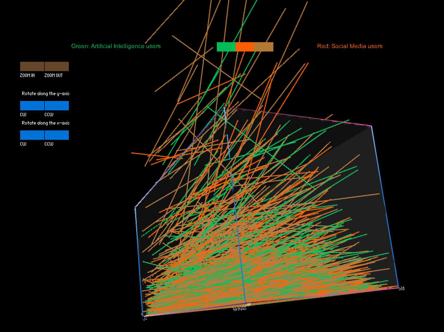
In this project, I utilized a color-coded visualization design to present Twitter users' sentiments toward the documentary "The Social Dilemma". The purpose of this visualization was to gain insights into the types of sentiment expressed in these tweets, as well as the topics that were being discussed by the users. To achieve this, I divided the tweets into three sentiment categories, each represented by a different color, which allowed us to identify patterns and trends in the sentiment data. Furthermore, I used the height of the curve, specifically the highest middle point, to represent changes in the volume of tweets in one month that were posted prior to and after the user's commentary tweet. This enabled me to compare the levels of user engagement with their social media platform before and after users posted their opinions about the documentary on social media.
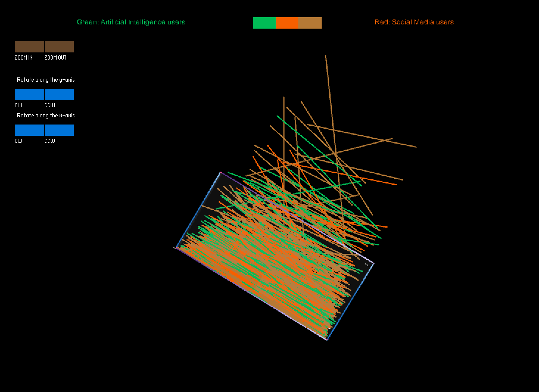
Additionally, I designed a panel that permitted viewers to switch between topic groups, where each of the seven colors was assigned to a distinct topic, and the sentiment groups. This feature enabled me to identify the most discussed topics related to the documentary, and to analyze how user engagement varied across different themes. Ultimately, my visualization generated a unique representation of the data, resembling a universe with a surface at the center (i.e., at height zero, where points are located when users don’t change their monthly posting frequency), which provided a clear and engaging way to present the findings.
Moreover, the distribution of points on the surface revealed that the total amount of neutral comments was the highest among the three groups, but the ratio of neutral comments decreased over time. In terms of the time dimension, the points were more dispersed around late morning, indicating a lower number of comments during that time period. However, the points became denser in the late afternoon.
When switching the model to the topic grouping mode, some fascinating differences in the shape of the curve collection were observed in different groups. For example, when only tweets related to topic four were selected, significant changes in the curves' heights appeared in the early stage, followed by a second lower wave near the end. Similar patterns were observed in two or three other groups. These findings suggest that these topics may have experienced two rounds of heated discussions, providing interesting insights into the nature of the discourse surrounding the documentary.
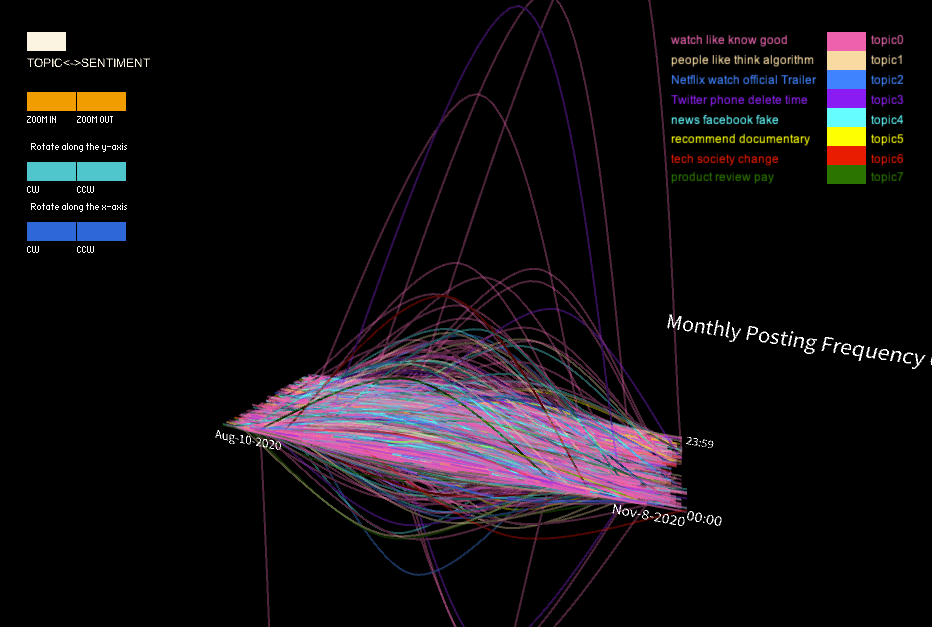
Additionally, I designed a panel that permitted viewers to switch between topic groups, where each of the seven colors was assigned to a distinct topic, and the sentiment groups. This feature enabled me to identify the most discussed topics related to the documentary, and to analyze how user engagement varied across different themes. Ultimately, my visualization generated a unique representation of the data, resembling a universe with a surface at the center (i.e., at height zero, where points are located when users don’t change their monthly posting frequency), which provided a clear and engaging way to present the findings.
Data Insights-Preliminary findings
The shape of final 3D model suggests that the shape below and above the surface are almost symmetrical, indicating that the data from the 3000-user sample doesn't provide any evidence of a tendency for the entire group to increase or decrease their monthly posting frequency. However, when analyzing a single sentiment group, some differences in the height of the curves were observed below and beyond the surface. For instance, the positive sentiment group exhibited higher curves beyond the surface, suggesting that there may be more outliers among users who increase their posting frequency. Nonetheless, the intensity of the shape was similar beyond and below the surface, and most users' curves were close to the surface, indicating only slight changes or even no changes in their frequency. These findings could offer insights for future statistical analyses of the data, such as the potential removal of outliers.Moreover, the distribution of points on the surface revealed that the total amount of neutral comments was the highest among the three groups, but the ratio of neutral comments decreased over time. In terms of the time dimension, the points were more dispersed around late morning, indicating a lower number of comments during that time period. However, the points became denser in the late afternoon.
When switching the model to the topic grouping mode, some fascinating differences in the shape of the curve collection were observed in different groups. For example, when only tweets related to topic four were selected, significant changes in the curves' heights appeared in the early stage, followed by a second lower wave near the end. Similar patterns were observed in two or three other groups. These findings suggest that these topics may have experienced two rounds of heated discussions, providing interesting insights into the nature of the discourse surrounding the documentary.
Code