Visualizing IVF Patient Journeys
MAT 259, 2023
Jenni Hutson
Concept
For my final project, I was interested in visualizing data which
represents very personal decisions or times in people's lives.
These topics seemed more difficult to reduce down to numbers, so
I was curious if I could create a visualization which represented
them well. I ended up finding a dataset which included 160,000
patients' data who underwent fertility treatment. I was specifically
interested in patients who had IVF treatment (In vitro fertilization).
IVF is a medical procedure whereby an egg is fertilized by sperm in
a test tube or elsewhere outside the body, and is used by people
who are unable to concieve naturally for a variety of reasons.
Query
Data obtained from the
Human Fertilisation and Embryology Authority (HFEA)
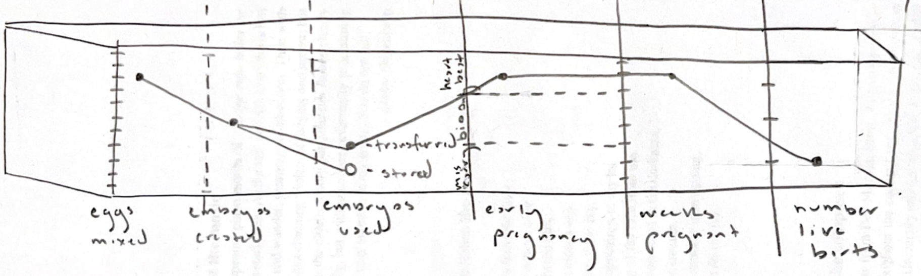
Preliminary sketches
IVF can be a long process, and many patients undergo multiple
rounds before they are able to concieve. I wanted to create
a sort of timeline which showed each patients journey through
the various stages of treatment.
The stages could included
- Number of eggs mixed
- Number of Embryos created
- Number of Embryos transferred
- Early pregnancy outcome: whether Intrauterine Fetal Pulsation Seen, biochemical pregnancy only (early miscarriage), or miscarriage
- Number Weeks pregnant
- Pregnancy outcome: live birth or no
Process
The initial dataset had ~130,000 rows of patient data who underwent
IVF. To select a more mangeable subset, I took a random sample to get
about 3000 rows. With the random method, there were far more patients
with male partners than patients with female partners or no partners.
Since I was curious if there would be any variations in these three groups,
I changed my method to select about 1000 patients from each group.
Within each group, these patients were randomly selected.
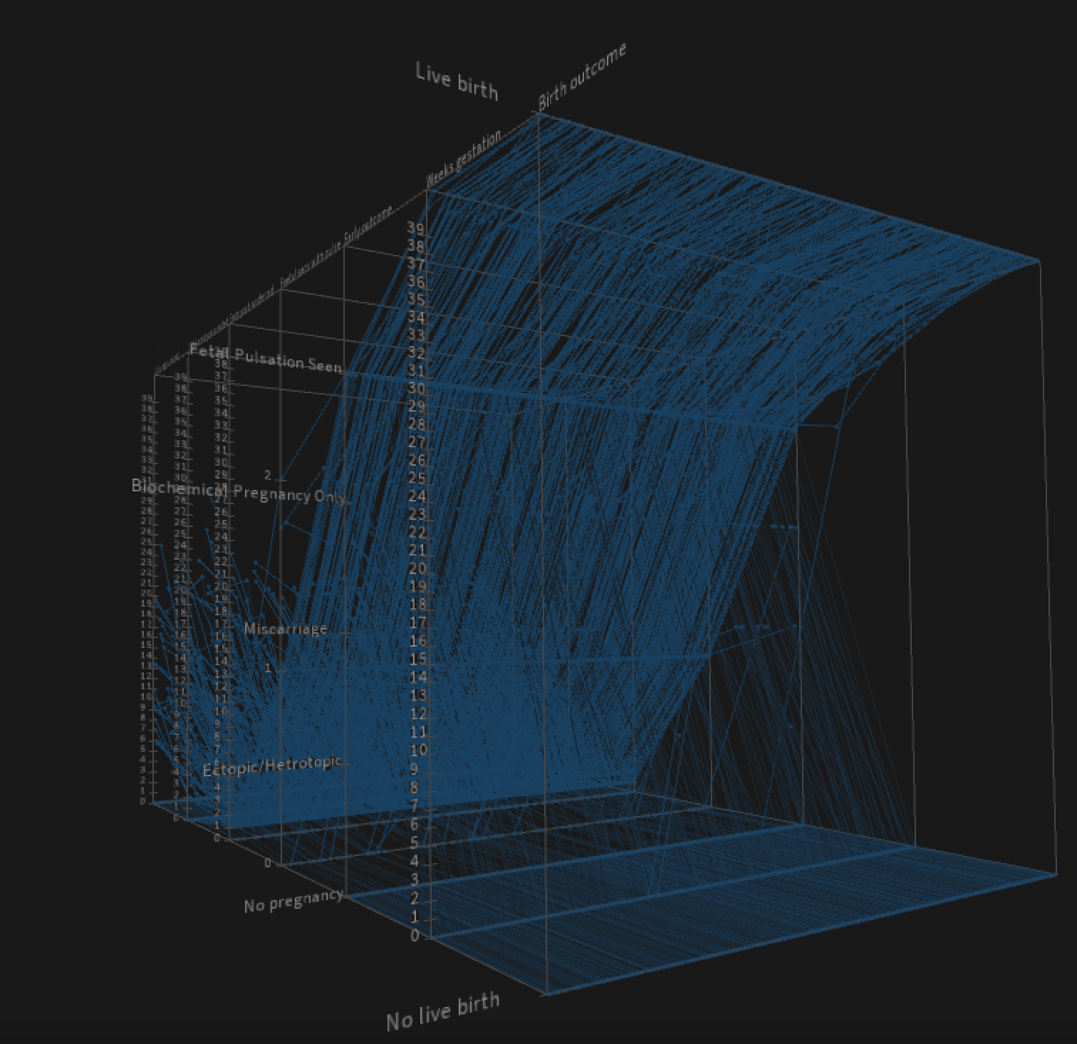
Final result
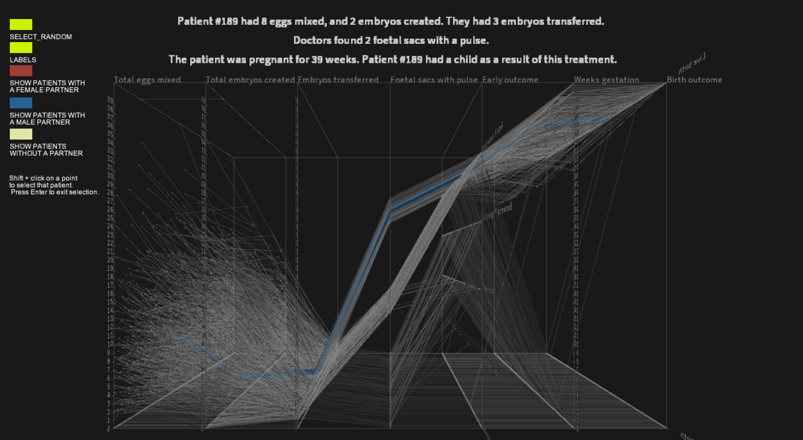
For the final project, I mapped each stage to a rectangle. If
the data for a stage wasn't numerical, I designated steps on the
y-axis to represent each category for that stage.
Many patients did not have a child as a result of this round of IVF. Since their lines went to zero on the visualization, I made these lines more transparent so as not to overwhelm the image. This way, the volume of patients who didn't have a successful outcome could still be visible and the point where treatment failed is clear.
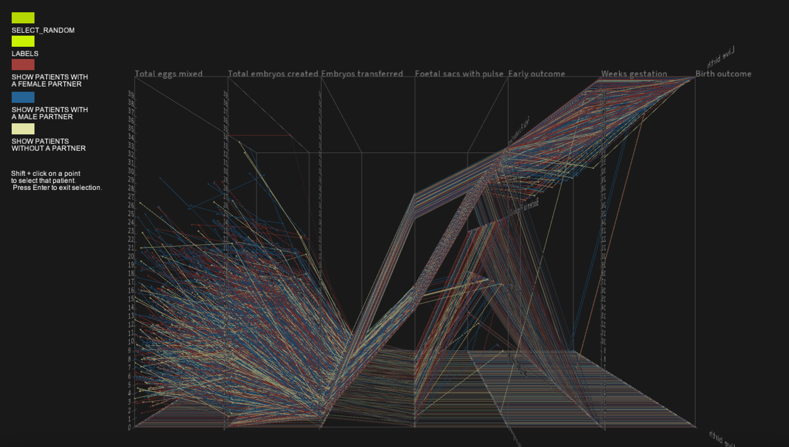
The user can select which group(s) they would like to visualize: patients with a male partner, a female partner, or no partner. In the following image, only patients with a male partner are visualized.
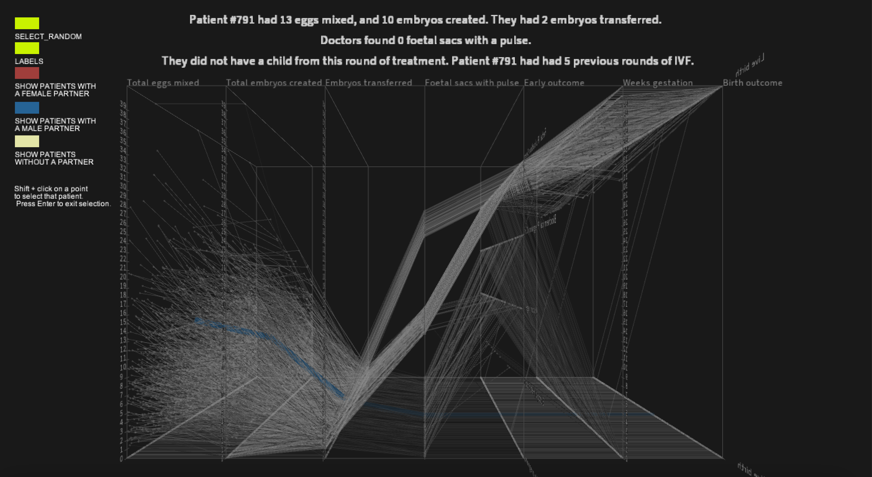
I added the ability to select an individual patient by shift-clicking on a data-point or randomly selecting one with a button click. This grays out the other data and makes the patient's line thicker.
I wanted to display data about the patients in a paragraph of plain text rather than over each stage so that a more wholistic journey was presented. When a patient is selected, a paragraph listing how many eggs they had mixed, embryos created and transferred, foetal sacs with a pulse were found, and the final outcomes of IVF. It also notes if they have had previous rounds of IVF.
Many patients did not have a child as a result of this round of IVF. Since their lines went to zero on the visualization, I made these lines more transparent so as not to overwhelm the image. This way, the volume of patients who didn't have a successful outcome could still be visible and the point where treatment failed is clear.
The user can select which group(s) they would like to visualize: patients with a male partner, a female partner, or no partner. In the following image, only patients with a male partner are visualized.
I added the ability to select an individual patient by shift-clicking on a data-point or randomly selecting one with a button click. This grays out the other data and makes the patient's line thicker.
I wanted to display data about the patients in a paragraph of plain text rather than over each stage so that a more wholistic journey was presented. When a patient is selected, a paragraph listing how many eggs they had mixed, embryos created and transferred, foetal sacs with a pulse were found, and the final outcomes of IVF. It also notes if they have had previous rounds of IVF.
Code