MLB Pitchers: Winning Percentage Across Other Metrics
MAT 259, 2023
Brianna Griffin
Concept
For the final project, I am using a data set on MLB starting pitchers
to analyze relationships between several different variables. Specifically,
I am interested in the interaction between variables and "winning percentage".
I have recently completed a Machine Learning Final Project in which I built 5 different
regression models that predicted the "winning percentage" as an outcome variable.
I found that 2 of the most prominent variables in predicting "winning percentage" were "best"
and "team_win_loss_percentage". I am curious to see if the same results will be displayed in
my 3D visualization. Going into the project, I also wanted to use curves in my visualization,
with cubes connecting their endpoints. My final idea includes 5 cubes with different x and
y axes that correspond to different metrics of the pitchers in the data set. The z-axis
is constantly the winning percentage for each observation. Curves are created for each observation,
and they will go through each cube. Hence, they are influenced by the 5 differing x, y metrics of
each cube. Also, the colors of the curves are based off of the age of the pitcher.
Data
The data that I am utilizing for the visualization contains statistics and metrics on MLB starting
pitchers in the National League during the years 2000-2022. The data was collected from the
webstite Baseball Reference.
Below is a list of the variables that are used in the visualization along with a brief description of their meaning
within the game of baseball.
- Winning Percentage = number of games won ÷ total number of games pitched
- Innings Pitched = numbers of innings pitched during the season
- Year = year of the given season
- Best = best game score
- Worst = worst game score
- "Game Score" measures a pitcher's performance in any given game started
- WLST = number of wins lost
- At the time the pitcher faced his final batter the pitcher was in position for a win, but game was blown by bullpen.
- LSV = number of losses saved
- At the time of his last batter the pitcher was in position for a loss, but team came back to tie or take lead.
- Team Win-Loss % = team win loss percentage
- The win-loss percentage of the team in games started by this pitcher.
- Quality Start % = quality start percentage
- Percentage of starts that were quality starts: pitcher pitched at least 6 innings and allowed 3 or fewer earned runs in a start.
- # Short Days Rest = number of short days rest
- less than 4 days of rest
- # Long Days Rest = number of long days rest
- more than 4 days of rest
Preliminary sketches
Below are some of the sketches I had before creating the final version of my 3D visualization.
In the beginning, I thought to have one singular cube and then partition the data into multiple groups. In those distinct groups, I wanted to draw curves inbetween each set of nodes. I think, although, this may have gotten a bit chaotic to visualize with the amount of data we have and putting it all into one constrained space of a cube.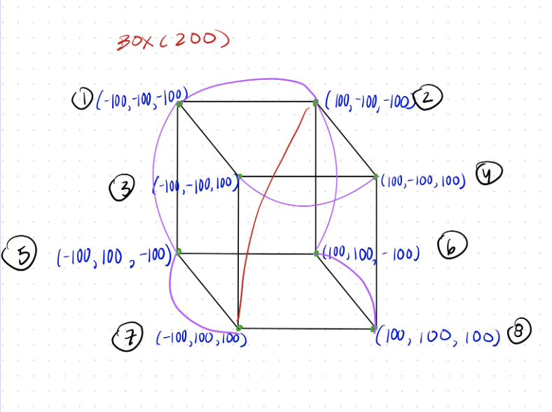
Below is another sketch I had originally of the idea of having a cubic space. I was brain storming how to interpret which points would go from which node to the other. Clearly, this first idea is still a bit chaotic seen from the messiness of the sketch.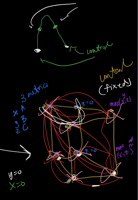
Here is my beginning sketch in Processing. It illustrates the idea I had in my above 2 handwritten sketches. As you can see, the curves intersect each other greatly making the results uninterpretable. This will lead me to another idea.
Here is my second draft in processing. I have colored the curves by age of the pitcher. I have also decided to do 5 cubes instead of 1 to clear up the crowding issues. This already looks better than previous sketches, but my final version creates continuous cubes running through all 5 cubes. It looks similar to this sketch, but with the curves going through all 5 cubes rather than starting and stopping in a singular cube.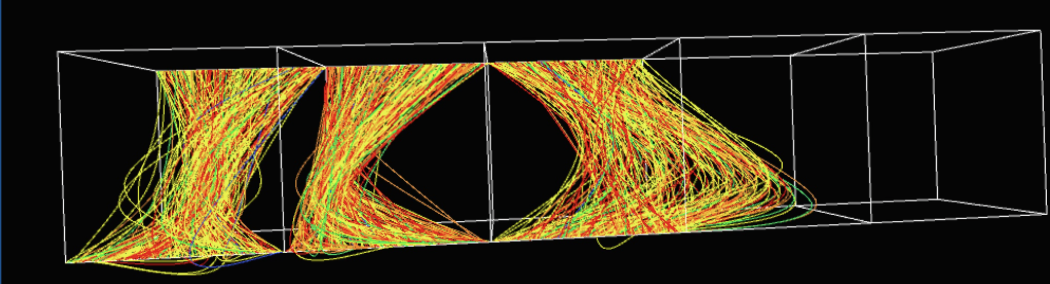
Process
Below is the process I followed in order to create my final 3D visualization:
- I began by importing the .csv data file into the processing environment.
- Then, I set up the PeasyCam assuring a minimum and maximum distance so that the user can easily access the visualization within the 3D axes. I also imported Gui into my Processing environment. I will be using this further on to create controls for the user.
- I created a function that determines the color of a curve based on the age of a player. I grouped pitcher's age into 6 categories with each category having a range of 5 years.
- I created the cubes and labeled the x, y, and z axes for each of the 5 cubes.
- Cube #1: (x, y, z) = (Innings Pitched, Year, Winning %)
- Cube #2: (x, y, z) = (Best, Worst, Winning %)
- Cube #3: (x, y, z) = (WLST, LSV, Winning %)
- Cube #4: (x, y, z) = (Team Win-Loss %, Quality Start %, Winning %)
- Cube #5: (x, y, z) = (Short Days Rest, Long Days Rest, Winning %)
- I created the curves for each observation. The curves start at the leftmost cube and end at the rightmost cube. Their x, y, and z points are influenced by the x/y/z axes named above for each cube. I used the "curveVertex()" function in Processing to make the curves.
- I added user interaction to the visualization. The commands were all made with GUI and are below:
- DIRECT - plots points on the correspond x/y/z axes showing their respective direct relationships
- This will remove the curves from the graph
- LABELS - removes the labels on the axes
- CUBES - removes the cubes
- AGE_19_24 - removes points with 19≤age≤24 years old
- AGE_25_29 - removes points with 25≤age≤29 years old
- AGE_30_34 - removes points with 30≤age≤34 years old
- AGE_35_39 - removes points with 35≤age≤39 years old
- AGE_40_44 - removes points with 40≤age≤44 years old
- AGE_45_49 - removes points with 45≤age≤49 years old (I color coded each button matching to the color of the curve for that age group.)
- ROTATE_CAM - rotates the camera view along the x-axis
- INITIAL - positions the camera at the initial point of view
- DIRECT - plots points on the correspond x/y/z axes showing their respective direct relationships
- I finalized my visualization by adding aeshetic finishes such as making the text more clear on the screen, and changing the stroke size of the curves.
Final result
Below are some screenshots of the final visualization.
The first image shows the default view once you run the Processing code. The curves clearly change in each cube. Thus, each metric varies per observation. This overall, shows a different affect on the winning percentage of the pitchers.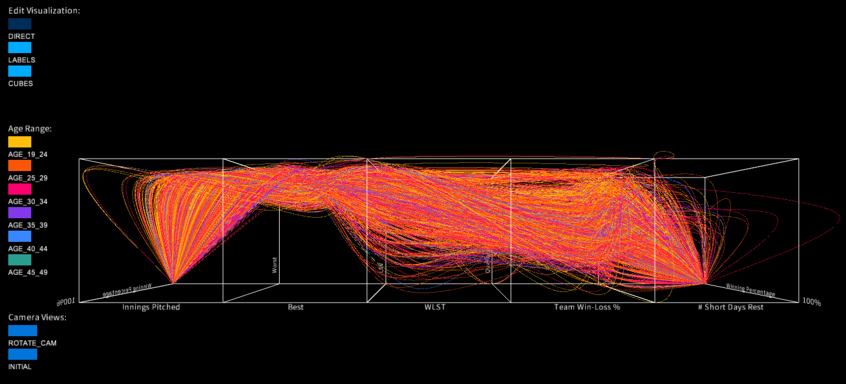
Now, this image shows the visualization once the "DIRECT" button is toggled. This screenshot produces interesting results because there are trends seen in the data in the 2nd and 4th cubes. In other words, the data points don't remain constain. The 2nd and 4th cubes contain the metrics for which the most important variables are for predicting winning percentage. I found these metrics while building and computing machine learning models using the same data set. It is interesting that a 3D visual environment can display similar results as a Boosted Tree Machine Learning Model with significantly less computation time!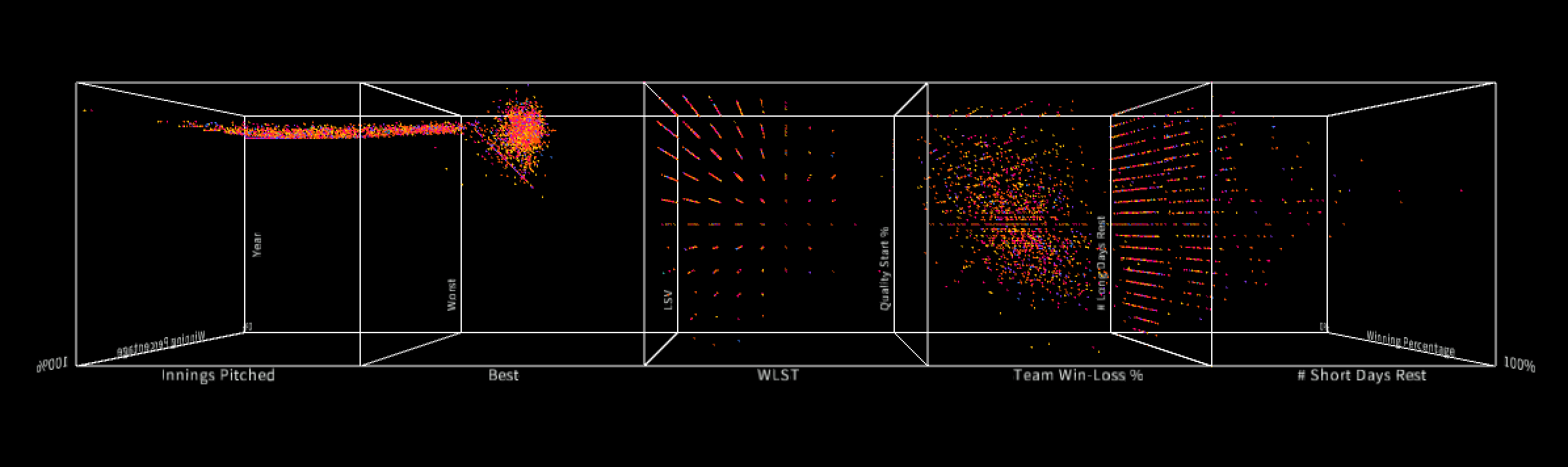
Now, here is a screenshot of the visualization but from a different camera angle. You can see here that the winning percentage in this data set mostly ranges from 0 to 60%, but there are few observations with a winning percentage of 100%. These are the rightmost curves.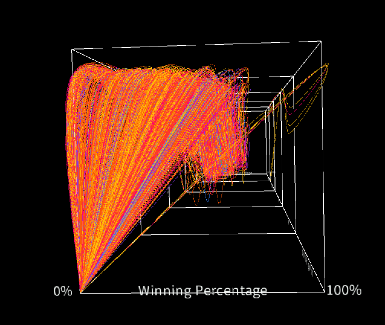
In conlusion, I am proud of my final results from this project. The data set presented difficulties with its denseness and multitude of variables. I was able to take this complicated data set and present it a 3D environment, showing the relationships between the winning percentage and other statistics of pitchers in the MLB. Furthermore, this project helped me improve my Processing coding skills. It showed me the possibilites of data visualization, and how my abstract sketches can turn into useful visualizations.
Code