Azure Video Indexer Insights From CBL-VR's Research, a 3D Graph
MAT 259, 2023
Arnav Kumar
Concept
The focus of this analysis is on the exploration of future possible pathways of data analysis for researching CBL-VR’s historical video archive, as well as incoming videos from current research. CBL-VR is a VR education project taking place under UCSB’s Gevirtz Graduate School of Education, and the videos themselves consist of research participants, who are mainly elementary school children, as well as CBL-VR researchers. The videos and their structure are extremely ad-hoc, with the purpose being to study participants and how they interact within a 3D, virtual reality space. The analysis would provide a small part of the research foundation supporting the ongoing development of a VR game under the same project, which is being designed to assist native and non-native English speakers to learn English.
Preliminary sketches
To begin, a simple design was the main goal so that the visualization may be used by academic coders within the project to assist to some extent with their coding efforts. A preliminary sketch is shown below.
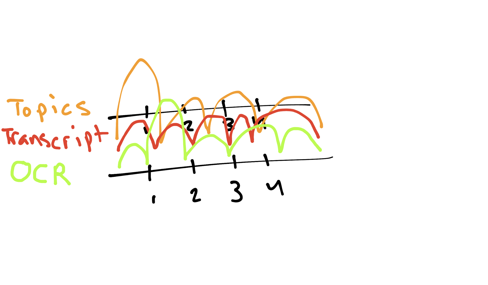
Figure 1: A sketch of the different Azure Video Indexer insights plotted as curves on a 3D timeline.
Figure 1: A sketch of the different Azure Video Indexer insights plotted as curves on a 3D timeline.
Process
The video had already been heavily condensed by Azure’s Video Indexer platform, which applies multiple machine-learning models to videos to provide robust insights. The first challenge was transforming the JSON output of the model into a single data table, and the JSON itself is moderately complex, having multiple nested hierarchies for different types of insights. Thus, it took significant development effort simply to transform the data into the desired form. The initial process involved Python, pandas, and native Python packages to transform the JSON into a singular data table with correctly formatted columns. It also involved redacting the names of researchers and participants involved in the video due to data privacy regulations and considerations. The final table came out to 1739 rows, with columns for the type of insight, the insight itself, the confidence level, and the start and end times for where the insight was observed.
Since curves were the original design pillar for the visualization, an appropriate visualization implementing similar designs would need to be selected. Such a visualization was found in Jared Brooks’s “High School English Class Books” visualization project. However, after some time trying to modify the code to fit the data, it was clear that this route would present a complex code architecture challenge.
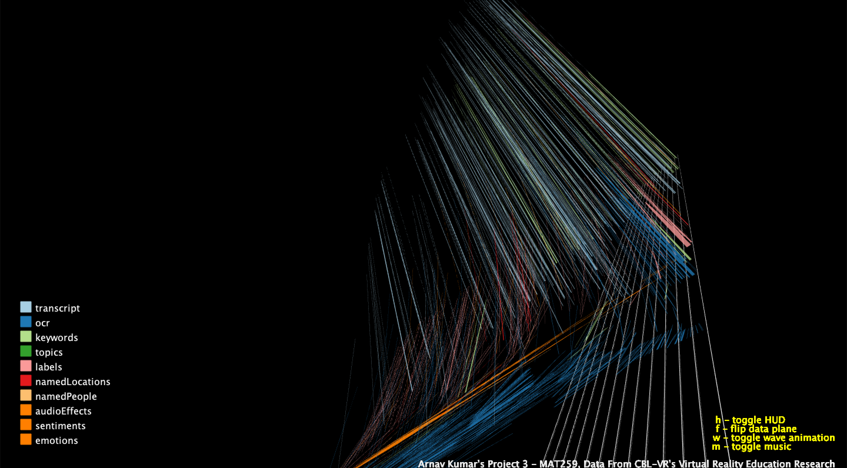
Figure 2: An unfruitful attempt at plotting 3D bezier curves on a 2D timeline.
This was the point where the decision was made to move on to a completely different design that would not be as difficult to implement. The goals of practicality for the visual would remain the same. This time, Russell Liu’s “Tesla Stock Checkouts” was the base template for the design, which would retain a linear timeline design while traditionally plotting the data as points. The data table would be transformed accordingly to include the actual insights as well, which this template was able to accommodate. This would also be the point where redaction procedures would be necessary since the names were included in the insights section of the data.
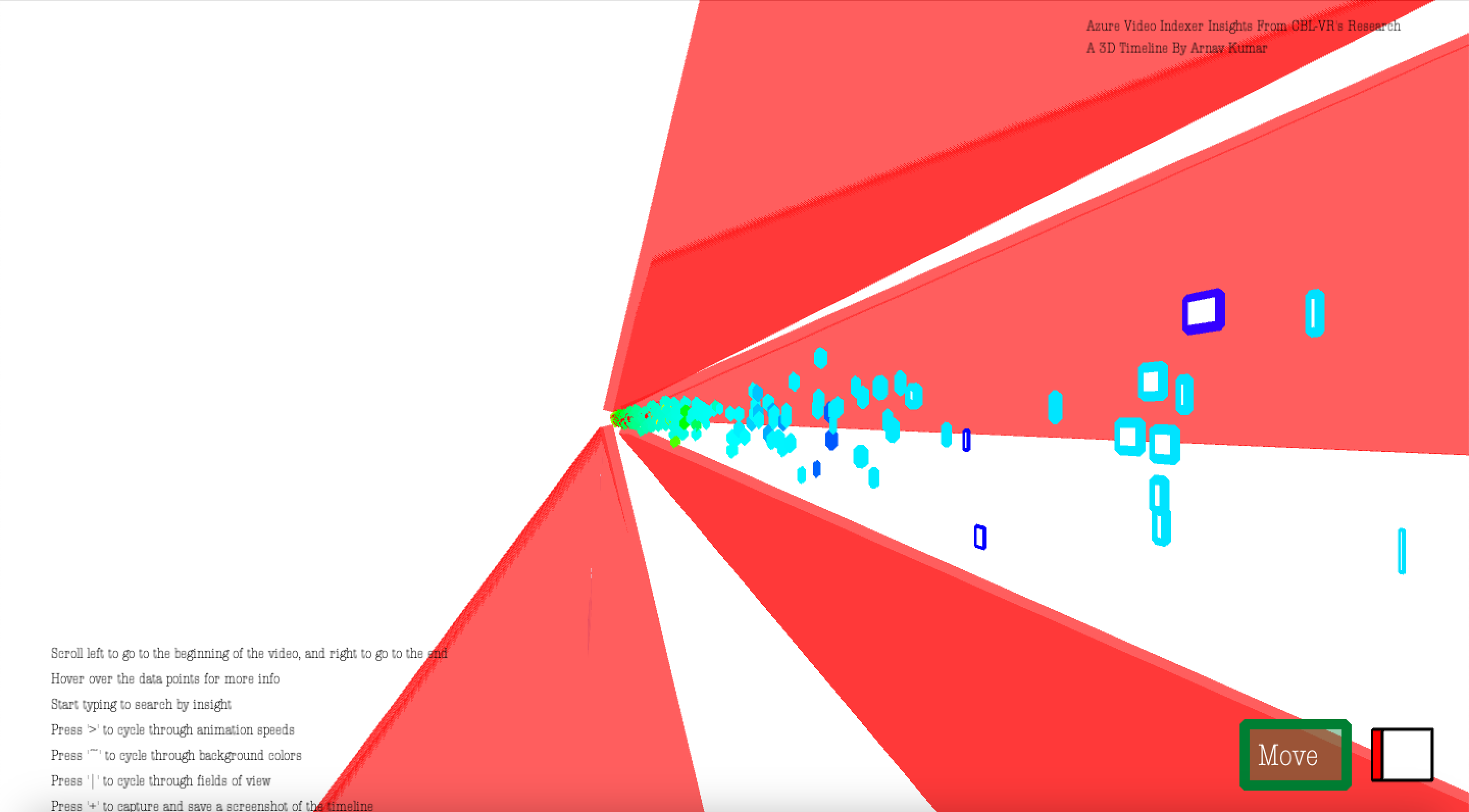
Figure 3: A view of the second iteration of the timeline visualization project from an angle.
However, this visualization did not fully take advantage of the 3D space due to the two dimensional nature of the data, and there seemed to be an important perspective that was missing from it. Another transformation was required, and this would be achieved by the sentence-to-vector functionality achieved by Google’s Universal Sentence Encoder. The encoder itself gives a 512-sized vector embedding to any string, whether it contains a single word or paragraphs. To obtain 3D coordinates for each insight, which were the strings of focus for the encoder, vectors were generated for each insight and subsequently analyzed by scikit-learn’s PCA to reduce the vector size from 512 to 3. These coordinates were then concatenated to the original data table for delivery into Processing, and further changes to the data necessary to accommodate the visualization would also be later added. Multiple new packages, such as numpy and TensorFlow, would also be added to accommodate the new direction of the data. Jiaxin Wu’s “MoMA Visualization” would be used as the base template for the final visualization due to similar data design choices.
Since curves were the original design pillar for the visualization, an appropriate visualization implementing similar designs would need to be selected. Such a visualization was found in Jared Brooks’s “High School English Class Books” visualization project. However, after some time trying to modify the code to fit the data, it was clear that this route would present a complex code architecture challenge.
Figure 2: An unfruitful attempt at plotting 3D bezier curves on a 2D timeline.
This was the point where the decision was made to move on to a completely different design that would not be as difficult to implement. The goals of practicality for the visual would remain the same. This time, Russell Liu’s “Tesla Stock Checkouts” was the base template for the design, which would retain a linear timeline design while traditionally plotting the data as points. The data table would be transformed accordingly to include the actual insights as well, which this template was able to accommodate. This would also be the point where redaction procedures would be necessary since the names were included in the insights section of the data.
Figure 3: A view of the second iteration of the timeline visualization project from an angle.
However, this visualization did not fully take advantage of the 3D space due to the two dimensional nature of the data, and there seemed to be an important perspective that was missing from it. Another transformation was required, and this would be achieved by the sentence-to-vector functionality achieved by Google’s Universal Sentence Encoder. The encoder itself gives a 512-sized vector embedding to any string, whether it contains a single word or paragraphs. To obtain 3D coordinates for each insight, which were the strings of focus for the encoder, vectors were generated for each insight and subsequently analyzed by scikit-learn’s PCA to reduce the vector size from 512 to 3. These coordinates were then concatenated to the original data table for delivery into Processing, and further changes to the data necessary to accommodate the visualization would also be later added. Multiple new packages, such as numpy and TensorFlow, would also be added to accommodate the new direction of the data. Jiaxin Wu’s “MoMA Visualization” would be used as the base template for the final visualization due to similar data design choices.
Final result
The final visualization is presented as a 3D graph, with nodes, or insights, connected to other insights by edges based on a simple algorithm that determines where the insight overlaps with other insights in the video. Implementing this graph of co-occurrence would also present many small challenges, which, when eventually solved, would produce an exceptional and relatively performant visualization fit for exploratory data analysis with a nuanced perspective on the data.
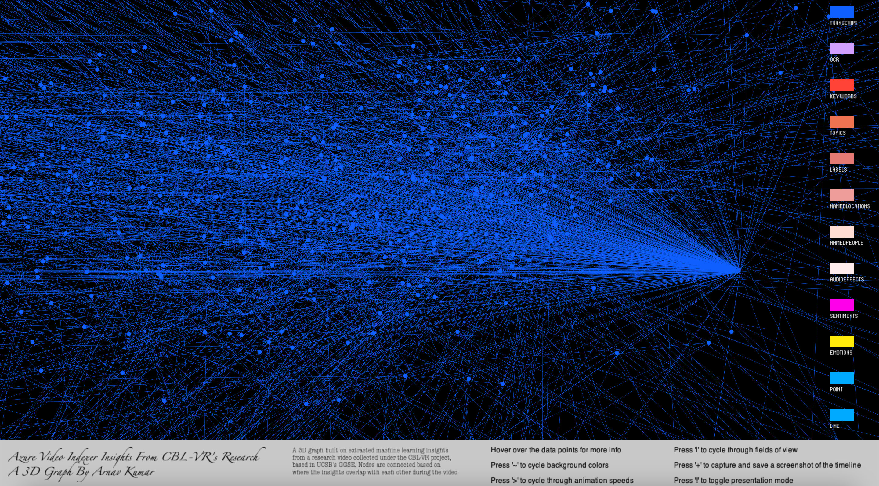
Figure 4: A view of the final iteration of the timeline visualization project, with only the transcript insight nodes and edges being displayed.
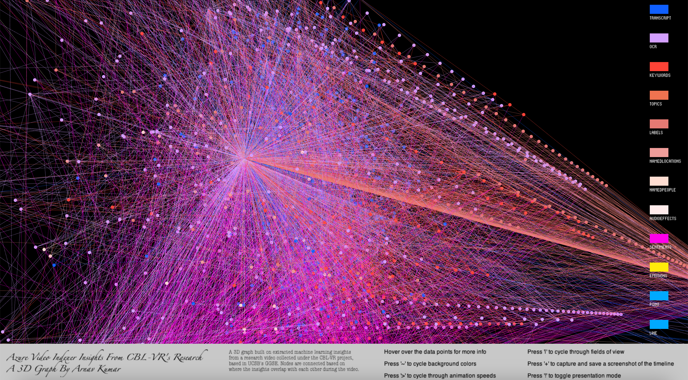
Figure 5: A view of the final iteration of the timeline visualization project, with all insight nodes and edges being displayed.
The final visualization features an animated view that randomly selects insight nodes and edges to be displayed, as well as a robust menu to toggle features like animation speeds, background colors, and which insights are displayed. All design operators are implemented to be as performant as possible due to the computationally intensive nature of the visualization graphics. An example is when the user enters the visualization, where no nodes or edges are displayed until the user selects presentation mode for random animations, or until they manually select insights to be displayed. Hovering over nodes also provides the information necessary to properly understand and traverse the graph’s data foundations.
For the CBL-VR project, this visualization serves as a proof of concept for the vast range of possibilities for future paths of exploration with the insights produced by Azure’s Video Indexer. It may also allow current work in the project to be completed more efficiently by providing high-level overviews of where to focus exploration efforts for the data insights in each video. The number of co-occurrences alone is far too much for a human coder to determine in a reasonable amount of time, and the visualization and its underlying algorithms are able to do that programmatically, thus allowing the coder to spend less time on manually finding potential avenues of exploration and more time on producing strong analyses and conclusions for their research questions.
Future work and research may involve building upon the existing program algorithms and scripts to produce a fully featured data pipeline for more advanced data analysis, while also separately building upon the visualization itself to further assist academic coders with their analyses of existing and future CBL-VR research videos.
Figure 4: A view of the final iteration of the timeline visualization project, with only the transcript insight nodes and edges being displayed.
Figure 5: A view of the final iteration of the timeline visualization project, with all insight nodes and edges being displayed.
The final visualization features an animated view that randomly selects insight nodes and edges to be displayed, as well as a robust menu to toggle features like animation speeds, background colors, and which insights are displayed. All design operators are implemented to be as performant as possible due to the computationally intensive nature of the visualization graphics. An example is when the user enters the visualization, where no nodes or edges are displayed until the user selects presentation mode for random animations, or until they manually select insights to be displayed. Hovering over nodes also provides the information necessary to properly understand and traverse the graph’s data foundations.
For the CBL-VR project, this visualization serves as a proof of concept for the vast range of possibilities for future paths of exploration with the insights produced by Azure’s Video Indexer. It may also allow current work in the project to be completed more efficiently by providing high-level overviews of where to focus exploration efforts for the data insights in each video. The number of co-occurrences alone is far too much for a human coder to determine in a reasonable amount of time, and the visualization and its underlying algorithms are able to do that programmatically, thus allowing the coder to spend less time on manually finding potential avenues of exploration and more time on producing strong analyses and conclusions for their research questions.
Future work and research may involve building upon the existing program algorithms and scripts to produce a fully featured data pipeline for more advanced data analysis, while also separately building upon the visualization itself to further assist academic coders with their analyses of existing and future CBL-VR research videos.
Code