Happiness Maps
MAT 259, 2023
Jenni Hutson
Concept
For my second project, I wanted to continue with my question from
project 1 of if overall happiness trends could be determined from
the titles checked out each day, but over a longer span of time (2006-2022).
My analysis was inspired by the Hedonometer project
from the Computational Story Lab at the University of Vermont.
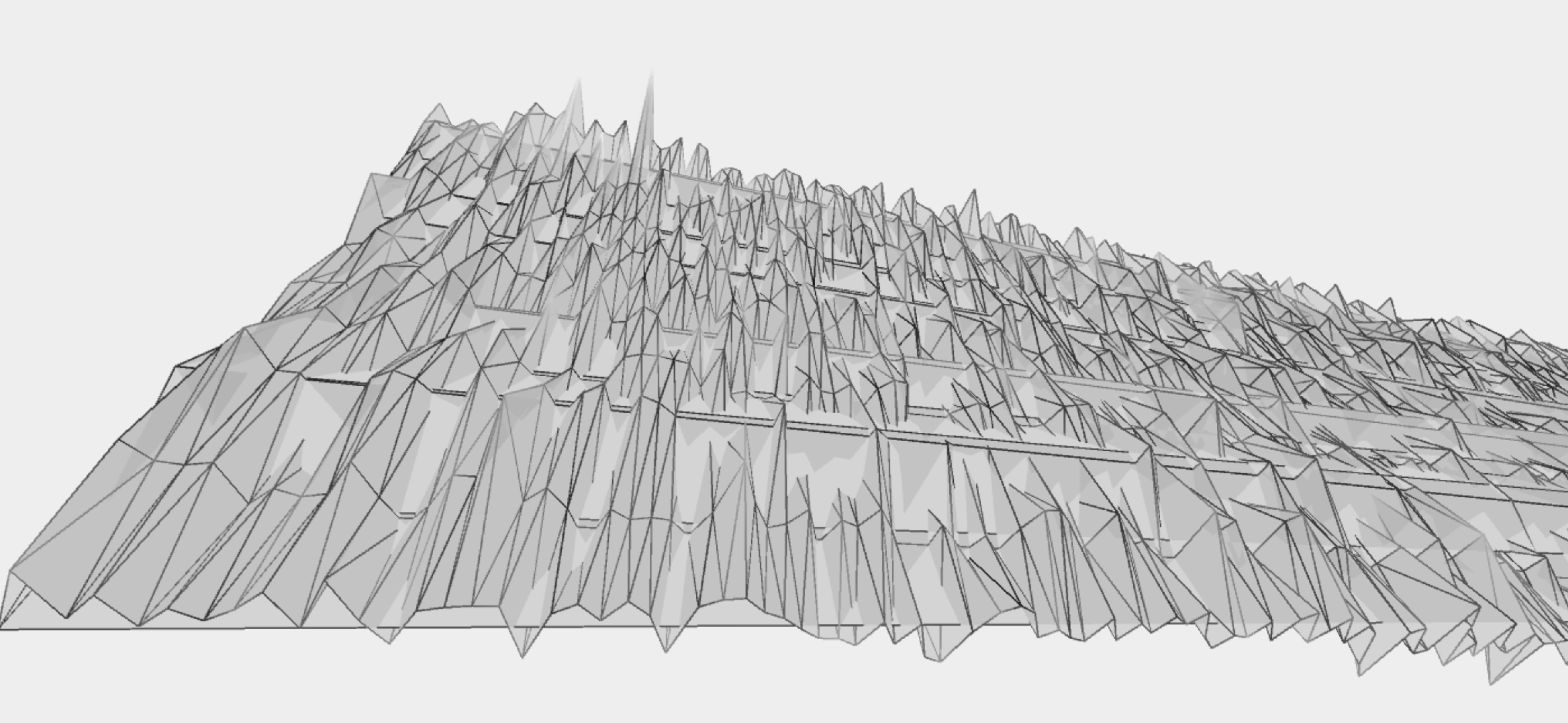
The initial results for a single year produced a line graph; I wanted to turn this into a 3D terrain.
The initial results for a single year produced a line graph; I wanted to turn this into a 3D terrain.
Query
SELECT cout, title, itemtype
FROM ‘spl_2016‘.‘outraw‘
WHERE cout LIKE ’20%’ AND itemType LIKE ’%bk’;
FROM ‘spl_2016‘.‘outraw‘
WHERE cout LIKE ’20%’ AND itemType LIKE ’%bk’;
Preliminary sketches
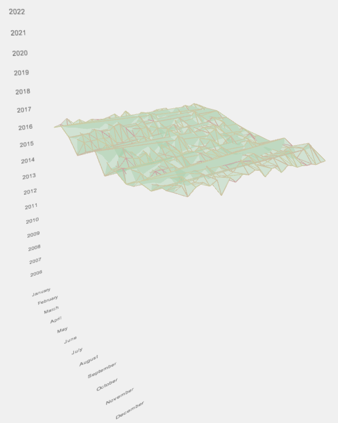
My first sketch had a timeline for each year going across the width
of the screen, with each point representing 1 day. X-values were
deteremined by date, Y-values were determined by happiness level.
Z-values were incremented for each year. I then connected all
the points with a triangle mesh to create a changing plane.
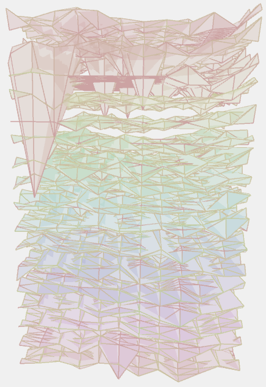
This sketch made it difficult to take in all of the information since it couldn't comfortably fit on the screen, so I switched to stacking the years along the y-axis, and arranging each year in a rectangular grid by month and day. I initially did this with a smaller subset of years.
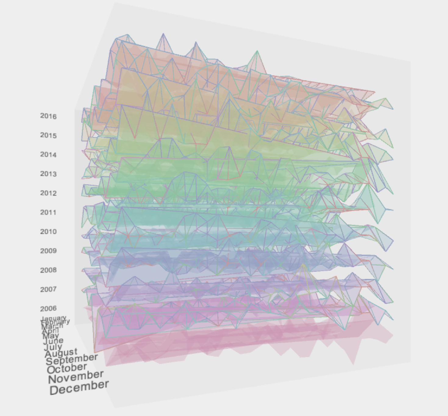
This sketch made it difficult to take in all of the information since it couldn't comfortably fit on the screen, so I switched to stacking the years along the y-axis, and arranging each year in a rectangular grid by month and day. I initially did this with a smaller subset of years.
Process
Initally, a lot of effort went into cleaning the data for the visualizations.
I wanted my code to be able to work for an abitrary dataset of datas
and happiness levels, so this was done in the Processing code itself.
Often, months would be missing days of data, so the program had to be able
to fill in this data so that the terrain would generate correctly in the
grid format I had created.
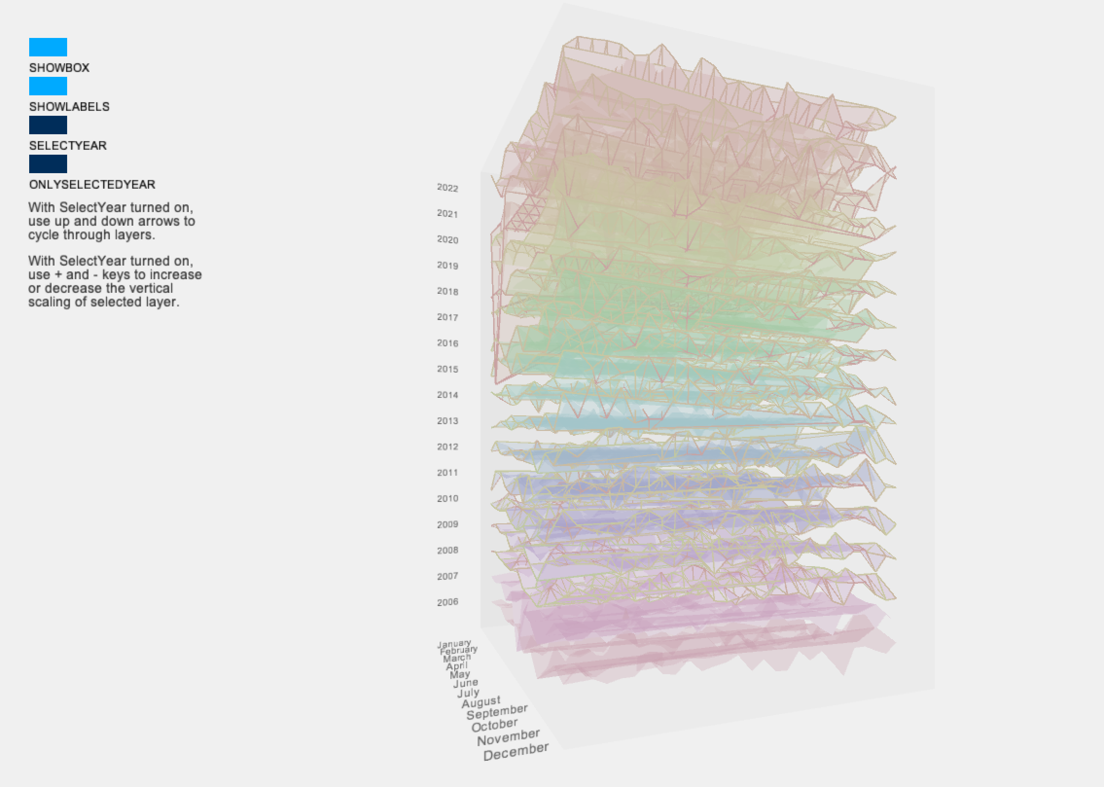
With the years stacked, I added color to help distinguish between the layers. Stroke color indicates volume of books checkout in a given day.
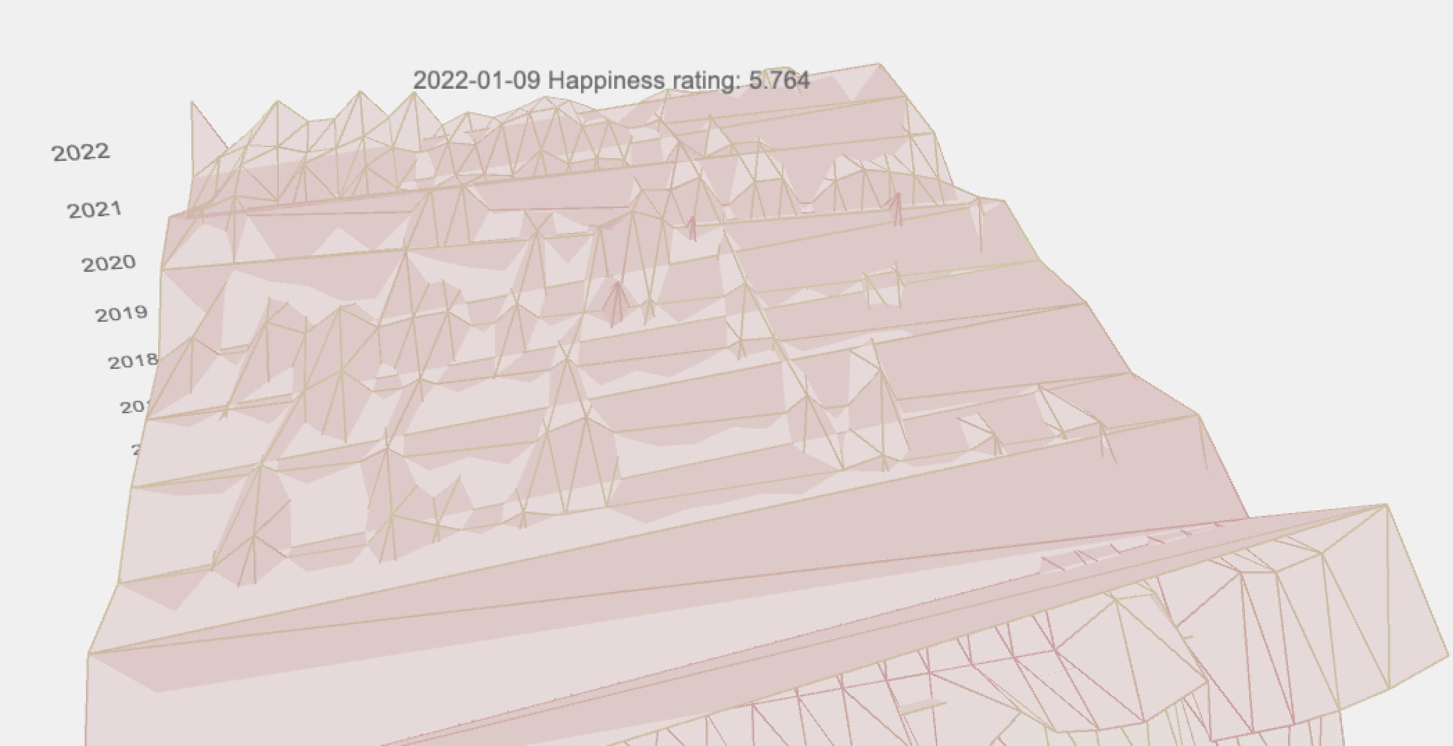
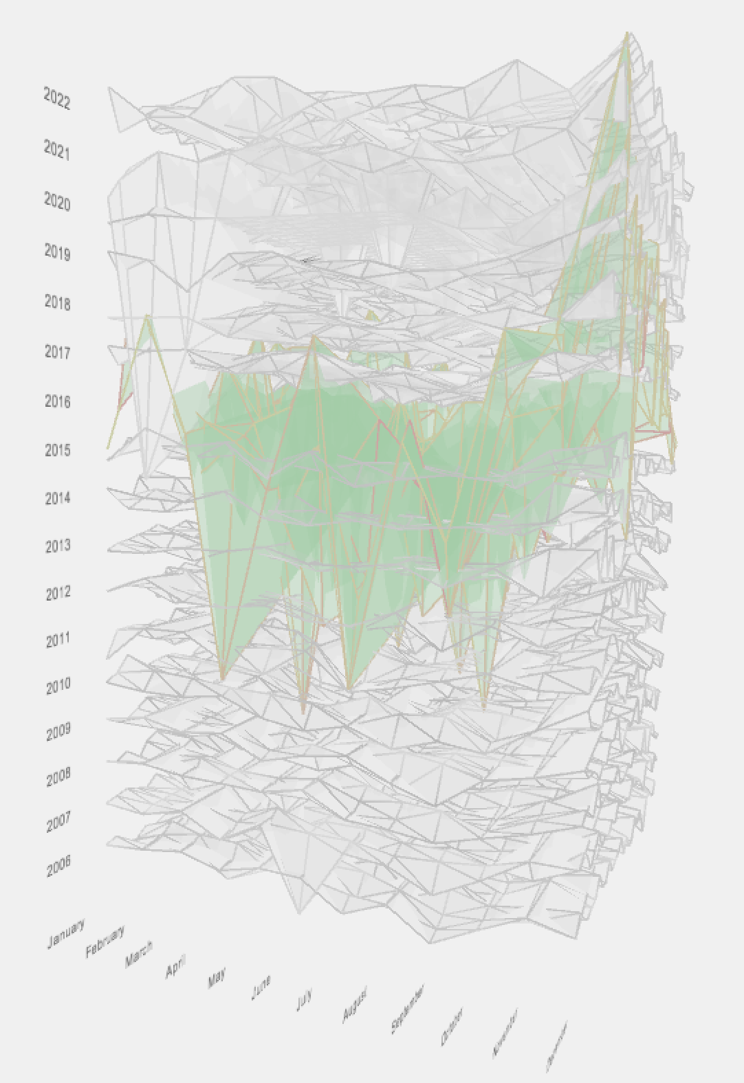
Although I like the visuals provided by the sketch, it was still difficult to analyze the data, especially for internal layers. I first added the ability to hover on a data point to see the date and happiness level. I also added the ability to turn on and off the transparent box which surrounded the data as well as the year and month labels.
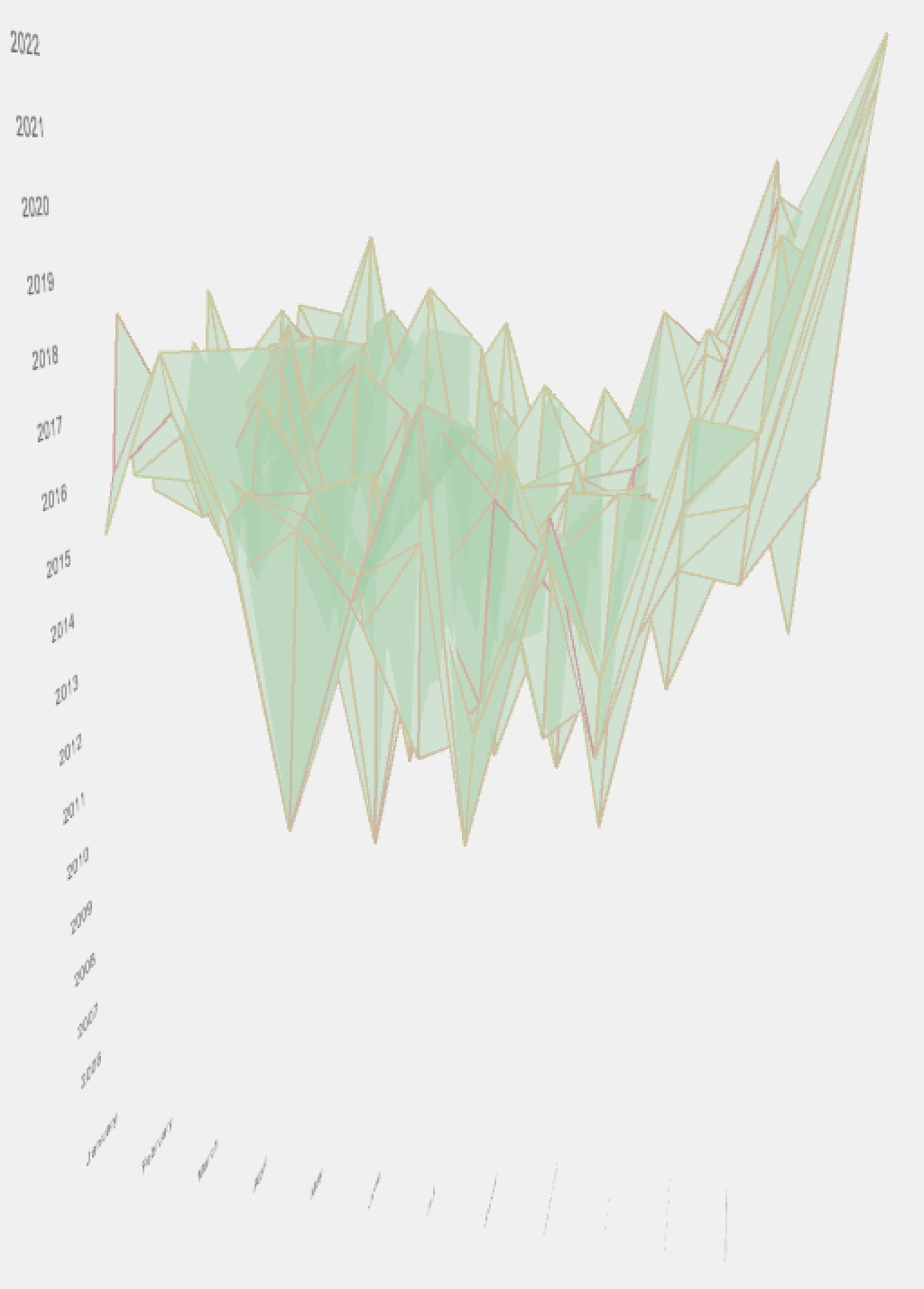
I still thought it was difficult to distinguish interyear trends. I added 2 modes to view a single year: one where all other years besides the selected were grayed out, and another where only the selected year was visible.
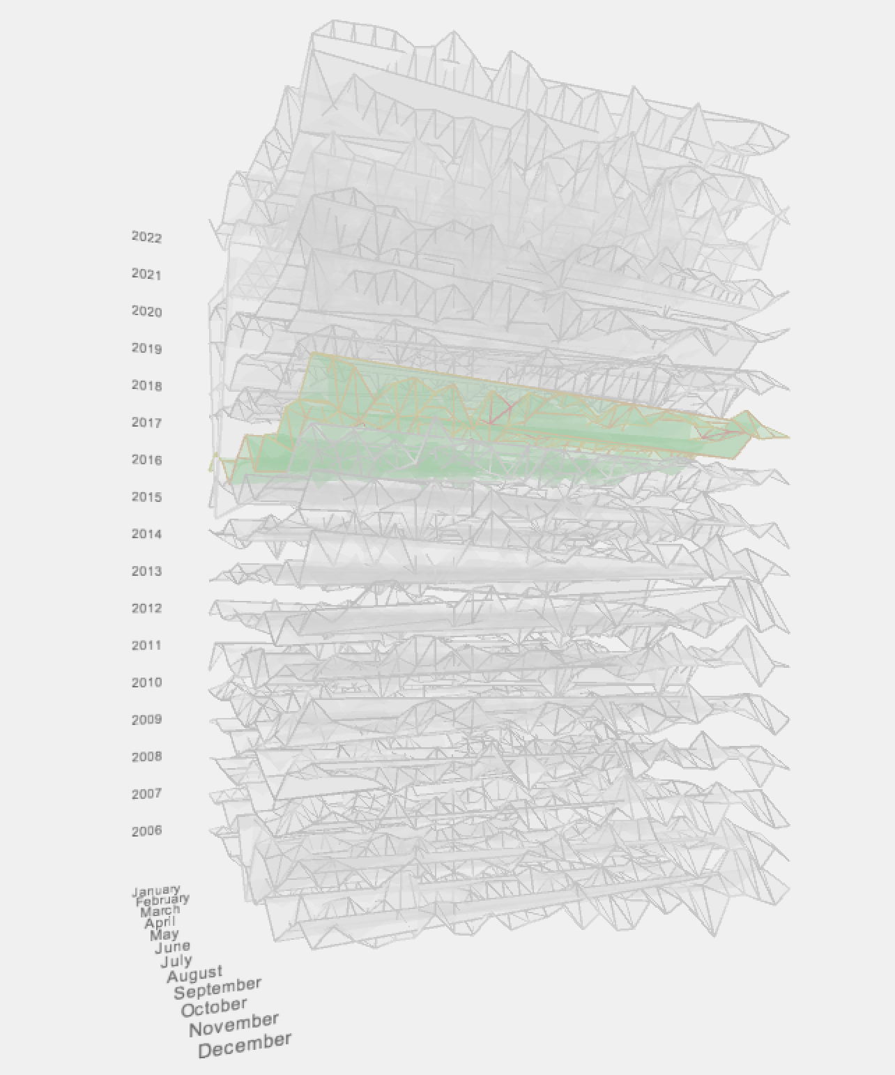
In either mode, I added the ability to change the scale of the selected year for easier visibility of trends.
With the years stacked, I added color to help distinguish between the layers. Stroke color indicates volume of books checkout in a given day.
Although I like the visuals provided by the sketch, it was still difficult to analyze the data, especially for internal layers. I first added the ability to hover on a data point to see the date and happiness level. I also added the ability to turn on and off the transparent box which surrounded the data as well as the year and month labels.
I still thought it was difficult to distinguish interyear trends. I added 2 modes to view a single year: one where all other years besides the selected were grayed out, and another where only the selected year was visible.
In either mode, I added the ability to change the scale of the selected year for easier visibility of trends.
Final result
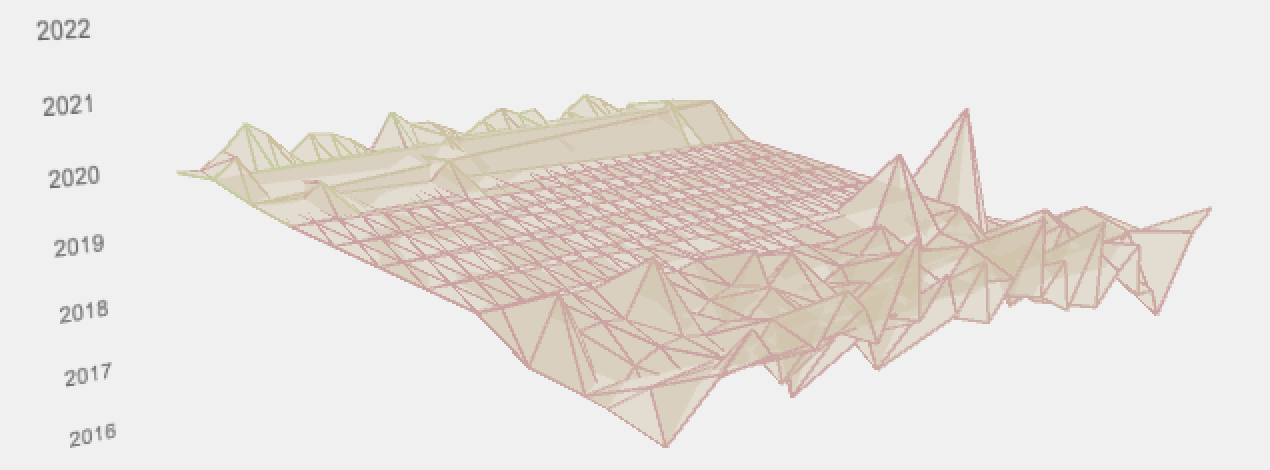
In the final iteration, we can see some inter and intra-year trends.
We can see that happiness increases at the end of every year, and
is gernally lower in the middle of the year. This matches the trends
viewed in project 1 for just one year.
We can also see the loss of information in 2020 as a result of the Covid-19 pandemic, which results in a flat plane for much of the year.
By far the saddest day shown is Feb. 2, 2021. Although this day reached the threshold needed for books checked out in order to be analyzed, this seems to be an outlier.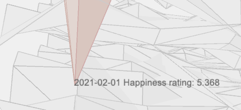
Code