Lifespan of Books at the Seattle Public Library
MAT 259, 2023
Brianna Griffin
Concept
I would like to show the relationships between the first checkout
date and the last checkin date at the Seattle Public Library.
Overall, this will show the "lifespan" of books at the SPL.
By connecting their first checkout date to the last checkin date,
the resulting vectors tells how long the book was in use by readers
in Seattle. A long line means the book was used for a long period
of time, while a short line means it was used for a short period
of time. I am also considering popularity of the books as a key
variable in my visualization by dividing the data into categories
based on their number of checkouts over time and coloring them
based on it.
Query
Below is the MySQL code I used to query for the data used in my 3D visualization.
SELECT DISTINCT
    B.title,
    MONTH(A.first_cout) AS x_0,
    DAY(A.first_cout) AS y_0,
    RIGHT(YEAR(A.first_cout),2) AS z_0,
    MONTH(A.last_cin) AS x_1,
  DAY(A.last_cin) AS y_1,
    RIGHT(YEAR(A.last_cin),2) AS z_1,
    B.item_cat,
    A.number_checkouts
FROM
    (SELECT DISTINCT
        (bibNumber), MIN(cout) AS first_cout, MAX(cin) AS last_cin, COUNT(cout) as number_checkouts
    FROM
        spl_2016.inraw
    GROUP BY 1
    LIMIT 10000) A
        INNER JOIN
    (SELECT
        bibNumber,
            title,
            CASE
                WHEN itemtype LIKE '%bk' THEN 'book'
                WHEN itemtype LIKE '%cd' THEN 'cd'
                WHEN itemtype LIKE '%per' THEN 'magazine'
                WHEN itemtype LIKE '%dvd' THEN 'dvd'
                WHEN itemtype LIKE '%vhs' THEN 'video (vhs)'
                ELSE 'other'
            END item_cat
    FROM
        spl_2016.inraw) B ON A.bibNumber = B.bibNumber

WHERE
    YEAR(A.first_cout) > 2005
The restulting data set has 5,589 rows and 9 columns.
Preliminary sketches
Here are some initial sketches that I had.
The first sketch illustrates how I wanted to connect the two points together by lines. Each line has a corresponding end and beggining point which correlates to the checkout and checkin date of the book. This will correlate to the x,y, and z axis in the 3D environment in processing.
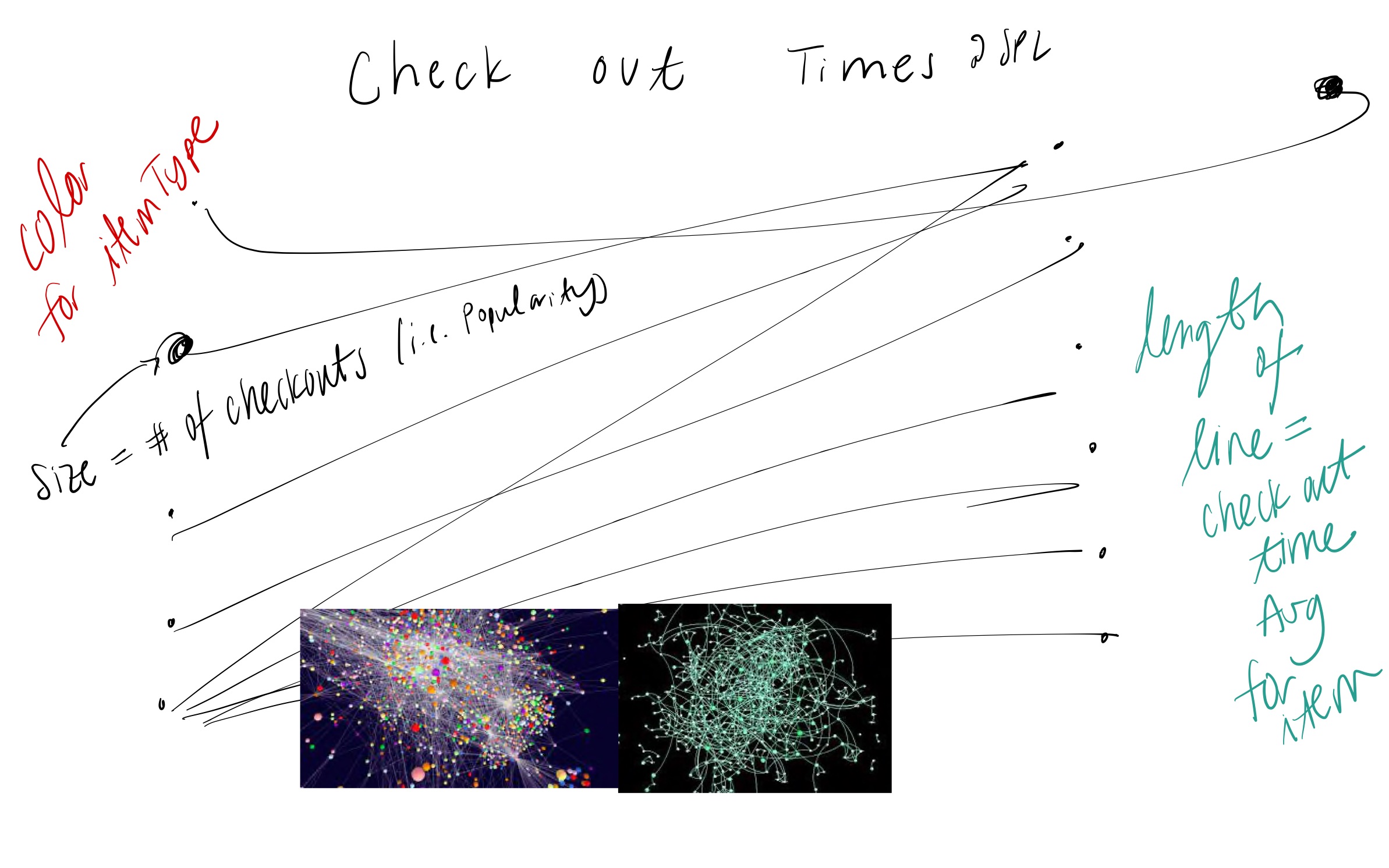
The next sketch is very similar to my idea from the first one. It looks the most similar to the final product. Bringing in images from the internet, I was interested in how these lines and points would look with a lot of them together in one area, densely packed together.

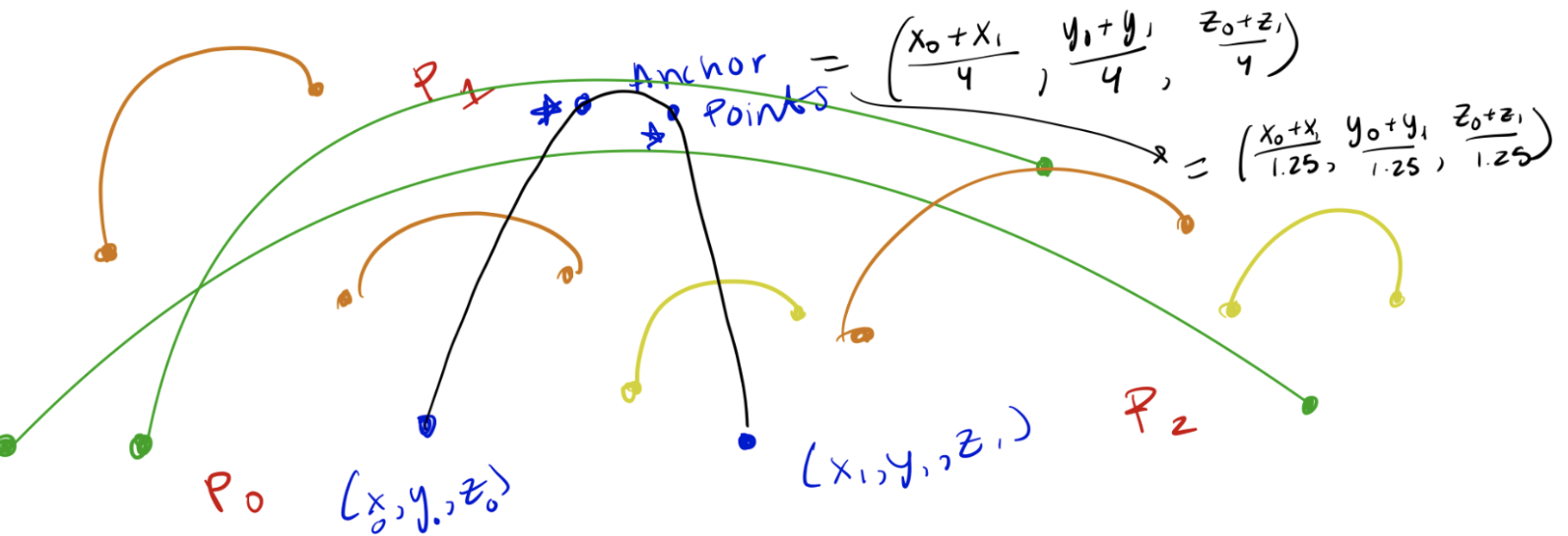
Finally, this was my first sketch using Processing as a technology. I used bezier curvers to connect the first checkout and last checkin dates for each book. All of the curves ended up clumping together into a larger tear drop shaped figure. Thus, I opted to using vectors in my final product.
The first sketch illustrates how I wanted to connect the two points together by lines. Each line has a corresponding end and beggining point which correlates to the checkout and checkin date of the book. This will correlate to the x,y, and z axis in the 3D environment in processing.
The next sketch is very similar to my idea from the first one. It looks the most similar to the final product. Bringing in images from the internet, I was interested in how these lines and points would look with a lot of them together in one area, densely packed together.
Finally, this was my first sketch using Processing as a technology. I used bezier curvers to connect the first checkout and last checkin dates for each book. All of the curves ended up clumping together into a larger tear drop shaped figure. Thus, I opted to using vectors in my final product.
Process
In order to create my final 3D visualization, I followed the following
steps:
- I began by importing the .csv data file into the processing environment.
- Then, I set up the PeasyCam assuring a minimum and maximum distance so that the user can easily access the visualization within the 3D axes.
- I created a function that determines the color of a vector based on the popularity of the book. The books are grouped into 5 categories based on popularity. Furthermore, I chose 5 different colors for each category.
- I created a linear gradient coloring from min(checkout) to max(checkout) that will determine the coloring along the vectors. Hence, each line begins at a light color and ends at a dark color. This is how one can determine the start of the line from the end of the line.
- Then, I wrote a function that will draw the vectors and points for each data point. Each point represents a checkin and checkout date, while the line represents how long the book was checked out for.
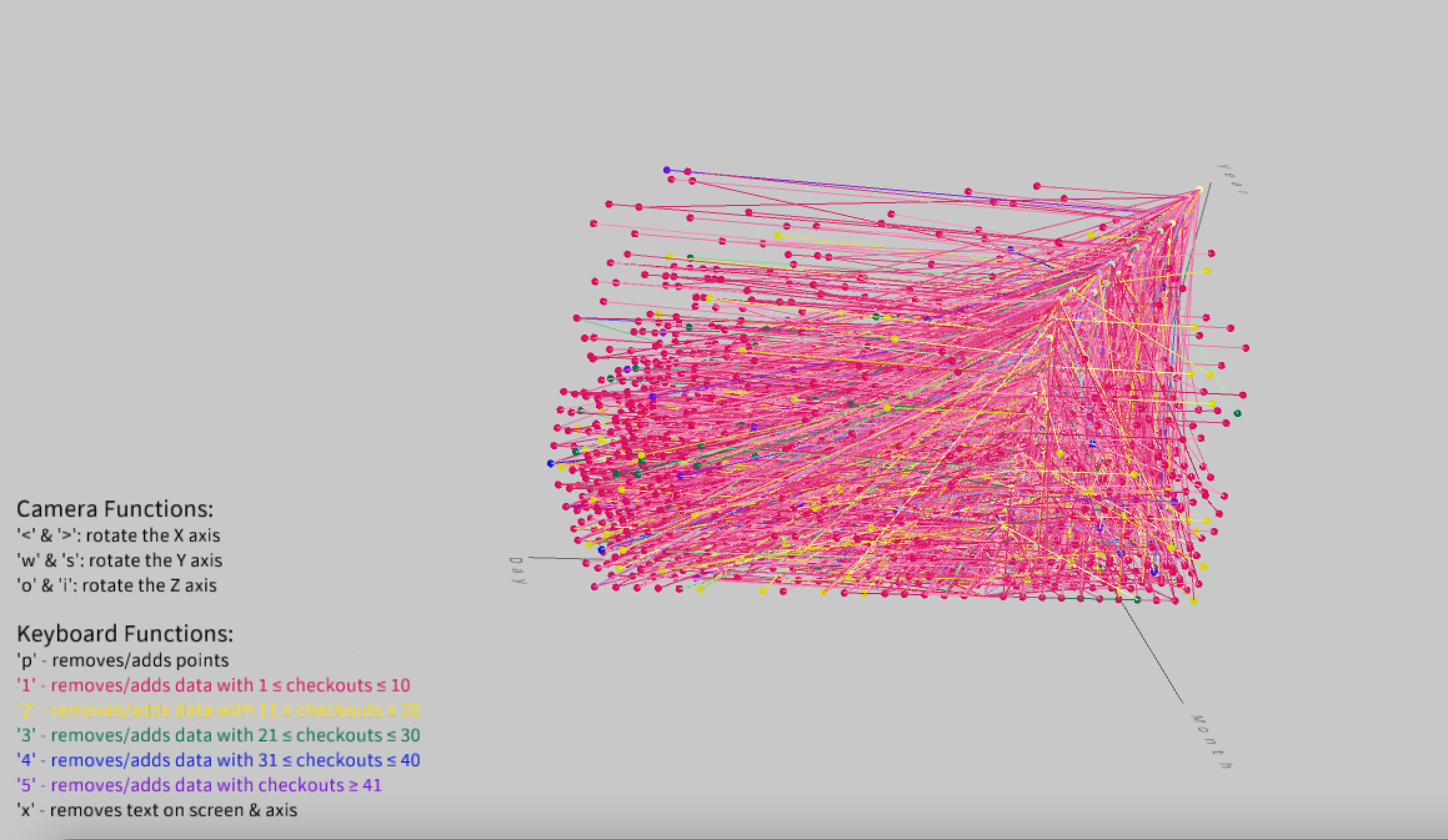
- Following, I imputed an x, y, and z axis onto the graph, labelling them accordingly. The x-axis represents the month of the checkout/checkin. The y-axis represents the day of checkin/checkout. The z-axis represents the year of the checkin/checkout.
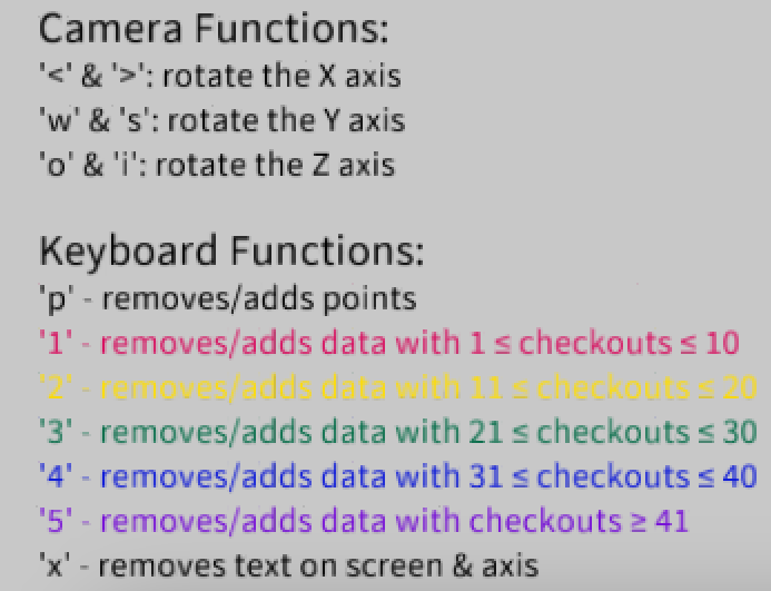
- I added user interaction to the visualization. The commands are below:
(Note that each command requires the user to press the corresponding number of letter on their keyboard.)
- 'p' - removes/adds the points the end points of the vectors
- '1' - removes/adds data with 1 ≤ checkouts ≤ 10
- '2' - removes/adds data with 11 ≤ checkouts ≤ 20
- '3' - removes/adds data with 21 ≤ checkouts ≤ 30
- '4' - removes/adds data with 31 ≤ checkouts ≤ 40
- '5' - removes/adds data with checkouts ≥ 41
- 'x' - removes text on screen
- '<' & '>': rotates the X axis
- 'w' & 's': rotates the Y axis
- 'o' & 'i': rotates the Z axis
Once I inputted all of these commands, I created a menu on the
processing screen so that the user can easily see their options for
interaction. It is located in the bottom left of the Processing window. - Finally, I added the finishing the finishing touches to the 3D visualization. This included coloring the axes so that they were not too bold, reformatting the interaction menu, and re-centering the PeasyCam.
Final result
Here are some screenshots of the final result:
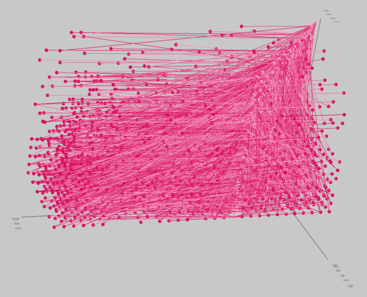
This is what the visualization looks like when you first run the processing code.
Let's take a look at the graph with just the group of books with just the least amount of checkouts. These are the least popular books and also the biggest population within our random sampling of data.
Now, let's look at the group of book's that are the most popular at the SPL within our sample. Do the lines change in size for this population?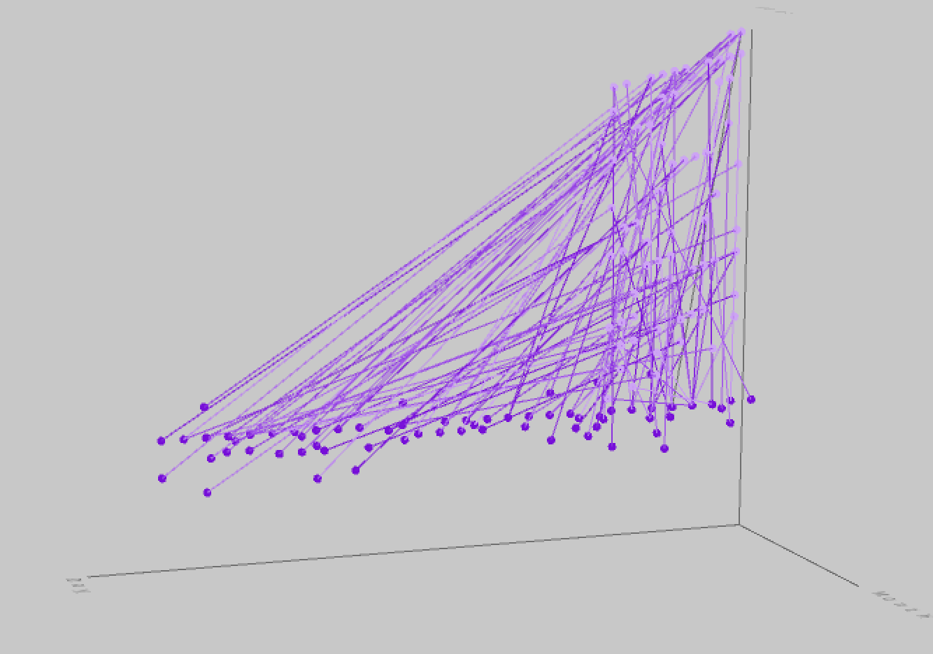
Although it may be hard to interpet with static images, the lines are longer with the more popular books. This means that they have had a longer "shelf life" at the SPL. In other words, they were used for a longer time due to their popularity, which makes sense logically.
In conclusion, the project helped me reach my goal of learning how to present library data in a basic 3D environment. I was able to show relationships between the first checkout date and the last checkin date at the Seattle Public Library. Working with Java and Processing for the first time presented some challenges to me, but in all I was able to learn a lot about 3D relationships and 3D spatial visualization. This topic is also something that is very interesting to me. It is something that should definetely be explored more in the future. While it is true that libraries play a vital role in cutting down paper waste in reusing physical paper copies, there may be some books that just sit in the library for years. It is important we continue to study and analyze the trends of books that are not being checked out to cut down on potential waste in the future.
Code