Global Migration Movements
MAT 259, 2021
Ingmar Sturm
Concept
In this project I wanted to visualize migration global human migration flows, i.e. how many people from one country move in any given country. Human migration a huge part of our lives and affects politics, economics, and many other aspects of
the social and natural world.
Sander, Guy J. Abel & Ramon Bauer have compiled this data for 5 year increments 196 countries
between 1990 to 2010 in 5 year increments. Their work also provides a major source of inspiration for my visualization.
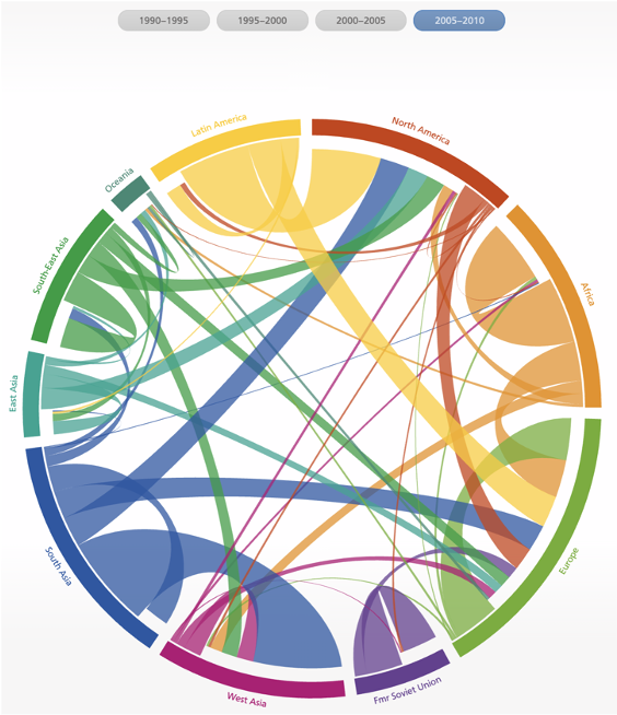
In this visualization, I want to show how strongly countries are connected to one another through migration. The 3-D aspect was inspired by the structure of neurons and network plots.
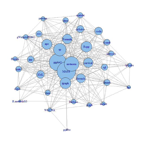
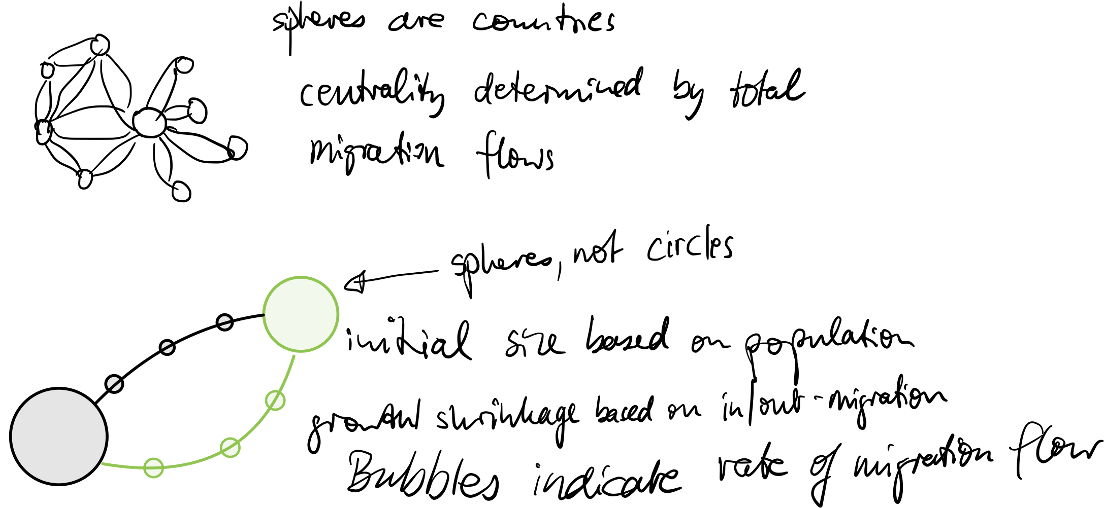
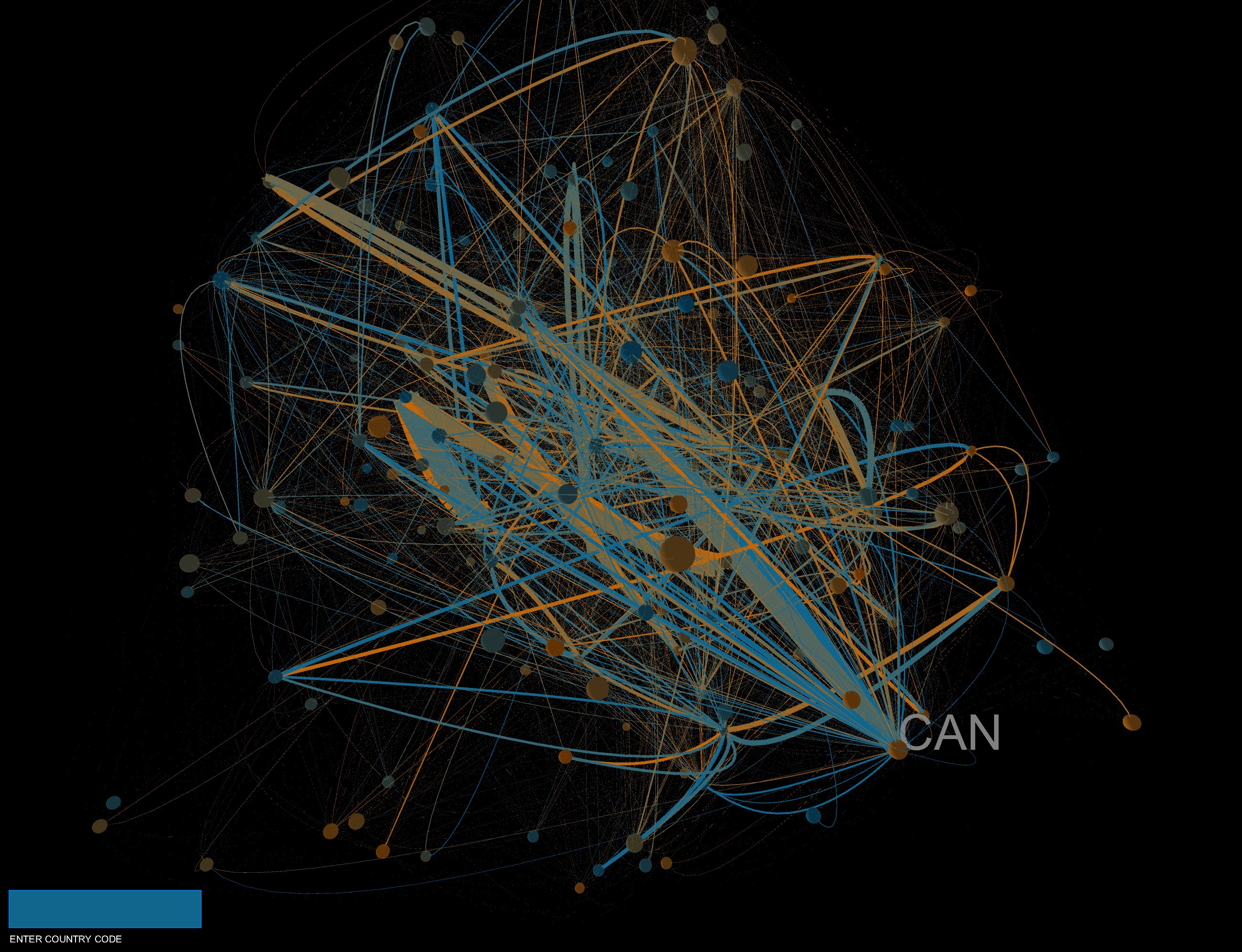
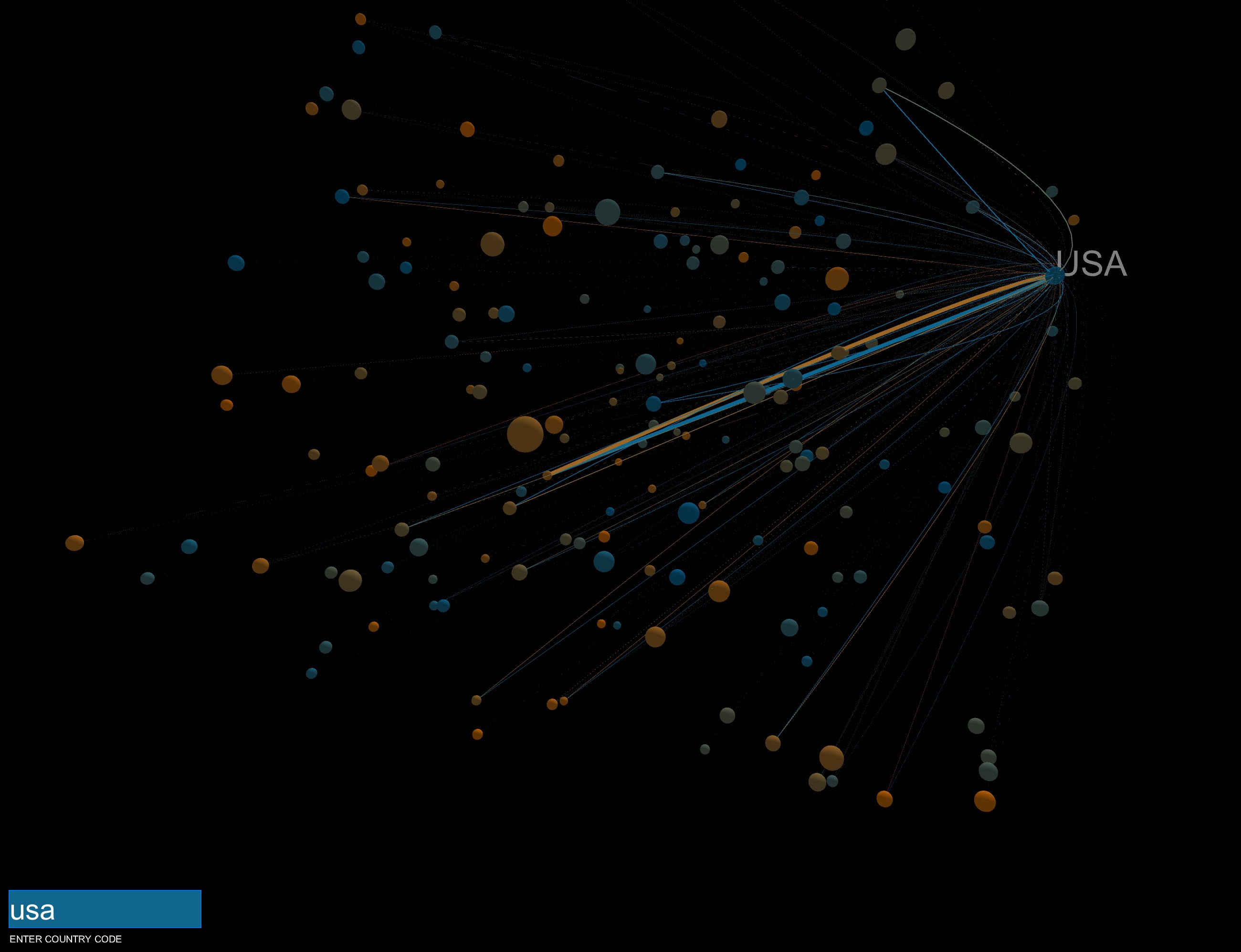
Like neurons in the brain, I envision that migration connects countries. Each country is represented by a sphere. The size of each sphere is proportional to the population of the country it represents. The colors of the spheres serve to show the origin of the migration movement. By using the keys 0, 1, 2, and 3, the user can change the year of the data displayed. To show the migration movements of each country, the user can enter a 3-letter ISO country code. On rollover, the 3-letter ISO codes are displayed.

In this visualization, I want to show how strongly countries are connected to one another through migration. The 3-D aspect was inspired by the structure of neurons and network plots.


Like neurons in the brain, I envision that migration connects countries. Each country is represented by a sphere. The size of each sphere is proportional to the population of the country it represents. The colors of the spheres serve to show the origin of the migration movement. By using the keys 0, 1, 2, and 3, the user can change the year of the data displayed. To show the migration movements of each country, the user can enter a 3-letter ISO country code. On rollover, the 3-letter ISO codes are displayed.
Data
The data was compiled by Sander, Guy J. Abel & Ramon Bauer
and can be downloaded here.
It contains estimated migration flows for 4 different time periods: 1990-1995, 1995-2000, 2000-2005, and 2005-2010.
Preliminary sketches
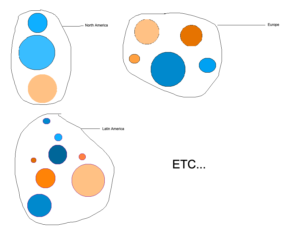
At first I thought about arranging the spheres by continent but I changed my mind and followed the philosophy that
the data should inform the visualization.


Process
The first step was to locate the colored spheres, which are sized according to the population size of the countries they represent.


Final result
The final product connects the spheres with ribbons, which are sized according to the migration flows between countries. There is additional
functionality like pressing keys to switch between years and entering the 3-letter ISO code to select just one individual country.


Code