MAT 259, 2020
Leo Lin
Concept
This project collected the Airbnb data in Asheville city and visualize the detailed price and available information into a dynamic visual design. It shows the available date, prices and reviews of customers which are several most valued elements by the customers to decide to choose the Airbnb house for a trip or short living. And my project provides a visualization for the customers to view the list of choice for Airbnb in a convenient way.
Query
These Airbnb data come from http://insideairbnb.com/get-the-data.html which includes the name, the name of the host, location information, type of rooms, price, reviews and days available. All these data form a sheet with more than hundreds of columns and more than 10,000 rows of data. But I do not need all these data, I only want to use some specific data to express the elements that matters in travelling and living there for few days. I link these important data, including the price and available days of these Airbnb, to the elements in the visualization project.
Preliminary sketches
I sketched this project with strips to describe my visualization. I found an interesting visualization project from https://manpopex.us/. So I decided to use the same pattern but another way to express my city visualization.
Process
There are two controlling system in this visualization project. The one is the control panel which adjust the color and the movement of visual elements. User can change the color of elements and the background. They can also decide the movement and speed of the elements.
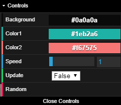
And another one is controlling the movement of camera. User can use w, a, s, d, z, x to control the camera in this 3D space with 3 axes. And users can use up arrow and down arrow to control the angle of the camera.
And another one is controlling the movement of camera. User can use w, a, s, d, z, x to control the camera in this 3D space with 3 axes. And users can use up arrow and down arrow to control the angle of the camera.
Final result
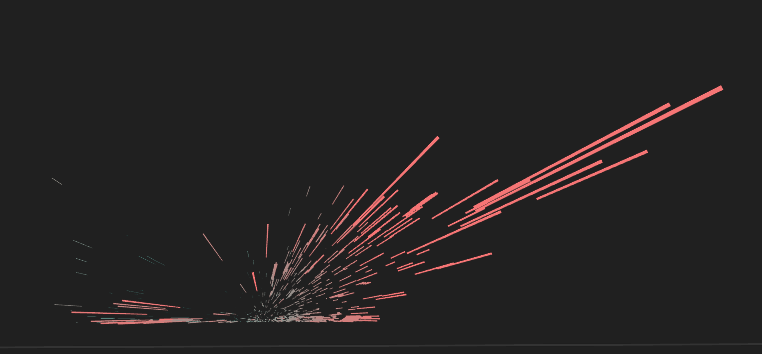
I use strip to represent each Airbnb in the 3D space. The color represent the review of this Airbnb house, the length of the strips (value of Z - axis) represents the available day of the Airbnb house, the X – axis represents the price of the Airbnb house and the Y – axis represents the number of reviews (which can highly reflect the total number of customers who have lived in this Airbnb house).
Following the visualization create by this project, we can find several facts that may reveal the regular pattern of the Airbnb house. The more expensive the Airbnb is received better review. And most of the negative reviews are given to the Airbnb house with short available days which means that these kinds of houses are not only for providing Airbnb services, so they are not professional enough to satisfy customers.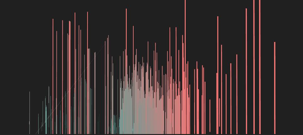
Here is the link to my project http://lzyleo.me/work/airbnb.html.
Code