Project 3 - Final 3D Data Visualization - Visualizing San Fracisco eviction rates and levels of gentrification (1997-2020)
MAT 259, 2020
Erin Woo
Concept
Being a Bay Area native, I have seen the landscape of San Francisco change dramatically during my lifetime. I am passionate about the communities and cultures I’ve grown up around and I believe that the accessible, diverse, and inclusive nature of San Francisco is what makes it such an incredible place. I hope this project brings insight to the areas most affected by the housing crisis and can show the relationship between rising eviction numbers and rapid socioeconomic change.
My final project examines the relationship between evictions by neighborhood from 1997 to 2020 and the current levels of gentrification in these neighborhoods as of 2017.
Because my previous project had a larger focus on aesthetics rather than the data itself, I wanted to spend a majority of my time experimenting with ways to combine multiple sources of data. I also spent time learning how to manipulate and combine datasets in Python using Jupyter Notebook.
Because my previous project had a larger focus on aesthetics rather than the data itself, I wanted to spend a majority of my time experimenting with ways to combine multiple sources of data. I also spent time learning how to manipulate and combine datasets in Python using Jupyter Notebook.
Data
The primary source of data for this project is from the Eviction Notices dataset from Data SF.
Data on neighborhood gentrification levels are from the Urban Displacement Project and the FCC's census area API was used to combine FIPS data attributes with the eviction dataset's longitudinal/latitudinal attributes.
Since all of the ~40,000 data points in the evictions dataset had to make a call to the FCC API endpoint to grab the area FIPS code, I wrote a script in Python that automated these calls and appended these values to a column in the existing evictions dataset. These FIPS area codes were used when referencing the gentrification status for each area. These scripts are included in the project's repo and downloadable zip file under data.ipynb.
The original dataset is under Eviction_Notices.csv and the modified dataset is under Evictions_fips.csv.
Preliminary sketches
Since each data point was limited by it's longitude and latitude mapping in space, I had to think of interesting ways to map the other variables.
The initial sketch shown below was inspired by the location tracking of cell phone usage project from the New York Times, which showed the volume of locational cell phone usage across periods of time. The sketch below demonstrated a similar approach in mapping longitude in x, latitutude in y and volume in z with a slider at the bottom to indicate the time frame the data displayed.
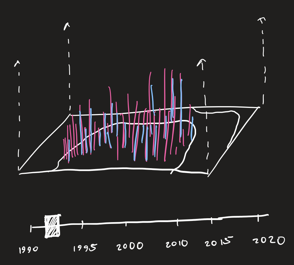
Although, I felt that this type of mapping wasn't interesting enough. I eventually decided to use the z axis to represent time, similar to my previous 3D project.
The initial sketch shown below was inspired by the location tracking of cell phone usage project from the New York Times, which showed the volume of locational cell phone usage across periods of time. The sketch below demonstrated a similar approach in mapping longitude in x, latitutude in y and volume in z with a slider at the bottom to indicate the time frame the data displayed.
Although, I felt that this type of mapping wasn't interesting enough. I eventually decided to use the z axis to represent time, similar to my previous 3D project.
Process
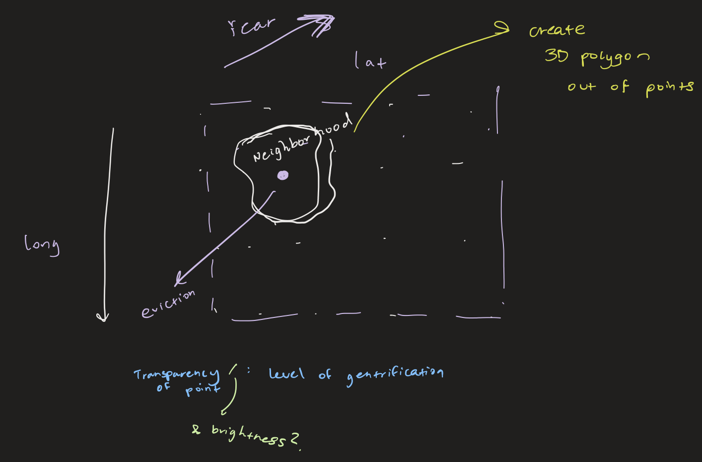
When sketching out this idea, I planned to display each neighborhood as a 3D polygon with edges connecting each eviction, displayed as a point or vertex. Although, this proved to be difficult due to the sheer volume of points in the sketch.
To fix the issue of slow rendering, I instead drew edges between every 10 points instead of between every single point (which is why some points appear to be floating without connections to other points).
The images below show what the sketch initially looked like. Each color represents a different neighborhood.


As you can see, it's a bit difficult to draw conclusions from this data visualization since there isn't any scale for time or way to compare the eviction densities for each time period. There also isn't a way to see the gentrification data for each neighborhood. The final product below addresses these problems by adding labeling, info boxes, time-based polygon drawing, and varying transparencies for different gentrification statuses.
The images below show what the sketch initially looked like. Each color represents a different neighborhood.
As you can see, it's a bit difficult to draw conclusions from this data visualization since there isn't any scale for time or way to compare the eviction densities for each time period. There also isn't a way to see the gentrification data for each neighborhood. The final product below addresses these problems by adding labeling, info boxes, time-based polygon drawing, and varying transparencies for different gentrification statuses.
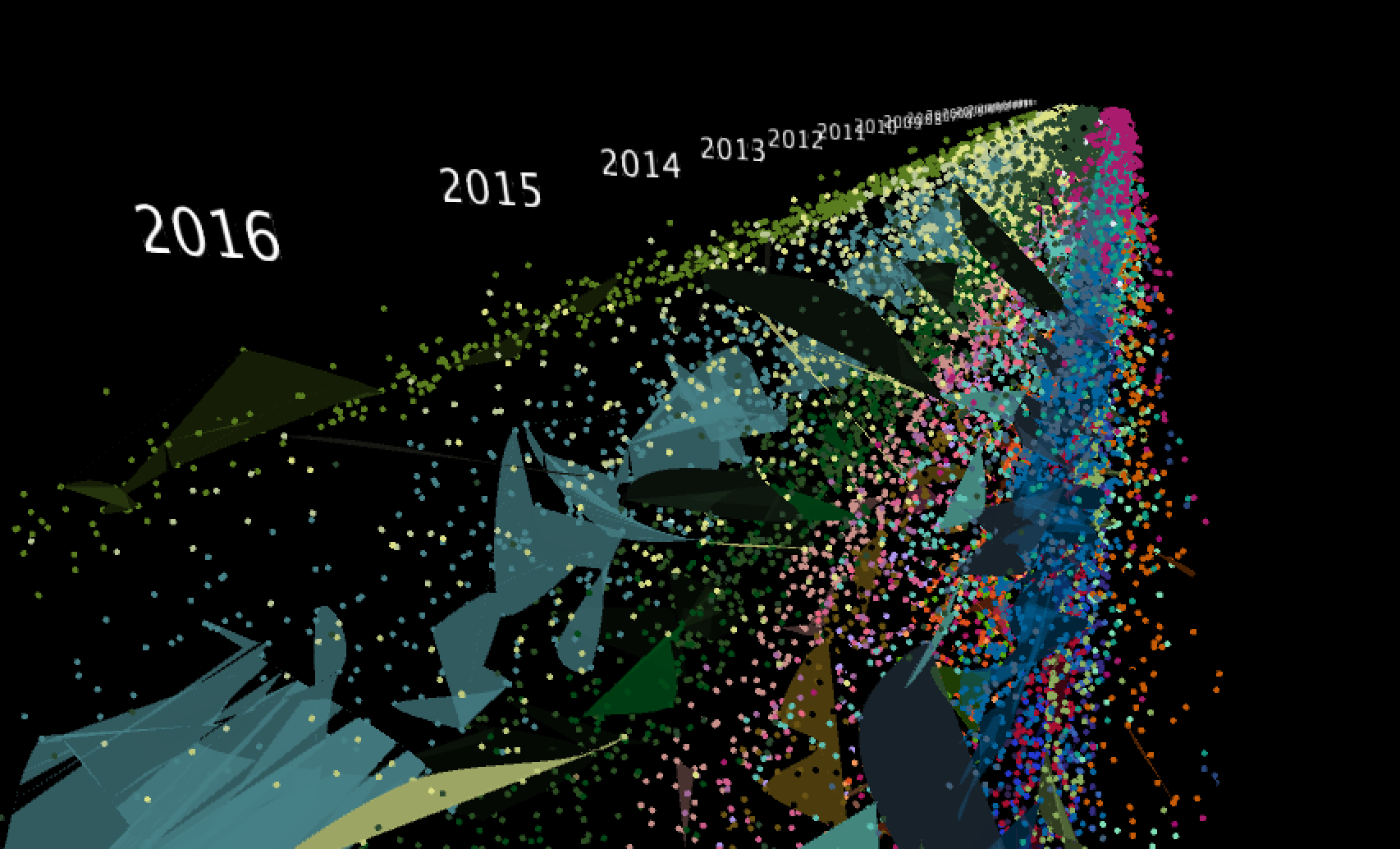
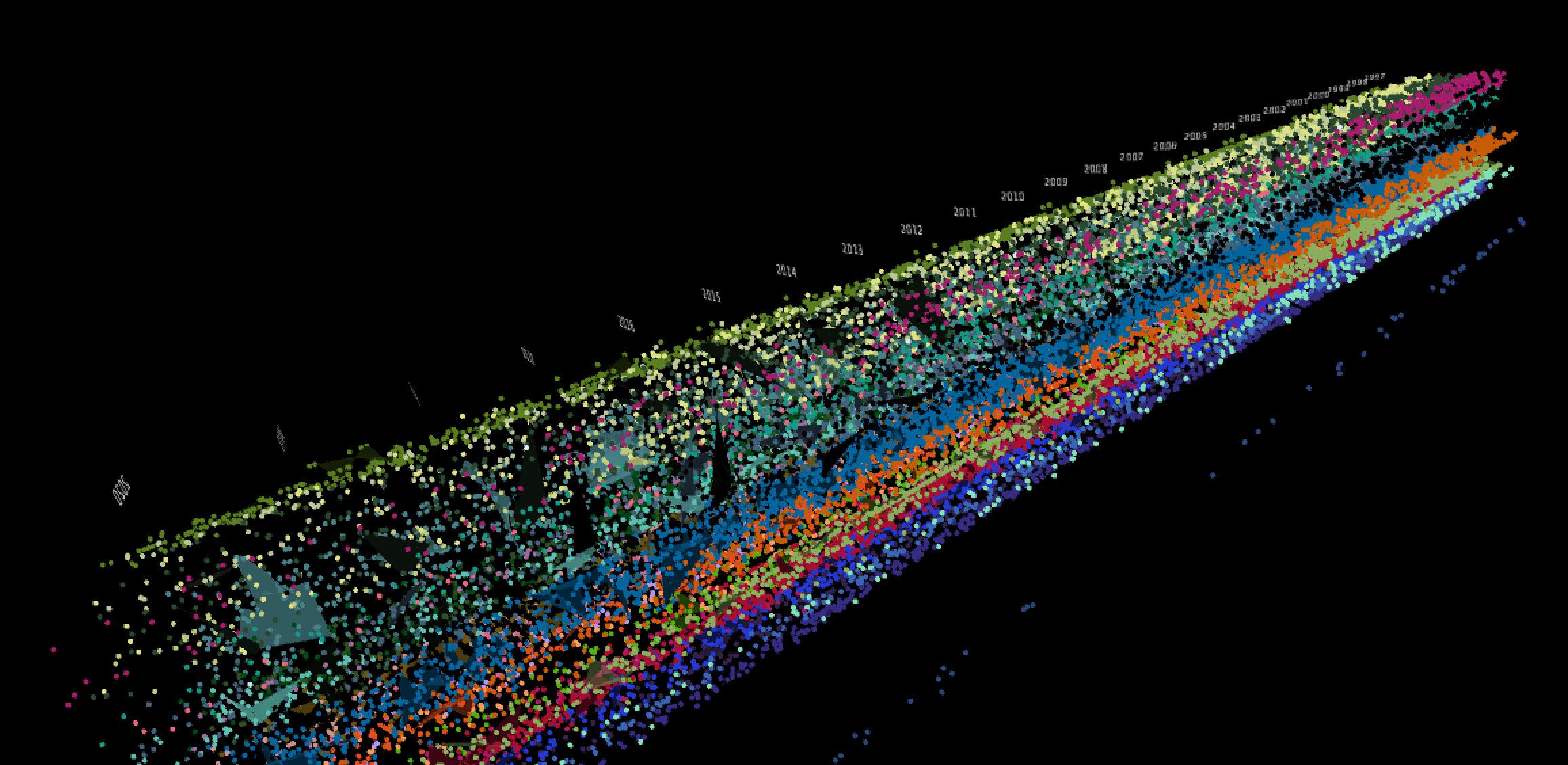
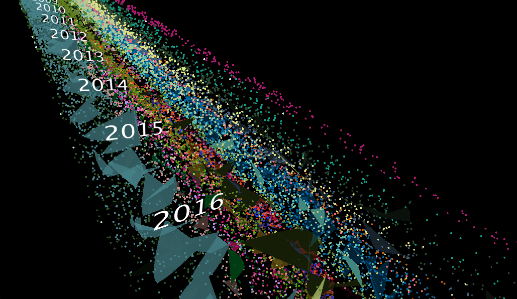
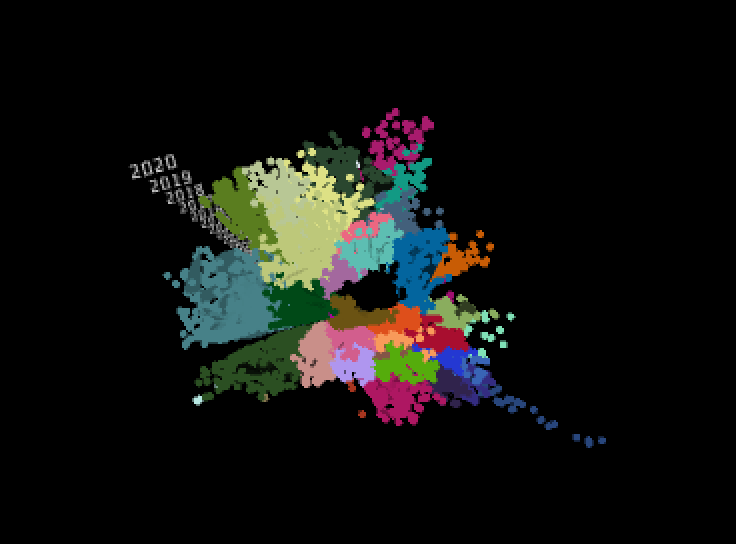
Final result
This final solution addresses the issues above. I wanted it to be easier to see variations in the data from year-to-year so each separated polygon only connects data points for a single year.
Additionally, I changed the shape of the polygon's by using Processing's curveVertex() instead of a regular vertex().
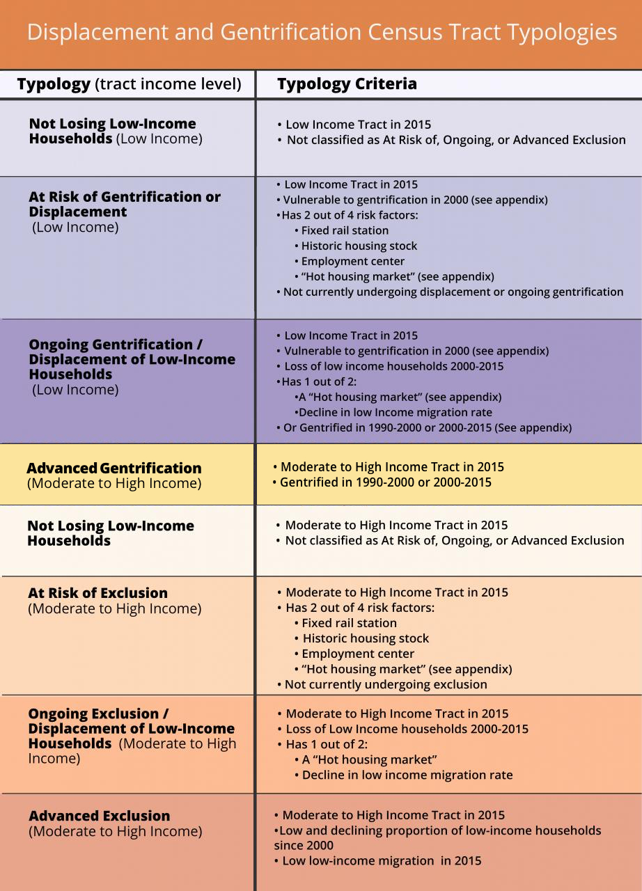
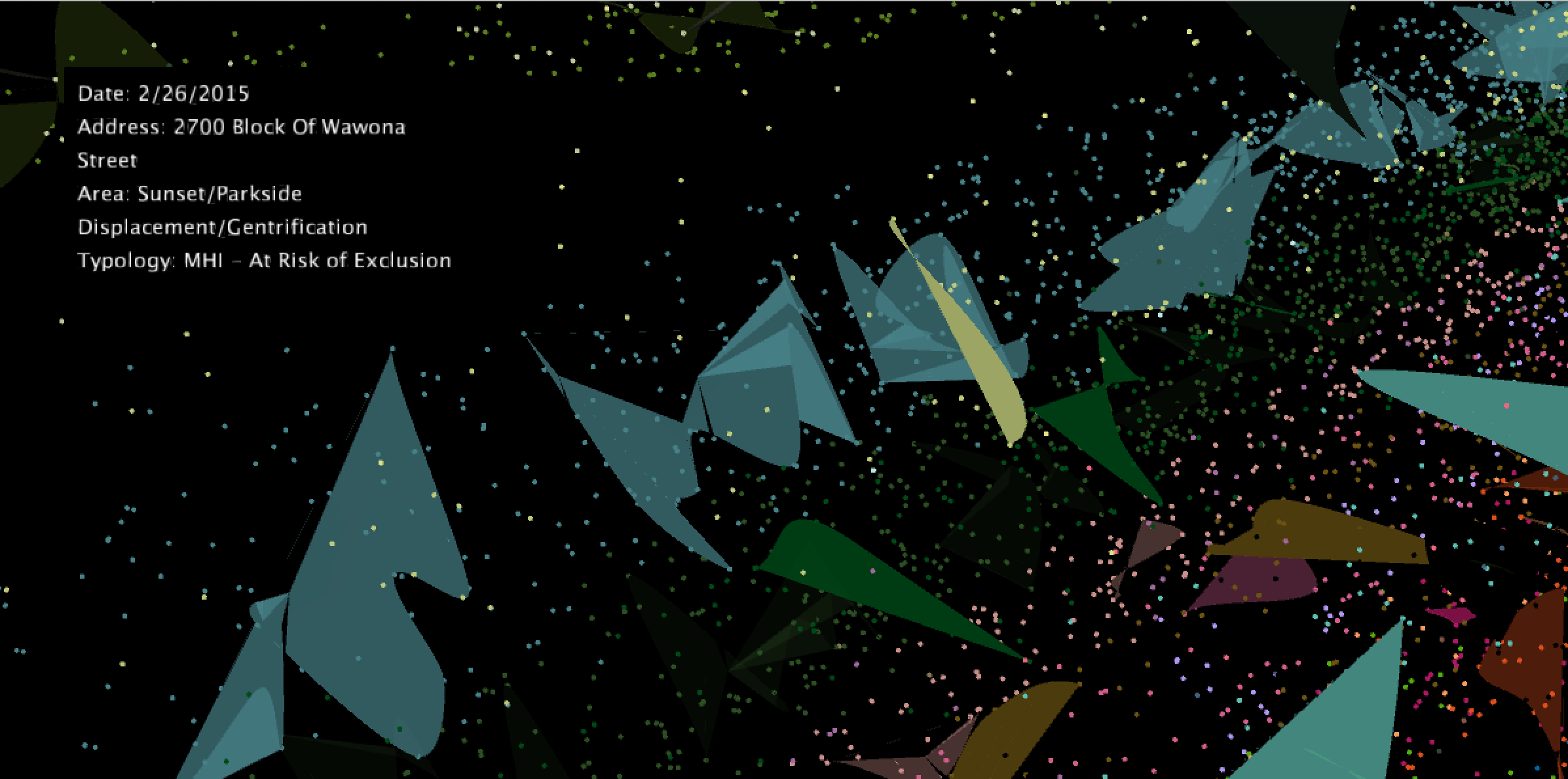
The transparency of each polygon correlates with that area's gentrification and exclusion typology as of 2017. The more advanced the gentrification/displacement status, the greater the opacity for that neighborhood's polygons. Mousing over a data point reveals more information about the eviction such as the date, location, and gentrification/displacement typology.
Each area is classified as low-income (LI) or moderate to high-income (MHI). Higher-income neighborhoods that have already achieved gentrification are susceptible to exclusion, which occurs when the neighborhood population is increasing but the number of migrating low-income occupants is decreasing. For more information, check out the Urban Displacement Project and their methodology for collecting this data.
Code