MAT 259, 2020
Boning Dong
Concept
For this project, I am trying to use the novel coronavirus data to visualize its breakout in China.
I want to work on this project for several reasons. First, I hope this project could make people remember the breakout of coronavirus and use it as an alert for future reference. Second, I want to make people realize how severe the disease and how fast it can spread. This virus is in the pandemic stage in some countries and I hope people can be alerted and union together to keep the plague from spreading.
I want to work on this project for several reasons. First, I hope this project could make people remember the breakout of coronavirus and use it as an alert for future reference. Second, I want to make people realize how severe the disease and how fast it can spread. This virus is in the pandemic stage in some countries and I hope people can be alerted and union together to keep the plague from spreading.
Query
In this project, I didn’t use the SQL query. I found the data set from the following link https://www.kaggle.com/sudalairajkumar/novel-corona-virus-2019-dataset, and from which I used the COVID_open_line_list_data.csv as my data source. I choose this dataset because it includes the location information represented by longitude and latitude, the gender information (not completed though) and confirmed date. I did my visualization based on all of these infos. I processed most of the data in javascript. Basically what I did is to fetch the important information into self-defined data structures for rendering.
Preliminary sketches
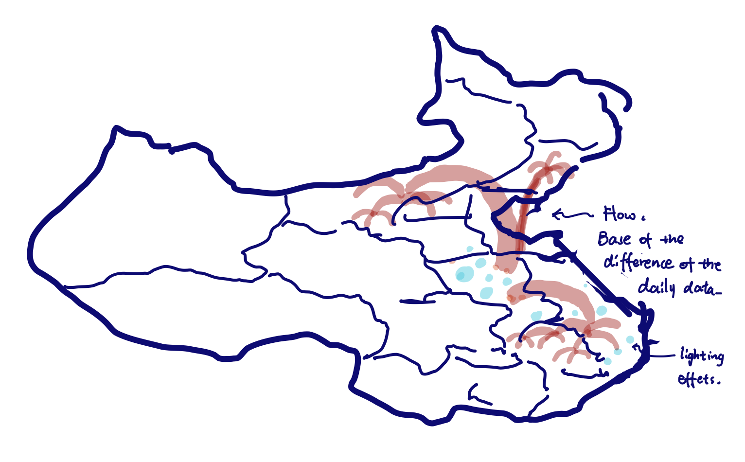
Based on what I am thinking from the very beginning, first I want to try to represent the number of cases using animating points with lighting effects, and the locations of these points are determined by where the cases are reported. Second, I am thinking to visualize the increment of the cases between days using flow patterns. Specifically, these flow patterns consist of a bunch of lines and flow animation which indicates the flow direction. Also, the color, thickness, or the brightness of the lines will be determined by how much the influence of one area to another.
Process
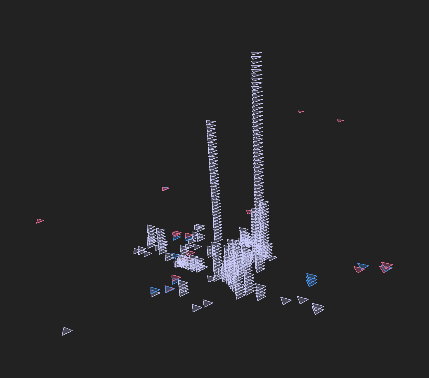
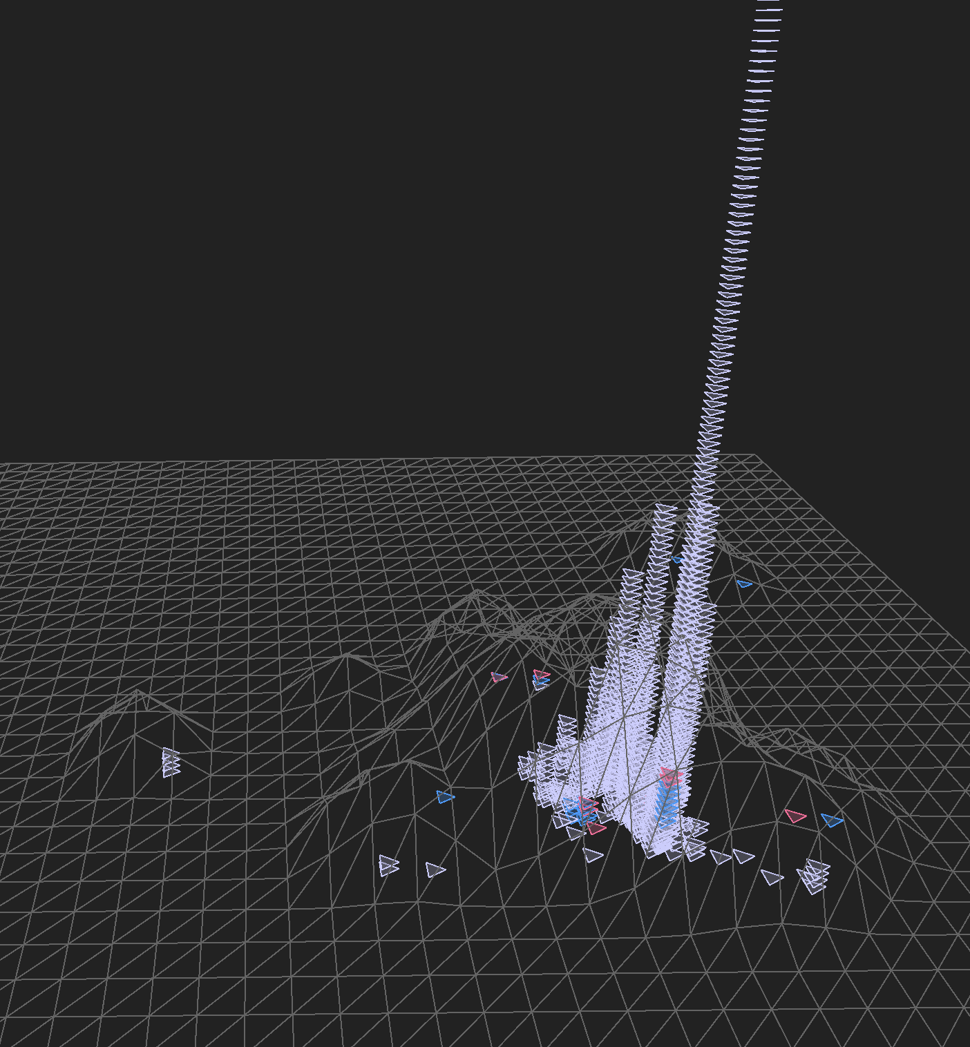
As I was working on this project, I first tried to visualize the data in Unity, because Unity provides a better performance while rendering a scene with numerous objects. I even used a shader graph to design my own shader, but it turned out the result didn’t go really well. Because the dataset provides the data that are relatively sparse and discrete so it actually doesn’t require much rendering power. So eventually I choose p5.js as the developing environment. I tested my data result using some basic mesh drawings. And eventually, tried to improve the aesthetic aspect of this project.
Final result
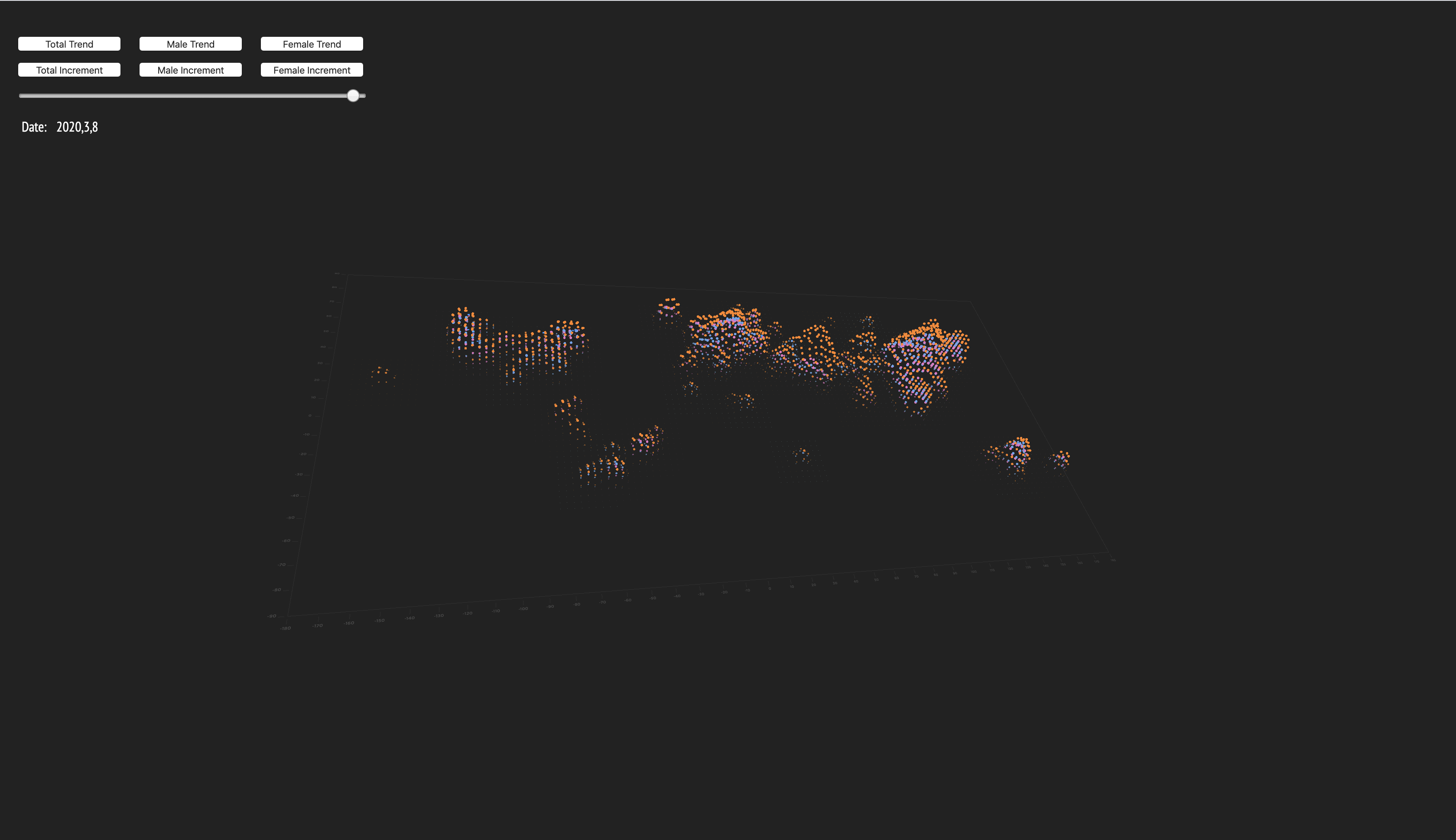
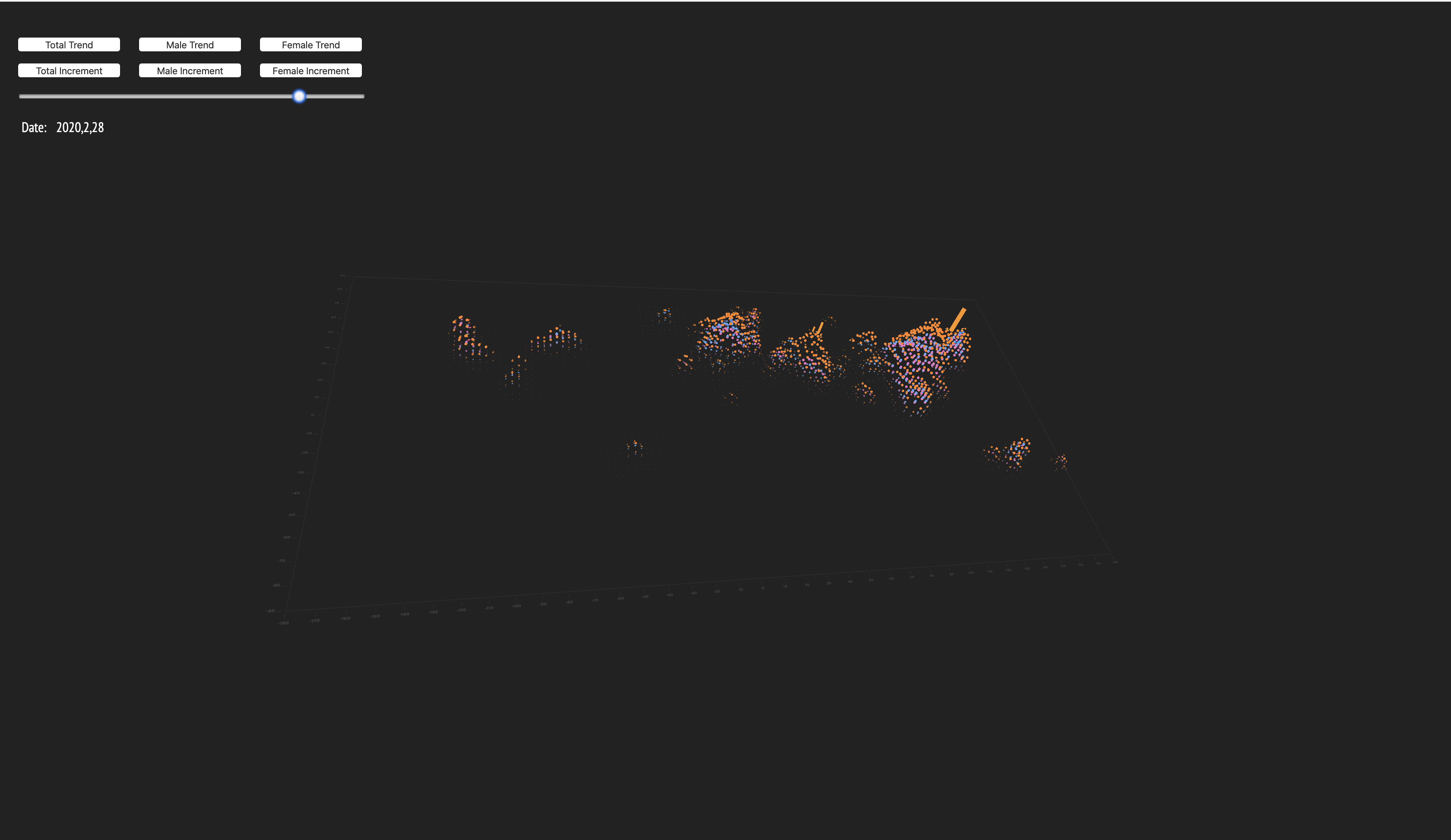
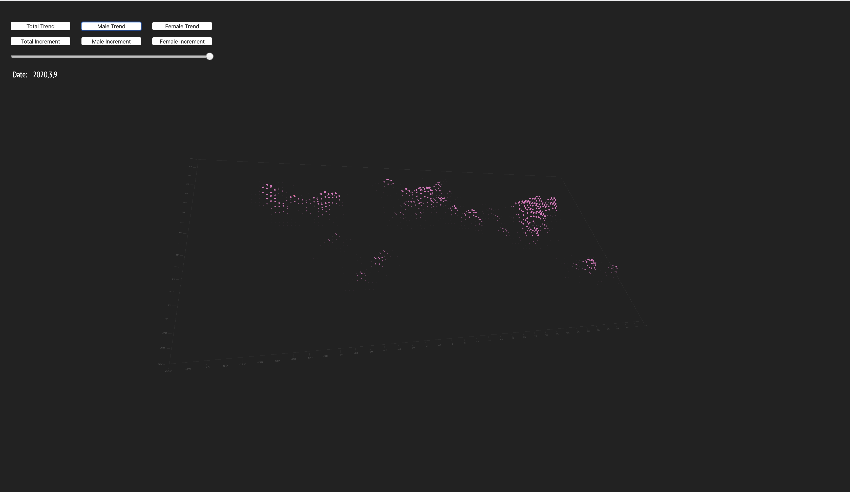
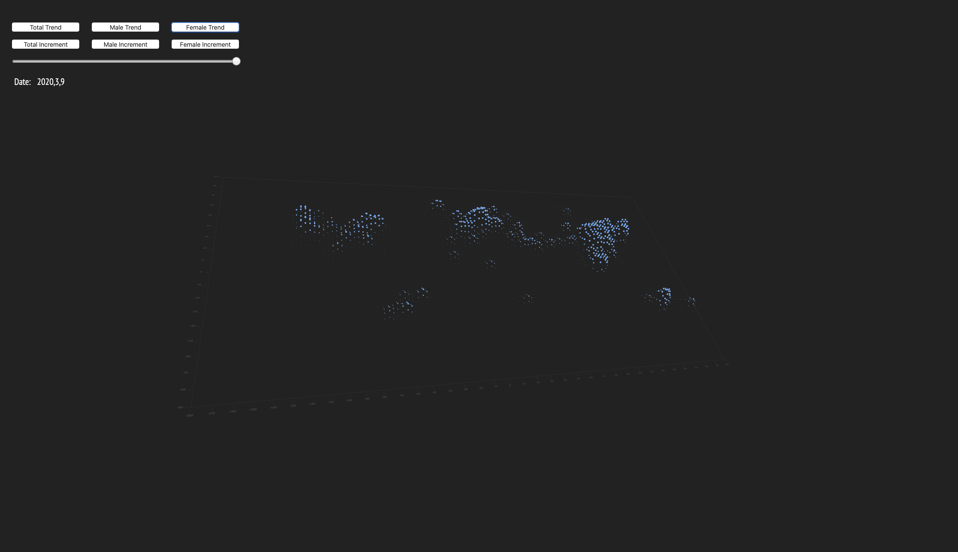
After exploring and comparing p5 and Unity, I eventually did my visualization using P5.js because overall p5.js is easier to use and can provide good visual effects for the dataset I found. In the visualization, I visualize the total cases, reported female cases and male cases separately across the world based on the longitude and latitude locations. In addition to the total accumulated cases for all genders, I also visualized the daily increments using vertical bars.
There is a slide bar that allows users to select the date they want to inspect. The date covers the start of the disease until the date of the last reported case. It worth mentioning that even though the cases are associated with a piece of location information, mapping them to the map directly will still show discrete peaks. So I wrote a ConvSum function that applies a gaussian filter to the data mesh so that the result can show an overall trend.
Here are the screenshots of the visualization:
Code