Earth, Moon and Sun in Literature
MAT 259, 2020
Yulei Yuan
Concept
This project builds on my initial idea of exploring astronomy related medias in Seattle Public Library. I’m interested in the checkouts of medias with title containing "earth","moon" and "sun". For this project, I utilized sql to select medias with desired titles and would like to see if there is a relative popularity in the selected medias. To measure popularity, I used total checkouts number for related items from 2006 to 2018 from all dewey classes.
Query
1. Select medias with "earth" in the title
Select YEAR(cout), TRUNCATE(FLOOR(`deweyClass`), -1) AS Dewey, count(*)
from spl_2016.outraw
where YEAR(cout) > '2006'
and title like '%earth%' or title like '%Earth%'
group by
year (cout), TRUNCATE(FLOOR(`deweyClass`), -1)
order by
year (cout), TRUNCATE(FLOOR(`deweyClass`), -1)
2. Select medias with "sun" in the title
Select YEAR(cout), TRUNCATE(FLOOR(`deweyClass`), -1) AS Dewey, count(*)
from spl_2016.outraw
where YEAR(cout) > '2006'
and title like '%sun%' or title like '%Sun%'
group by
year (cout), TRUNCATE(FLOOR(`deweyClass`), -1)
order by
year (cout), TRUNCATE(FLOOR(`deweyClass`), -1)
3. Select medias with "moon" in the title
Select YEAR(cout), TRUNCATE(FLOOR(`deweyClass`), -1) AS Dewey, count(*)
from spl_2016.outraw
where YEAR(cout) > '2006'
and title like '%moon%' or title like '%Moon%'
group by
year (cout), TRUNCATE(FLOOR(`deweyClass`), -1)
order by
year (cout), TRUNCATE(FLOOR(`deweyClass`), -1)
Select YEAR(cout), TRUNCATE(FLOOR(`deweyClass`), -1) AS Dewey, count(*)
from spl_2016.outraw
where YEAR(cout) > '2006'
and title like '%earth%' or title like '%Earth%'
group by
year (cout), TRUNCATE(FLOOR(`deweyClass`), -1)
order by
year (cout), TRUNCATE(FLOOR(`deweyClass`), -1)
2. Select medias with "sun" in the title
Select YEAR(cout), TRUNCATE(FLOOR(`deweyClass`), -1) AS Dewey, count(*)
from spl_2016.outraw
where YEAR(cout) > '2006'
and title like '%sun%' or title like '%Sun%'
group by
year (cout), TRUNCATE(FLOOR(`deweyClass`), -1)
order by
year (cout), TRUNCATE(FLOOR(`deweyClass`), -1)
3. Select medias with "moon" in the title
Select YEAR(cout), TRUNCATE(FLOOR(`deweyClass`), -1) AS Dewey, count(*)
from spl_2016.outraw
where YEAR(cout) > '2006'
and title like '%moon%' or title like '%Moon%'
group by
year (cout), TRUNCATE(FLOOR(`deweyClass`), -1)
order by
year (cout), TRUNCATE(FLOOR(`deweyClass`), -1)
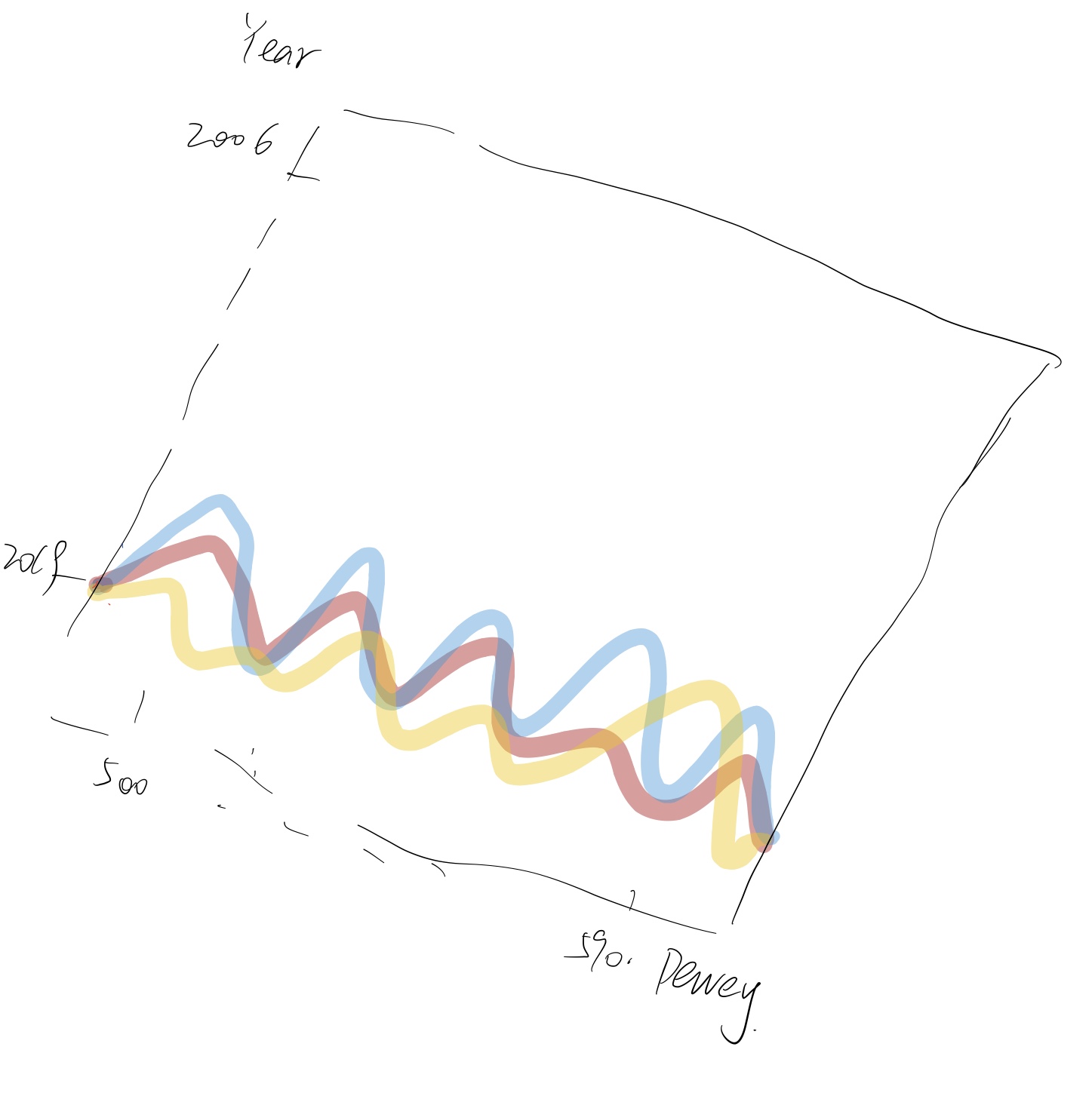
Preliminary sketches
In my bref sketch, I thought that I can put dewey classes on the x axis, years on the y axis and checkout counts on the z axis. Then I can connect the counts in someway for a same year through all dewey classes, while assigning representative colors for my topics here: red for "sun", blue for "earth" and yellow for "moon".
Process
The first draft is a simple point plot. I abandoned this first idea because the data that I got have many duplicated counts, as a result, the points that were revealed on the plot overlaped with each other. I couldn't find a better way to optimize the graph using the original dataset, so I decided to find new datasets and redo the project.

The part shown is for the earth related data. I didn't like the gaps between triangles so I changed the shape to quadratic strips.
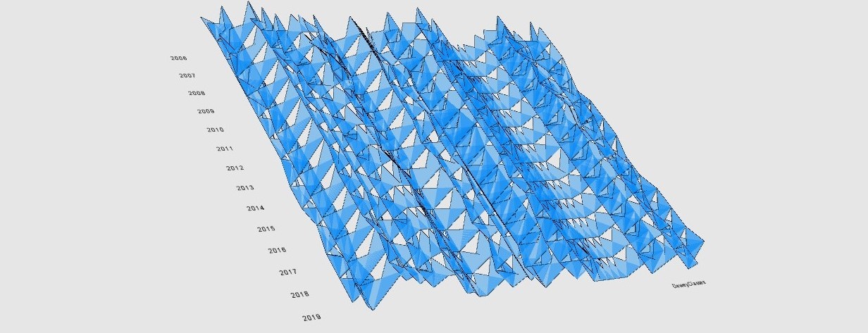
After changing to strips, the surfaces turned to mix up, so I changed the way to connect the points.
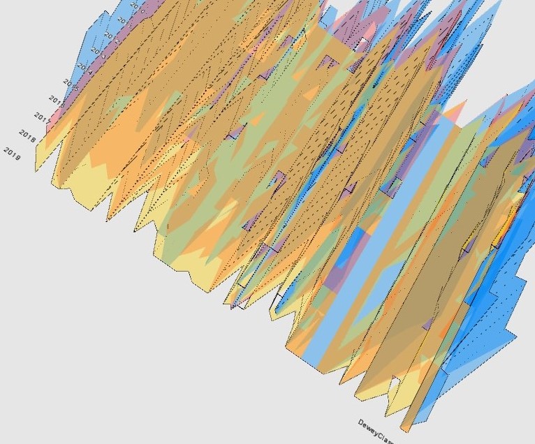
The first try of putting title and descritions in the graph.
The part shown is for the earth related data. I didn't like the gaps between triangles so I changed the shape to quadratic strips.
After changing to strips, the surfaces turned to mix up, so I changed the way to connect the points.
The first try of putting title and descritions in the graph.
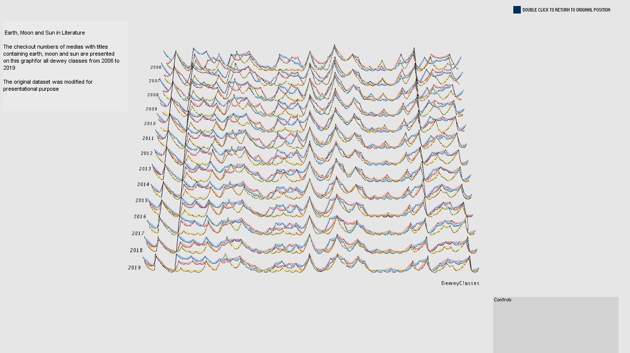
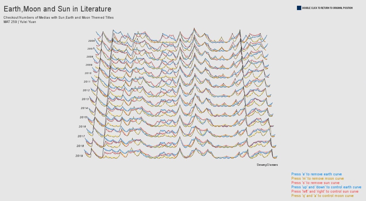
Final result
Overview of the graph.
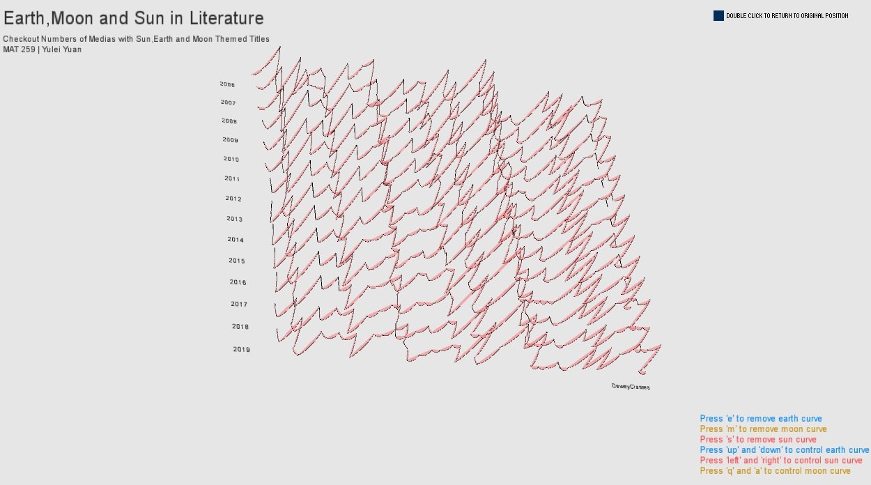
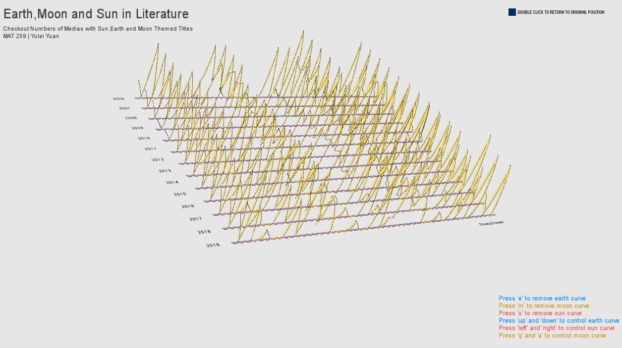
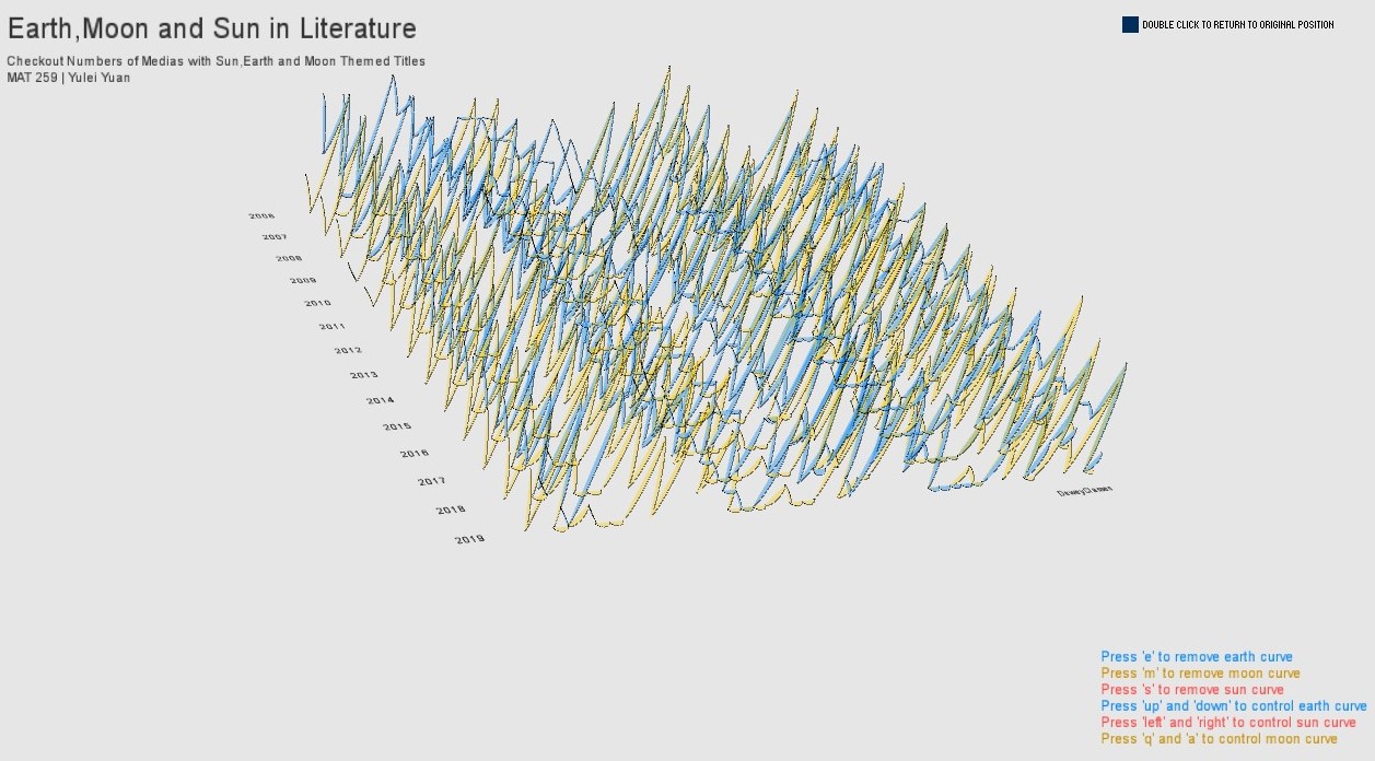
Viewers can choose to view only one topic by hiding the other two plots.
Viewers can also increase or decrease the vertical scaling for the graph to clearly see the tread through dewey classes for a certain year.
From the graph, I discovered that from 2006 to 2019, the checkout numbers actually follow approximately the same pattern from year to year. From a statistical view, I can probabily use time series knowledge to build models for predicting the patterns for all of the three selected titles of medias for 2020.
Code