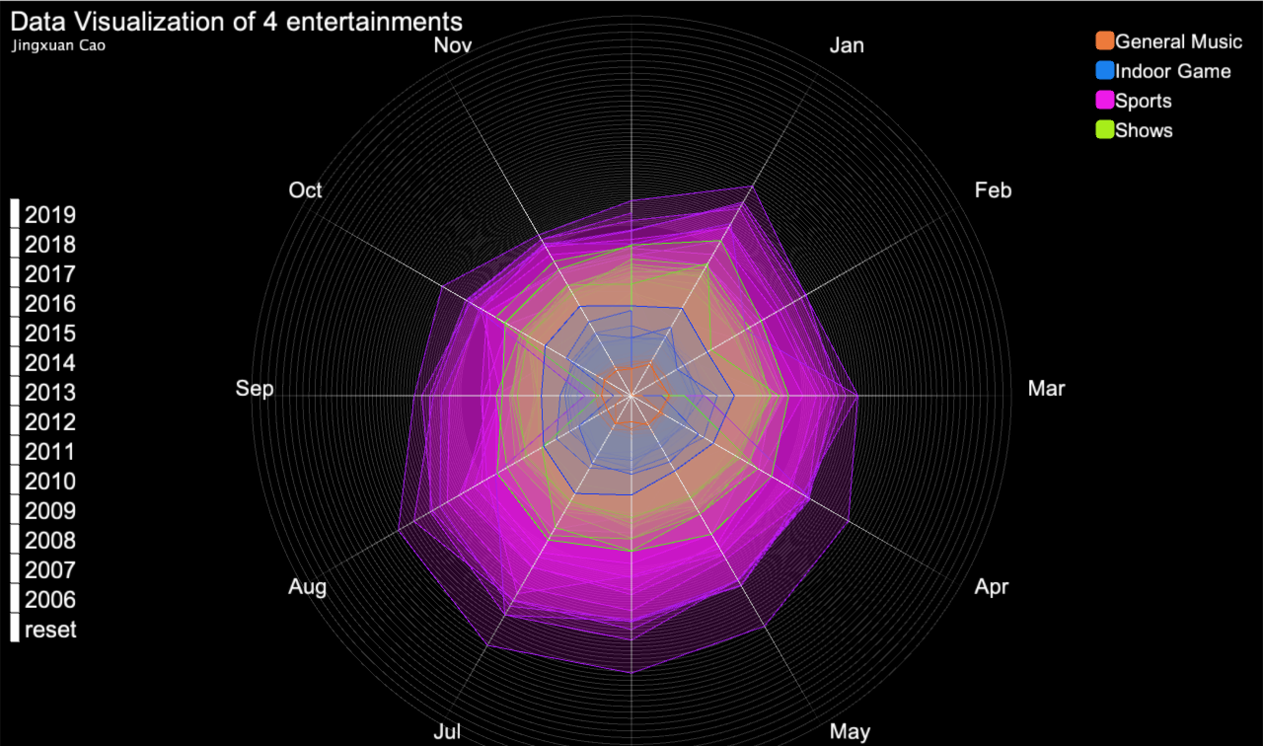
3D visualization of 4 entertainments
MAT 259, 2020
Jingxuan Cao
Concept
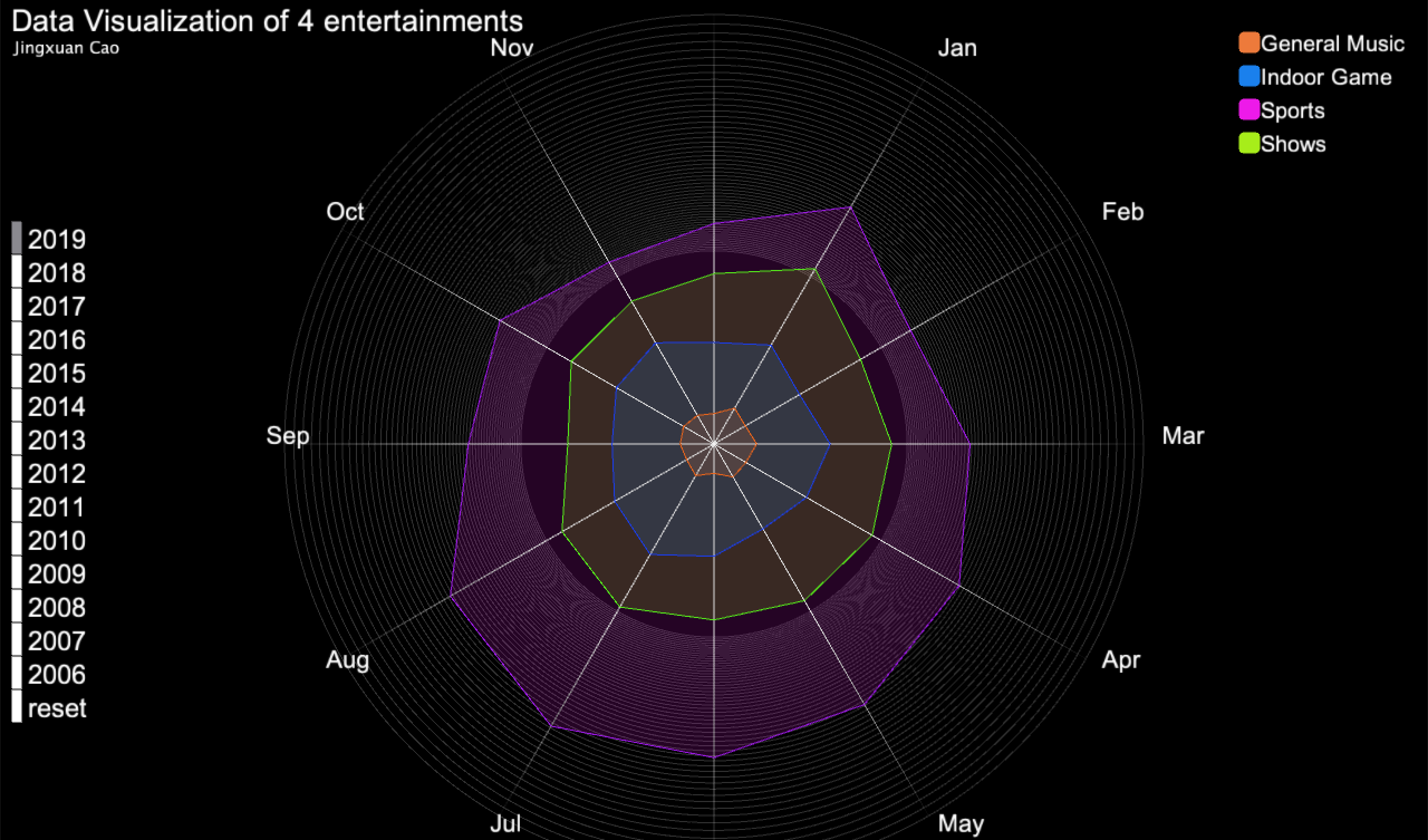
I am interested to see the data visualization of 4 entertainments(General Music, Indoor Games, Sports, Shows) from 2006 to 2019. Therefore, I used MySQL to collect data from the Seattle public library. I also separate the data set from January to December.
Query
SELECT
YEAR(cout) AS year,
MONTH(cout) AS month,
SUM(IF(deweyClass >= 780 and deweyClass < 781, 1, NULL)) AS 'General music',
sum(IF(deweyClass >= 793 and deweyClass < 796, 1, NULL)) AS 'Indoor game',
sum(IF(deweyClass >= 796 and deweyClass < 800, 1, NULL)) AS 'Sports',
sum(IF(deweyClass >= 791 and deweyClass < 792,1, NULL)) AS 'Shows'
FROM
spl_2016.outraw
WHERE
(deweyClass > 750 AND deweyClass < 900)
AND YEAR(cout) BETWEEN 2006 AND 2019
GROUP BY year , month
ORDER BY year , month;
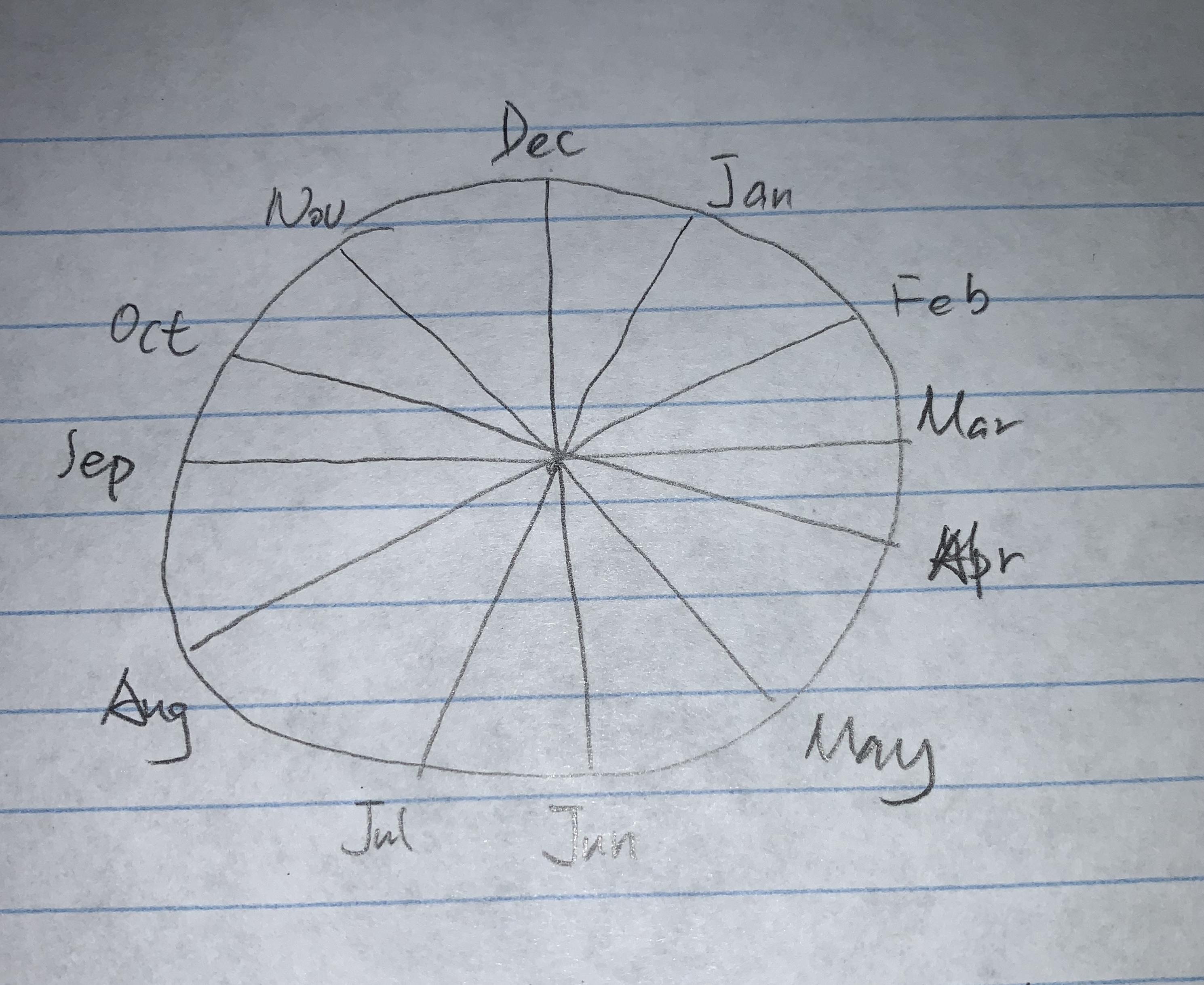
Preliminary sketches
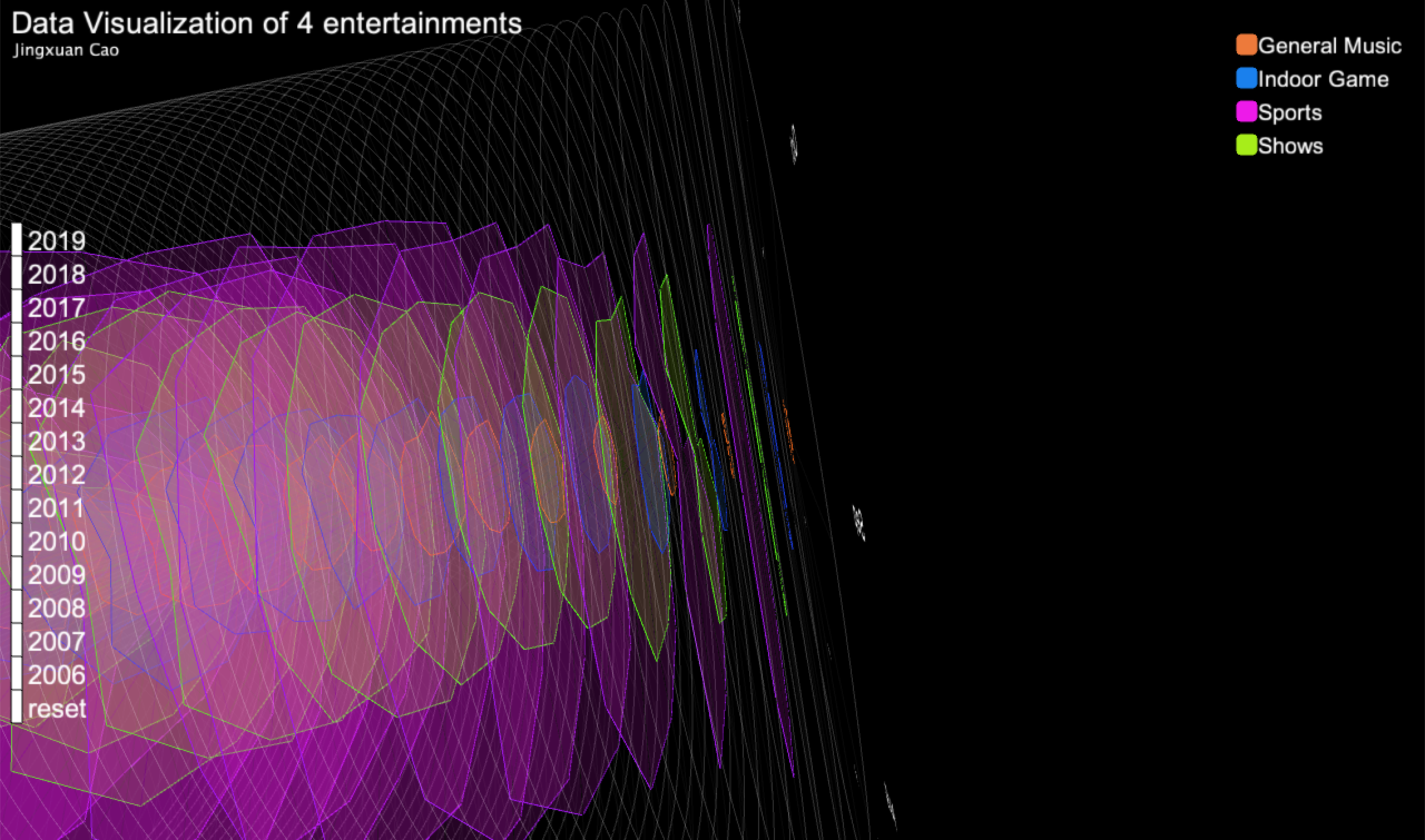
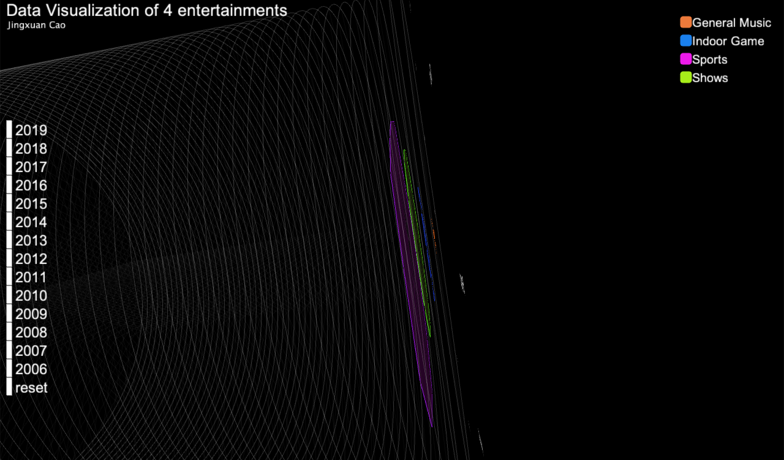
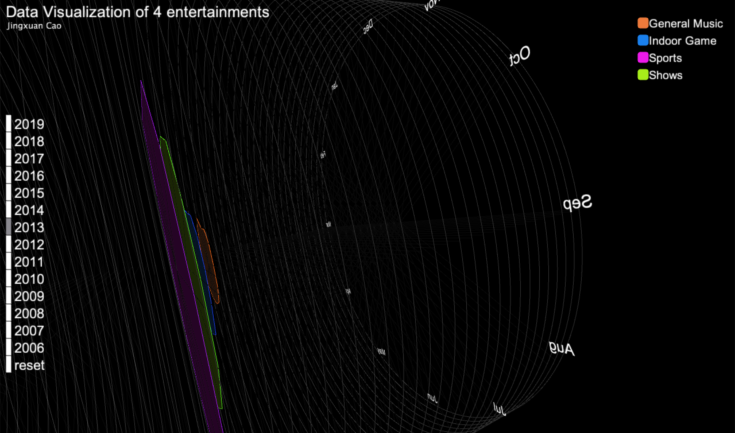
Here is my sketch of how to plot the data into a 3D graph. Each circle will contain the data of a entertainment of one year from 2019 to 2006.
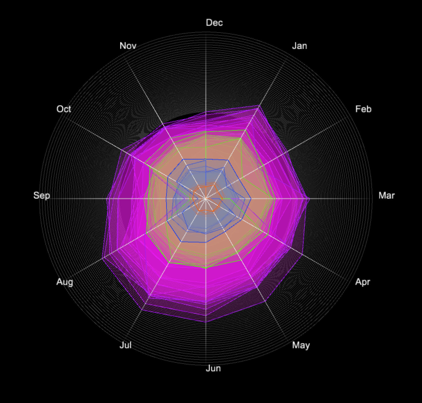
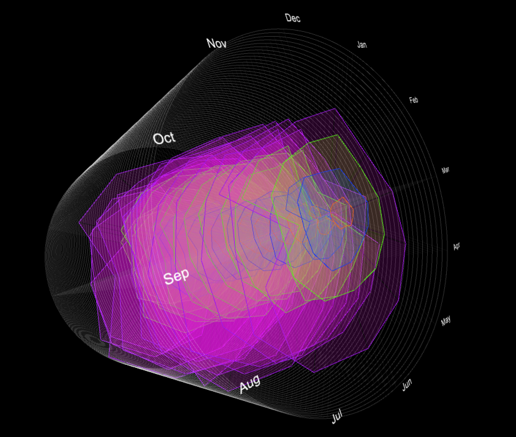
Process
I split a circle to 12 pieces and each piece has a month label which indicates one month. The data on the line of one month shows the number that the closer to the center of the circle means smaller and the further to the center means larger. I put plenty of circle that one circle represent a layer, and one layer is a entertainment of a year. The arrangement of layers are based on years starts from 2019 to 2006.
Final result
Finally, to give viewers a better experience to understand the data, I add some labels to clarify the color of each entertainment. Additionally, I build a list of buttons on the left. Viewers can see the button turn to grey when they put mouse on each button and each button represents a year. The graph shows the data of the year by clicking that year's button. With this function, viewers can easily see the change of each year.
Code