MAT 259, 2020
Boning Dong
Concept
In this assignment, I wanted to explore the change of the popularities of different programming languages over the past years. By using the Seattle Public Library checkout records, I fetched, classified and visualized these checkout records to analyze the popularity change of a specific language, and also tried to see if there is any relationship between the trend of different programming languages.
Query
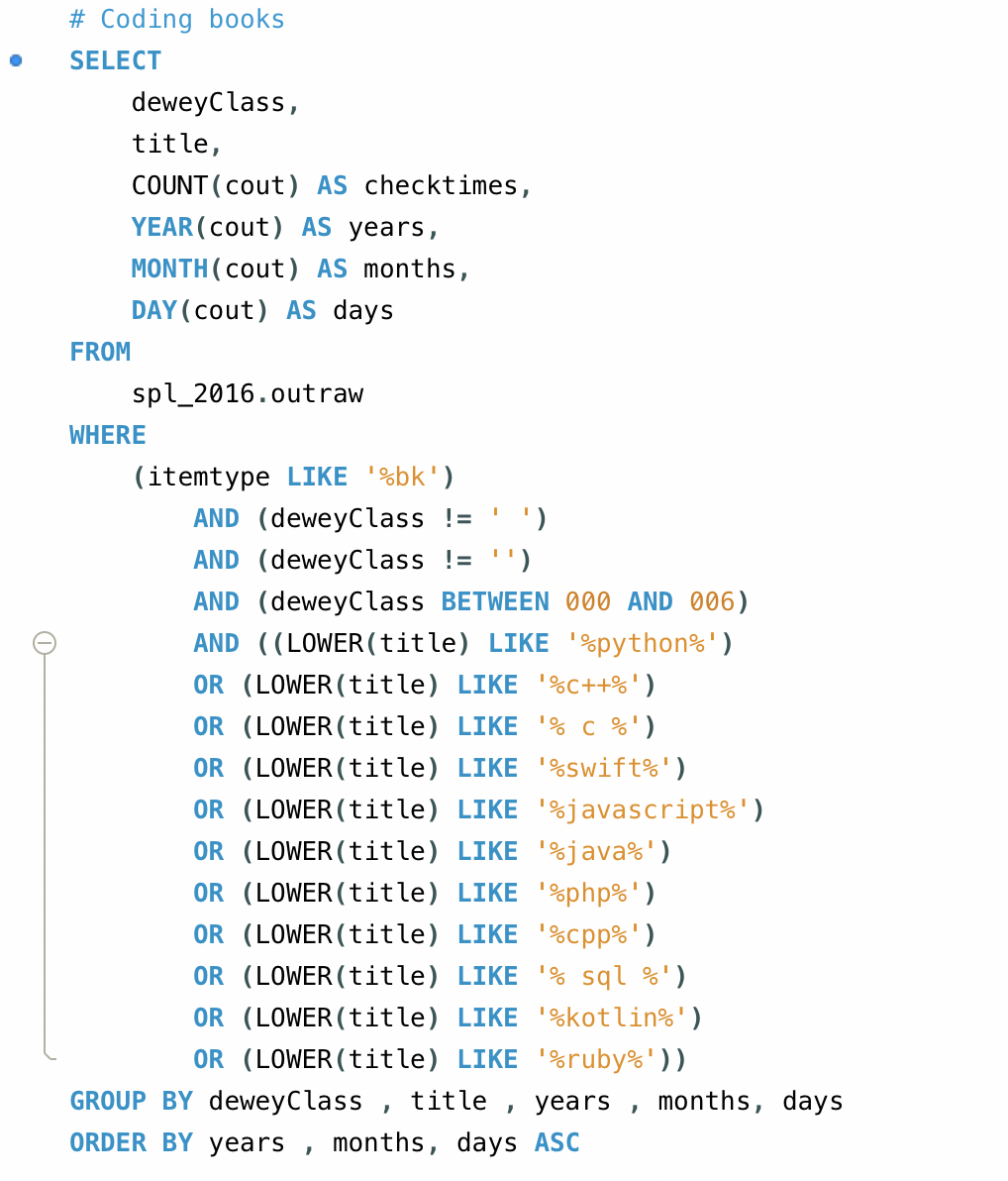
I tried to search the names of different programming languages to fetch the corresponding data from the MySQL server. Yet the result got in this way include non-programming materials, for example there are a lot of non-programming books contain the word “ruby”. So I also check if the Dewey class is between 000 and 006, which are the Dewey class numbers assigned for computer science books. Here is the query I used to fetch all of the data.
To show the popularity of a specific programming language, I also need to classify the results and sum the checkout times of the same language together. But doing that in SQL is too hard, so I determined to process this in Javascript. The way I did that is to create a data matrix that contains the daily checkout times for a specific language. Here are the details of the code which handles book classification.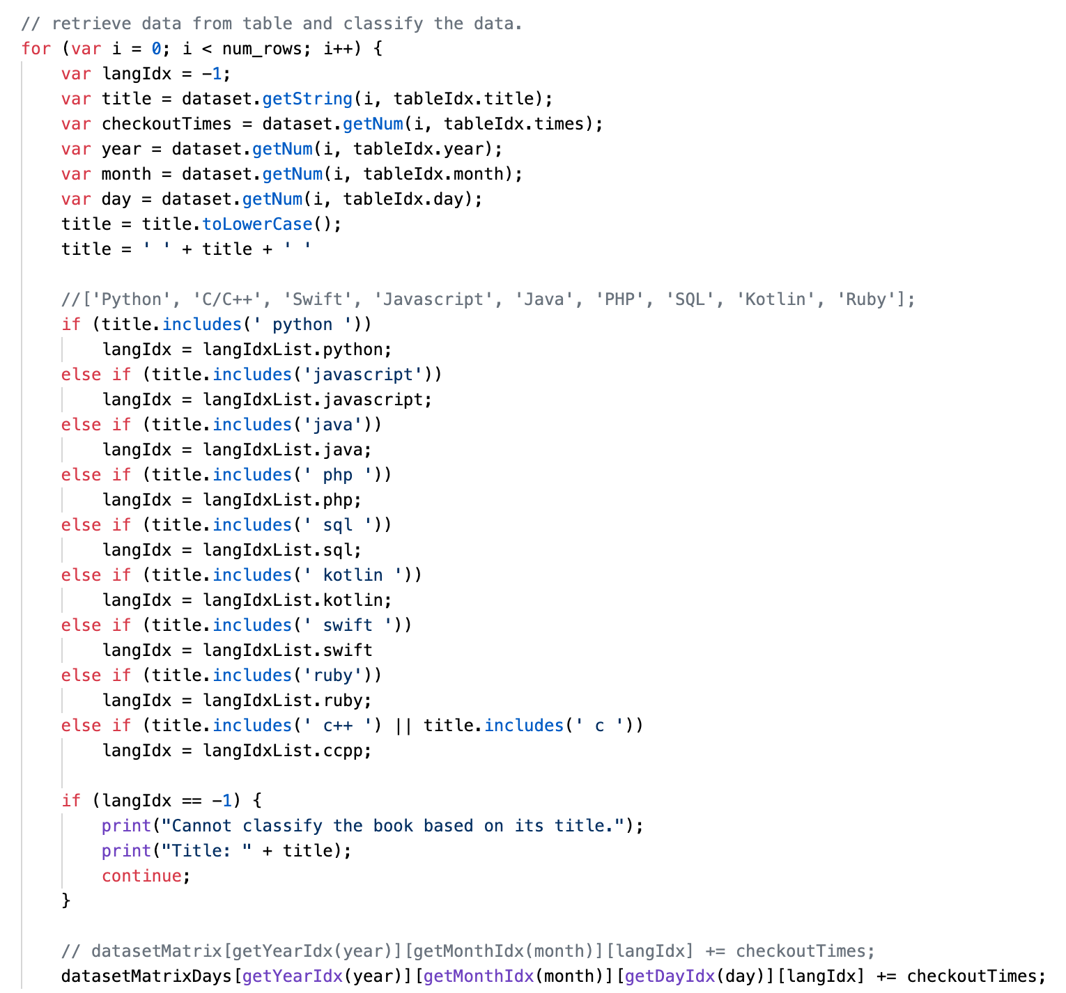
Basically what it does is to check if the title includes any keywords to indicate what programming language it is about, and then save to the corresponding cell determined by the date and the language itself.

To show the popularity of a specific programming language, I also need to classify the results and sum the checkout times of the same language together. But doing that in SQL is too hard, so I determined to process this in Javascript. The way I did that is to create a data matrix that contains the daily checkout times for a specific language. Here are the details of the code which handles book classification.

Basically what it does is to check if the title includes any keywords to indicate what programming language it is about, and then save to the corresponding cell determined by the date and the language itself.
Preliminary sketches
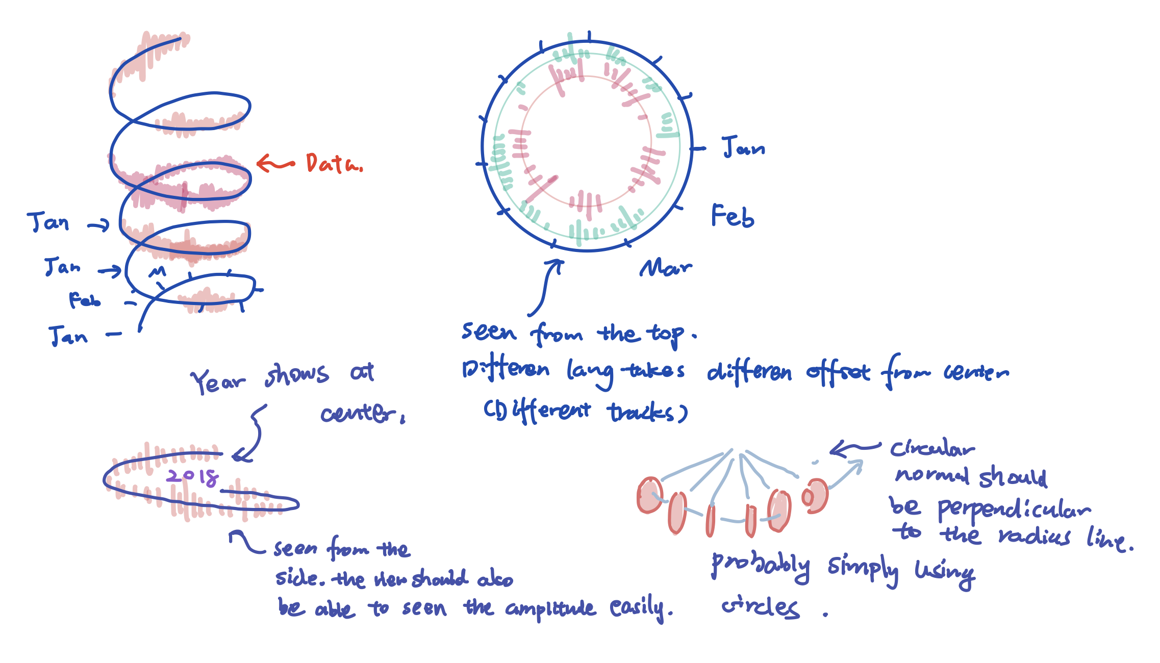
To fully utilize the extra dimensions in 3D space, I am trying to use the angle to represent the month information, and the height to represent the year. So overall the data will be presented following a helix pattern.
To differentiate the programming languages, I colored most of them based on their logo color, and each language will take one radius as their track so that they will not collide with each other.
The daily checkouts should be displayed using circles or torus so that the viewer can see the result from any angle.
Also, the user should be able to select the years and languages to be shown, it’s easy for the languages to be compared.

Process
Technically, this project can be divided into 3 stages. The first stage for sure is about fetching the necessary data from the SQL database using MySQL. Then after having the data in csv format, it enters the second stage - processing the data in javascript and saving them into customized data structures. The 3rd stage then is about rending and drawing the data on the screen. I splitted the drawing functions into drawing the data and drawing the measures.
When I first visualized the data, I tried to visualize it monthly, but the result was too sparse and discrete. I cannot see the overall trend day by day.
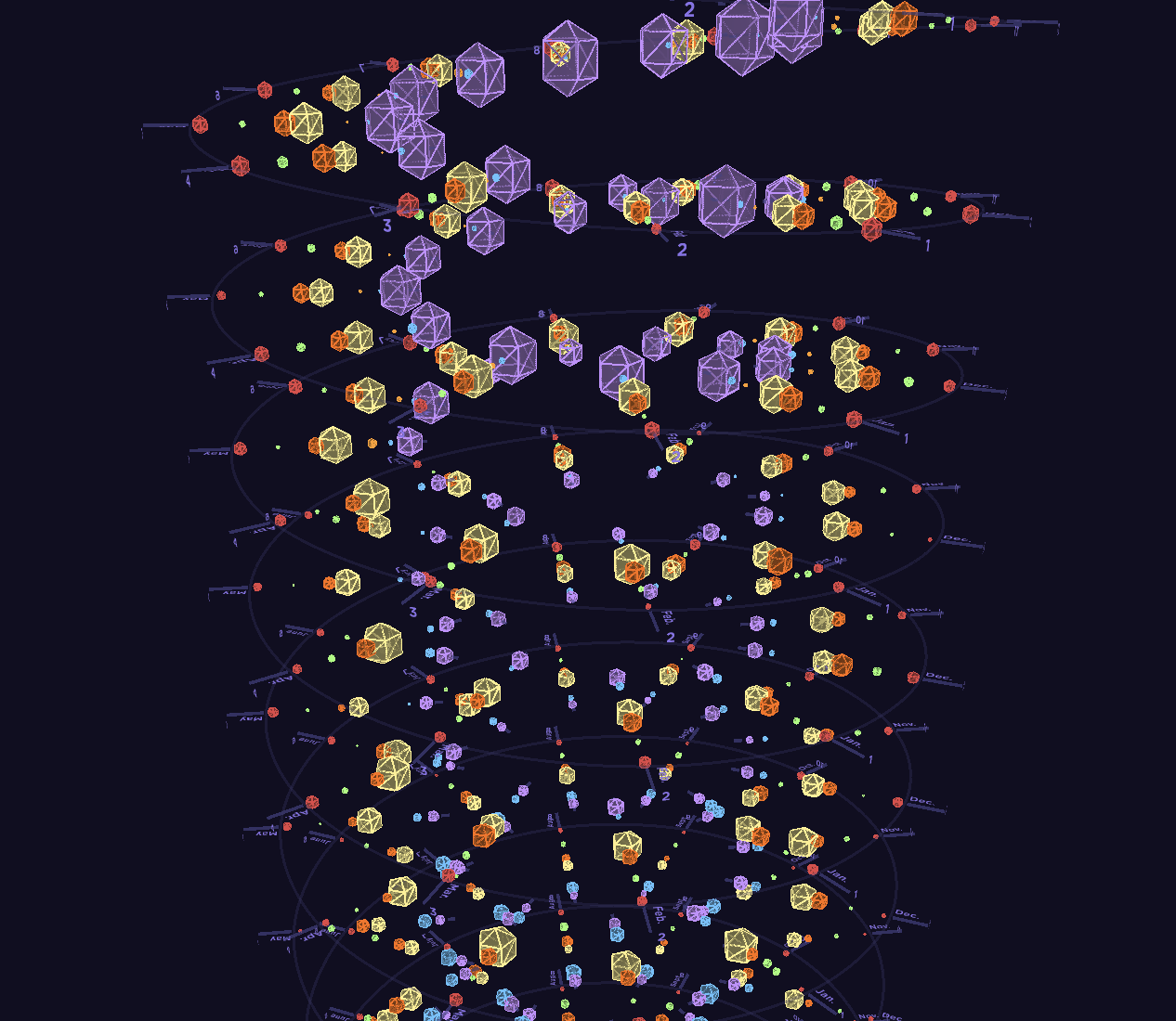
When I first visualized the data, I tried to visualize it monthly, but the result was too sparse and discrete. I cannot see the overall trend day by day.

Final result
Eventually I rendered the data based on the daily change. Here are the results.
Here it shows the data from 2008 to 2018 for all the programming languages.
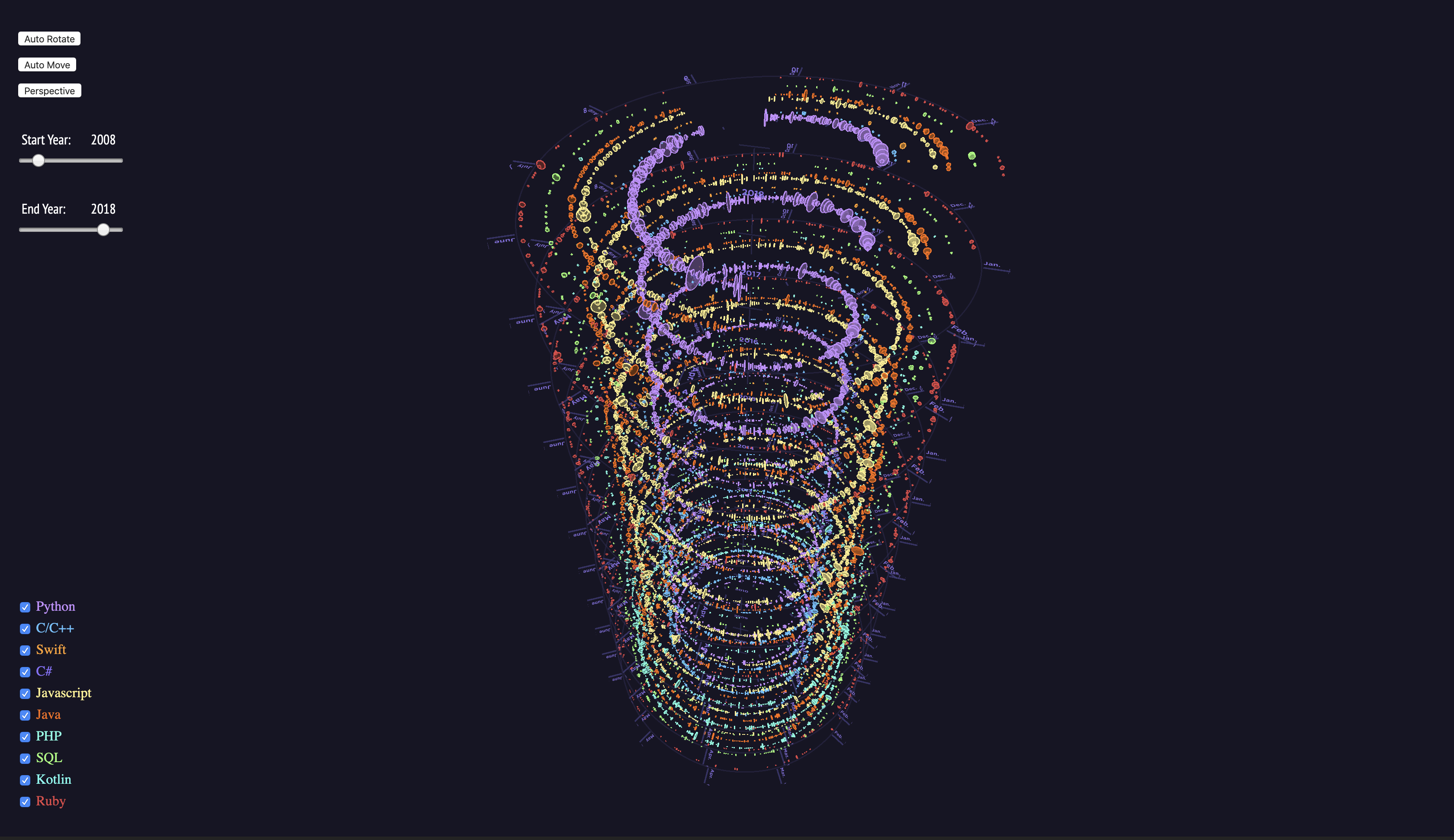
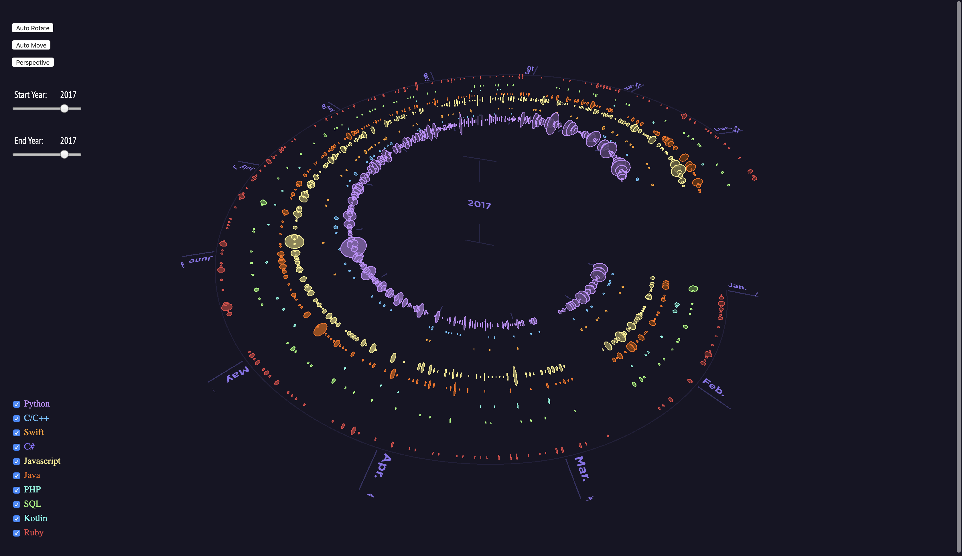
Users can select only one year to show, which makes it easier to visualize the relative popularity of these languages over one year.
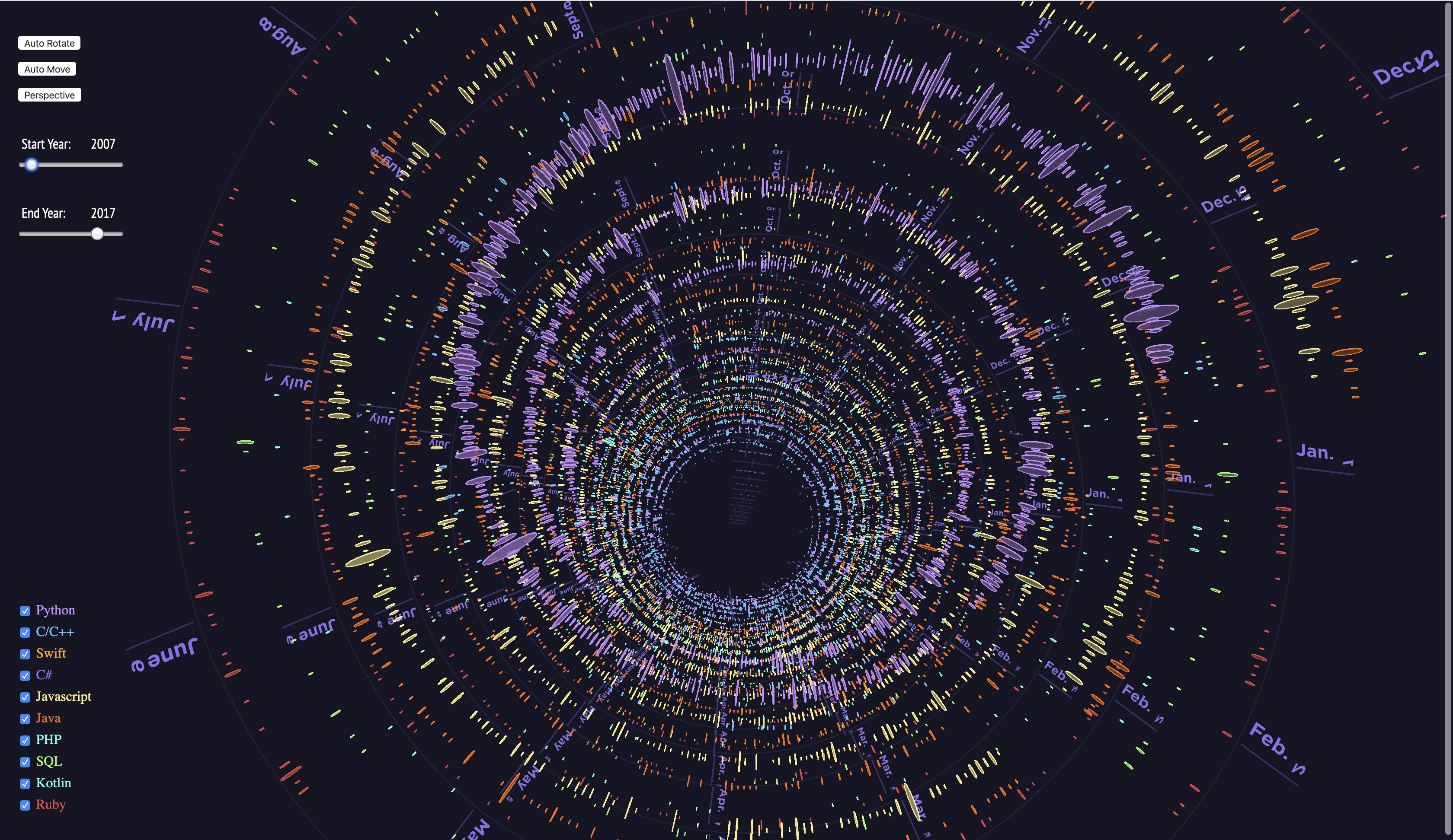
Seeing from the top, users can also see clearly the daily checkouts over the years, because circle diameter size implies the checkout times.
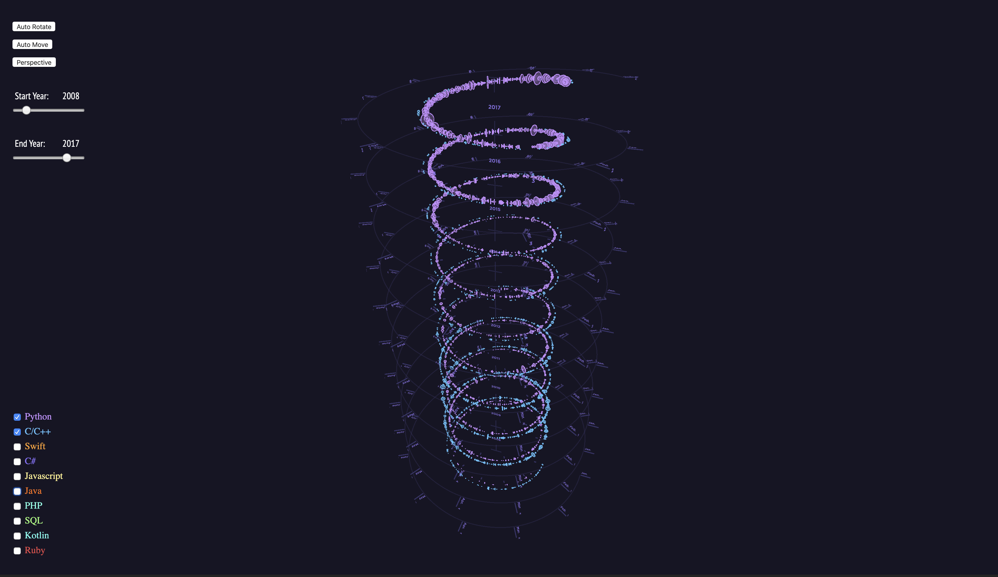
Users can turn off other languages to only show the languages they want to compare. For the following picture, I only turned on ‘Python’ and ‘C/C++’, we can see the trend of these two languages over the years. Obviously, Python is getting more and more popular and vice versa for C/C++.
Here it shows the data from 2008 to 2018 for all the programming languages.

Users can select only one year to show, which makes it easier to visualize the relative popularity of these languages over one year.

Seeing from the top, users can also see clearly the daily checkouts over the years, because circle diameter size implies the checkout times.

Users can turn off other languages to only show the languages they want to compare. For the following picture, I only turned on ‘Python’ and ‘C/C++’, we can see the trend of these two languages over the years. Obviously, Python is getting more and more popular and vice versa for C/C++.

Code