Examining Segregation through Travel Activity in Los Angeles & Orange Country
MAT 259, 2019
Susan Burtner
Concept
My final project is a culmination of my previous work (with a fair amount of highly appreciated help!) I want my dissertation research to involve examining travel activity of different communities of individuals to see how they move differently in space and how this can help us perceive "boundaries" of communities. Thus, the goal of this final project was to make a multi-layered network analysis of travel activity for a given area and population of interest.
The data I use comes from the California Household Travel Survey(http://www.dot.ca.gov/hq/tpp/offices/omsp/statewide_travel_analysis/chts.html). The survey consists of a one-day travel log from almost 50,000 households throughout California, from the years 2010-2013, using various data collection methods (GPS, written responses, etc.)
The data I use comes from the California Household Travel Survey(http://www.dot.ca.gov/hq/tpp/offices/omsp/statewide_travel_analysis/chts.html). The survey consists of a one-day travel log from almost 50,000 households throughout California, from the years 2010-2013, using various data collection methods (GPS, written responses, etc.)
Query
I did not run a query per se, but I took the initial data into R and created travel trajectories, which mainly involved connecting the places people went in sequence of one another. This meant joining personal information, household information, and travel activity information. Since there were still so many households in my area of interest, I decided to limit each network to those individuals who were in the top 50 in terms of number of places travelled.
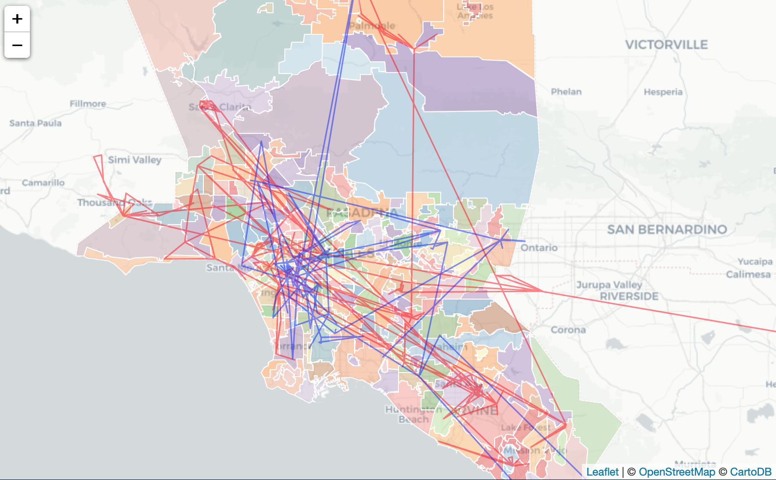
Preliminary sketches
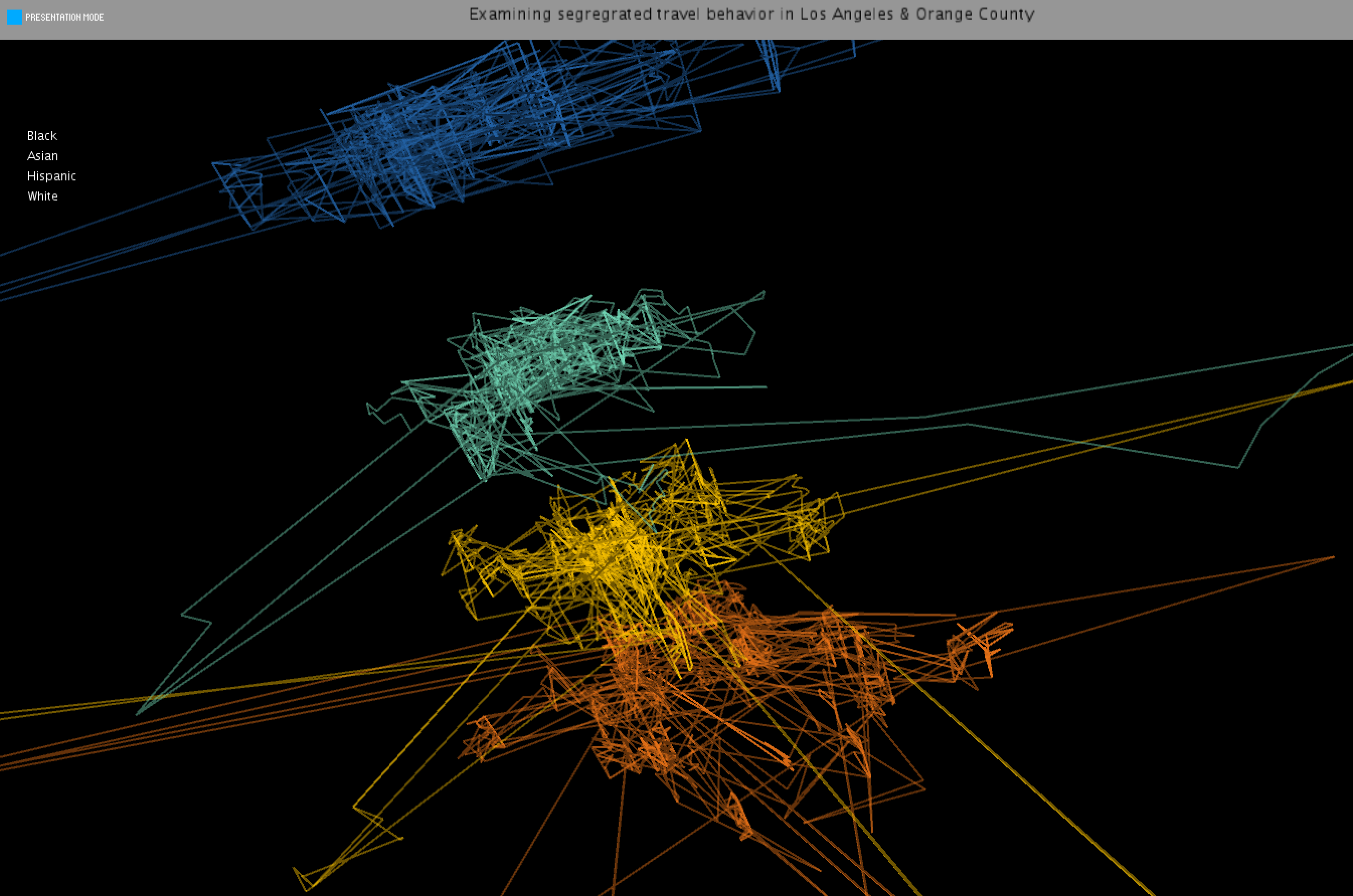
When I created an initial sketch in R, I could already see that my hypothesis that certain populations move differently in Los Angeles and Orange County had merit. Though it's difficult to see that when all the networks are layered on top of one another, just displaying two networks exposes the differences. I also brought in a shapefile (a digital map) of neighborhoods in LA & Orange County to help orient myself in the initial stages of data exploration.
Process
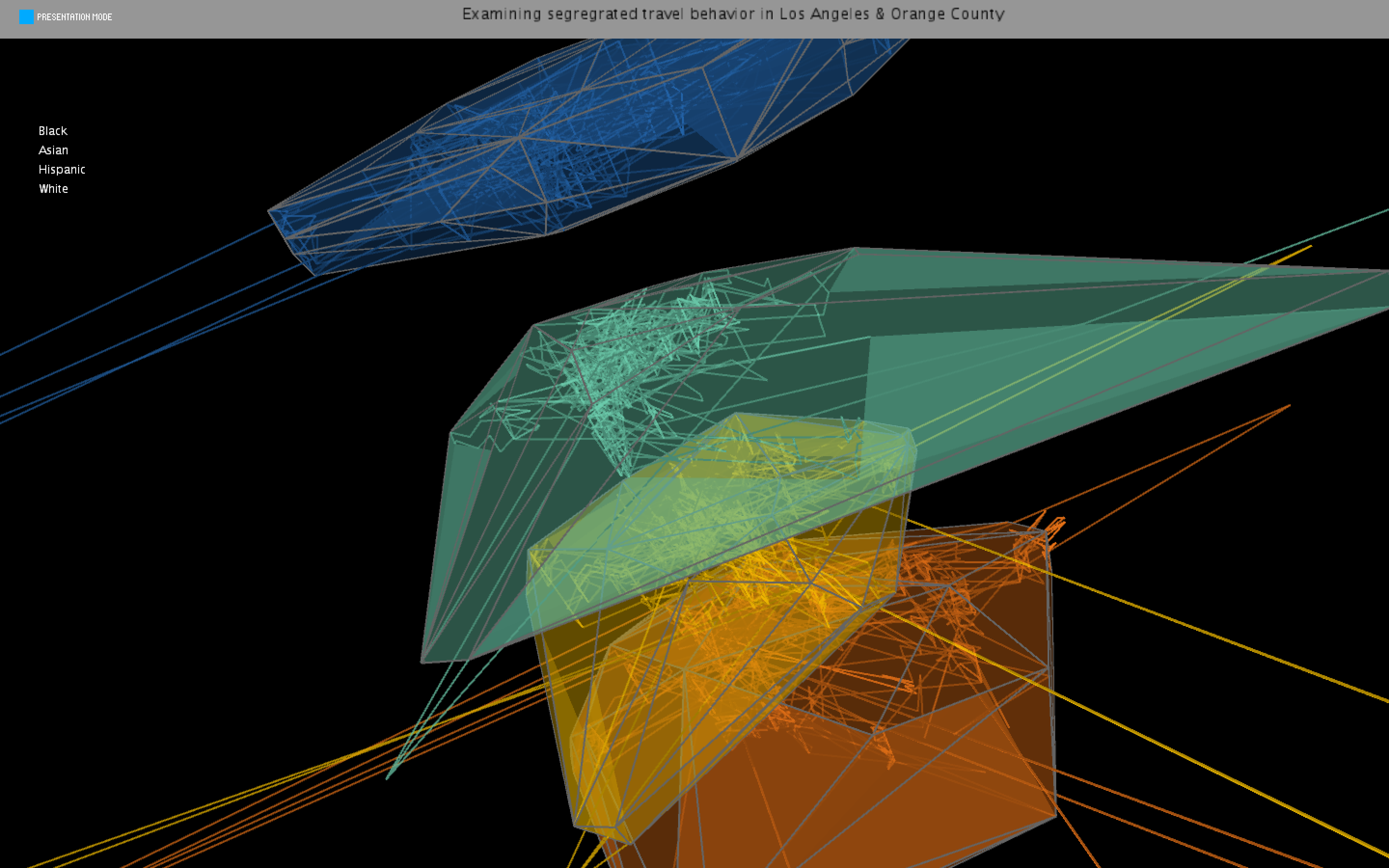
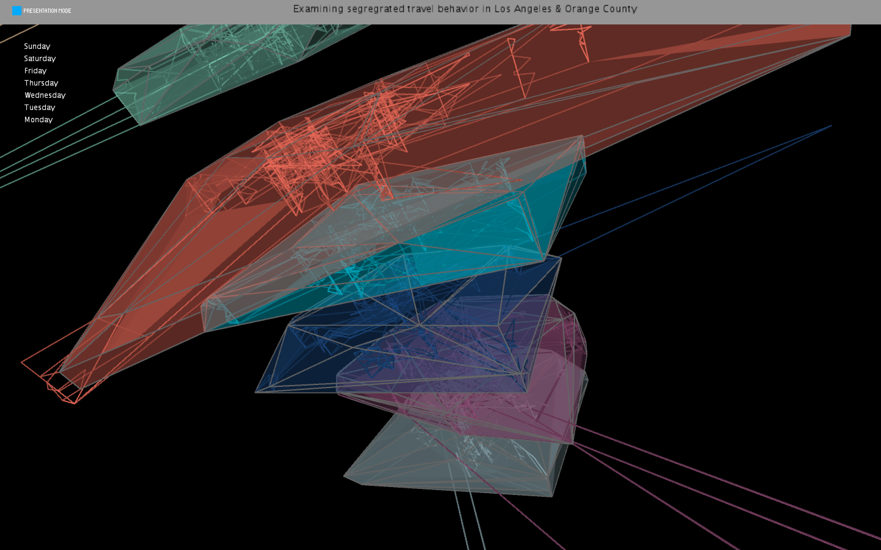
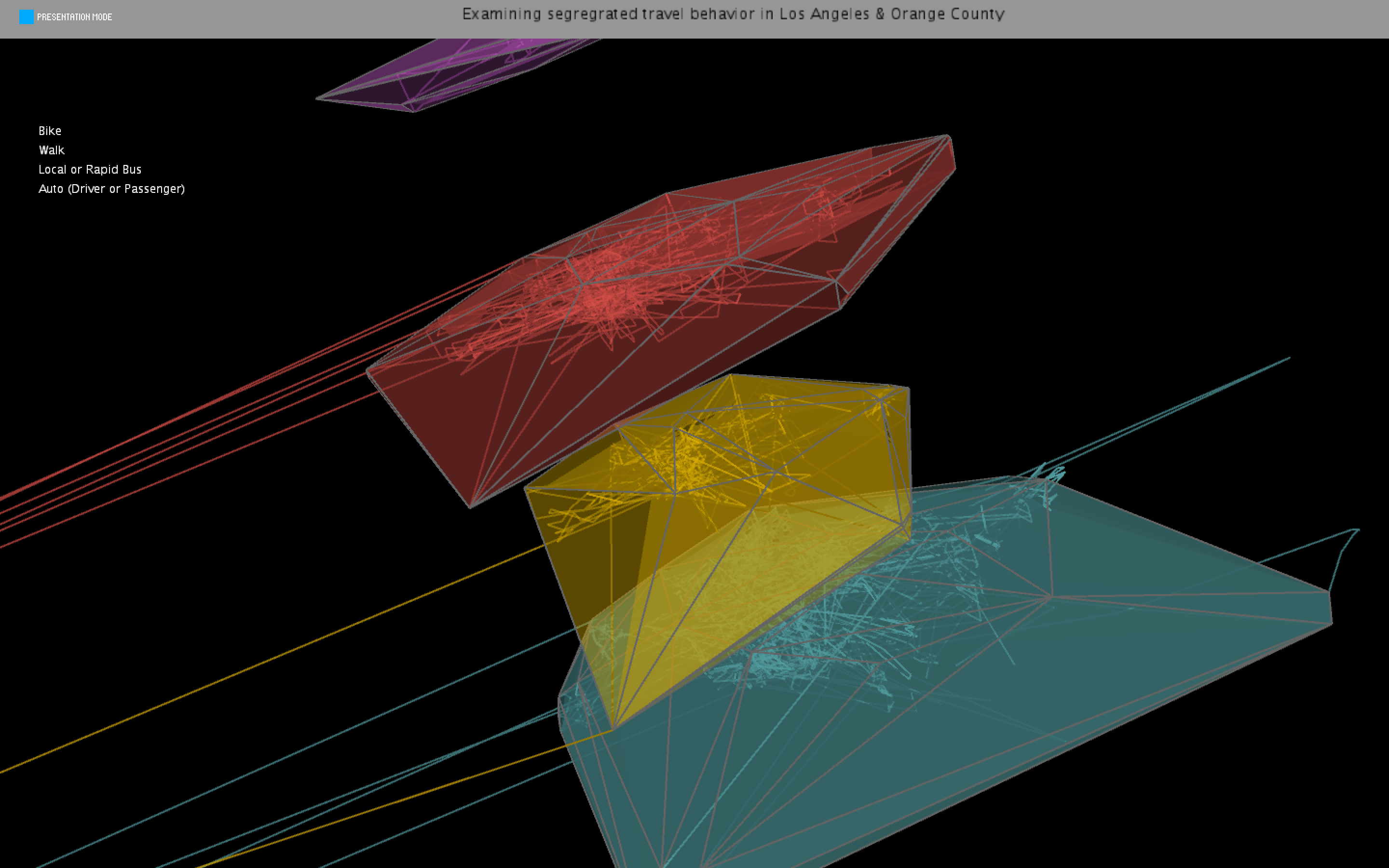
I again forgot to take more progress pictures, however, significant changes were made in between my class presentation and my final, final product. The images below showed the 3D visualization of my travel activity networks by race, day of the week, and mode of transit. At first I was only able to get one series of information (race) but eventually added the day of the week and modes of transporation (still filtered by the top 50 individuals by race.) The networks at this point were almost there, however, I still wanted to add some additional dimentionality within the layers, namely a time element, so you could see which people were going to the same places at the same time.
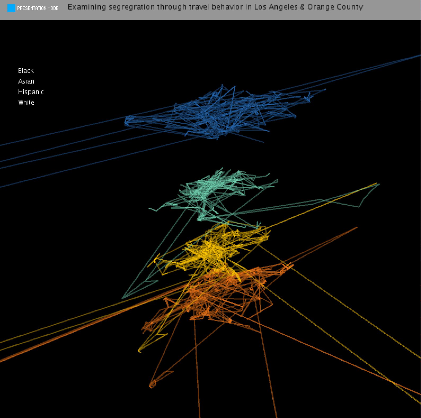
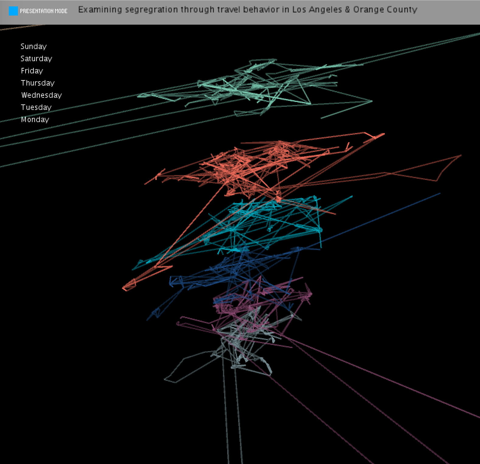
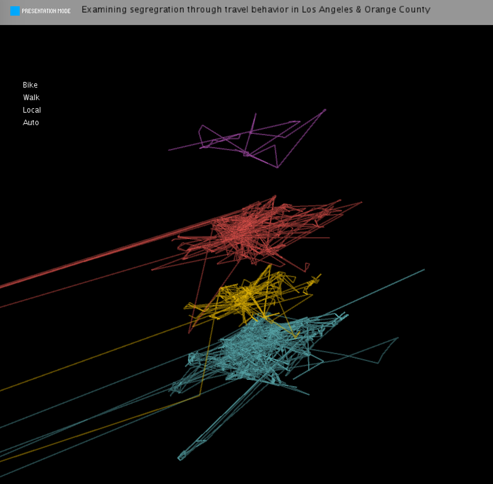
Final result
The final visualization incorporates several 3D elements at once, adding the arrival time of the individual at that place (multiplied my a constant so it can be seen better) for all layers. I also included a function to toggle the convex hulls of the travel activity spaces, and I think this adds another great tool for comparing the networks. This required bringing in an additional package in Complex Geometry, and credit is due to the creators of that Processing packages.
Overall, I am very happy with how the final visualization turned out. While I could further improve upon the trajectory constructions (right now, the individuals are connected one after the other to form one long polyline) I think this project at least provides a good proof of my original concept, and can serve me well as as a template for a visual aid in my future research.
Overall, I am very happy with how the final visualization turned out. While I could further improve upon the trajectory constructions (right now, the individuals are connected one after the other to form one long polyline) I think this project at least provides a good proof of my original concept, and can serve me well as as a template for a visual aid in my future research.
Code