Visualizing Power Production in Germany
MAT 259, 2017
Niklas Griessbaum
Concept
Large parts of German electricity generation is traded on the European Power Exchange Day-Ahead Spot market (EPEX-Spot). Electricity producers, retailers and traders place bids here every day to sell or buy electricity for each hour of the upcoming day. Once a day, the marked is cleared, the clearing price for each hour is determined, and all the according transactions are executed.
Since historically large portions of the power producing assets are owned by a small number of companies, insider knowledge is a big concern. The EPEX (and an according law) therefore are enforcing a number of transparency measures. One of them being that every power plant above a nominal power of 100 MW is obliged to report their power production with an hourly resolution. This data is publicly available on the website www.eex-transparency.com.
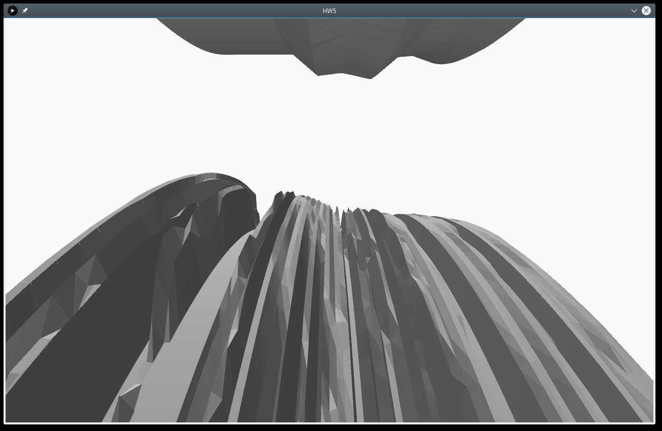
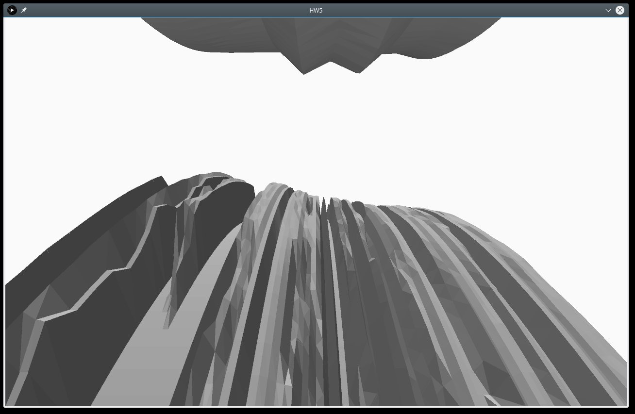
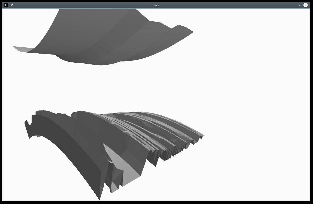
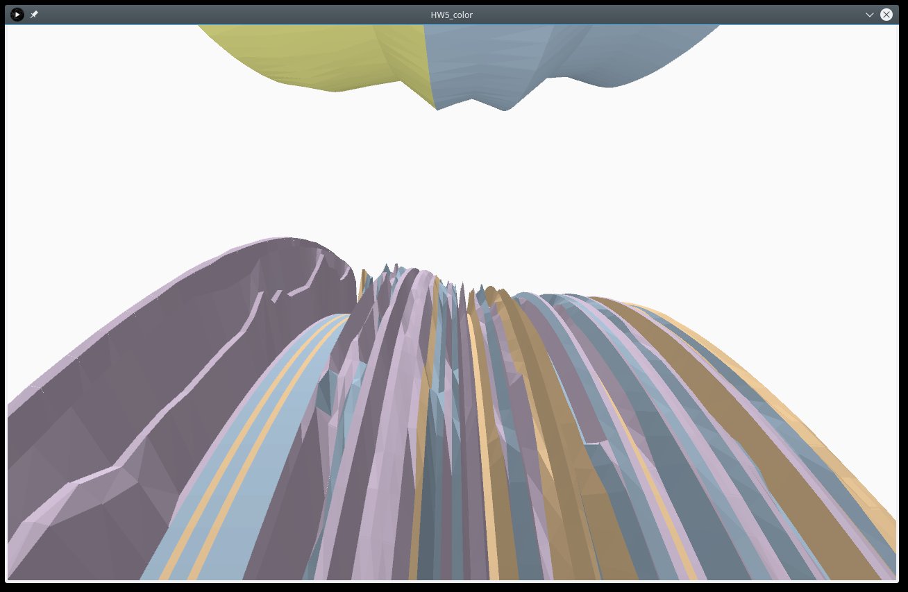
The data-set contains more than 200 reporting power plants over a time span of more than two years. Visualizing these time-series in a two-dimensional fashion is messy and information is not easily conceivable. I therefore attempted to line up the each time-series in a three dimensional space next to each other. Instead of spreading the data out in a linear space though, I bent time around the x-axis of the visualization. This has two effects:
From a theoretical point of view, each power plant has a specific (short-term marginal (i.e. not considering deprecation cost etc.)) power production price, which is defined by the fuel price and the efficiency of the plant. If the plants are ordered from lowest to highest power production price, a so called merit-order-list is created. Again theoretically, given a certain power demand, the merit order list can be used to determine the most expensive power plant that has to be activated to provide a certain power demand. The set of activated power plants therefore theoretically corresponds to the current power demand. There are occasions where we expect power plants not to be activated according to the merit order list because e.g. the power demand is changing too quickly for larger, cheaper plants to react so that smaller, more expensive power plants have to be activated first.
Given the theoretical behavior, I expected to see waves in my three-dimensional visualization. The waves would hereby be induced by the changes in the residual power demand (i.e. the power demand minus the power from renewable power generation). I expected that we would clearly see how the more flexible gas power plants would be ramping up quickly with increasing residual load and then would be relieved by cheaper coal power plants.
Since the behavior of the power plant operation is theoretically driven by the residual load, I included power production from wind and solar into the visualization. They are visualized as an opposingly rotating object on top of the screen. I expected that we would see how the renewable power production would "push down" the conventional power generation.
Since historically large portions of the power producing assets are owned by a small number of companies, insider knowledge is a big concern. The EPEX (and an according law) therefore are enforcing a number of transparency measures. One of them being that every power plant above a nominal power of 100 MW is obliged to report their power production with an hourly resolution. This data is publicly available on the website www.eex-transparency.com.
The data-set contains more than 200 reporting power plants over a time span of more than two years. Visualizing these time-series in a two-dimensional fashion is messy and information is not easily conceivable. I therefore attempted to line up the each time-series in a three dimensional space next to each other. Instead of spreading the data out in a linear space though, I bent time around the x-axis of the visualization. This has two effects:
- The visualization appears to resemble the rotation of a steam turbine in a thermal power plant, which, given the used data appears to be an appropriate metaphor.
- Due to the fact that data further in the future is hidden behind the horizon, it does not have to be visualized and hence saves computational power.
From a theoretical point of view, each power plant has a specific (short-term marginal (i.e. not considering deprecation cost etc.)) power production price, which is defined by the fuel price and the efficiency of the plant. If the plants are ordered from lowest to highest power production price, a so called merit-order-list is created. Again theoretically, given a certain power demand, the merit order list can be used to determine the most expensive power plant that has to be activated to provide a certain power demand. The set of activated power plants therefore theoretically corresponds to the current power demand. There are occasions where we expect power plants not to be activated according to the merit order list because e.g. the power demand is changing too quickly for larger, cheaper plants to react so that smaller, more expensive power plants have to be activated first.
Given the theoretical behavior, I expected to see waves in my three-dimensional visualization. The waves would hereby be induced by the changes in the residual power demand (i.e. the power demand minus the power from renewable power generation). I expected that we would clearly see how the more flexible gas power plants would be ramping up quickly with increasing residual load and then would be relieved by cheaper coal power plants.
Since the behavior of the power plant operation is theoretically driven by the residual load, I included power production from wind and solar into the visualization. They are visualized as an opposingly rotating object on top of the screen. I expected that we would see how the renewable power production would "push down" the conventional power generation.
Query
The data is sourced from the platform www.eex-transparency . For this purpose, I developped a web-scraper and set up an according database. The database schema and the codebase for the web-scraper is available on github: https://bitbucket.org/niklasphabian/energy_db. I then iteratively querried the database for each power plant's timeseries.
Final Result
In the visualization, one ring of the (lower) rotating object represents one power plant. We have one value for each hour. The power production of each plant corresponds to the (ever changing) radius of each ring. Since the behavior of the power plant operation is theoretically driven by the residual load, I included power production from wind and solar into the visualization. They are visualized as an opposingly rotating object on top of the screen. I expected that we would see how the renewable power production would "push down" the conventional power generation.
Evaluation/Analysis
The expected waves, at best, are very hard to observe in the chosen visualization. The dispatch appears to be far more random than expected. This ultimately leads to the conclusion that plant dispatch is far more complex (in its original meaning) than anticipated with the before described mental
model. A few of the invalid simplifications may include:
I encountered some issues regarding the performance of the sketch. I believe the issue of why this sketch is so power-hungry is my approach of trying to visualize a big and complicated surface and the way processing handles pshapes: Each data point I have is one (invisible) dot in my visualization. Each dot is connected through a (visual) triangle to two of its neighbors. That way, I can create an arbitrarily looking surface. However, I end up with several thousand triangles. While only a hand full of them are visualized at the same time (because most of them are hidden behind the horizon), all of them are created and saved in memory during the startup of the sketch. At some point, with too much objects in the memory, the computer starts to choke. However, this limit seems to be different for each computer. It is somewhat an issue with pshapes that I did not anticipate: I expected that the objects would be created when we draw them and discarded afterwards. However, it turns out that all phshapes remain in memory until termination of the sketch and there appears to be no handling to manually discard them. Unfortunately, I only found out about this behavior quite late in the process.
- The power production cost of a power plant does not stay constant over its range of power output. I.e. the cost of marginal power output at 50 % load may be very different from the marginal power output at 100 % load. Consequently power plants are not activated strictly one after another.
- There is a geospatial component to power production. Network congestion may force operators to activate more expensive power plants before cheaper power plants.
- Power plant dispatch is heterogeneously optimized by the individual operators and may obey to long term strategies and tactics resulting in (for the uninformed observer) surprising dispatch.
I encountered some issues regarding the performance of the sketch. I believe the issue of why this sketch is so power-hungry is my approach of trying to visualize a big and complicated surface and the way processing handles pshapes: Each data point I have is one (invisible) dot in my visualization. Each dot is connected through a (visual) triangle to two of its neighbors. That way, I can create an arbitrarily looking surface. However, I end up with several thousand triangles. While only a hand full of them are visualized at the same time (because most of them are hidden behind the horizon), all of them are created and saved in memory during the startup of the sketch. At some point, with too much objects in the memory, the computer starts to choke. However, this limit seems to be different for each computer. It is somewhat an issue with pshapes that I did not anticipate: I expected that the objects would be created when we draw them and discarded afterwards. However, it turns out that all phshapes remain in memory until termination of the sketch and there appears to be no handling to manually discard them. Unfortunately, I only found out about this behavior quite late in the process.
Code