Final Project: Capital Bike Flow
MAT 259, Winter 2017
Kimberly Schlesinger
Concept
With this project, I chose to explore the visualization of transportation data. I was specifically interested in finding a design to highlight interesting patterns in the flow of traffic between different points, without relying on geographical locations and routes. I chose to use publicly available data from Capital Bikeshare, Washington, DC’s bike share system. Users register for either a long-term or a short-term membership, and can then make trips using city-owned bicycles docked at various stations across DC and the surrounding metro area. At the end of the trip, they must dock the bike back in a station again. I am interested in exploring and visualizing the characteristics of the different stations and the rides that users make between them.
Data
Obtaining the data for this project was as simple as downloading some zipped files from the Capital Bikeshare website. However, since this data simply consisted of large .csv files listing the characteristics of millions of bike trips, figuring out the best ways to work with the data took more effort. I ended up creating my own locally hosted MySQL database so that I could store the data and design queries. Although it took some time to resolve formatting inconsistencies in the original data, this setup made the analysis much easier.
After looking through multiple years of data, I decided to focus on data from about 2.5 million bike rides from Jan - Sep 2016. It includes the start and end times, duration, start and end bike stations, bike ID, and account type of the user for each ride. Eventually I would like to compare data from different years and especially from different cities, but the work involved in cleaning and processing data from other cities wasn't realistic for this project.
After looking through multiple years of data, I decided to focus on data from about 2.5 million bike rides from Jan - Sep 2016. It includes the start and end times, duration, start and end bike stations, bike ID, and account type of the user for each ride. Eventually I would like to compare data from different years and especially from different cities, but the work involved in cleaning and processing data from other cities wasn't realistic for this project.
Process
I treated the data as a network of 392 bike stations and the routes between them, and used network properties to determine the 3D layout. First, I used a force-directed graph layout algorithm (implemented with the graphviz algorithms found in the python graph module "networkx") to find the station positions in 2D, keeping each pair of stations closer together if they had more total rides between them. To determine the 3rd coordinate of each station, I tried a few different graph metrics that quantify the role of each node in the graph. These choices create interesting 3D shapes for the city based on its bike riding patterns.
My initial idea was to show each bike ride separately as its own data point in the visualization of the bike routes between stations, but the variation in number of rides between each pair of stations, and the sheer number of rides overall, made this too slow and unwieldy. Instead, I found the average properties of the rides on each route by month, and drew a curve representing each route, whose shape was determined by these properties. Since the many curves in the graph caused a lot of visual clutter, I made them mostly translucent, and only plotted those bike routes that had at least 200 total rides. I added interactivity that allows the user to highlight a station’s tours by mousing over them, and to make the other stations invisible.
Overall, I am fairly happy with the way the visualization turned out and how I was able to capture different aspects of station and route relationships with 3D positioning. The hardest parts of this project were working out issues with the display and camera, and preprocessing the data: even after performing MySQL queries, I had to write several python scripts to perform the clustering analysis, and to re-format and threshold the data in order to reduce the sketch loading time.
Final visualization
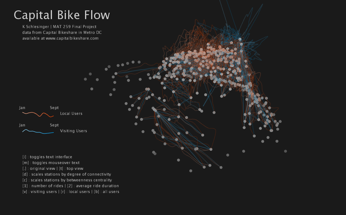
Each bike station is represented by a white or gray dot, whose 3D position is determined by its properties in the network or graph of bike rides. First, the stations are clustered in 2D, using a force-directed graph layout algorithm. This method simulates the dots as if they were connected by mechanical forces such as springs, and arranges them to satisfy the forces by minimizing the spring energy. I used the number of rides between each pair of stations to set the force strengths; this means that stations with more rides between them will tend to be placed closer together, and those with very few rides or no rides between them will be pushed further apart. Running this algorithm provides the 2D positions (as seen from the top view).
The height (third position coordinate) of each station is then determined by either the station's "degree of connectivity" or its "betweenness centrality." (Pressing "d" and "c" will switch between these options.) Stations with a higher degree of connectivity have routes between them and many other stations, while those with a low degree only have routes to a few other stations. Stations with a high betweenness centrality are on the most efficient paths of travel through the network, and are important "links" between different areas of the network. Examples of these are the stations right on the river between DC and Virginia, or other places where there are only a few paths between different clusters of stations.
The routes between pairs of stations are represented by orange or blue curves. Orange lines represent rides by long-term users (locals) and blue lines represent rides by visiting users (tourists). As each route moves from January to September (denoted by increasing saturation), the displacement of the route from the straight-line path between its two stations denotes the number of rides along that route in that month. By pressing "1" and "2", a user can change the route displacements to instead represent the average duration of rides on that route.
There are several interactive components. Mousing over a station will display the station’s name, and highlight the routes to and from that station. Pressing "r" causes all stations to disappear when not moused over. As mentioned above, a user can switch between viewing the station connectivity or centrality, and between viewing the number of bike rides and the average duration of rides. Pressing "v", "l", or "b" will turn on the visitor or local rides, or both. Pressing "i" toggles the text interface, and pressing “m” toggles the station name display. Finally, different views are available by pressing "." and "t".
Images
Initial view. Shape of the city is visible with station height corresponding to the degree of connectivity.
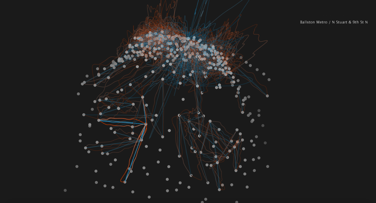
Rotated view, with Ballston Metro station and its connections highlighted with the mouseover interaction.
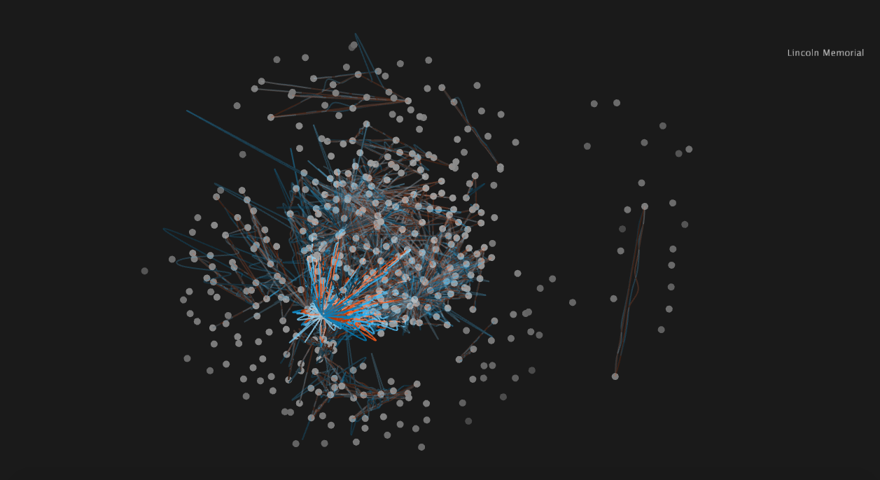
Top view. The split running along the left side corresponds to the Potomac River. Lincoln Memorial, an often-used tourist station, is highlighted.
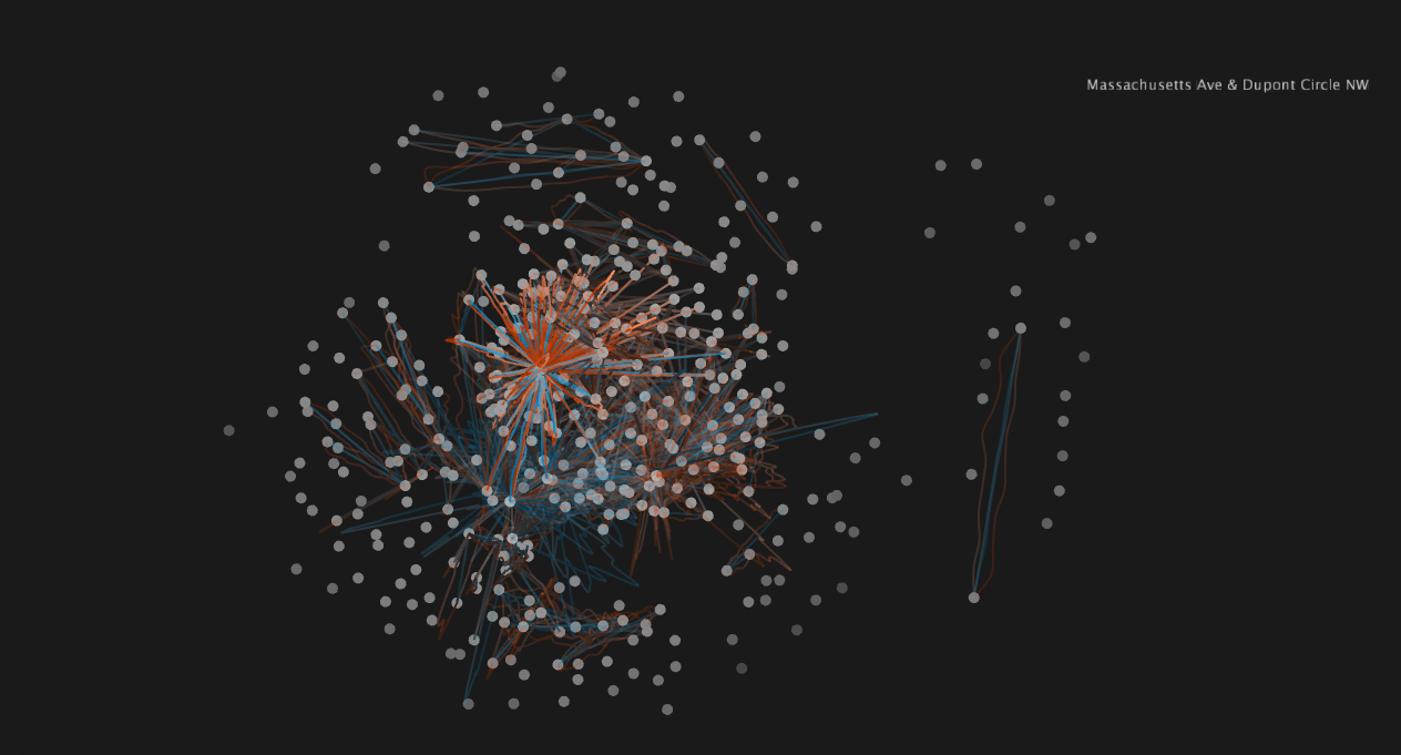
The same top view with a different station highlighted, this one with many more commuter rides than the Lincoln Memorial, especially traveling to stations near the top of the screen.
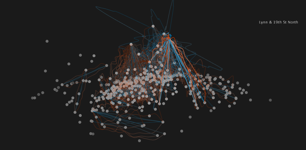
Side view with station height = betweenness centrality. Many of the stations with highest betweenness centrality lie near the river crossing, which can be seen as the split near the right hand side. Lynn & 19th St station in Virginia is highlighted, a popular point for crossing the river into DC.
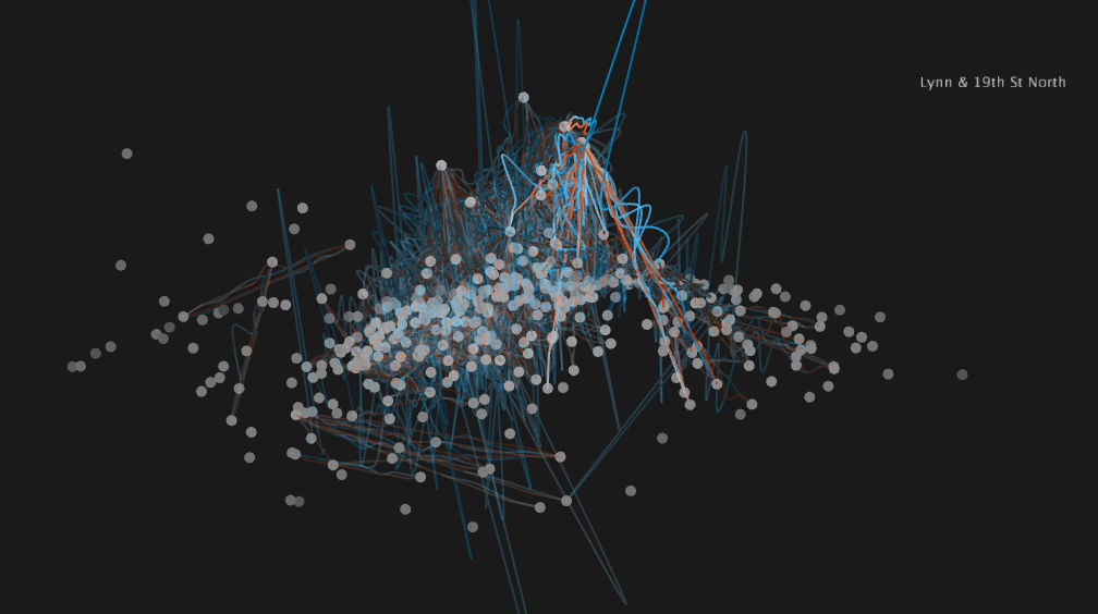
Same side view as above, now with routes showing ride duration. Clearly the blue (tourist) rides take much longer to complete on average.
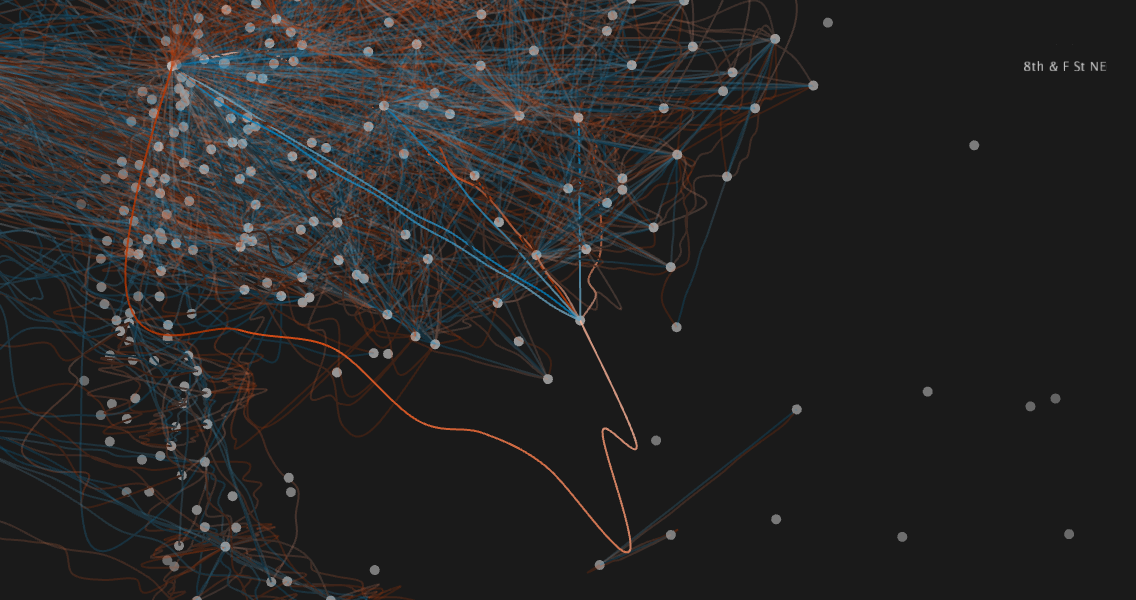
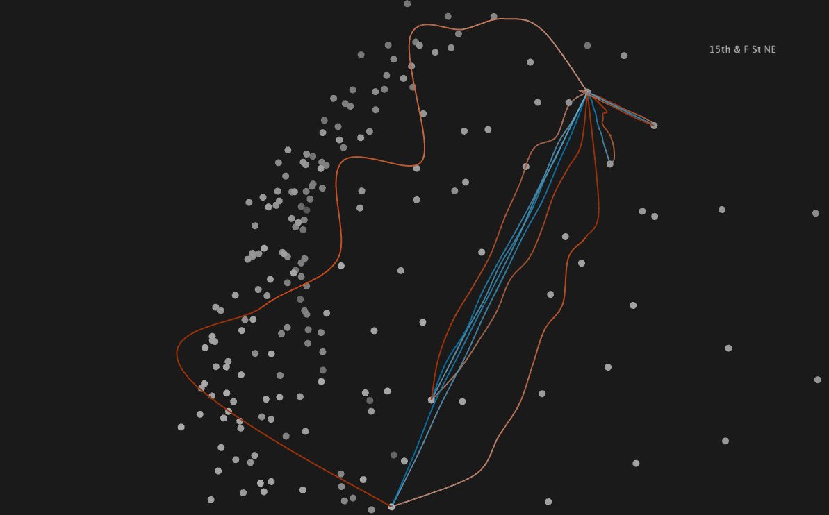
Close-up of route mainly used by commuters: 8th and F St NE (highlighted) to Union station (in top left corner). Many locals ride this route, especially after the winter months are over.
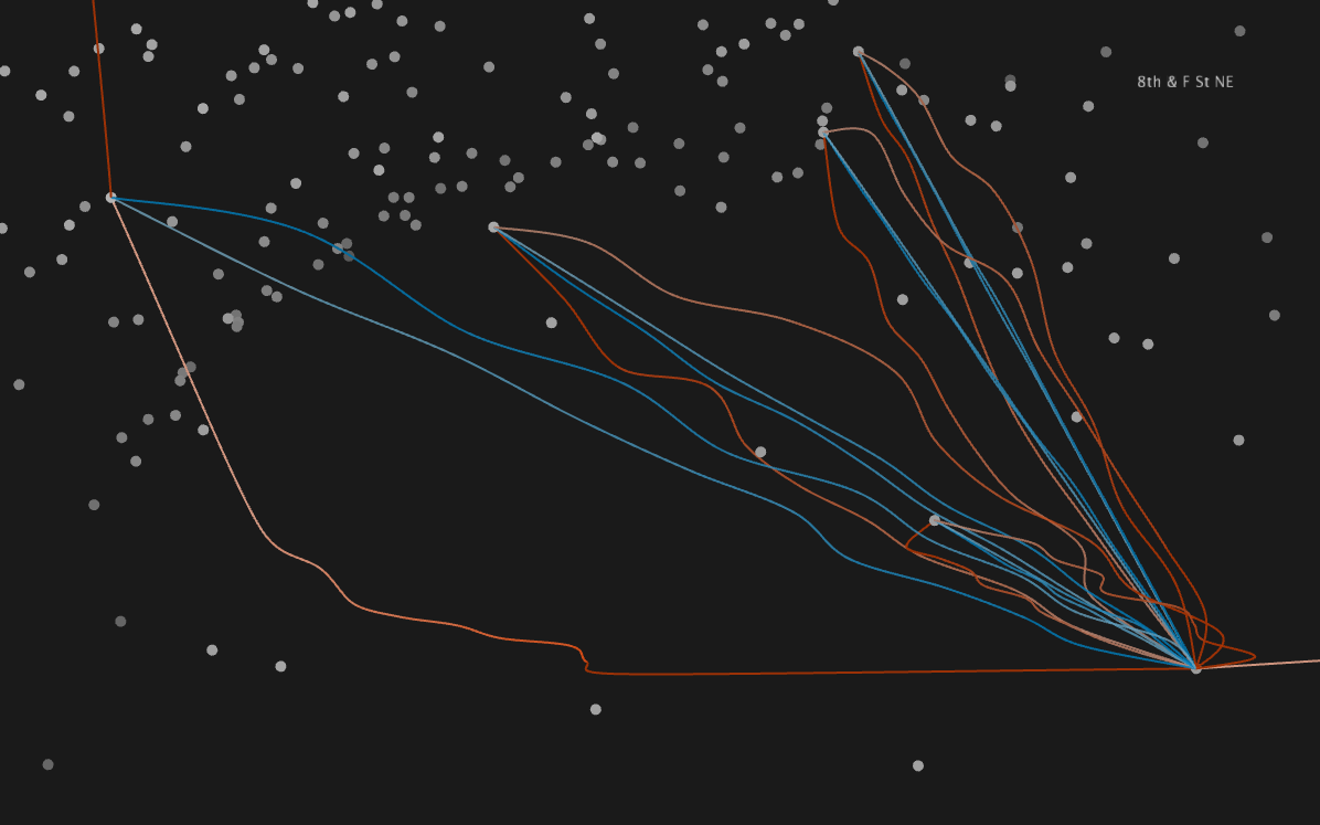
The same route, this time from another angle and with all other routes invisible for easier viewing.
Another example of a highlighted route with the other routes invisible.
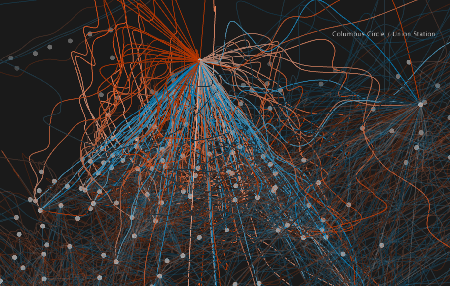
Close-up of Union Station, one of the most popular bike stations, with route lines showing number of rides. Most of these routes see many more locals than tourists riding.
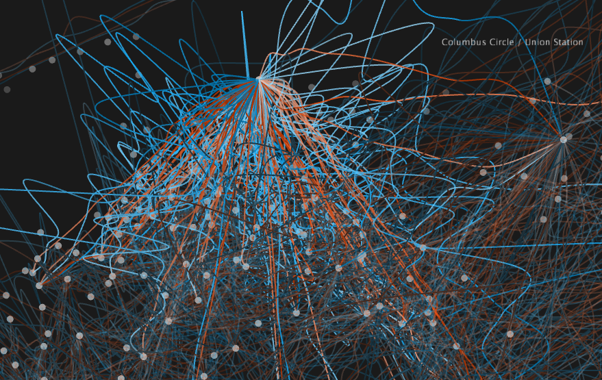
Close-up of Union Station, now in “ride duration” mode. As with most stations, the tourist rides from this station are much longer than the local rides in duration.
Rotated view, with Ballston Metro station and its connections highlighted with the mouseover interaction.
Top view. The split running along the left side corresponds to the Potomac River. Lincoln Memorial, an often-used tourist station, is highlighted.
The same top view with a different station highlighted, this one with many more commuter rides than the Lincoln Memorial, especially traveling to stations near the top of the screen.
Side view with station height = betweenness centrality. Many of the stations with highest betweenness centrality lie near the river crossing, which can be seen as the split near the right hand side. Lynn & 19th St station in Virginia is highlighted, a popular point for crossing the river into DC.
Same side view as above, now with routes showing ride duration. Clearly the blue (tourist) rides take much longer to complete on average.
Close-up of route mainly used by commuters: 8th and F St NE (highlighted) to Union station (in top left corner). Many locals ride this route, especially after the winter months are over.
The same route, this time from another angle and with all other routes invisible for easier viewing.
Another example of a highlighted route with the other routes invisible.
Close-up of Union Station, one of the most popular bike stations, with route lines showing number of rides. Most of these routes see many more locals than tourists riding.
Close-up of Union Station, now in “ride duration” mode. As with most stations, the tourist rides from this station are much longer than the local rides in duration.
Code
Here I have attached my code for rendering the sketch in Processing, as well as the data. I have also included the Python scripts written to perform the data preprocessing and 2D clustering, as well as a table of the graph metrics calculated in Python.
Source Code + Data