Trends of the Top Crunchbase People
MAT 259, 2016
Ariella Gilmore
Concept
My final project I decided to take the top ten people off https://www.crunchbase.com/app/search/people and show their google trends. Crunchbase "is the leading platform to discover innovative companies and the people behind them." I had an internship in a Equity Crowdfunding company (similar to Kickstarter) that helped me discover this website. For each person listed, Crunchbase also lists their primary company they are related to. I then used Google Trends to see how often each person and their company were being searched over the past 5 years. This gave a weekly report of how many times each person/company was being googled.
Query
Gathering the information I was able to just use the names of the top people listed on Crunchbase and the company they are associated with. I then used google trends and saved the csv file to see the amount of searches each person and company every week over the past five years.
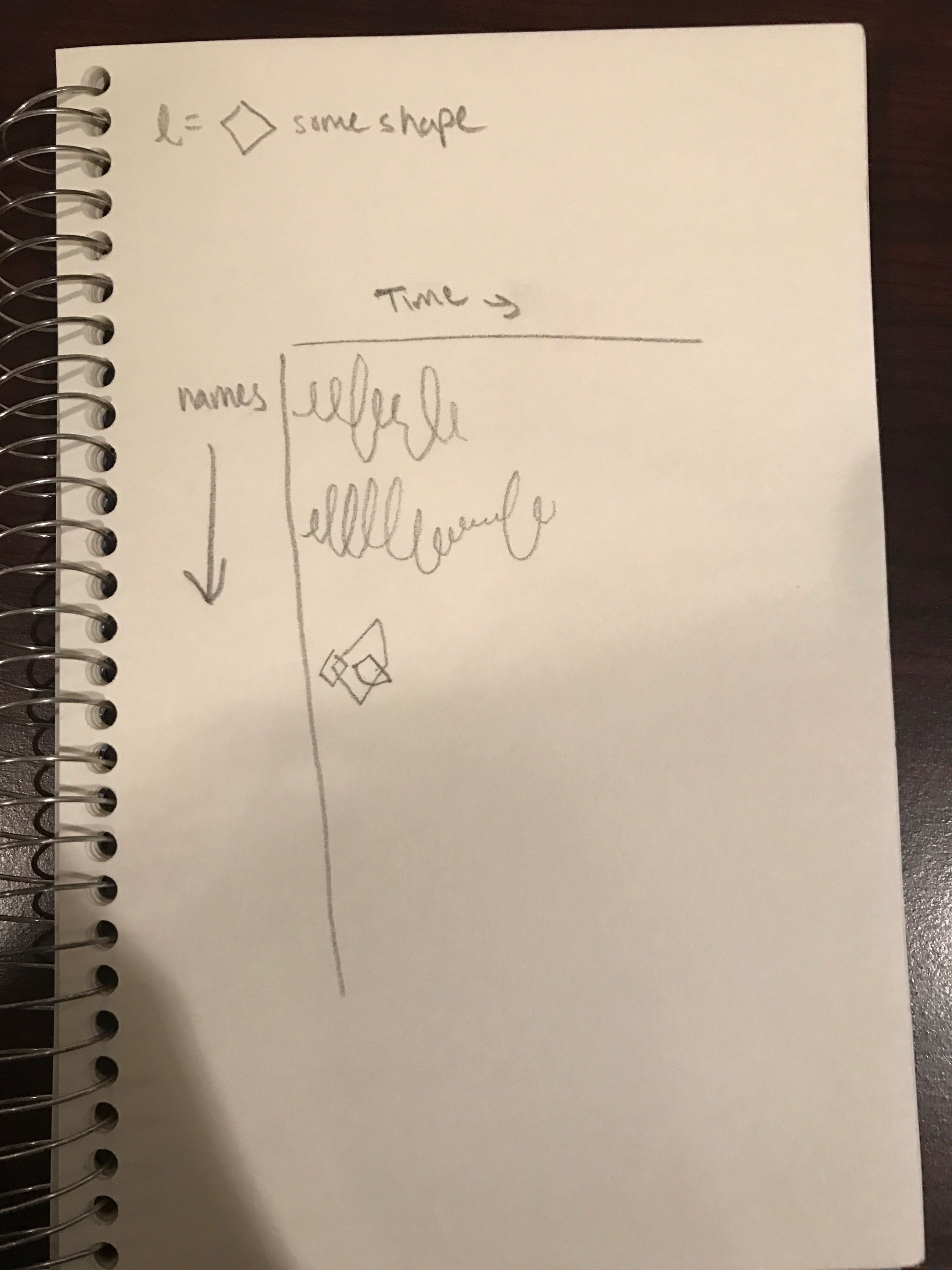
Preliminary sketches
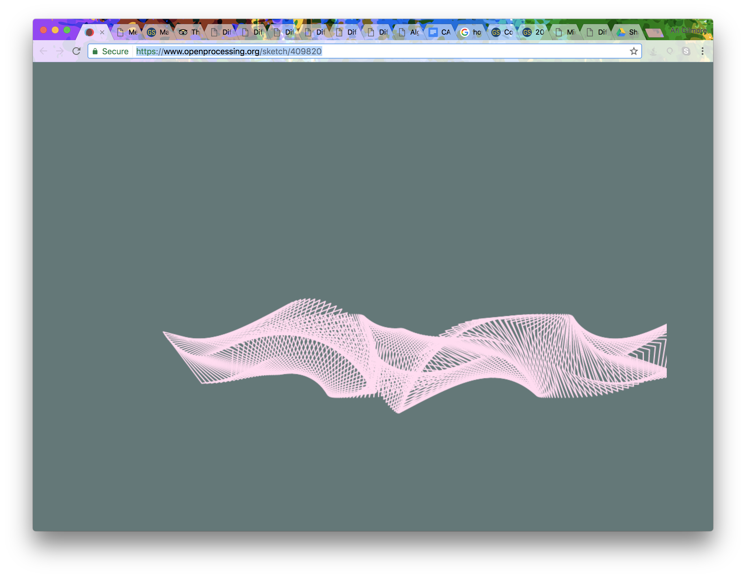
Before starting my visualization I got idea from openprocessing.com and used this sketch: https://www.openprocessing.org/sketch/409820. I was able to distort it to make my own and input my information, so the data could be represented.
Process
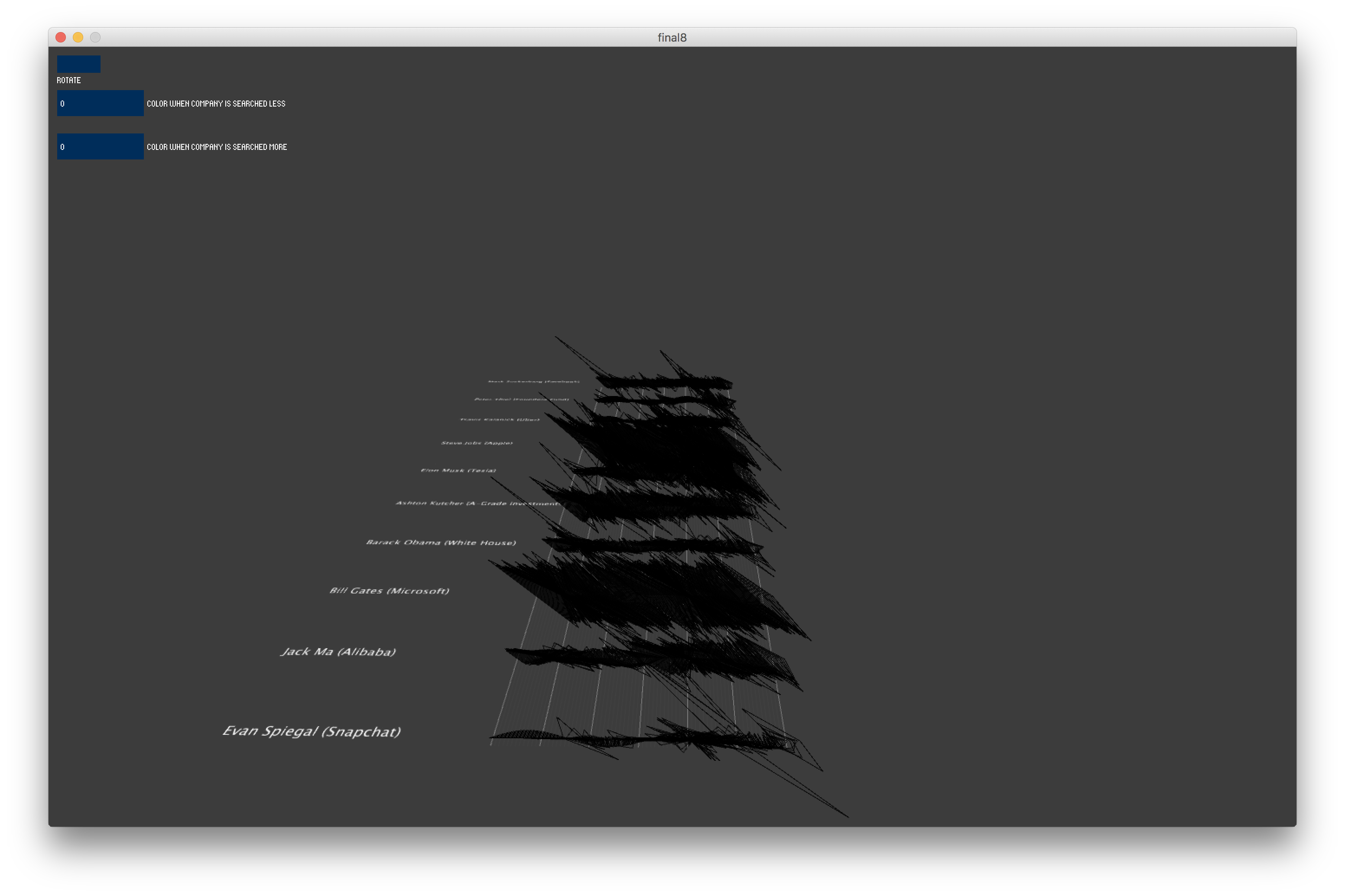
Before adding the company aspect to the shape, the shape was only represented in 2D with no interesting color.
Final result
Visualization:
Each person has it's own shape created from different quads. The length of each quad is dependent on how many times that person was searched in that given week. As you can see in the image below, Mark Zuckerberg was searched a lot during a period in 2012, while Steve Jobs is constantly being searched a lot from 2012 to 2017. The shape is also rotating each quad at a certain angle and that angle depends on how often there company is being searched. Because this is very unclear to see, but just added an interesting effect to the shape, I also added color which reinforced how often the company was being searched. Again looking at Mark Zuckerberg, one can see that Facebook was being googled a lot more in 2012 then 2017. The reason Microsoft is all the pink color is probably people trying to constantly figure out how to use or download Microsoft on to there computer. The first image, I used the colors pink and blue because in my opinion I liked those colors the most.
Controls:
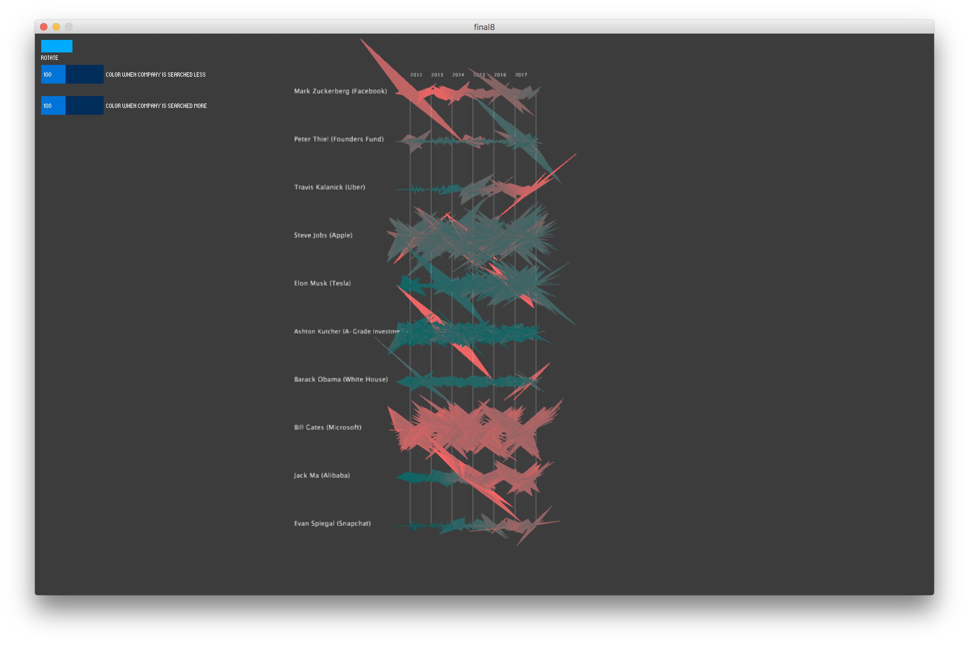
I came across a few other colors though that also helped show the data, so I decided to add a slider, so that the viewer is able to choose what colors they want to see. In the second image, I set the values to zero, created a brighter red when the company is searched more and a dark red when the company is not searched as much. The rotate button at the top rotates each person's shape, so some of the quads might become more visible if they are being obstructed by the angle they are positioned at. Also, if you press the "f" key it will fill the each shape, which might give the viewer a clearer perspective and pressing "d" will reset the fill. Any other key will rotate the entire image, so one can view it from the side or back to get a different perspective.
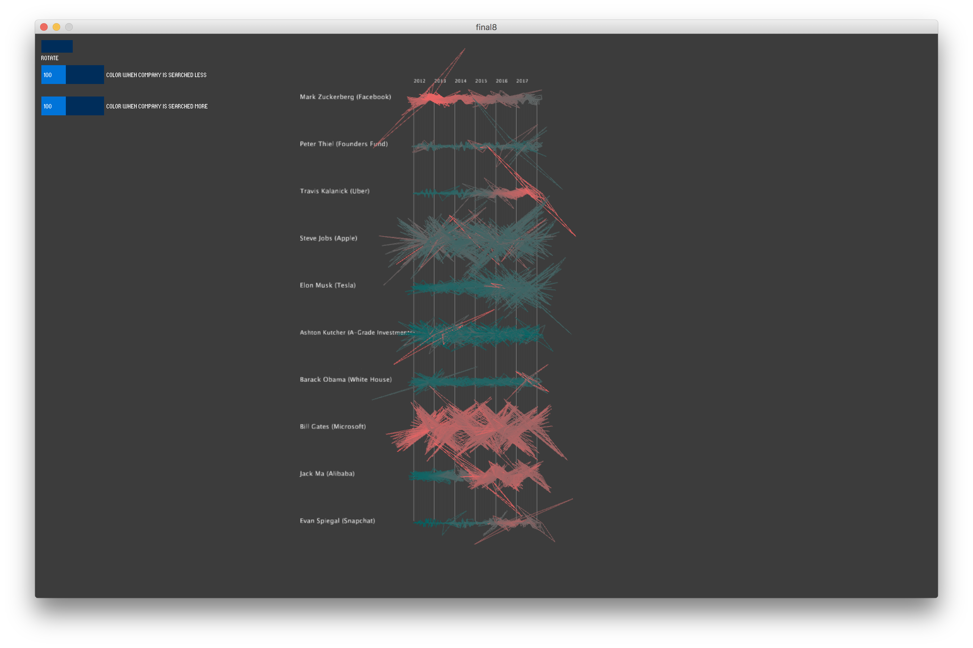
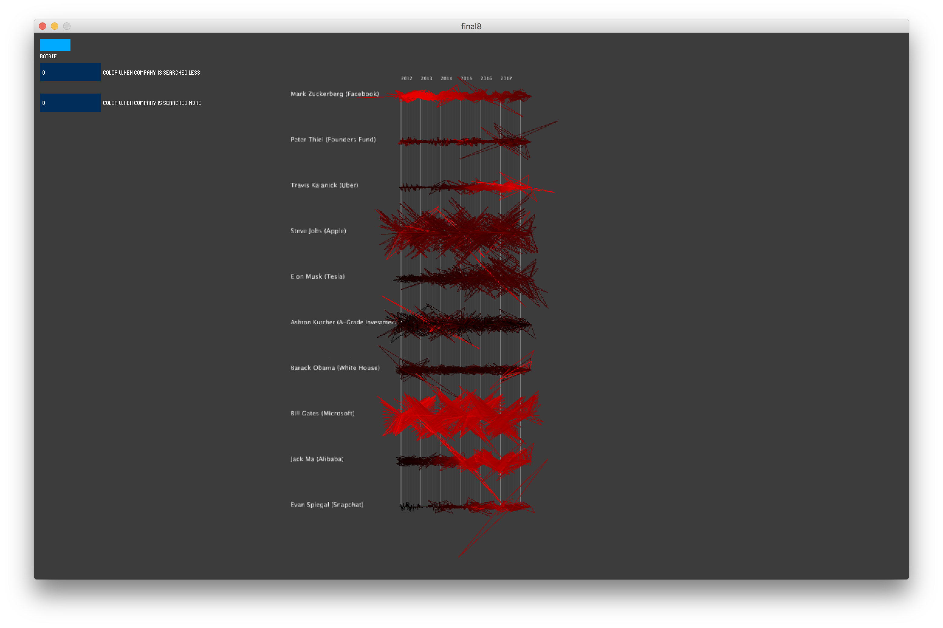
Each person has it's own shape created from different quads. The length of each quad is dependent on how many times that person was searched in that given week. As you can see in the image below, Mark Zuckerberg was searched a lot during a period in 2012, while Steve Jobs is constantly being searched a lot from 2012 to 2017. The shape is also rotating each quad at a certain angle and that angle depends on how often there company is being searched. Because this is very unclear to see, but just added an interesting effect to the shape, I also added color which reinforced how often the company was being searched. Again looking at Mark Zuckerberg, one can see that Facebook was being googled a lot more in 2012 then 2017. The reason Microsoft is all the pink color is probably people trying to constantly figure out how to use or download Microsoft on to there computer. The first image, I used the colors pink and blue because in my opinion I liked those colors the most.
Controls:
I came across a few other colors though that also helped show the data, so I decided to add a slider, so that the viewer is able to choose what colors they want to see. In the second image, I set the values to zero, created a brighter red when the company is searched more and a dark red when the company is not searched as much. The rotate button at the top rotates each person's shape, so some of the quads might become more visible if they are being obstructed by the angle they are positioned at. Also, if you press the "f" key it will fill the each shape, which might give the viewer a clearer perspective and pressing "d" will reset the fill. Any other key will rotate the entire image, so one can view it from the side or back to get a different perspective.
Evaluation/Analysis
I thought it was really interesting to see the comparison between the shape and colors to all the top ten Crunchbase people. Some people we can see are getting searched a lot exactly when there company is being searched a lot, while others might just get searched a lot all the time, but there company is only being searched so often. We can see the difference looking at Mark Zuckerberg for example was searched a lot in 2012 and Facebook was searched a lot in 2012. This was the moment when Facebook surpassed 1 Billion users. The shape becomes larger again in 2016 and is still on the pink side in 2016 because this is when they announced Facebook Live. On the other hand, since 2012 till 2017 Steve Jobs seems like he is constantly being searched a lot because the shapes are larger, but a large majority of them are colored blue suggesting that Apple is not being searched that often. The few moments when the shapes are the bright pink are I assume when Apple is announcing or releasing new products. The people with smaller shapes, such as Evan Spiegal (snapchat), was not popular until closer to 2017.
Code