Life and Death of Media
MAT 259, 2017
Chris Chen
Concept
My idea from the start was to highlight the changes in media type popularity. As the list of mediums increases, it's interesting to see how long so-called obsolete formats still remain popular and to see where exactly their declines start and end. At the same time, the data set as a whole sheds insight on how a library's role has remained or been undermined by the onset of online and digital platforms for people to access such items. For the graphical design of this task, I knew I wanted to present the data in a circular form. In terms of legibility, this allowed for the easy and direct comparison of changes over different months and different years - at the same time, it visually conveyed a cyclical and continuous idea of popularity which I thought was far more interesting and intuitive than a completely linear format.
Query
SELECT date(cout), sum(case when itemtype LIKE "%bk%" then 1 else 0 end) as Books, sum(case when itemtype LIKE "%cd%" then 1 else 0 end) as CDs, sum(case when itemtype LIKE "%dvd%" then 1 else 0 end) as DVDs, sum(case when itemtype LIKE "%vhs%" then 1
else 0 end) as VHS, sum(case when itemtype LIKE "%cas%" then 1 else 0 end) as Cassettes FROM outraw WHERE year(cout) > 2006 and year(cout)
< 2017 GROUP BY date(cout)
Preliminary sketches
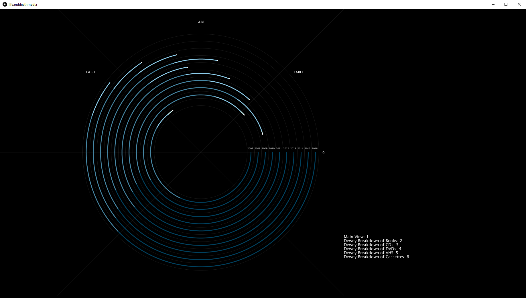
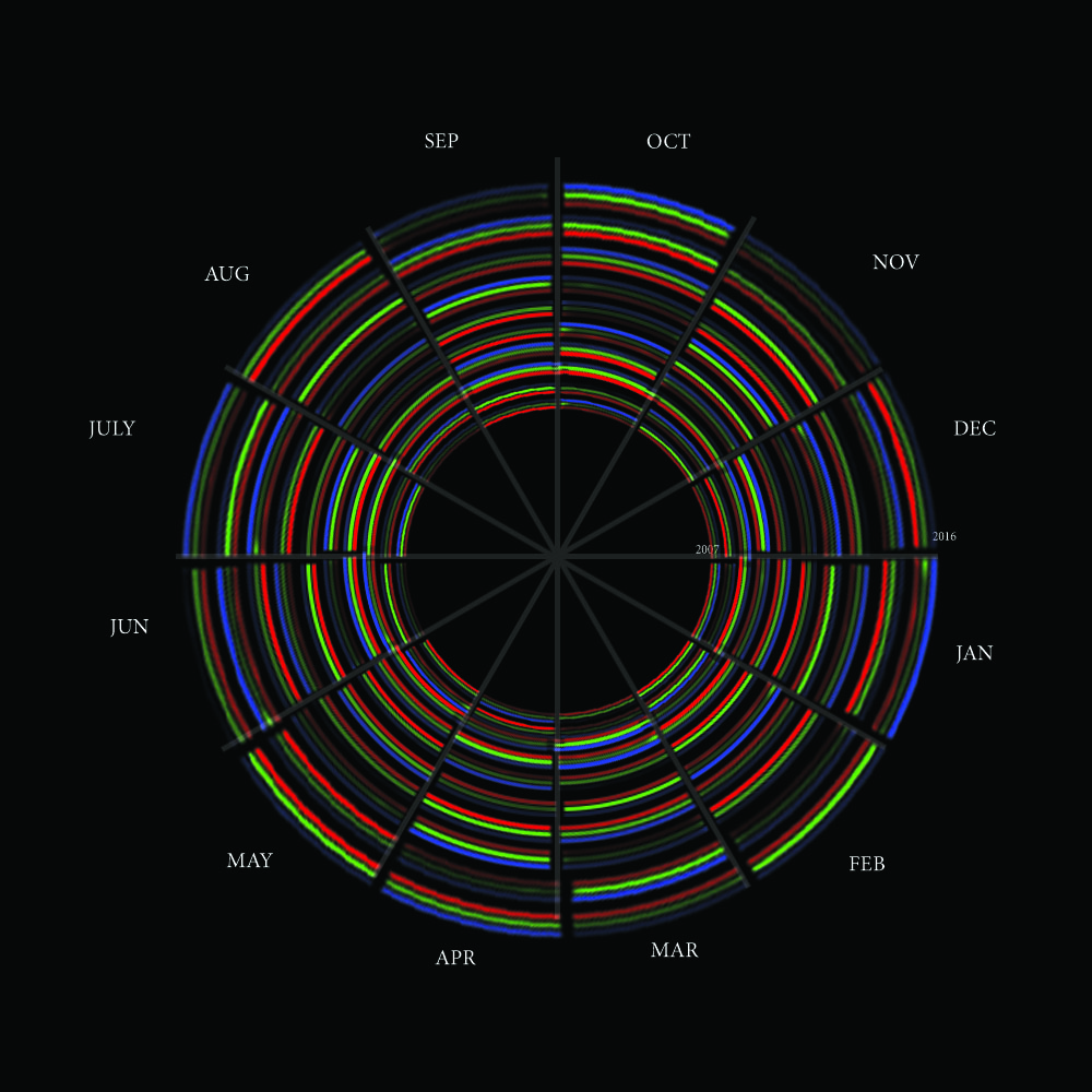
My first attempt was to very simply display the relative popularities, or raw number of checkouts, of each of the media types in a given year all in a circular format. I also wanted the option available to go to each different media type and see the number of checkouts of items from each Dewey class over the ten year span. This idea was lacking in respect to granularity and so I decided to come up with a moore dynamic dataset. In this case, I wanted to draw 10 different circles for each of the years the data came from. Each of those circles was further broken down into five bands of different color, each of which indicated a different media type. Finally, each circle was broken down into 365 subdivisions for each year. If a given day had more checkouts, that segment of the circle would be more opaque - the less checkouts (and less popular) meant a more transparent segment.
Process
After first making a quick Photoshop mockup of the new version, my first task was to edit my query: I needed to gather the daily number of checkouts of every item type. Once this was done, I could then start working on making the Processng sketch. This mostly consisted of working on the framework of how the segments within each circle are drawn. Further consideration was put into interactivity, including a labeling system which gave the rough date markings and filtering out different item types.
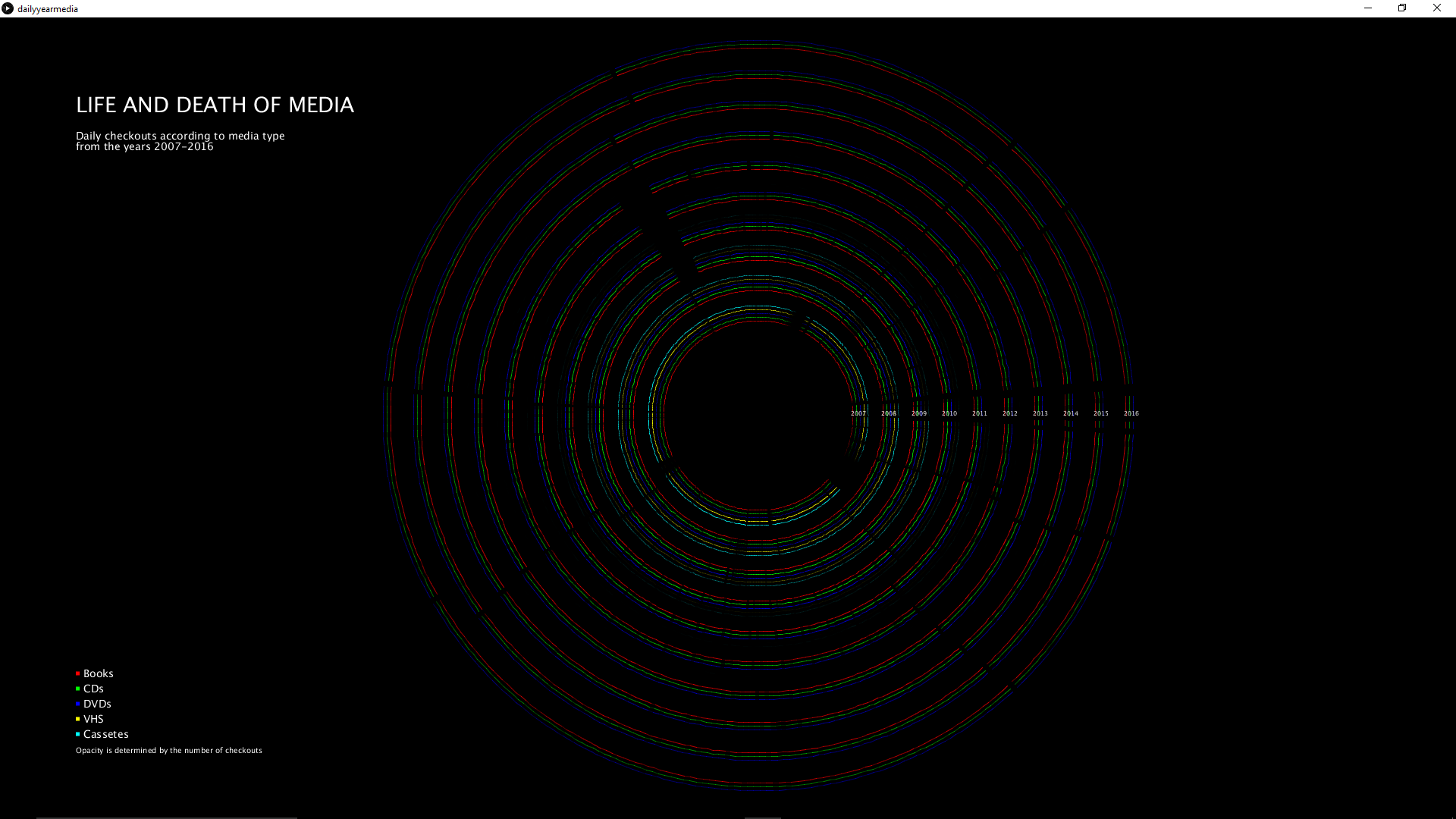
Final result
The end product is a detailed and visually engaging presentation, with a focus on a circular and cyclical theme that highlights the waning and waxing popularities of various items in the Seattle Public Library.
Evaluation/Analysis
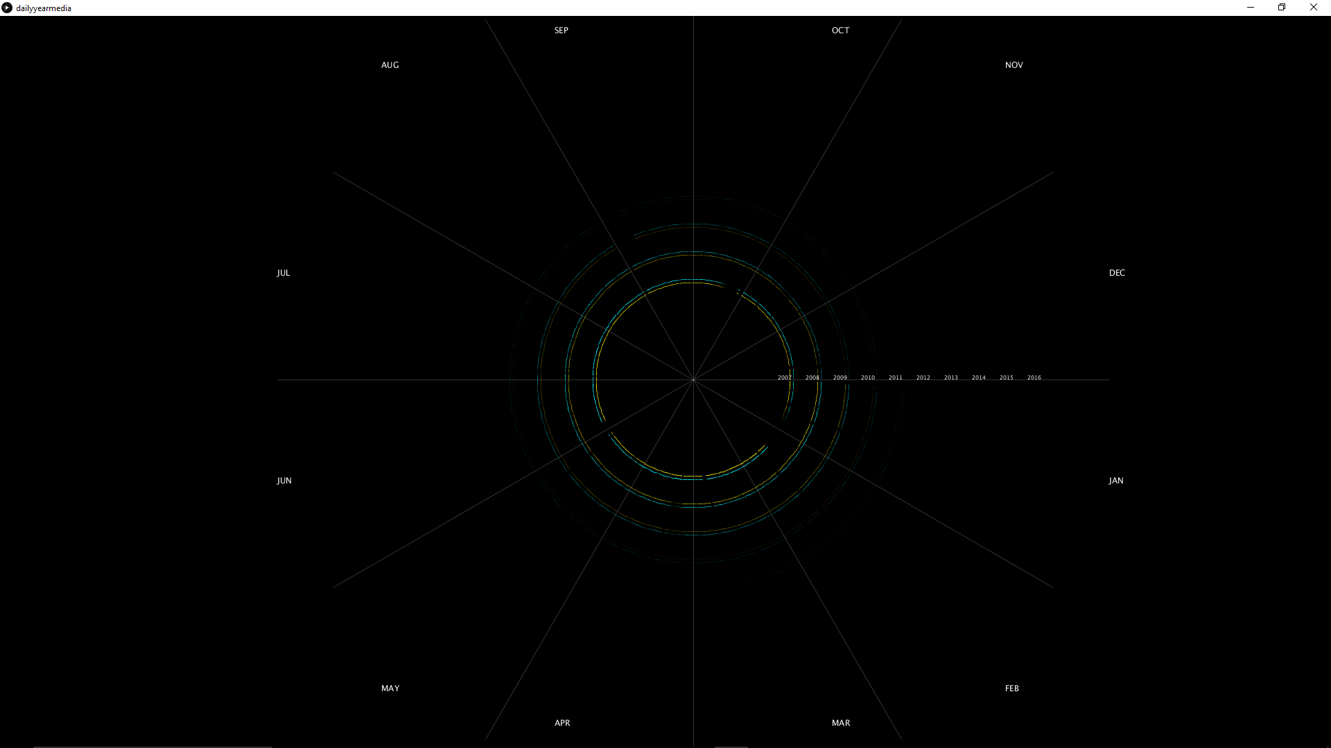
The most obvious trend that is seen within the data is that cassetes and VHS both died about the end of 2009 and the beginning of 2010 (casettes retained popularity for a little longer). Further data about the number of checkouts of books, CDs, and DVDs is less clear. Examination, however, will reveal that CD checkouts seem to peak in 2009-2011 and drop off steaduky afterwards. DVDs experience a similar pattern. Books, however, have a fairly steady pattern throughout the years. Visual enhancements on the display of the data itself, then, could be made on making these patterns more distinct and readily understandable.
Code