Visualizing the Seattle Public Library Yelp reviews
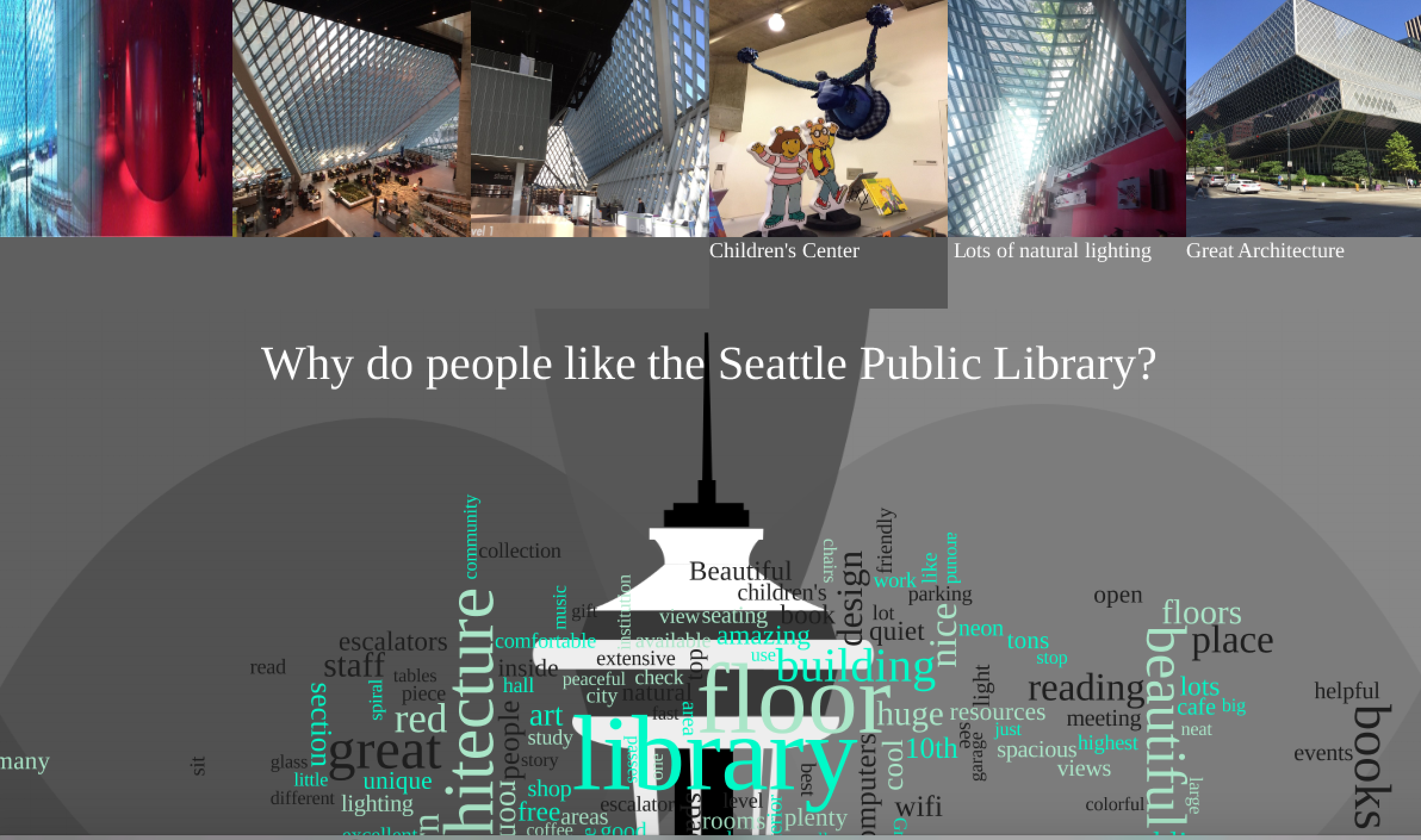
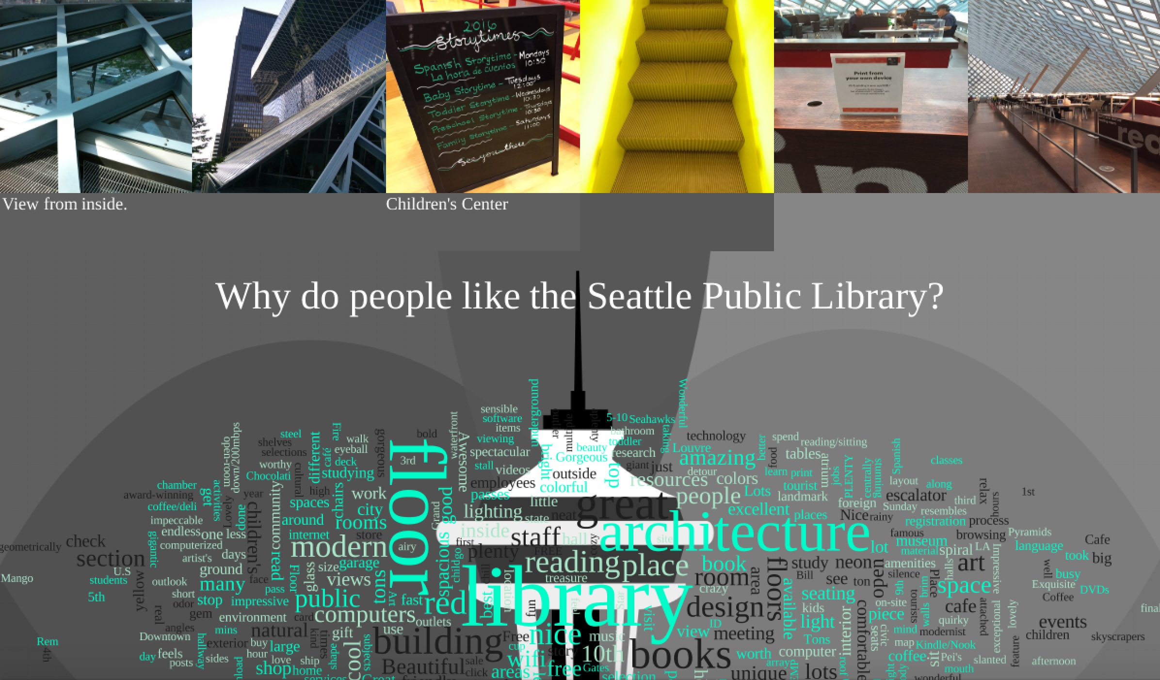
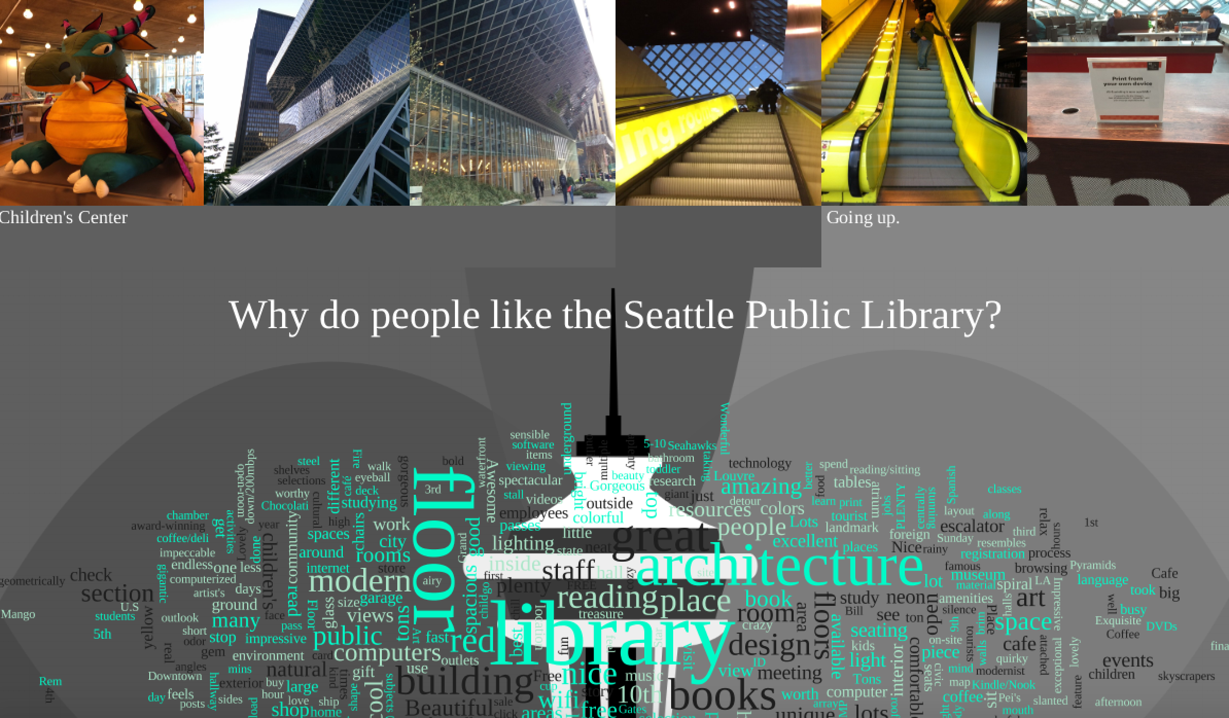
In this project we try to answer the question of "What do people think of the Seattle Public Library? If we want to explore what do the people think, the first and naive thing that comes to mind is visiting the yelp website and reading the reviews. The more efficient solution is to compress the reviews into one visualization. The visualization will have text from the reviews and images the users took and uploaded themselves.
The first step to tackle this problem was to download the reviews through the Yelp API. Unfortunately, upon checking the Yelp API, I found out that the Yelp API does not provide access to the full review text at this point. At that point, I decided to build my own database. The database consisted of three columns: Review (contains the review text), Images (contains the image names associated with that review), and Image Tags (contains the user-generated labels associated with the images).
The second step was to extract review tags from the review text. Since most of the review texts contained a lot of unimportant and common words, I used manual feature selection to get the most important features of the review. The third step was visualizing the review features and the images uploaded by the users.
- amazing architecture
- 10 floors of pure awesomeness
- 10th floor highest view point
- 9th floor map room
- really short bathroom stall doors
- worth the stop
- Beautiful library
- plenty of seating
- meetings at the auditorium
- great resources for business and market research
- helpful librarians
- click to chat feature on website
- good customer experience
- Seahawks themed library cards.
- best library
- crazy fast wi