Life is Elsewhere
MAT 259, 2016
Jing Yan / Eye
Concept
/ *
I like the poetic nature of the sentence Life is Elsewhere, first created by Rimbaud then passed down to Milan Kundera. Besides, I was thinking about myself, the situation of moving away from the homeland and living in somewhere else.
* /
In this project, the Elsewhere represents the remote areas, the geolocation changes. It represents a specific point of time, that frozen moment you keep as photos, some retainable matters in the digital world. It also represents a reflection of yourself in someone elses eyes, the trace of your existence in the social world.
Question
I would like to explore something, some influence, relationship, or maybe interaction between peoples temporal changes and their social contact.
Query
Due to the concept, the Instagram API is a good fit for this project.
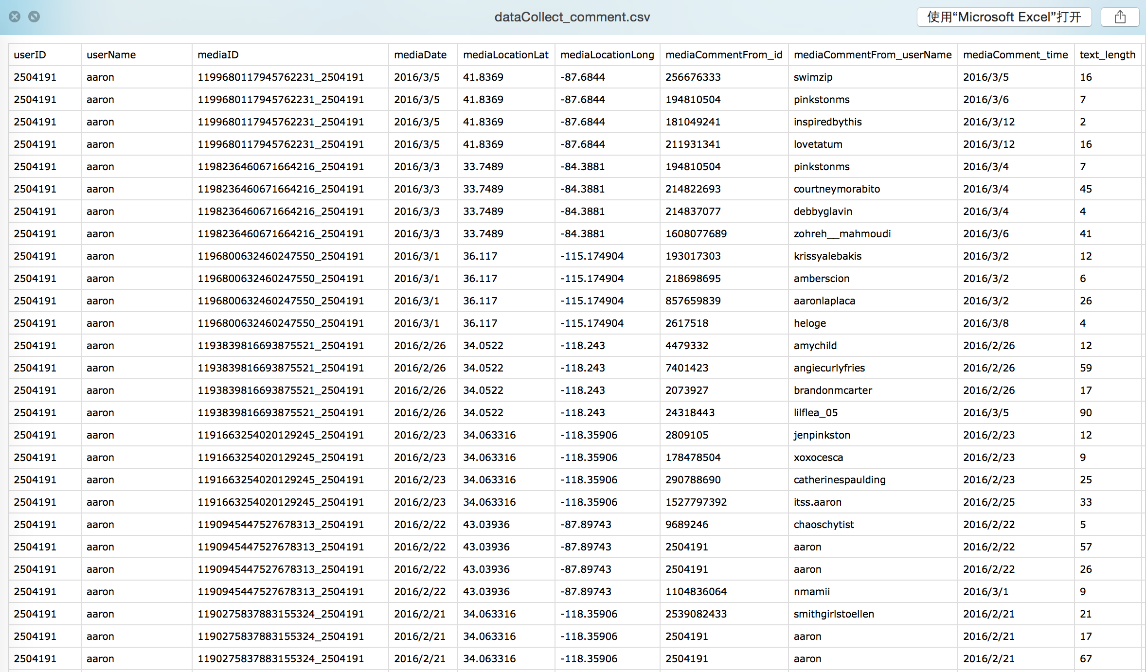
The data mainly contains two parts:
users temporal information : location and date
users social contact : comment and like
Actually, I use the comment information of users media post instead of the like information, because the comment data has more detailed information, such as the comment created time and the comment text. Also, since the like function is overly used, the comment data might be more accurate about social contacts.
Common name >> User ID >> Recent Medias Location >>
Filter the User ID >> Recent Media Data
Step1. I searched 30 common names and save them as csv file. Step2. With those names, I get about 30*50=1500 users ID. Step3. With all the user IDs, I get the location data from their recent media, and filter them by the number of their valid locations. That means if the user has more than 5 null locations, I just skip him/her. And as I would like to limit my geo-space to the united states, I set a threshold with longitude and latitude to filter all the users. Step4. With those valid users ID, I get the recent medias from each of them. And in each recent post media, I get the medias location, date, comment from who (ID and username), comment time, comment text, and calculate the text length, then store them into a csv table.
Here is part of the csv table.
Preliminary sketches
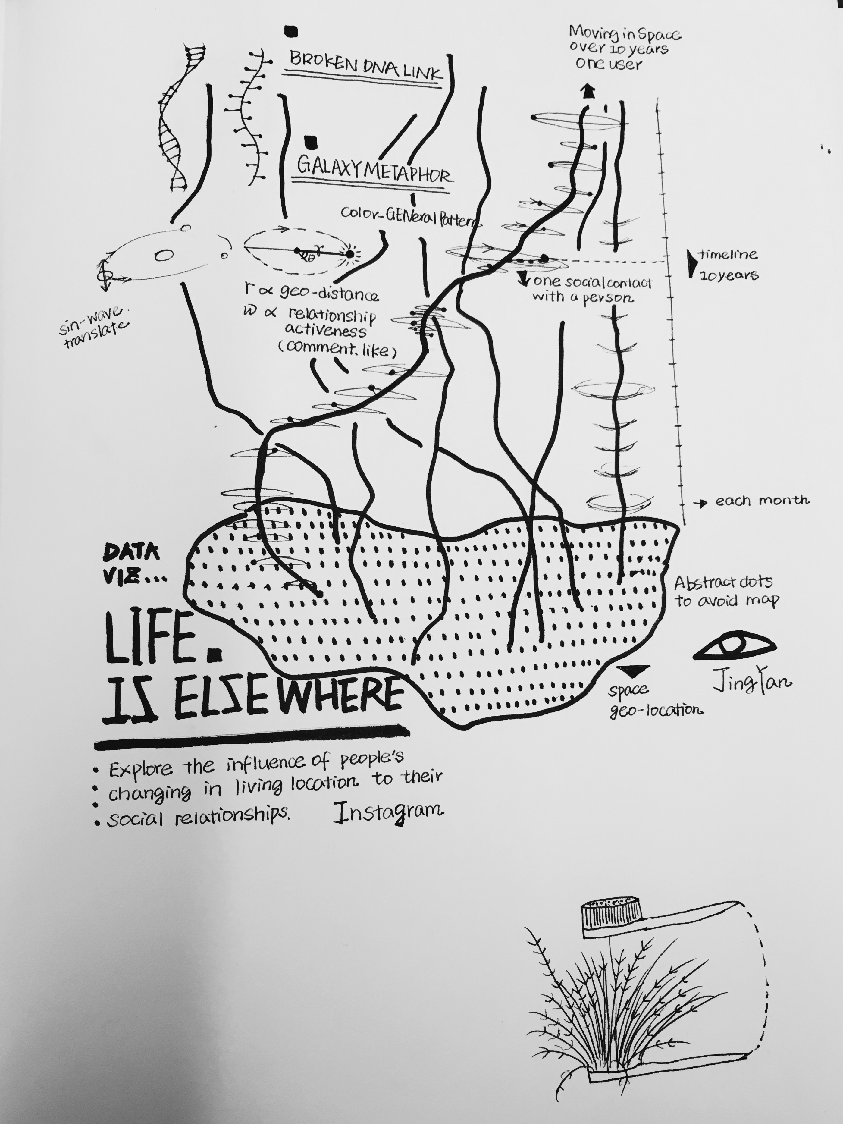
Model
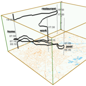
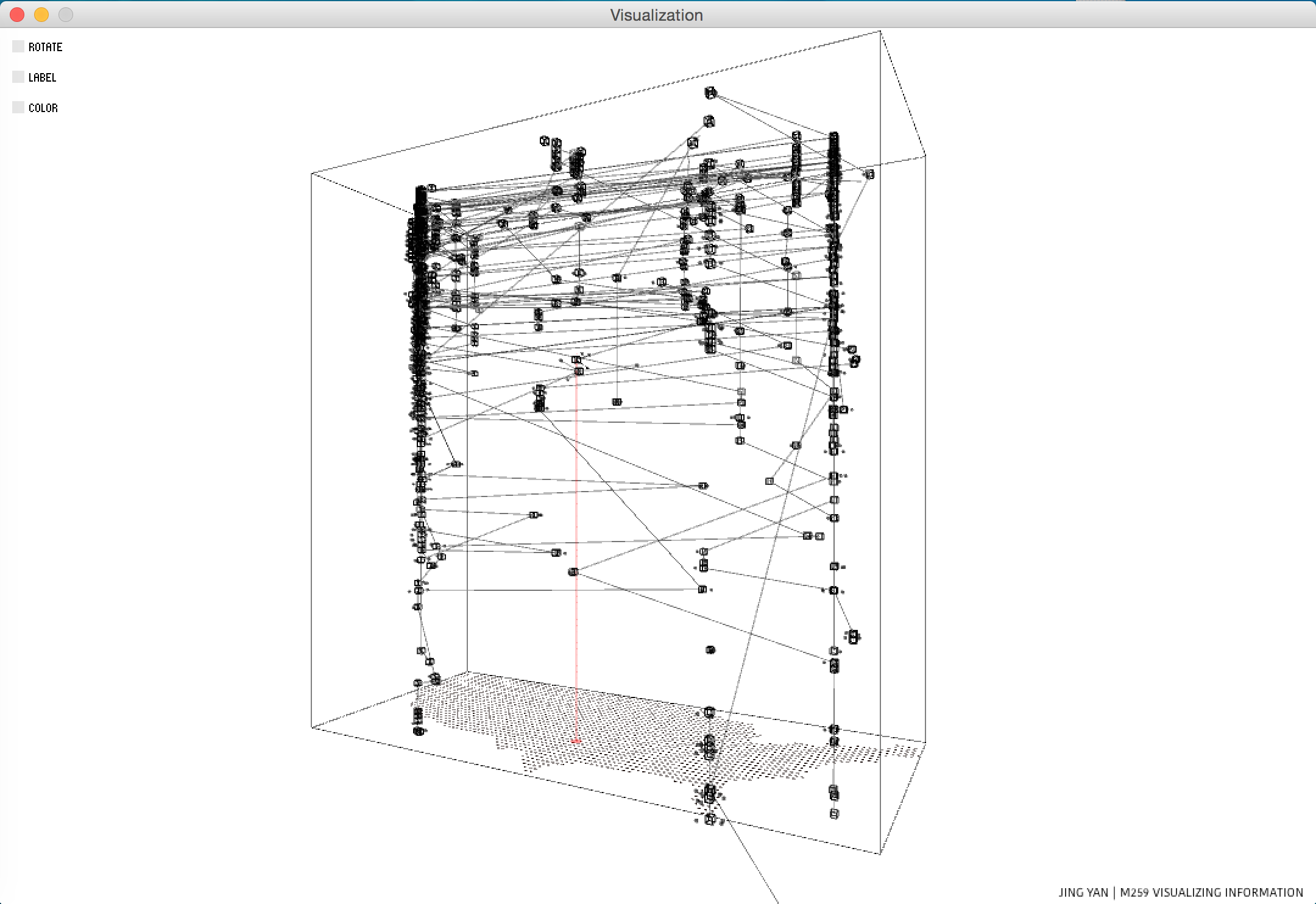
I am using the 3D space time cube to present data of temporal changes. The horizontal ground represents the geo-location, and the vertical axis represent the time line.
Process
The general view shows the trajectory of users in the space-time cube. The bottom plane located as the area of US. And the vertical axis represents the timeline from 2015.12.01 to 2016.3.14. (The time is limited due to the limitation of access tocken from the Instagram API. Only 20 recent media post can be got from each user. This might be improved if you get a access tocken with higher permission.)
Each box represents one image which was posted at that certain location and time, and I use this data to represent the movement of that user.
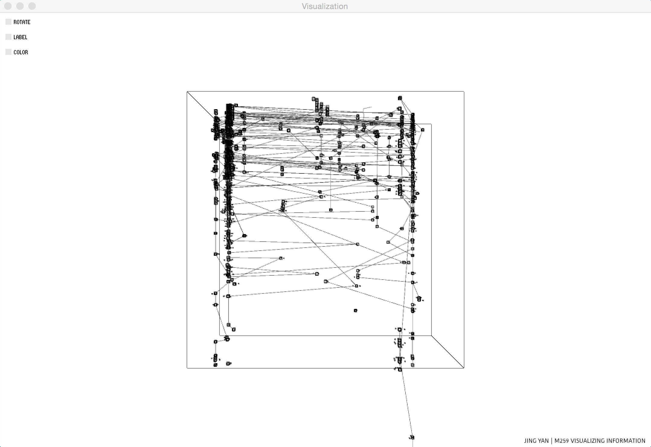
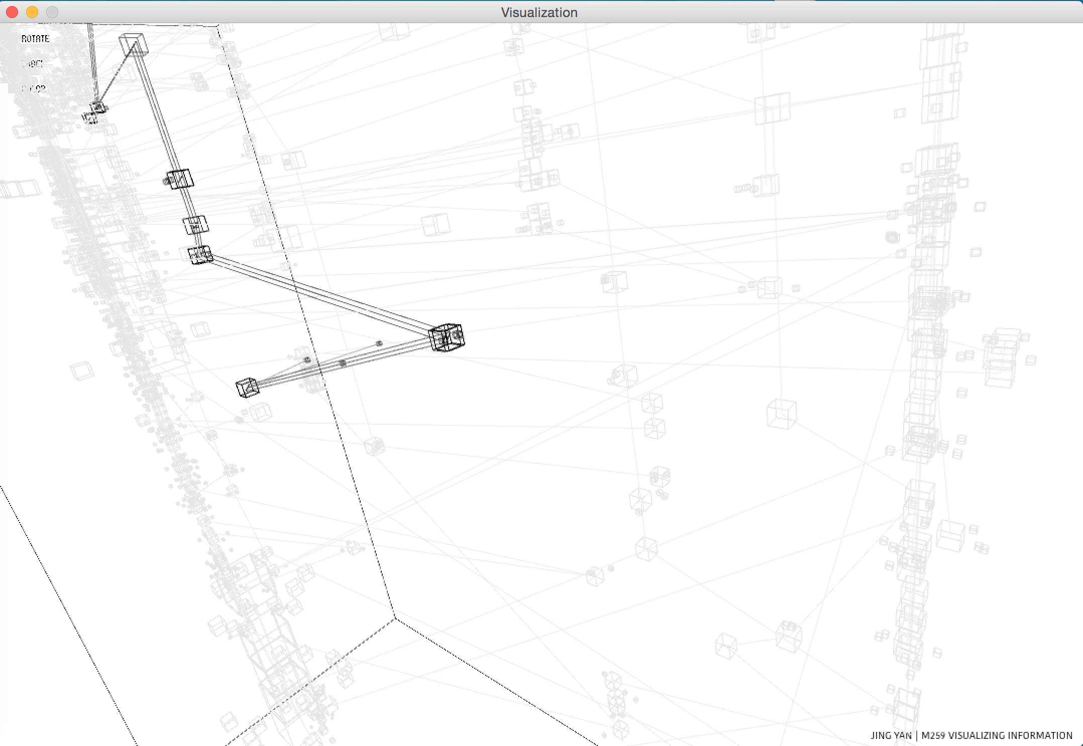
Upon the space-time cube model, I combine it with a metaphor of galaxy to present the social contact of each user in a specific space-time location. Each small cubes rotating around the large cube represents one comment of that photo the user has posted. The number of comments is mapped to the number of boxed. (If possible, the idea of boxes could be improved as pieces of pixels from photos in order to be more consistent to the image based API.) The radius of the orbit represents the time difference between the comment time and photo post time, which means the small comment box will be far away from the large box if the comment is made g ago from the photo post time. The speed of that rotating comment box is mapped to the text length of that comment. In this way, I trying to show the social contact of that particular user in a specific time and place.
Each box represents one image which was posted at that certain location and time, and I use this data to represent the movement of that user.
Upon the space-time cube model, I combine it with a metaphor of galaxy to present the social contact of each user in a specific space-time location. Each small cubes rotating around the large cube represents one comment of that photo the user has posted. The number of comments is mapped to the number of boxed. (If possible, the idea of boxes could be improved as pieces of pixels from photos in order to be more consistent to the image based API.) The radius of the orbit represents the time difference between the comment time and photo post time, which means the small comment box will be far away from the large box if the comment is made g ago from the photo post time. The speed of that rotating comment box is mapped to the text length of that comment. In this way, I trying to show the social contact of that particular user in a specific time and place.
Final result
Level of Perspective
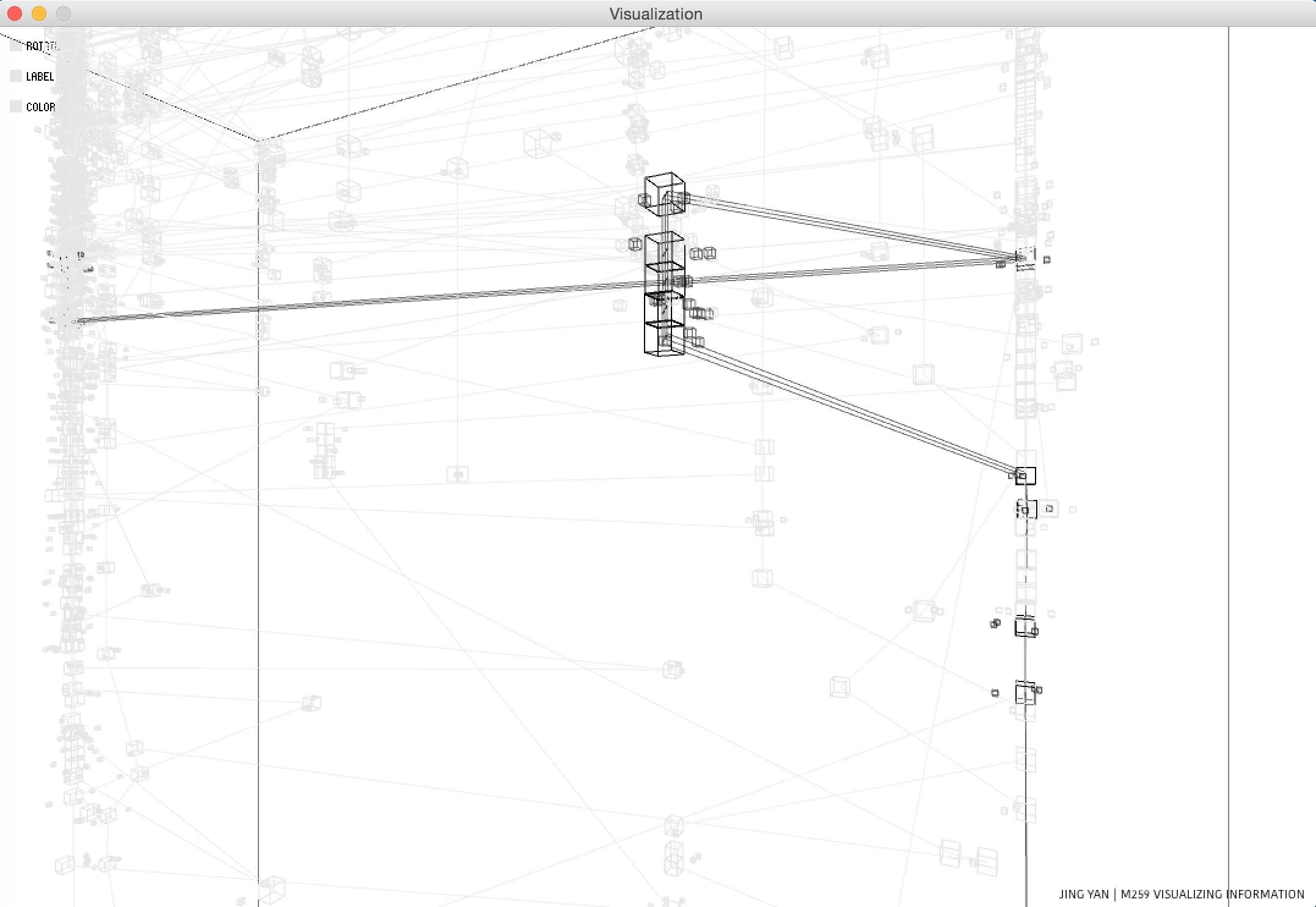
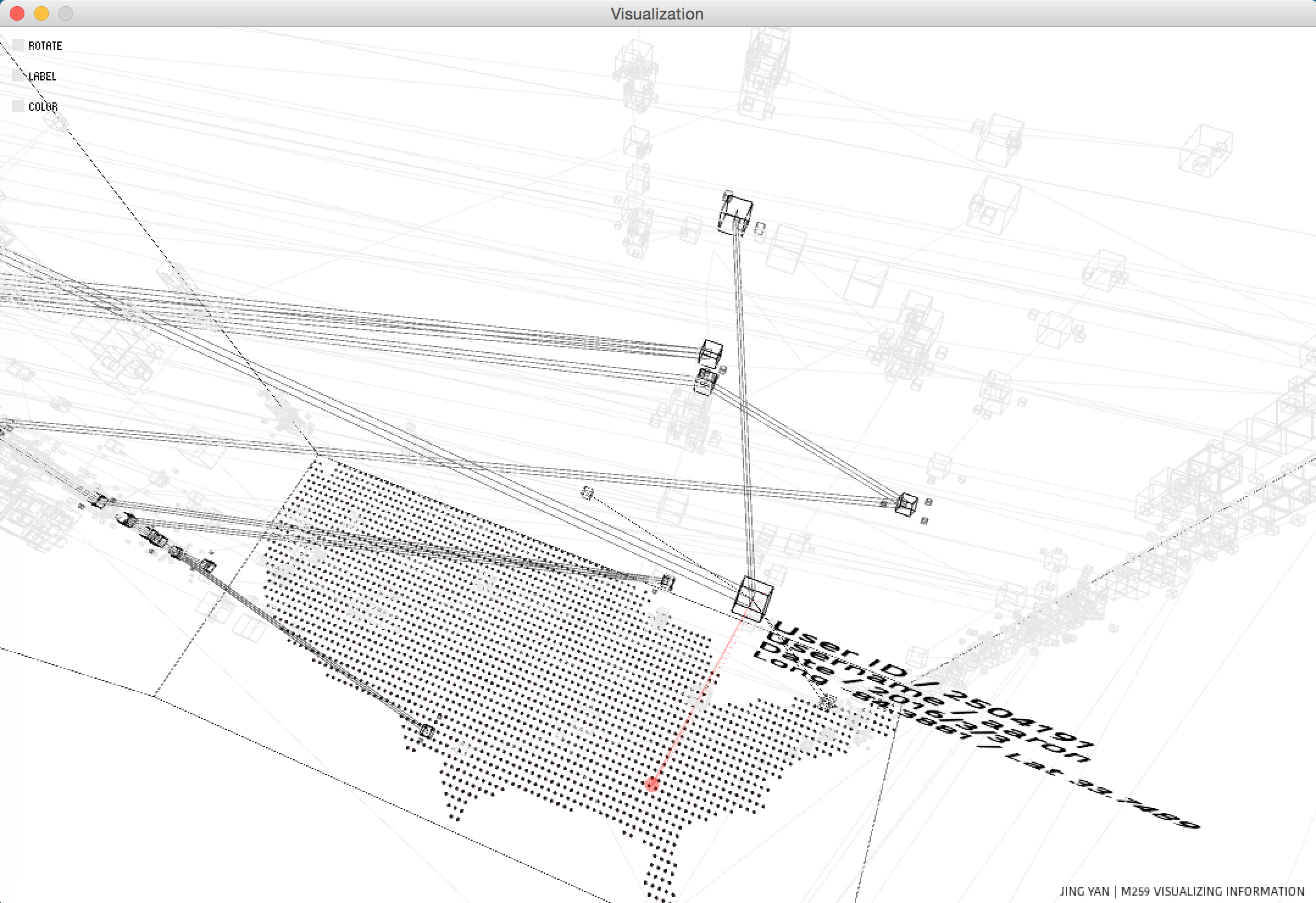
In order to provide the whole dataset with a better organization, I design three levels of perspective: the user group, the medias of each user, and the comment of each media.
There is a selection mode, which switches on and off automatically depends on the distance of camera. (Though you can still manually turn on/off that mode with key.)
User group: When you are far away, the selection mode turns off. All the lines are equally draw which provides you with a feeling of the general shape and motions. You can also click the box rotate to get a thorough view.
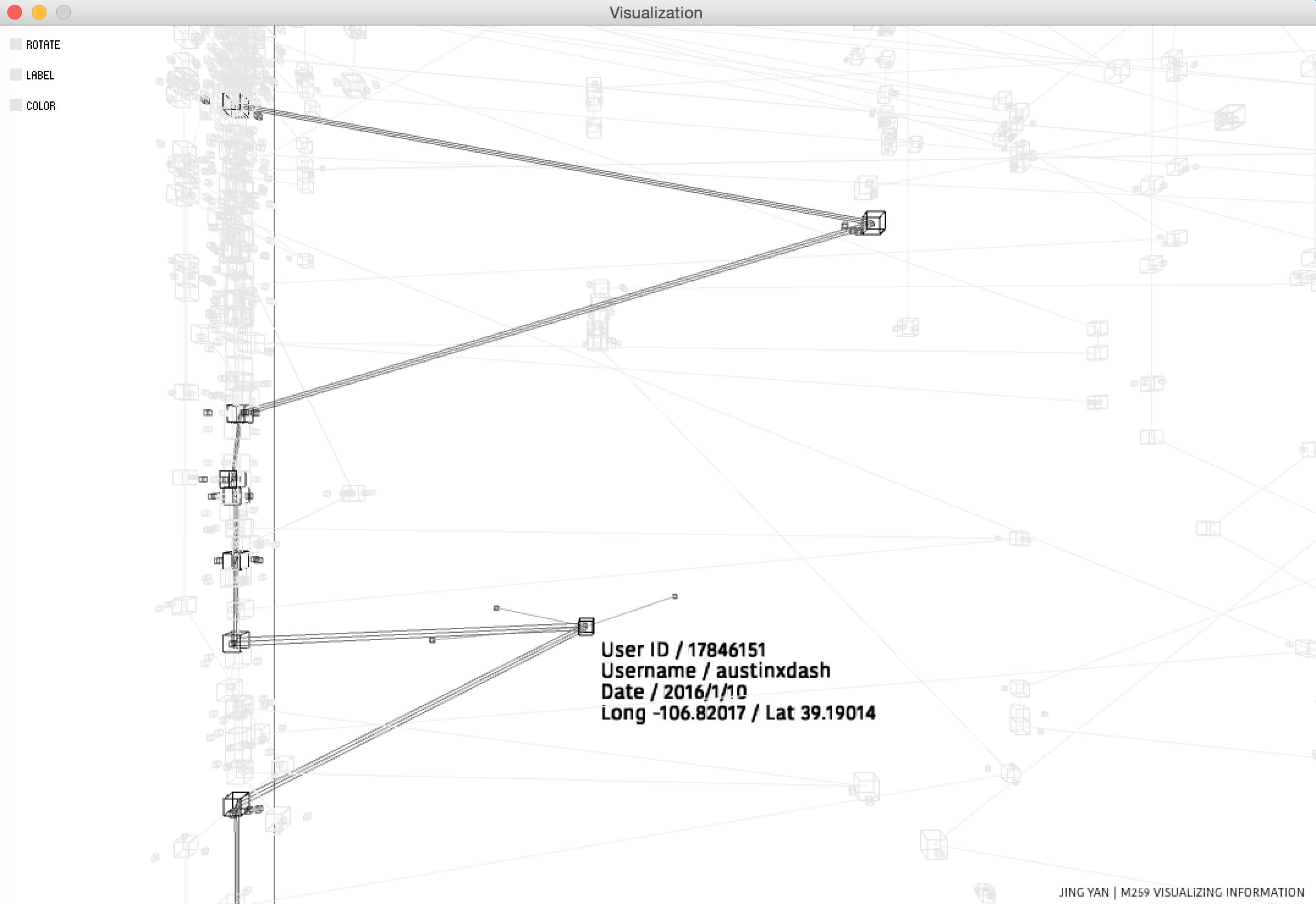
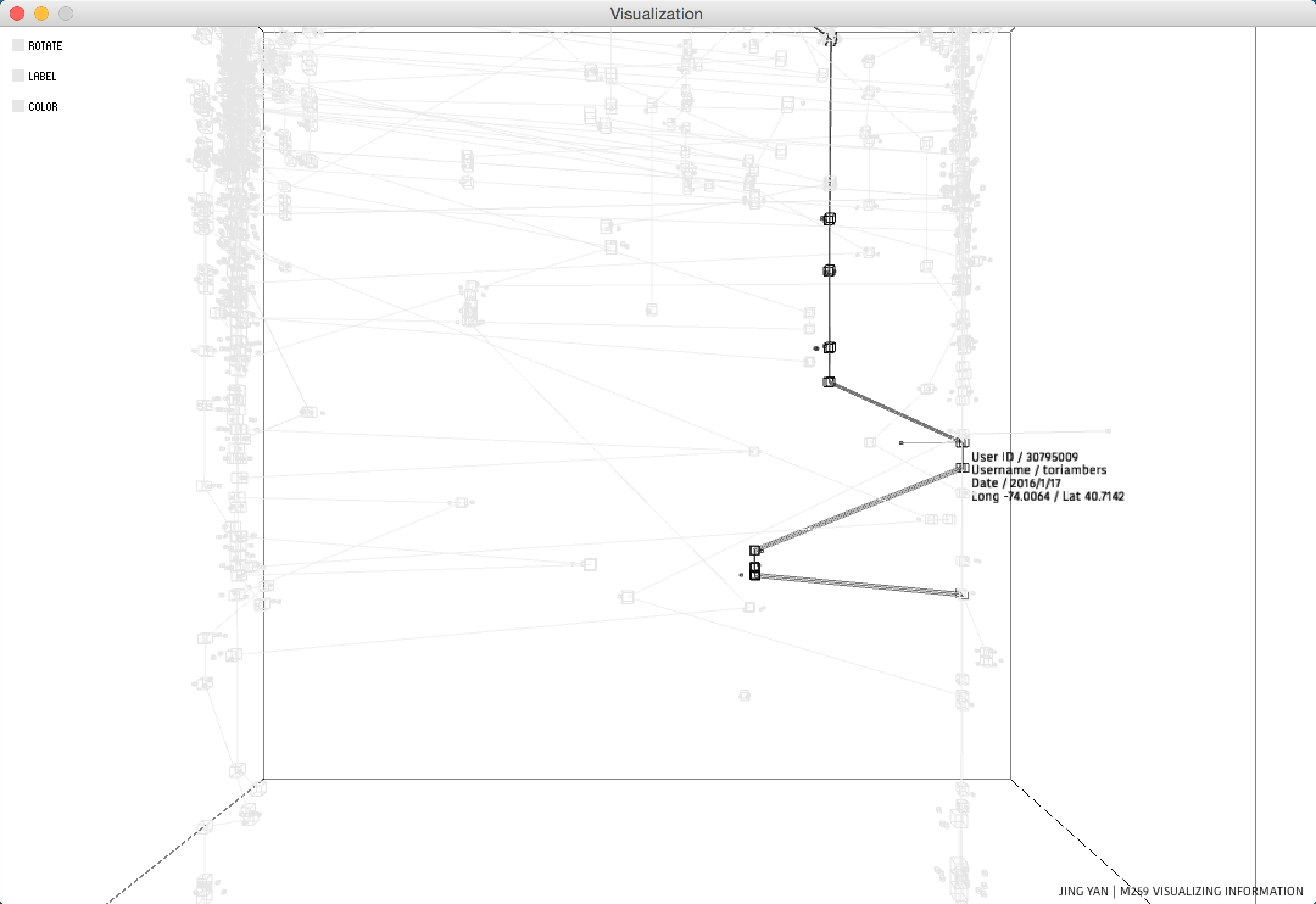
Medias: When you get closer, the selection mode will turn on. All the lines and boxes of other users will fade out; except the user you pick up with your mouse will be illuminated with more bunch of lines. This allows you to get a clearer view when examine the detail of data.
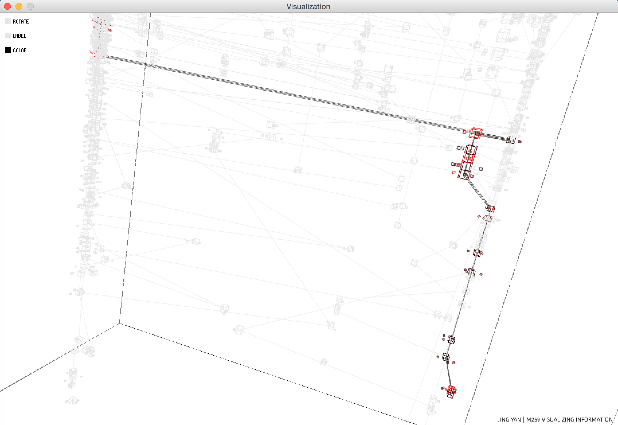
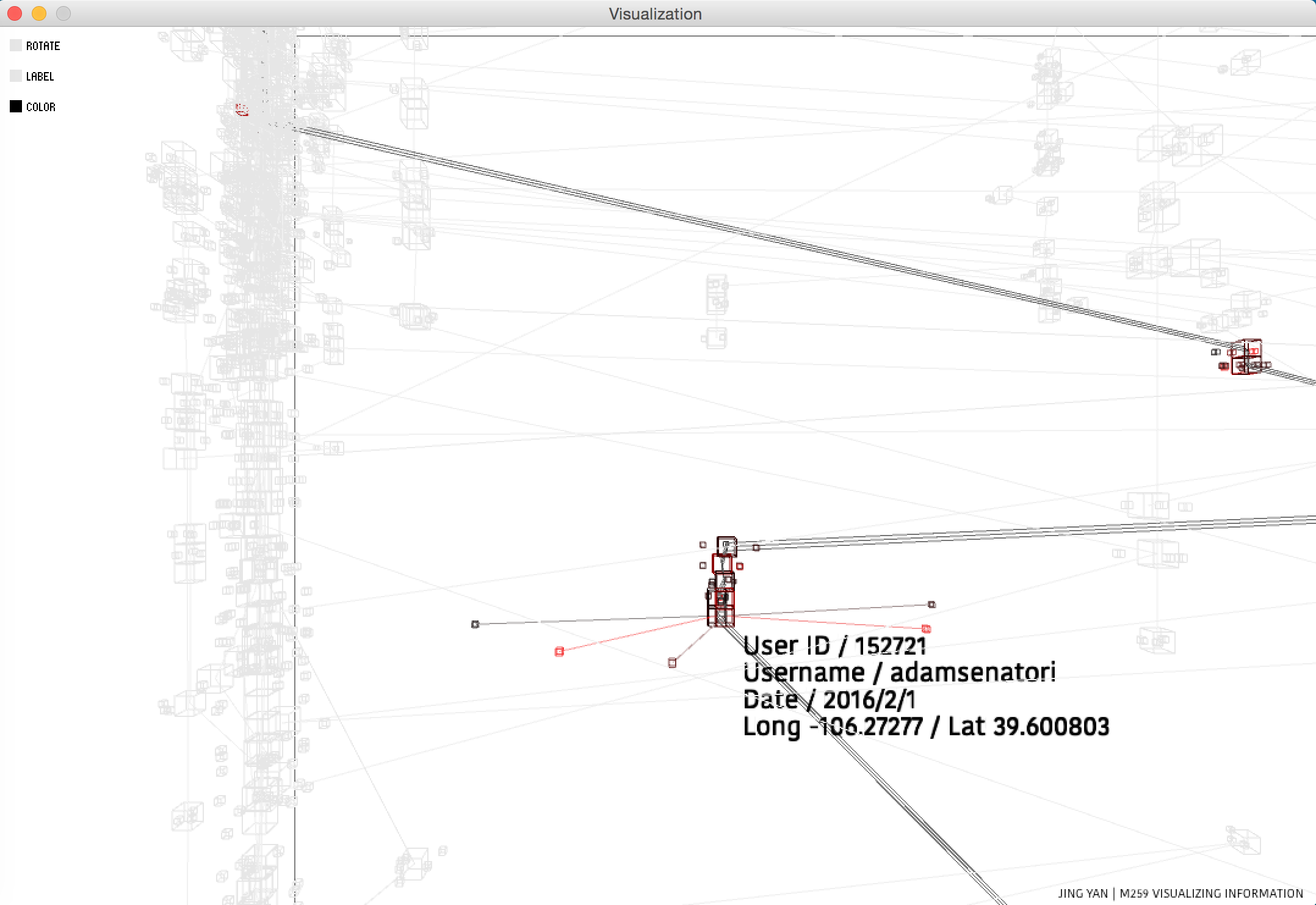
Comments: You can select one user to show the path. Also you can select one media to show the social contact. When a media is selected, the motion of its related comments will be exaggerated which allows you to examine the difference between each comment.
Label and Map
A transparent dots of map is added to the visualization as label so that the user will be able to examine specific data better. And in order to enhance that function, I link it with a red line and project a red shadow on the ground each time you choose one media box. However, since data visualization is somehow emerging out of the organization data, I offer an opportunity for the user to switch off the map and the link as switch off labels.
Color Mode
The color represents the general heat of social contact which combine all the elements from the comment data.
Style
I meant to create a lively world even with some randomness. However, it turned out to be full of mechanical sensitivity. It reminds me of the inner structure of a clock, the hidden part of an elevator, or those fully organized sections of artifacts. Yet, in contrast to the ordered data, the tiny motion of social contact adds some aliveness and even absurdity to the whole scene. When gazing at the data visualization, it weirdly provides me with an omniscient point of view: the busy and commonplace lives in this well structured world.
In order to provide the whole dataset with a better organization, I design three levels of perspective: the user group, the medias of each user, and the comment of each media.
There is a selection mode, which switches on and off automatically depends on the distance of camera. (Though you can still manually turn on/off that mode with key.)
User group: When you are far away, the selection mode turns off. All the lines are equally draw which provides you with a feeling of the general shape and motions. You can also click the box rotate to get a thorough view.
Medias: When you get closer, the selection mode will turn on. All the lines and boxes of other users will fade out; except the user you pick up with your mouse will be illuminated with more bunch of lines. This allows you to get a clearer view when examine the detail of data.
Comments: You can select one user to show the path. Also you can select one media to show the social contact. When a media is selected, the motion of its related comments will be exaggerated which allows you to examine the difference between each comment.
Label and Map
A transparent dots of map is added to the visualization as label so that the user will be able to examine specific data better. And in order to enhance that function, I link it with a red line and project a red shadow on the ground each time you choose one media box. However, since data visualization is somehow emerging out of the organization data, I offer an opportunity for the user to switch off the map and the link as switch off labels.
Color Mode
The color represents the general heat of social contact which combine all the elements from the comment data.
Style
I meant to create a lively world even with some randomness. However, it turned out to be full of mechanical sensitivity. It reminds me of the inner structure of a clock, the hidden part of an elevator, or those fully organized sections of artifacts. Yet, in contrast to the ordered data, the tiny motion of social contact adds some aliveness and even absurdity to the whole scene. When gazing at the data visualization, it weirdly provides me with an omniscient point of view: the busy and commonplace lives in this well structured world.
Code