The Melting World
MAT 259, 2016
David Aleman
Concept
Because our reliance to technology continues to grow we need to power them and by usin energy. This energy we use comes from the burning of fossil fuels which propagates climate change and global warming. Glacier, and sea ice levels have gone down dramatically and using data from the Polar Science Center I aim to visualize this reality that we face today.
Query
No SQL query was used to obtain this data. Instead I used the data The Polar Science Center has in their website.
Polar Science Center Data
Polar Science Center Data
Preliminary sketches
Some early ideas to create this project was to create vertices and draw the iceberg figure and then duplicate them for every year. Also, I wanted to add some change to the icebergs to signify its decrease in volume of Arctic ice.
Process
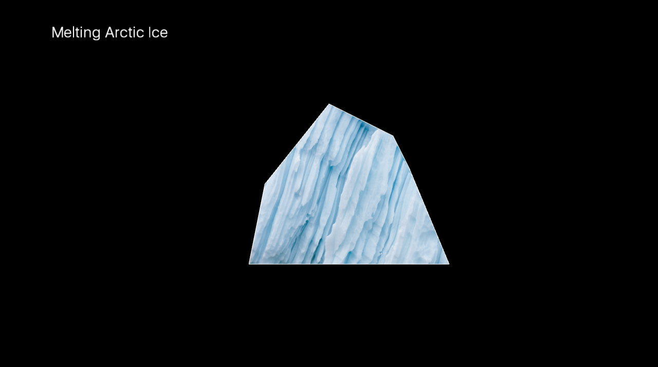
Here is my primitive iceberg shape. To make it interesting I added a texture based on an image I found online.
Disappointed by early results I decided to stray away from creating 2D shapes and use a new method. I loaded an image of an iceberg and instead of using it as a texture I used it as the way my data will be visualized. I loaded the image and created boxes to act like pixels to compose the image and make it more realistic.
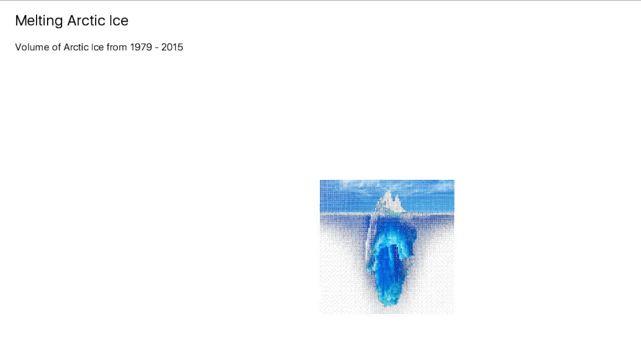
Disappointed by early results I decided to stray away from creating 2D shapes and use a new method. I loaded an image of an iceberg and instead of using it as a texture I used it as the way my data will be visualized. I loaded the image and created boxes to act like pixels to compose the image and make it more realistic.
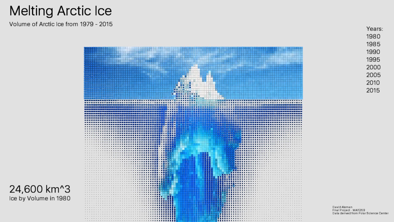
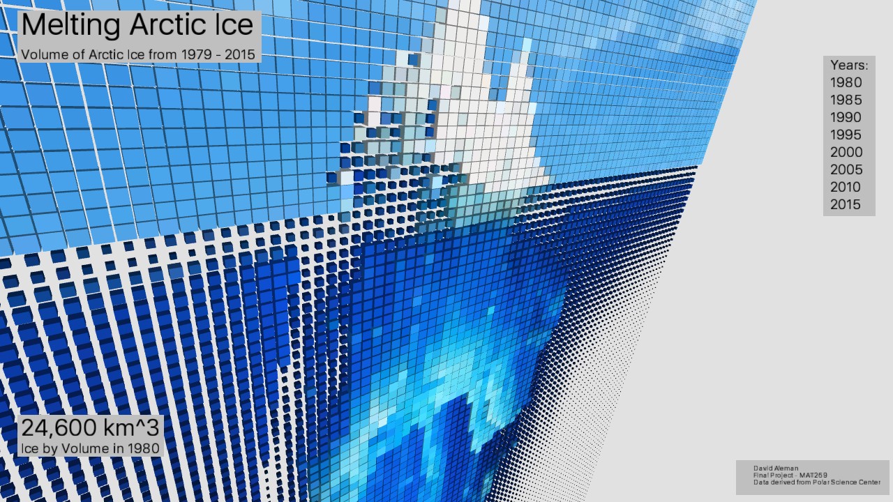
Final result
After adding the fixed labels to my project I also added interaction to it using the number keys. The keys will switch between years and show the decrease in ice by making the boxes smaller and making them dim in brightness.
Code