Bird Migration Patterns in the United States
MAT 259, 2015
Nataly Moreno
Concept
The goal was to give a visual of where a particular bird species is during different times of the year as well as where most of the species is residing at a given time. This type of visualization would be educational and allow us to see where bird species live and how they migrate throughout our country. Maybe some bird species prefer the east coast, while others the west, and yet others reside in only one state and maybe their numbers are small, or maybe their numbers are big. This visualization would give an overview of some of the bird species who live in the United States.
Query
There was no query. I used bird data given to me by Stephen Pope, a former MAT Faculty member. The data consists of frequency vectors of where birds were spotted around the United States for a given year. Because the bird data is not publicly available, it is not included in any of the the zipped project files.
Preliminary sketches
The initial sketch was to make a map of the United States and show the bird populations spotted in particular states and their migration paths. The data however, does not provide a particular coordinate for where a particular bird in x species appeared, limiting what can be done with the data.
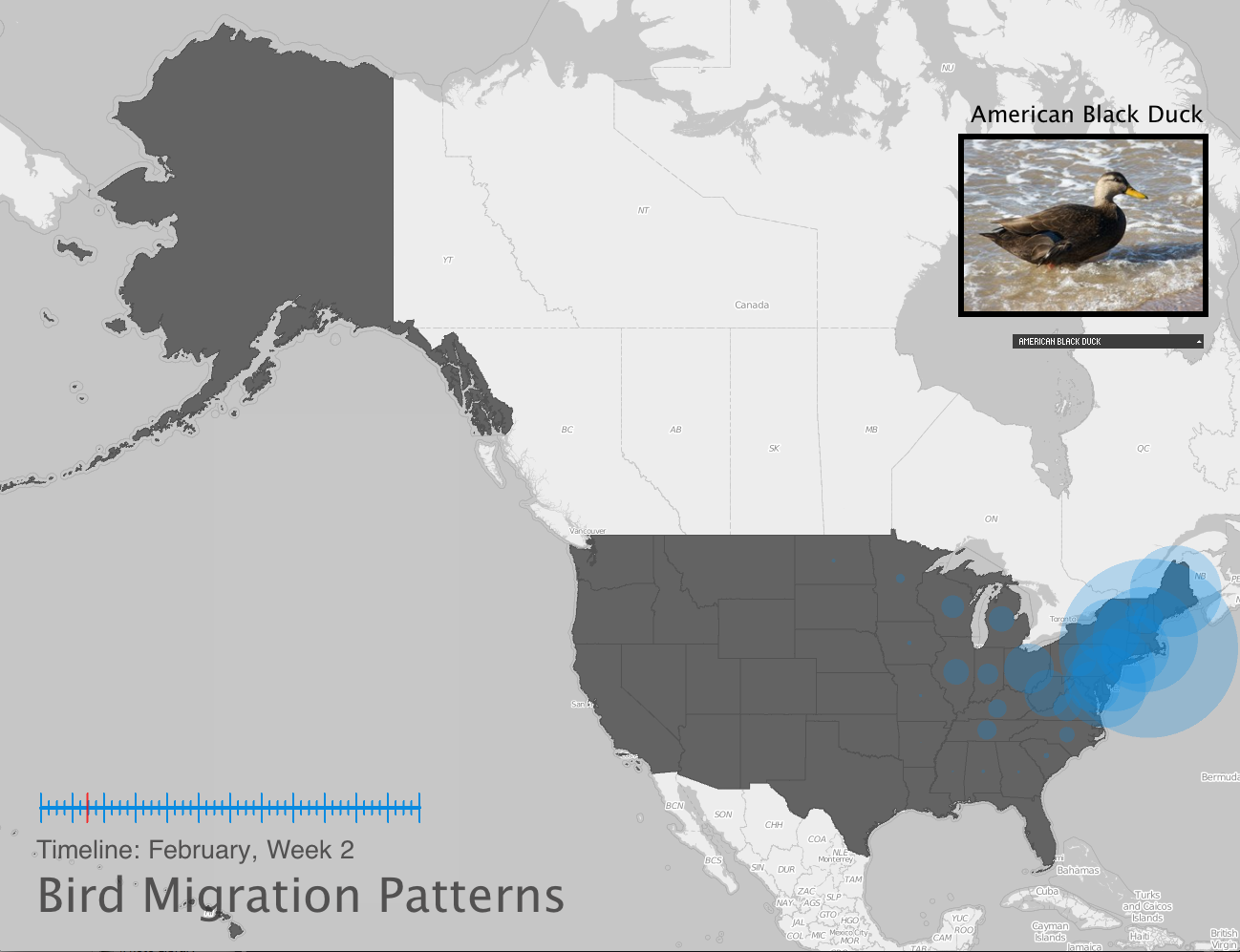
Mouse-roll-over interaction was introduced to assist users in remembering state names, and a photo of the bird is displayed to link a face to the bird species name. Users can choose which bird's data they want to display from a drop down menu. Lastly, bird populations are displayed by circles; the radius corresponds to the number of birds seen, bigger circles indicate more birds.
Initial Processing Sketch: United States displaying data centers with initial downloaded coordinate data. The mouse is currently over Alaska.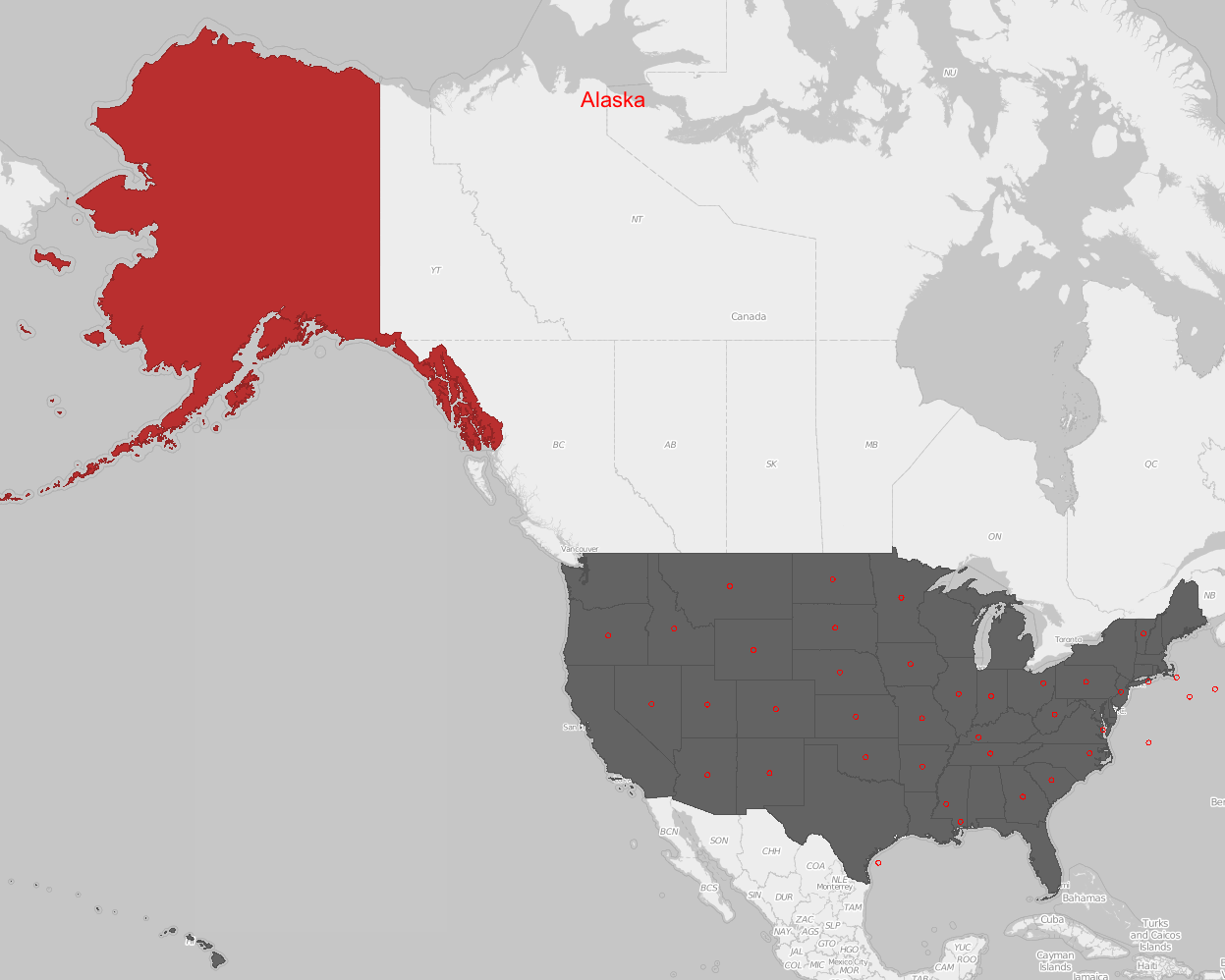
United States displaying fine-tuned data centers.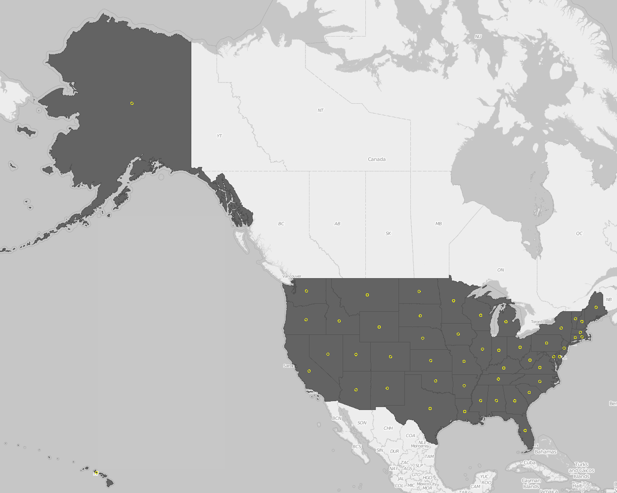
First Result Showing the Initial Layout Design and Circle Animation.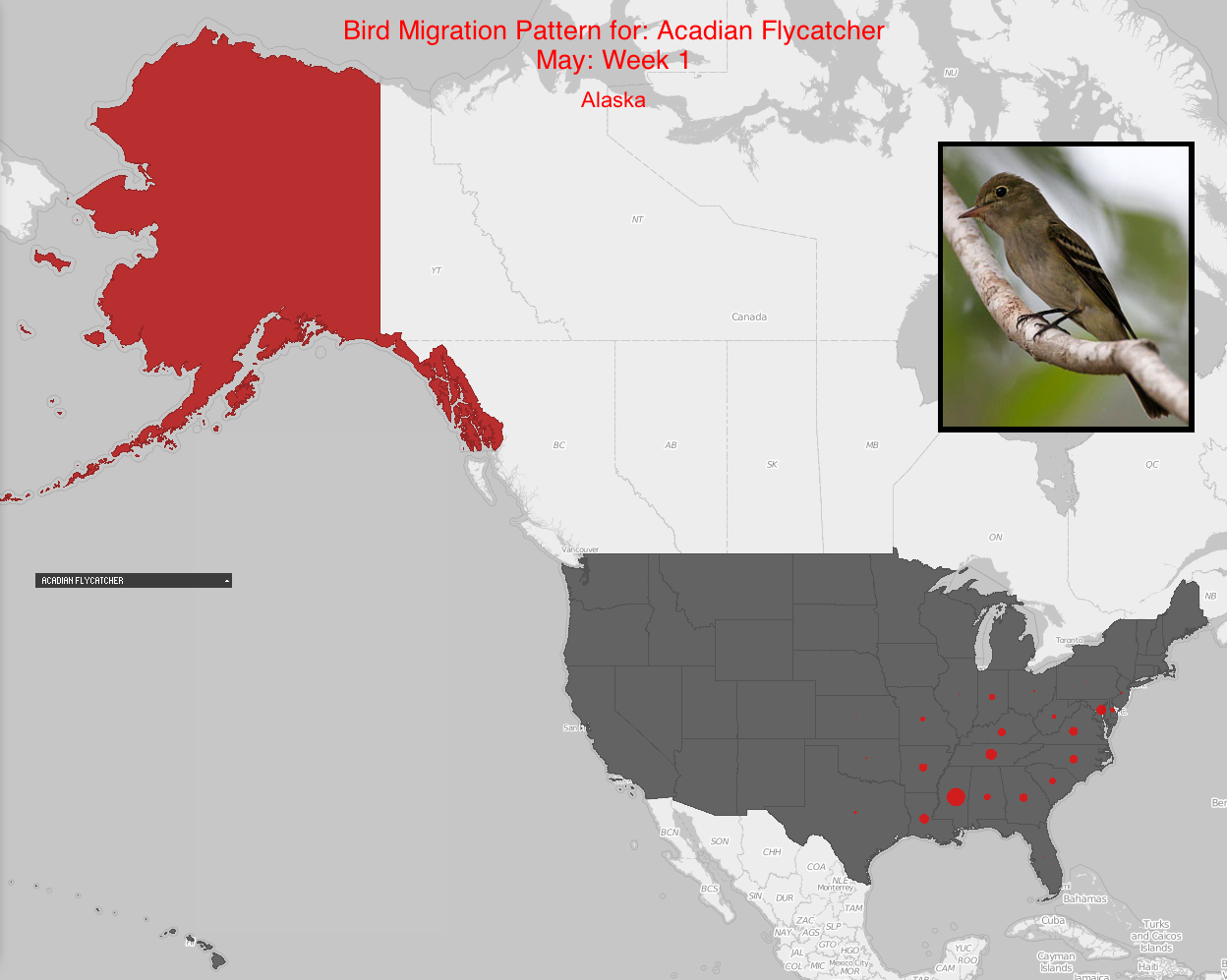
Process
Once the functionality was obtained, colors and layout were worked on. The theme became blue, grays, and black leaving the states roll-over action as red to draw attention. The circles were initially too small and without much additional movement so more animation was introduced. Perlin noise, transparency, and a slight radius increase while the week lasted made a big difference to the visual result. The addition of a timeline also helped visualize what part of the year was currently being displayed and how much time was left.
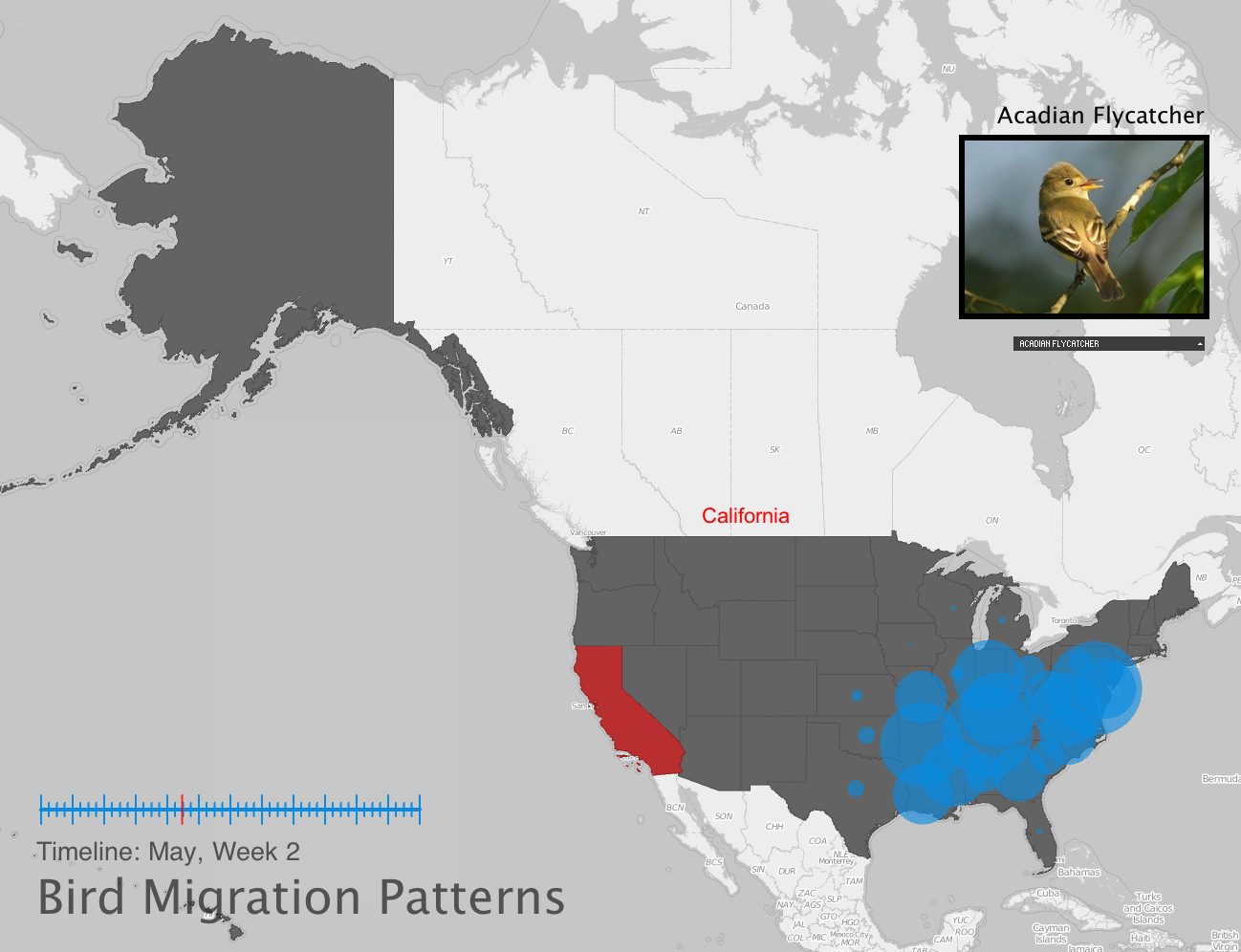
New Layout with New Additions and Modifications Displaying Acadian Flycatcher's Data. Mouse is Over California.
New Layout with New Additions and Modifications Displaying American Black Duck's Data.
New Layout with New Additions and Modifications Displaying Acadian Flycatcher's Data. Mouse is Over California.
New Layout with New Additions and Modifications Displaying American Black Duck's Data.
Final result
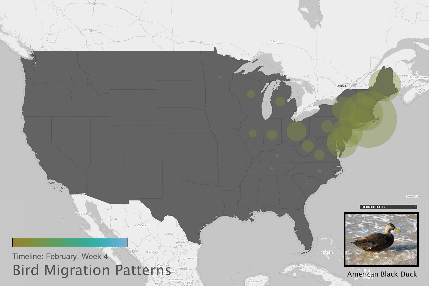
Since there is little to no data for Alaska or Hawaii, the map was zoomed in on the other 48 states. The timeline was removed and a color bar replaced it. The colors were to plain, so the new color themes had at least 3 different hues to make the changing weeks more obvious. There are two color schemes, one of 3 hues, and a rainbow color scheme.
The migration pattern is more obvious on some birds, while not much on others. For example, the Acadian Flycatcher begins to appear around April and the data continues to extend out until around August. However, not all birds have this type of animation that appears to spread.
Final Layout Design Currently Displaying American Black Duck with Color Scheme 1
Final Layout Design Currently Displaying American Avocet with Color Scheme 2.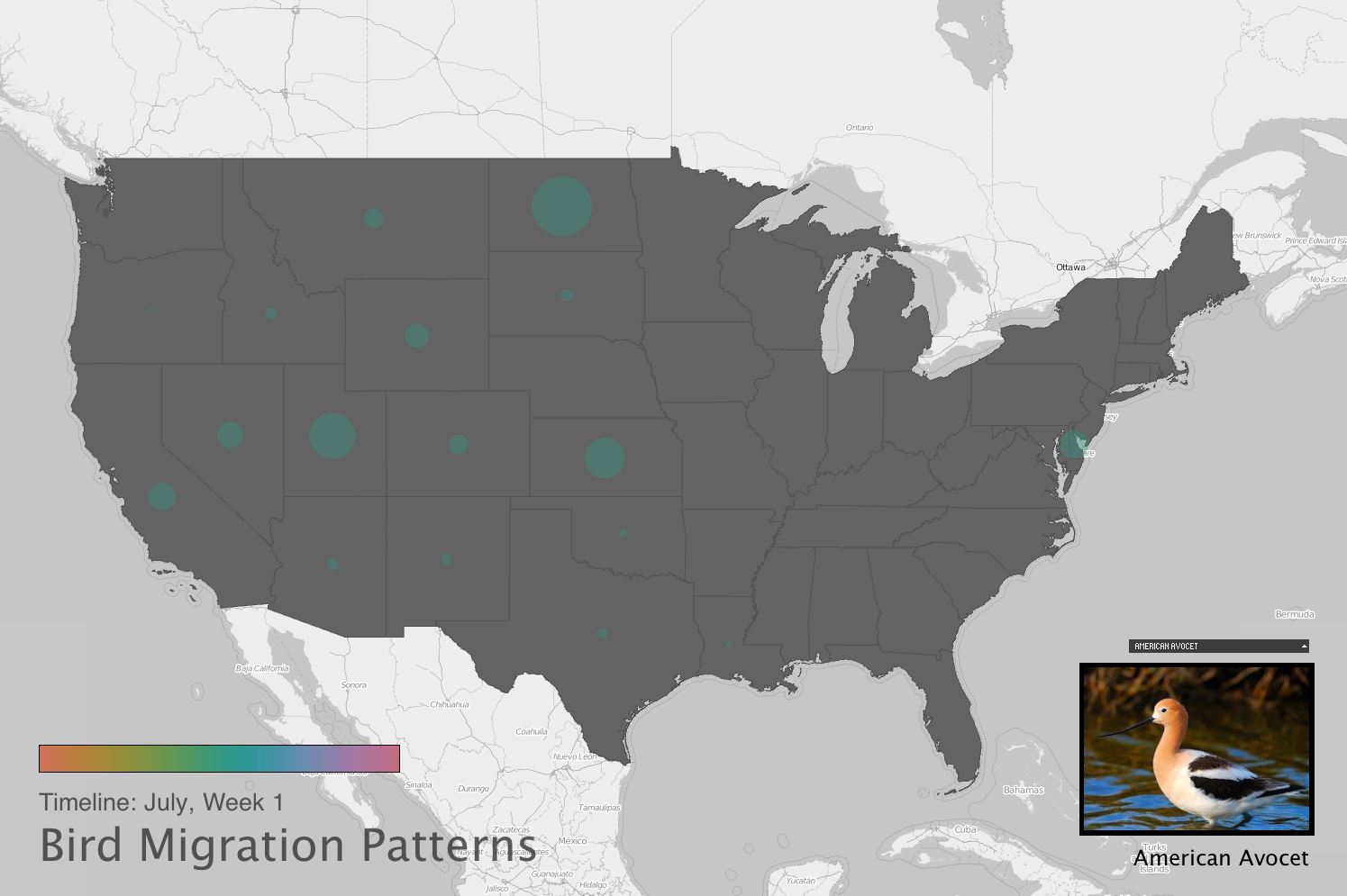
Final Layout Design Currently Displaying American Avocet with Color Scheme 2. Mouse is Over Iowa.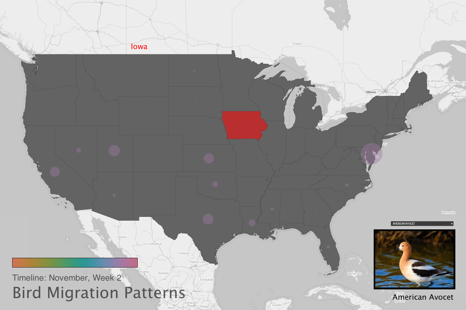
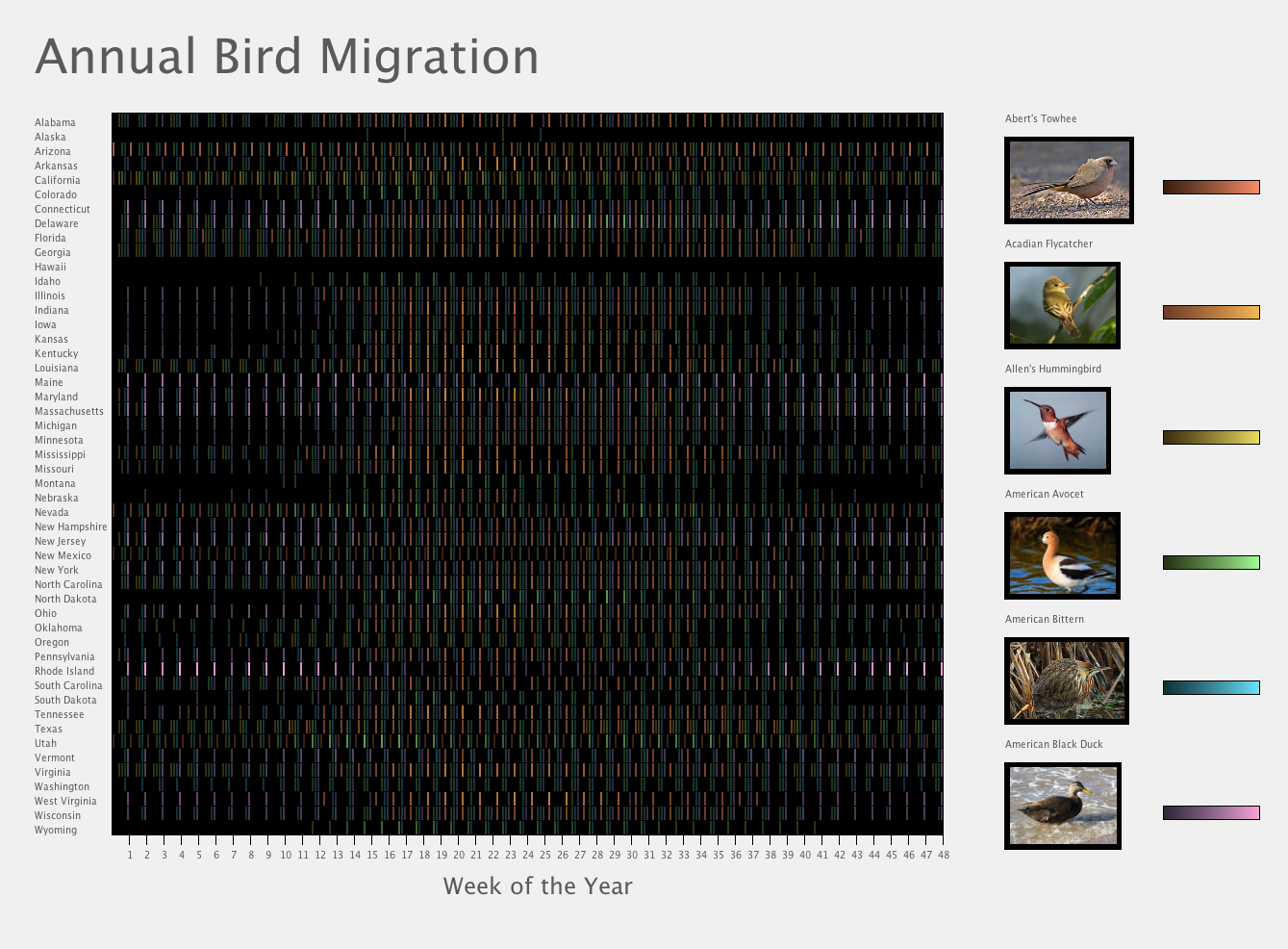
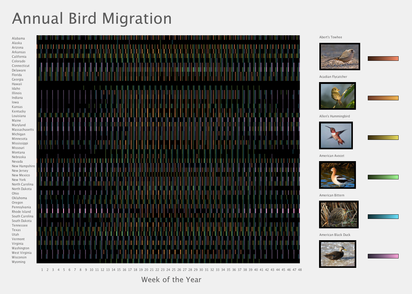
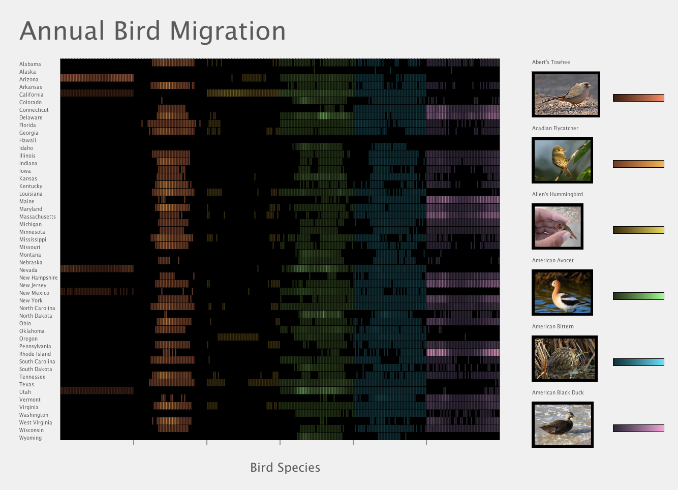
Although the animation is intriguing to look at and watch, it does not allow viewing all the birds and all the data at once. Therefore, a new project using the same data that is being animated in the first project was made to display all the bird data at once in a chart. Black cells represent no data.
The bird data can be organized in two ways. In the first way, the data is organized by week, and for every week the birds appear in order from bird1 to bird6, then it repeats for the next week with its corresponding data. The y-axis is for states, and the x-axis is for birds and week of the year. The birds are displayed on the right hand side with their name, photo and color scheme.
Data Organized by Method 1. Cells Have Gray Border.
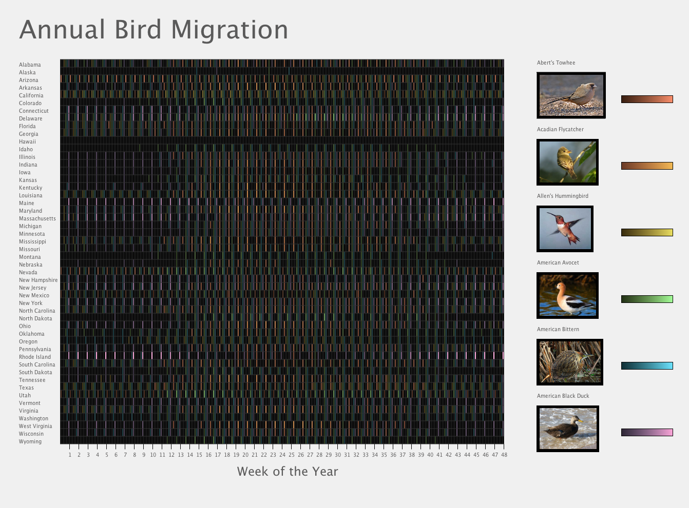
Data Organized by Method 1. Cells Have Black Border.
Data Organized by Method 1. Cells Have No Border.
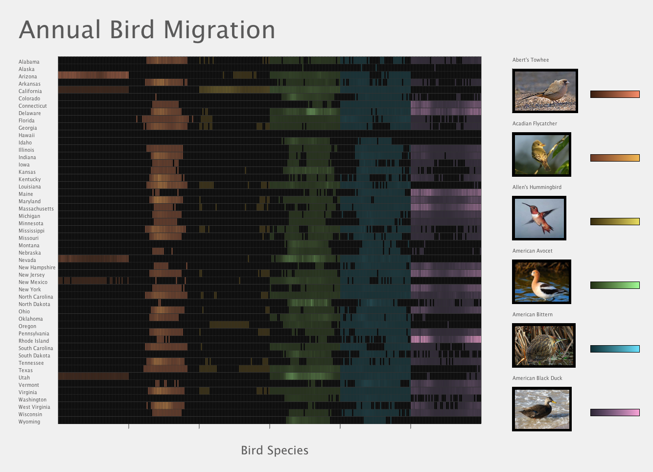
The second version has the same overall layout, and only changes the way the data is organized. The data chart displays all of the data chronologically for one bird along the x-axis together. The y-axis has the states, while the x-axis now has the bird species and time.
Data Organized by Method 2. Cells Have Gray Border.
Data Organized by Method 2. Cells Have Black Border.
Data Organized by Method 2. Cells Have No Border.
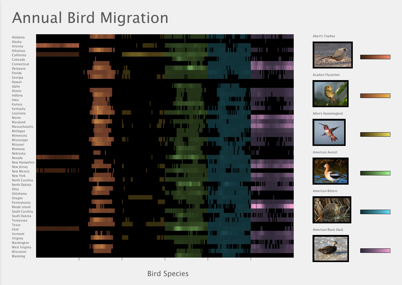
From the results, it can be seen that some birds do not have as much data as others. Abert's Towhee is not present in many states. The Acadian Flycatcher seems to appear most around March through May. Allen's Hummingbird is in California all year round, while it not spotted as much in the other states. The American Avocet is in most states, but it appears to be more prevalent in Utah, and in Delware around June. The American Bittern seems to be spotted similar times if spotted at all in most states. The American Black Duck is most prevalent in Rhode Island at the beginning and end of the year.
The migration pattern is more obvious on some birds, while not much on others. For example, the Acadian Flycatcher begins to appear around April and the data continues to extend out until around August. However, not all birds have this type of animation that appears to spread.
Final Layout Design Currently Displaying American Black Duck with Color Scheme 1
Final Layout Design Currently Displaying American Avocet with Color Scheme 2.
Final Layout Design Currently Displaying American Avocet with Color Scheme 2. Mouse is Over Iowa.
Although the animation is intriguing to look at and watch, it does not allow viewing all the birds and all the data at once. Therefore, a new project using the same data that is being animated in the first project was made to display all the bird data at once in a chart. Black cells represent no data.
The bird data can be organized in two ways. In the first way, the data is organized by week, and for every week the birds appear in order from bird1 to bird6, then it repeats for the next week with its corresponding data. The y-axis is for states, and the x-axis is for birds and week of the year. The birds are displayed on the right hand side with their name, photo and color scheme.
Data Organized by Method 1. Cells Have Gray Border.
Data Organized by Method 1. Cells Have Black Border.
Data Organized by Method 1. Cells Have No Border.
The second version has the same overall layout, and only changes the way the data is organized. The data chart displays all of the data chronologically for one bird along the x-axis together. The y-axis has the states, while the x-axis now has the bird species and time.
Data Organized by Method 2. Cells Have Gray Border.
Data Organized by Method 2. Cells Have Black Border.
Data Organized by Method 2. Cells Have No Border.
From the results, it can be seen that some birds do not have as much data as others. Abert's Towhee is not present in many states. The Acadian Flycatcher seems to appear most around March through May. Allen's Hummingbird is in California all year round, while it not spotted as much in the other states. The American Avocet is in most states, but it appears to be more prevalent in Utah, and in Delware around June. The American Bittern seems to be spotted similar times if spotted at all in most states. The American Black Duck is most prevalent in Rhode Island at the beginning and end of the year.
Code
Mapped Visualization
I used Processing and the external Processing libraries linked below.
Unfolding: www.unfoldingmaps.org
ControlP5: www.sojamo.de/libraries/controlP5/
The Unfolding library is used to create the interactive map and ControlP5 is used for making the drop down menu.
The interactive map required additional data to create the mouse-roll-over interaction. I worked off the MarkerSelectionApp that comes in Unfolding's examples, and obtained the coordinate data from the link below, however, the center coordinates required further fine-tuning.
www.eric.clst.org/wupl/Stuff/gz_2010_us_040_00_500k.json
In addition to the above, I used Google Images API to connect to the internet and get images corresponding to the bird data being displayed. No extra downloads are required for Google Images. I modified the code sample I obtained from the link below.
www.openprocessing.org/sketch/132752
Colors were obtained using the online Color Picker, linked below:
www.tristen.ca/hcl-picker/
Controls:
Spacebar: Change Color Scheme
Source Code + SomeStateData + NoBirdData
Graphed Visualization
I used Processing and the Google Images API which requires no further downloads.
Colors were obtained using the online Color Picker, linked below
www.tristen.ca/hcl-picker/
Controls:
Spacebar: Change Data Organization
's': Change Stroke Color
Source Code + NoBirdData