A Controversial Clustering
MAT 259, 2015
James Schaffer
Concept
For this phase of the project, I shelved the controversy score used previously and decided to use an unsupervised learning technique to determine if checkout behavior could indicate controversial - and therefore interesting - books. Unfortunately, it looks like SPL1 was taken down between this project and the last, so I no longer had access to page numbers and ratings, but I passed the deviation of checkout duration, topic, and popularity (checkout quanitity) to a k-means and heirarchical clustering algorithm. Heirarchical clustering proved far too slow for more than 4000 books, so it was ditched for the former.
Query and Processing
The same query from the TreeMap was used:
SELECT
activity.bib,
dewey.dewey as topic,
extras.pages,
popularity.popularity as pops,
STD(UNIX_TIMESTAMP(activity.i) - UNIX_TIMESTAMP(activity.o)) AS checkoutVariance
FROM
spl1.activity,
spl1.popularity,
spl1.dewey,
spl1.extras
WHERE
activity.bib = popularity.bib
AND dewey.bib = activity.bib
AND activity.i > '2005-01-01 00:00:00'
AND dewey.dewey >= 100
AND dewey.dewey < 200
AND popularity.popularity > 10
AND extras.bib = activity.bib
GROUP BY activity.bib;
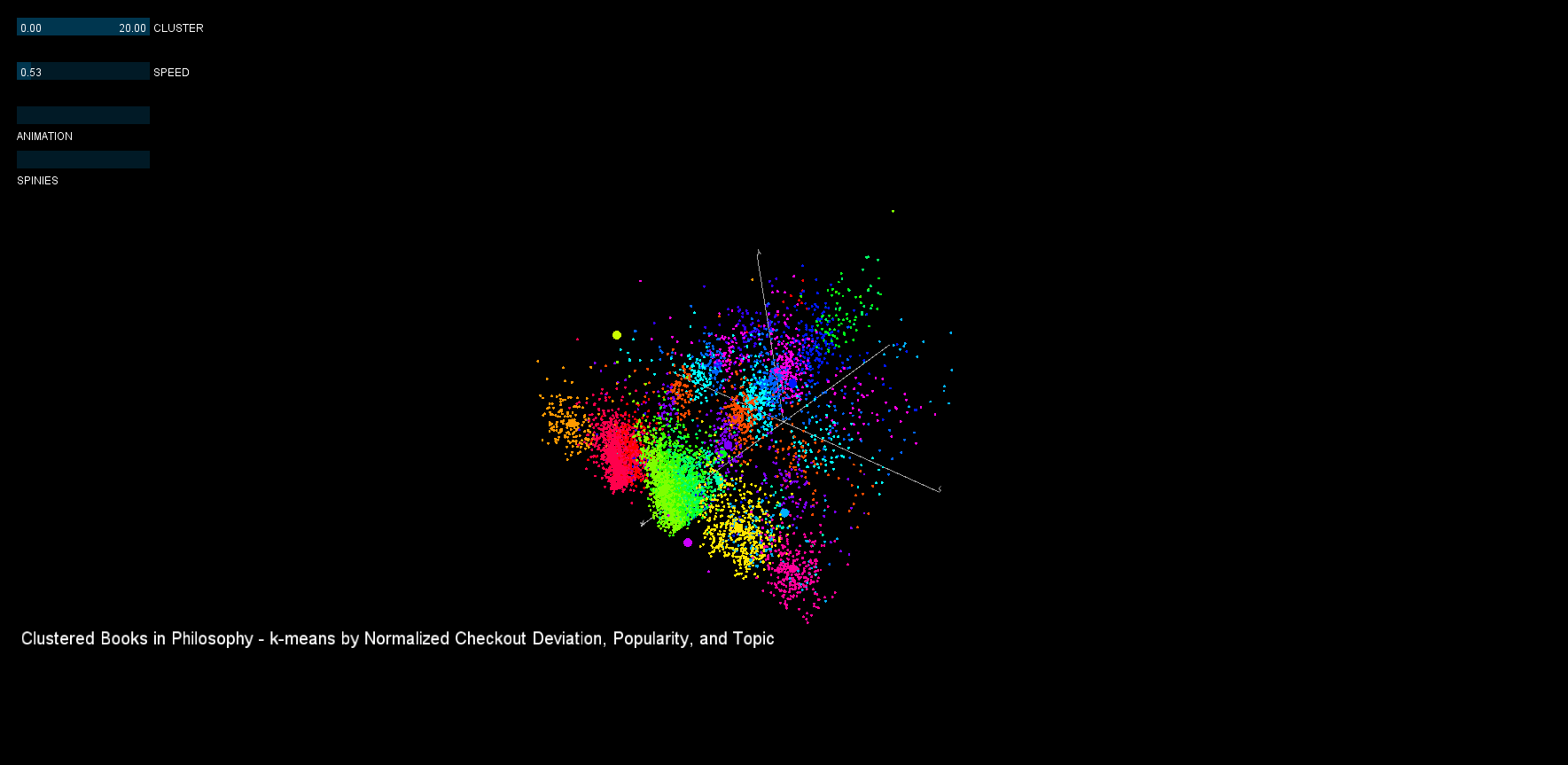
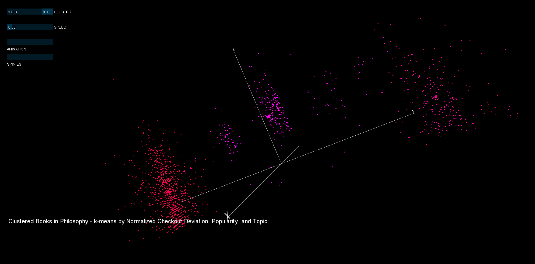
Afterwards, a K-Means clustering in Java (code attached) using the above library yielded approximately 20 clusters over deviation of checkout time, topic, and popularity for books in the philosophy category (total 7500, taken after 2005).
SELECT
activity.bib,
dewey.dewey as topic,
extras.pages,
popularity.popularity as pops,
STD(UNIX_TIMESTAMP(activity.i) - UNIX_TIMESTAMP(activity.o)) AS checkoutVariance
FROM
spl1.activity,
spl1.popularity,
spl1.dewey,
spl1.extras
WHERE
activity.bib = popularity.bib
AND dewey.bib = activity.bib
AND activity.i > '2005-01-01 00:00:00'
AND dewey.dewey >= 100
AND dewey.dewey < 200
AND popularity.popularity > 10
AND extras.bib = activity.bib
GROUP BY activity.bib;
Afterwards, a K-Means clustering in Java (code attached) using the above library yielded approximately 20 clusters over deviation of checkout time, topic, and popularity for books in the philosophy category (total 7500, taken after 2005).
Preliminary sketches
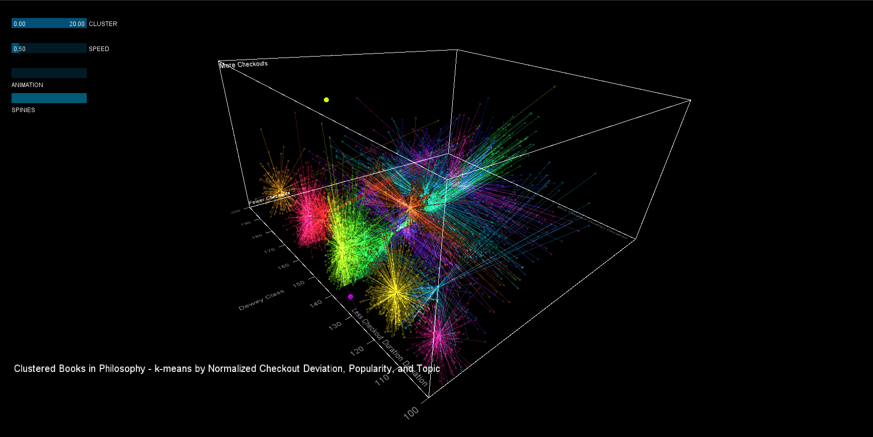
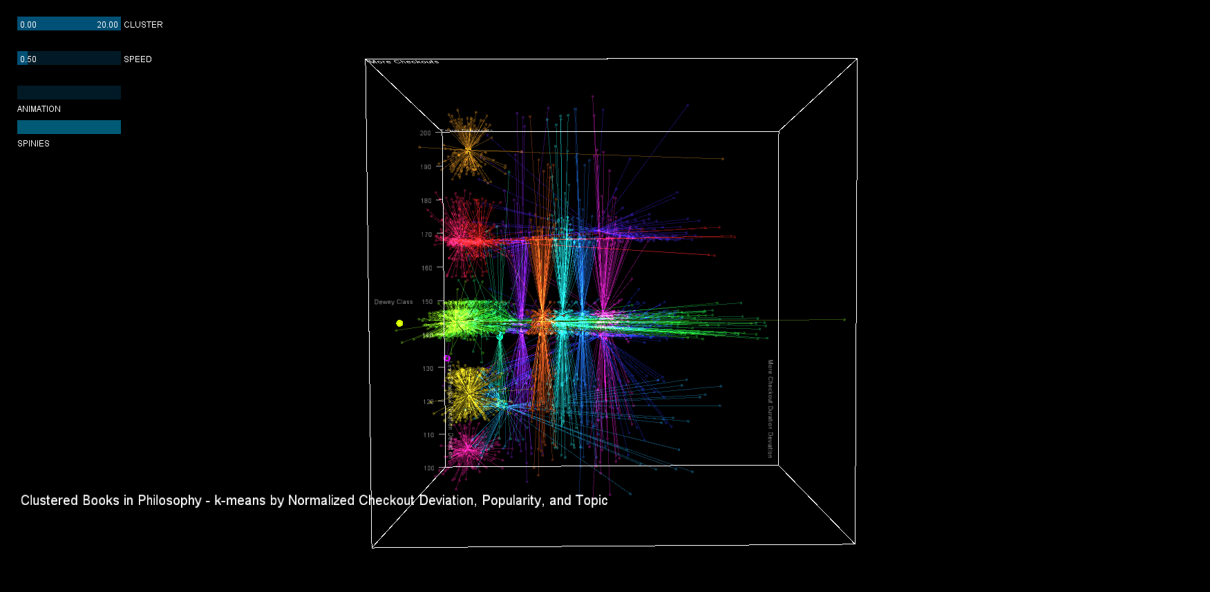
In the visualization, deviation is plotted on the x-axis, logarithmic popularity on the y-axis, and topic on the z-axis. Each dot is a book, larger dots represent the cluster's centroid, and each cluster has a different color. Some interesting clusters can be seen in the high deviation and popularity range.
The first attempt used opaque colors and lines, but this proved to be less informative than was desired. Additionally, the centroid visualization (using the spinies) was not very aestheically appealing.
The first attempt used opaque colors and lines, but this proved to be less informative than was desired. Additionally, the centroid visualization (using the spinies) was not very aestheically appealing.
Process
As with the first project, a dark background with bold colors was used to make the visualization more visually striking. When additive image blending was added in the second iteration, colors could be desaturated and remain bold due to the overlap effect.
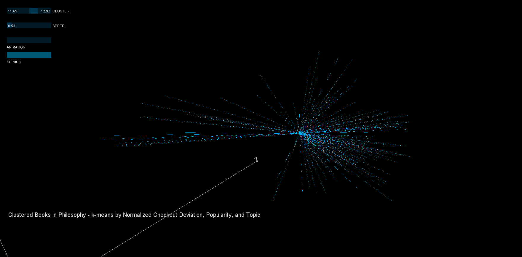
Centroid visualization was also interesting to consider. Originally, simple lines and larger circles were used, but in the second iteration these were replaced with 'bobby pins' (below) that were much more appealing.
Finally, a pulsing cycle through the clusters was added to create an automated visual. The cycle was implemented using sin(), with similar use as in my final project listed here.
Final result
Clustering is an NP-hard problem, and k-means clustering is merely a heuristic that is prone to error. In general, visualizing the clusters yielded useful feedback for running the original k-means clustering. At first, the clusters seemed oddly shaped, and a bit of investigation showed that the original algorithm needed normalized values to work properly. Once that was corrected, drawing a line between each point and the mean of the cluster shows a few more surprisingly shaped clusters that could perhaps be improved through further manipulation of the k-means input.
In the final version, visuals were tuned (as mentioned above), and more readable XYZ scales were added. Similar to what is recommended by statisticians for dense visualization, additive image blending was used to distinguish the density of the clusters. The second iteration proves to be far more interesting visually, and creates a better impression of the distribution of books in 3 dimensions.
From the visualization, we can draw a few conclusions.
1. Checkout quantity and the deviation of the checkout duration are correlated. Interesting books would therefore have a high deviation relative to their popularity.
2. The clustering is not perfect. The clusterer made "slices" of the data in the X and Z directions, clustering together data that is far apart (more clusters would be necessary to get a better fit). Using the 'spinies', poor clusters can quickly be identified.
3. Cluster 8 contains the most popular books with the highest checkout deviation (even though it is a split cluster). Although interaction is not implemented, the original dataset can be used to yield the book list, here are a few selections:
8, "Watch me grow Im one every parents guide to the enchanting 12 to 24 month old"
8, "Toward a psychology of being"
8, "Full catastrophe living using the wisdom of your body and mind to face stress pain and illness"
8, "Crucial conversations tools for talking when stakes are high"
8, "Awakening from grief finding the road back to joy"
Code
Code can be downloaded by clicking here: Controversy Cluster Visualization. Processing, mysql, and Java were used for this project.
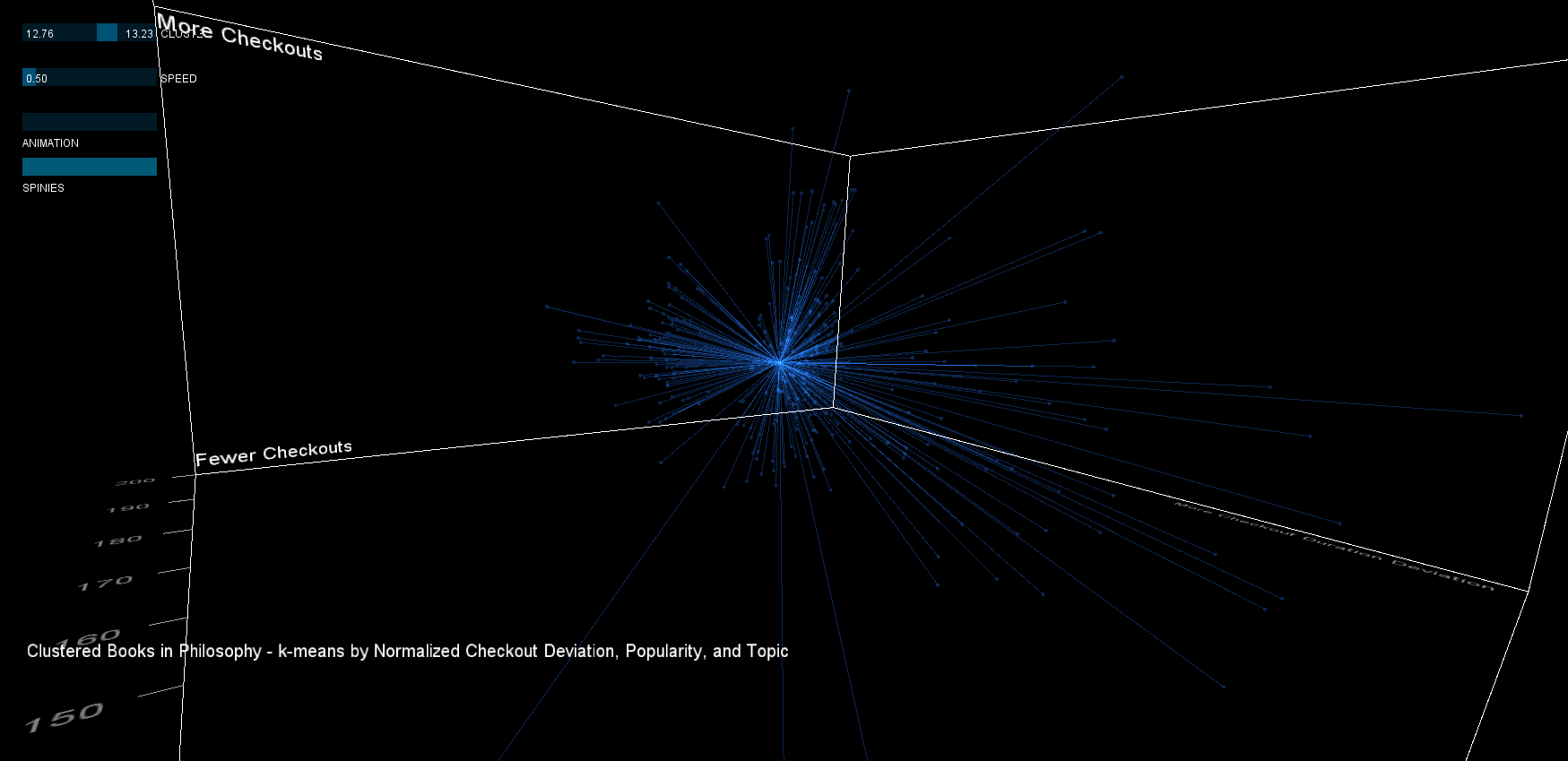
Pressing 1-5 snaps to a pre-defined viewpoint.The sliders at the top can filter the clusters based on their number, and adjust the speed of the animation. The two buttons can be used to enable/disable the centroid visualization (spinies) and toggle the animation.