Forgotten War (Pacific theater of World War II)
MAT 259, 2015
Intae Hwang
Concept
In the history of human, conflicts between two or many countries have continued without any peace time. In the New York Times API, I set the word three major wars in the last century, "Pacific War", "Korean War", "Vietnam War", and got results by each years from 1930. I was able to gather interesting information from the API, how much attention of people had been increased then fall down by each years. I decided to visualize this information.
Query
http://developer.nytimes.com/docs
Preliminary sketches
Interestingly, each graph of the "hit" of each wars showed me different patterns, this represented how did the wars were anticipated before the war was broken, and affected quite long time after the break.
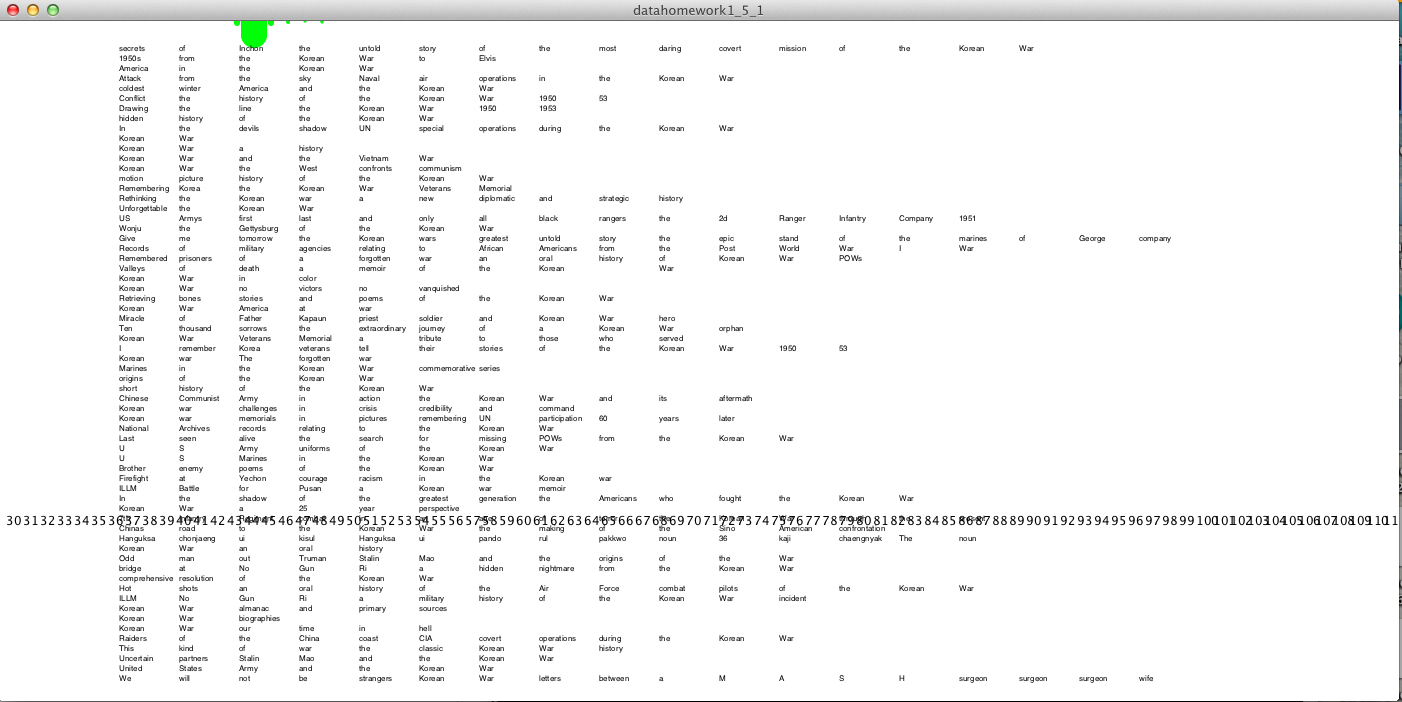
I connected this idea to the Seattle library data base, did brief survey that book does have title of the wars. Then break each titles into single words, and find out the most frequent used in the title.
I'd liked to show the title and changes of interests by the time. Such as, based on the time the book published, arranged words by years, and find out how did the war described by the time line.
Process
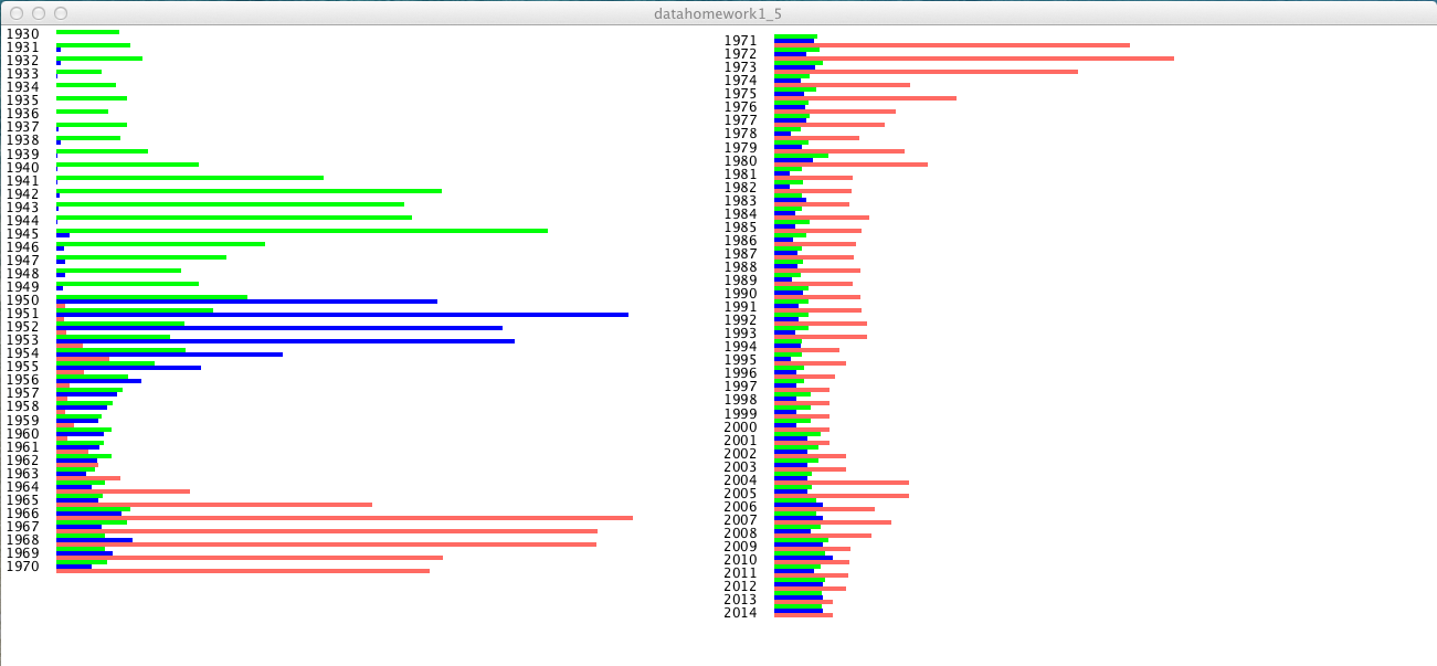
I used the bar graph and draw them with the "Hit" numbers by each year. This graph clearly shows that how many times the three wars were mentioned on the New York Times. The most intersting was that the blue graph, the Korean War, before the war broken, there were only few hit, this means, no one expected the huge conflict happens in Korea. But the as you see, this bar graph is only a transformation of numbers on the data.
Final result
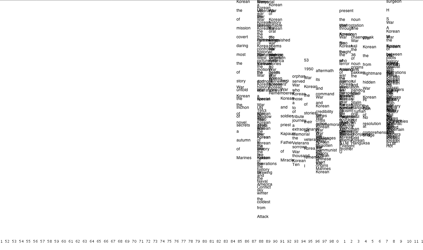
I wanted to inclued the Seattle library data base in this war project. I did brief survey that book does have title of the each actions. After that, I link most frequently checked out books and DVD form the first to fifth on the bottom side of the window.
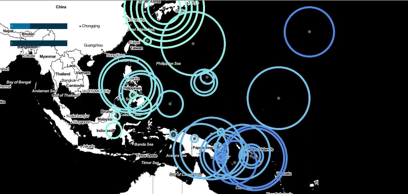
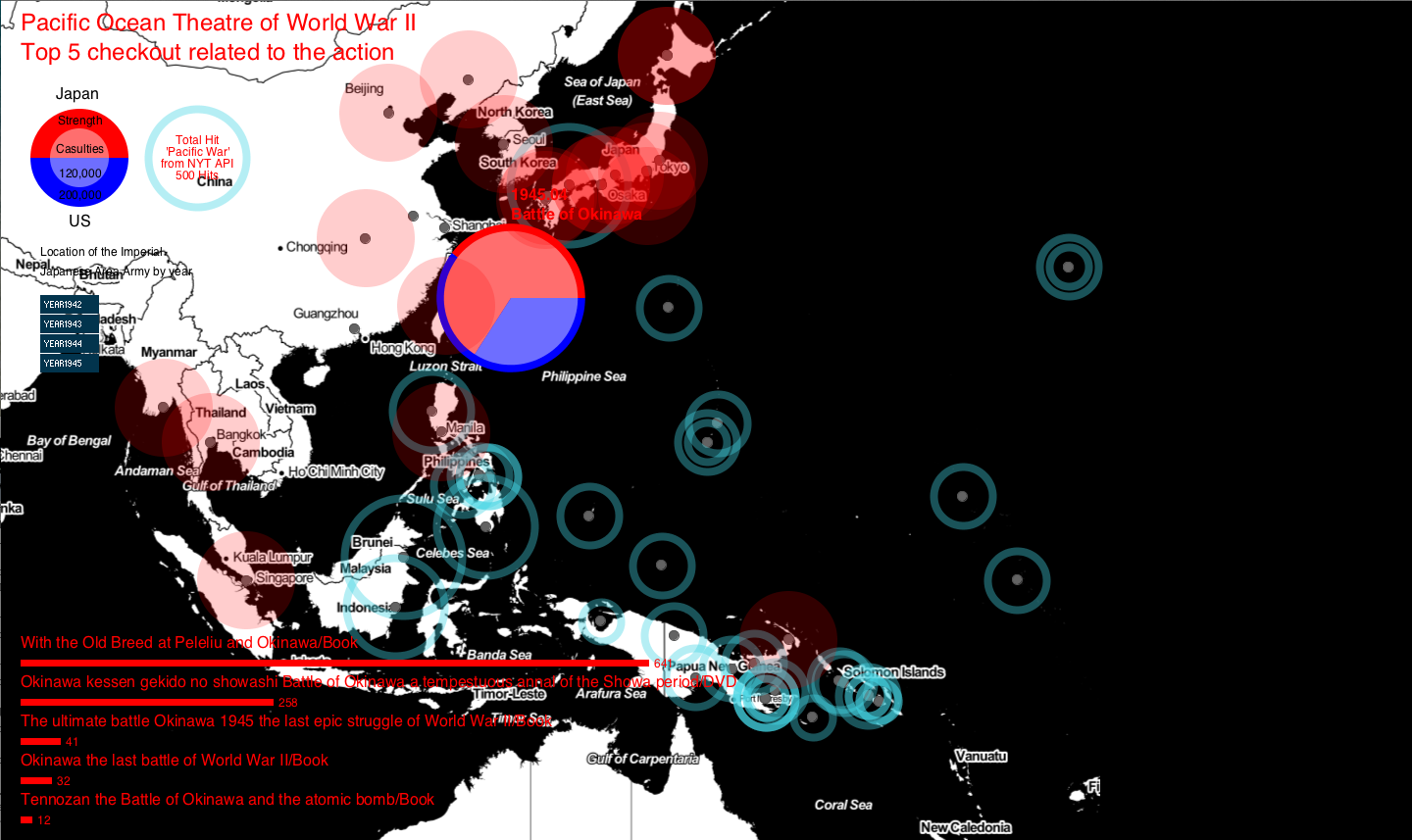
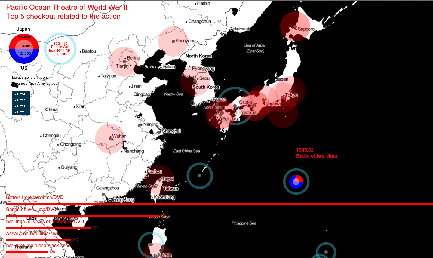
Compare to the European theater, Pacific war was not known well to the public, but the famous movie series introduced these forgotten stories, then they were able to get attention from people. I used the keyword "Pacific War" from 1942 to 1945 by every month, then used the numbers for the diameter of ellipse, the center of round are located to the major campaigns in each month.
Based on Wikipedia, I collected numbers of strength and casualties, then drew graphs. As you can see from the second picture below, outside ellipse stands for entire army strength engaged that war, small ellipse inside shows casualties including killed, lost and POW.
During Pacific War, Imperial Japanese Army has 22 Area Armies, which are commanded by a lieutenant general. This is same as one of six geographical commands in the US Army today. I placed each Area Armies onto their headquarters, this reminds that Imperial Japan Expended the territory during the war.
Interestingly, when it became true that Japan was defeated the war, the Imperial Army organized new area armies to defense US attack to the mainland Japan.
Unfolding map offers nice map interface, but I faced several problems to draw lines and shapes on the map, because, to draw line on the map, each points should coordinate their latitude and longitude not x,y points in the background.
Since the organizations are so complicated, it is almost impossible to get the components date of the area armies, if I get more detailed data, I could map the strength of the armies on the map. This will clarify the change of the war by years.
Code
I used Processing.
Control: Zoom in and out
Shows the location of headquarter of the Imperial Japanese Area Armies. (Red circle)
The top five checkout books related the actions
Strength and casulties of the actions
Source Code + Data
Control: Zoom in and out
Shows the location of headquarter of the Imperial Japanese Area Armies. (Red circle)
The top five checkout books related the actions
Strength and casulties of the actions
Source Code + Data