The Finance of Fear
MAT 259, 2015
Daniel Imberman
Concept
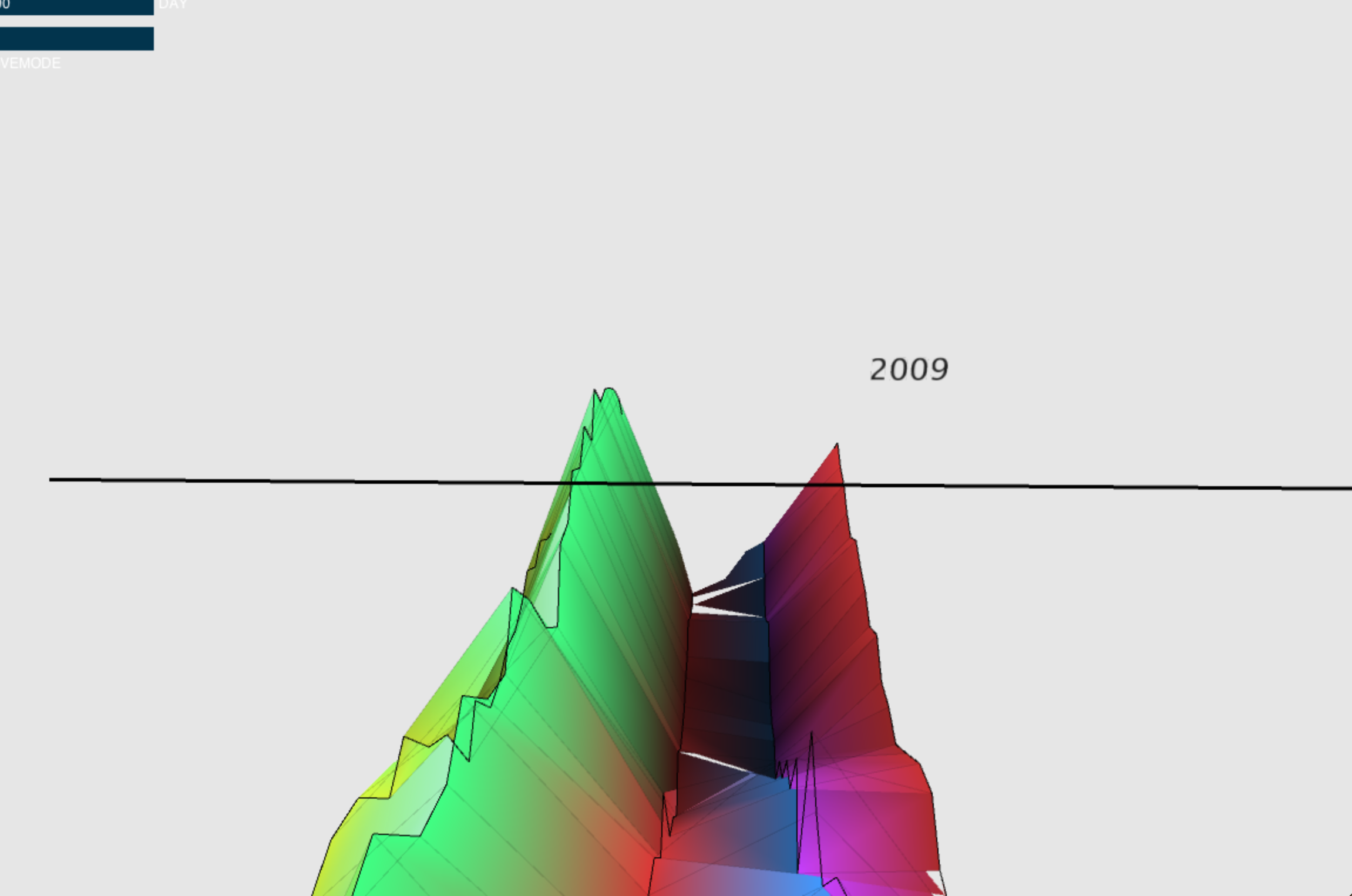
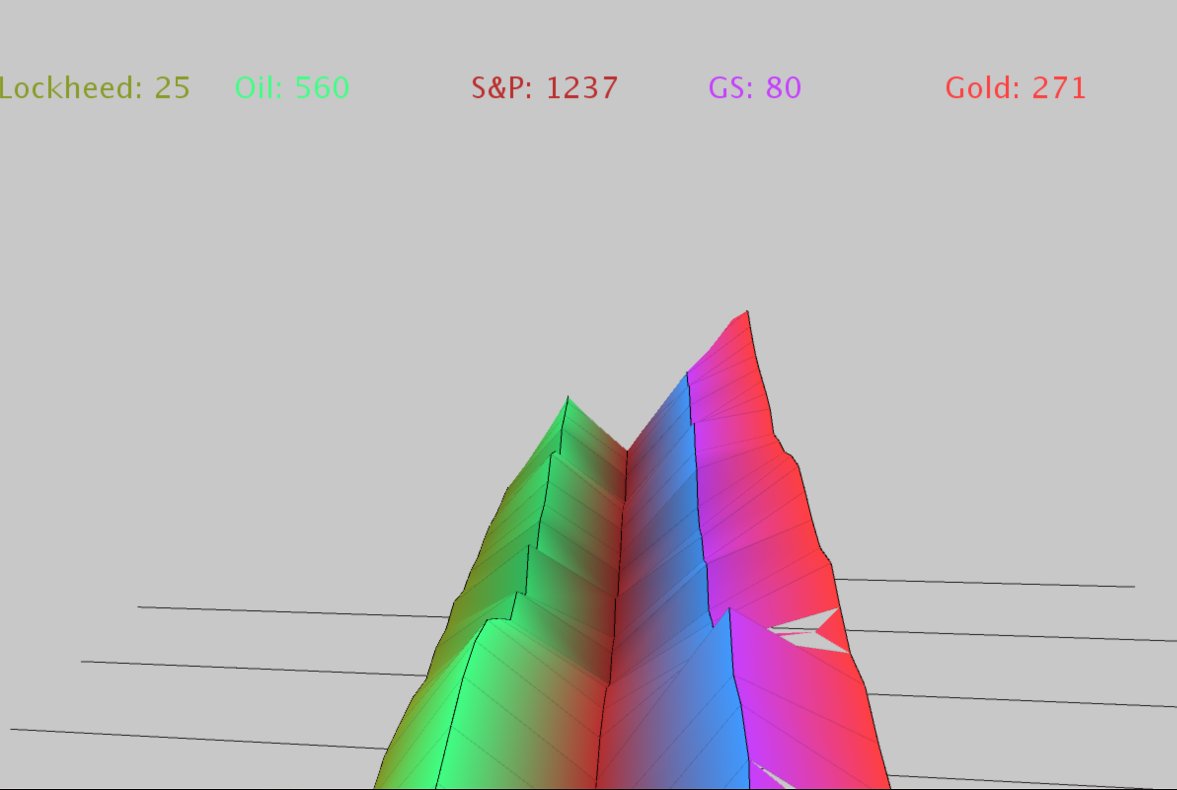
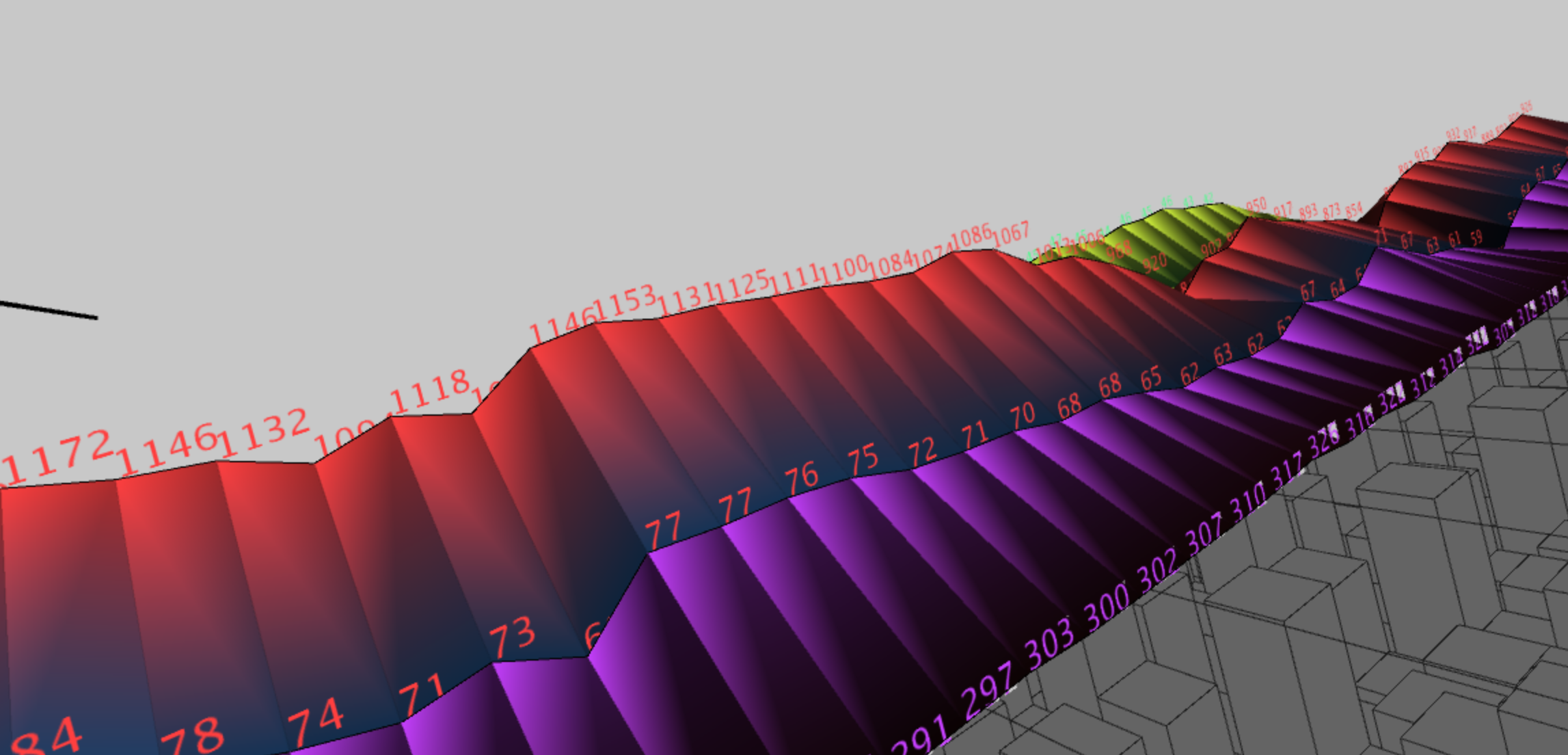
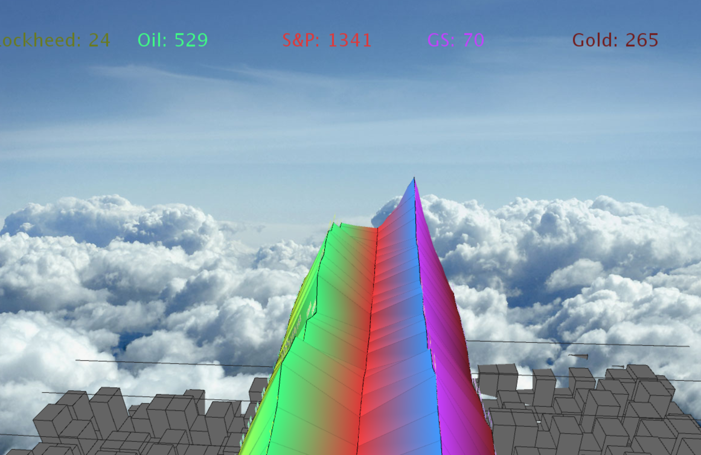
For my project, I wanted to create a stock market visualization that actually expressed the chaos of the financial markets and the susceptibility to world events. I used the quandl api to gather information on gold, goldman sachs, lockheed martin, the S&P 500, and crude oil. In doing so I was able to create a visualization that shows these stocks as a living organism. I wanted to create a sense of health in each stock as time passed, so I made it so that stocks that are doing badly look as if the are rotting.
I found multiple fascinating correlations while doing this project, particularly that there is a fairly heavy relationships between gold and stocks. While I was not surprised that every time the S&P500 tanked gold skyrocketted, I was surprised to find that when the stock market recovered gold was a very slow drip down to its low prices.
I found multiple fascinating correlations while doing this project, particularly that there is a fairly heavy relationships between gold and stocks. While I was not surprised that every time the S&P500 tanked gold skyrocketted, I was surprised to find that when the stock market recovered gold was a very slow drip down to its low prices.
Query
https://www.quandl.com/api/v1/datasets/YAHOO/INDEX_GSPC.csv?trim_start=2000-01-01&trim_end=2015-03-01
https://www.quandl.com/api/v1/datasets/YAHOO/LMT.csv?trim_start=2000-01-01&trim_end=2015-03-01
https://www.quandl.com/api/v1/datasets/WGC/GOLD_DAILY_USD.csv?trim_start=2000-01-01&trim_end=2015-03-01
Process
By using Pshapes, I was able to create custom shapes for each correlated change in stock price, and by directly correlating the brightness of the shape to the normalized price of the stock, we could create a sense of health and sickness in each stock.
Final result
For my final step, I put in a background that mimicked a new york city skyline. I wanted the stocks to soar over the city, creating an almost aurora like effect. I also added in functionality to control the animation
Code
Control: f to move forward, r to reverse, space to stop. press f or r multiple times to speed up.
Source Code + Data