External Correlation
MAT 259, 2013
Scott Bcesar
Introduction
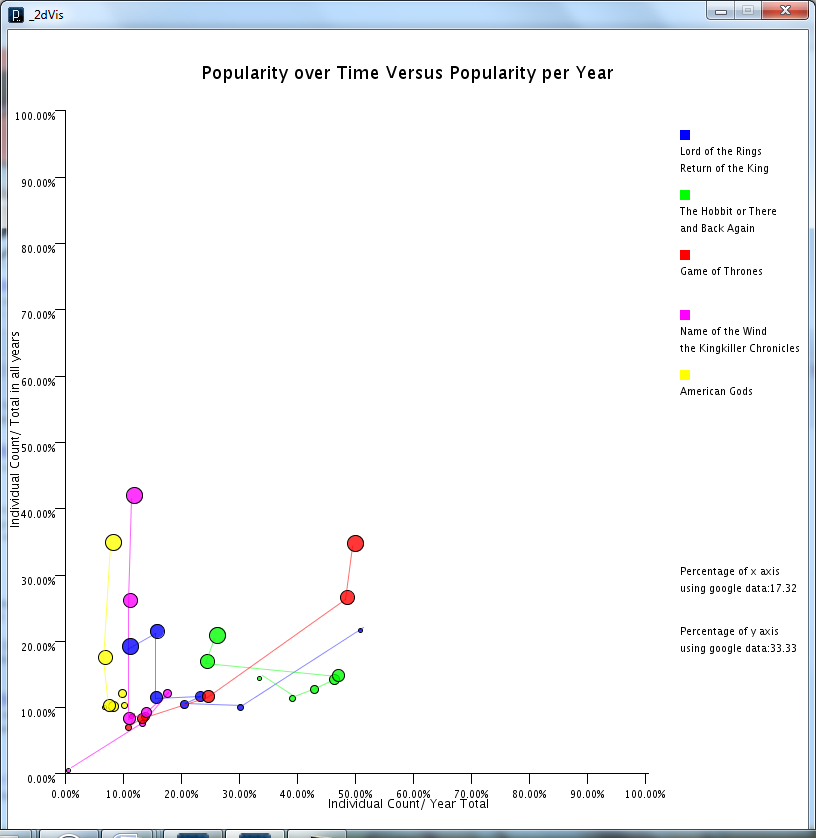
For this project i wanted to experiment with the visualization created in my last project, extending it to visualize two competing sets of data; to that end, I scraped a data set from google's search trends similar to the set I got from Seattle public library, and made the same calculations; then to display the data in an interesting and potentially useful way, I averaged the two data sets together; using mouse position on the screen to control the rate at which they were combined:
Background and Sketches
Query
select
count(*) as count,
sum(case when (title = "lord of the rings return of the king") then 1 else 0 end) as lotrrotk,
sum(case when (title = "hobbit or There and back again") then 1 else 0 end) as hobbit,
sum(case when (title = "game of thrones") then 1 else 0 end) as got,
sum(case when (title = "name of the wind the kingkiller chronicle day 01") then 1 else 0 end) as notw,
sum(case when (title = "american gods") then 1 else 0 end) as ag,
year(o) as years,
month(o) as months
from
title inner join activity on activity.bib=title.bib inner join collection on activity.item=collection.item
where
(title= "lord of the rings return of the king"
or title = "hobbit or There and back again"
or title = "game of thrones"
or title = "name of the wind the kingkiller chronicle day 01"
or title = "american gods")
and year(o)>=2006
group by
YEAR(o), MONTH(o) ASC
limit
100
Results and Analysis
Code
I used Processing and NYTimes - The Article Search API (http://developer.nytimes.com/docs/article_search_api/)
Run in Browser
Source Code
Run in Browser
Source Code
Control
Rolling with the mouse over the data is possible to control percentage of x and y axes. After clicking and rolling over with the mouse, you can see the specific data individual count numbers of year and all years.