External Correlation
MAT 259, 2013
Ramon Rovirosa
Introduction
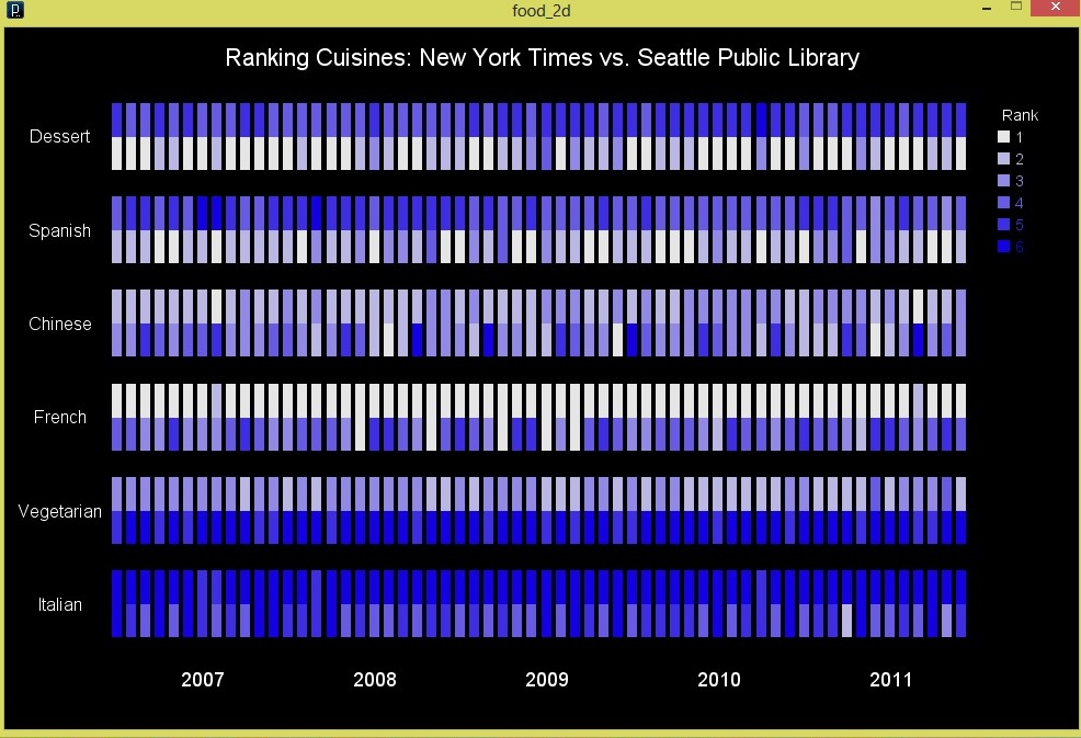
Ranking Cuisines: NY Times vs. Seattle Library
This is a visualization that ranks different food cuisines by popularity at two different sources. The popularity of Cookbooks in the Seattle Public Library Ranked from 1 most popular to 6 least popular and similarly articles in the New York Times are also ranked, and compared in the visualization.
New York Times is the top square for each category, and the Seattle Public Library the bottom Square.
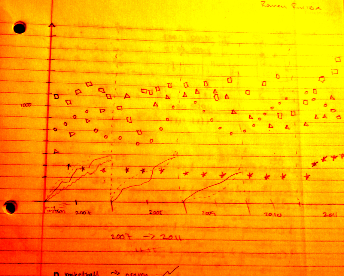
Sketch
Query
SPL Query:
SELECT year(cout) as Days, month(cout) as Months, cout as Dates, itemtype, SUM(case When subj like '%chinese%' and subj like '%food%' Then 1 Else 0 End) as chinese, SUM(case When subj like '%vegetarian%' and subj like '%food%' Then 1 Else 0 End) as vegetarian, SUM(case When subj like '%spanish%' and subj like '%food%' Then 1 Else 0 End) as spanish, SUM(case When subj like '%Italian%' and subj like '%food%' Then 1 Else 0 End) as italian, SUM(case When subj like '%french%' and subj like '%food%' Then 1 Else 0 End) as french, SUM(case When subj like '%dessert%' and subj like '%food%' Then 1 Else 0 End) as dessert FROM inraw where year(cout)= ('2007') or year(cout)= ('2008') or year(cout)= ('2009') or year(cout)= ('2010') or year(cout)= ('2011') or year(cout)=('2012') GROUP BY month(cout), year(cout);
SELECT year(cout) as Days, month(cout) as Months, cout as Dates, itemtype, SUM(case When subj like '%chinese%' and subj like '%food%' Then 1 Else 0 End) as chinese, SUM(case When subj like '%vegetarian%' and subj like '%food%' Then 1 Else 0 End) as vegetarian, SUM(case When subj like '%spanish%' and subj like '%food%' Then 1 Else 0 End) as spanish, SUM(case When subj like '%Italian%' and subj like '%food%' Then 1 Else 0 End) as italian, SUM(case When subj like '%french%' and subj like '%food%' Then 1 Else 0 End) as french, SUM(case When subj like '%dessert%' and subj like '%food%' Then 1 Else 0 End) as dessert FROM inraw where year(cout)= ('2007') or year(cout)= ('2008') or year(cout)= ('2009') or year(cout)= ('2010') or year(cout)= ('2011') or year(cout)=('2012') GROUP BY month(cout), year(cout);
Results and Analysis
Overall, this project was an improvement on my previous visualization where I was able to more adequately show a change in food ranking by using color/brightness instead of physical position ranking more efficiently.
Code
I used Processing and NYTimes - The Article Search API (http://developer.nytimes.com/docs/article_search_api/)
Run in Browser
Source Code
Run in Browser
Source Code
Control
[1-3] highlight individual data set by color
[0] turn off highlighting
[0] turn off highlighting