2D Spatial Map
MAT 259, 2013
Ramon Rovirosa
Introduction
What is Seattle Eating?
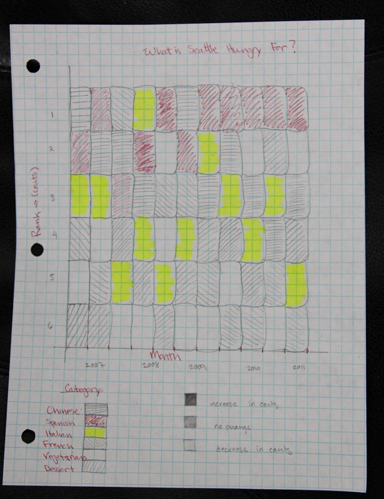
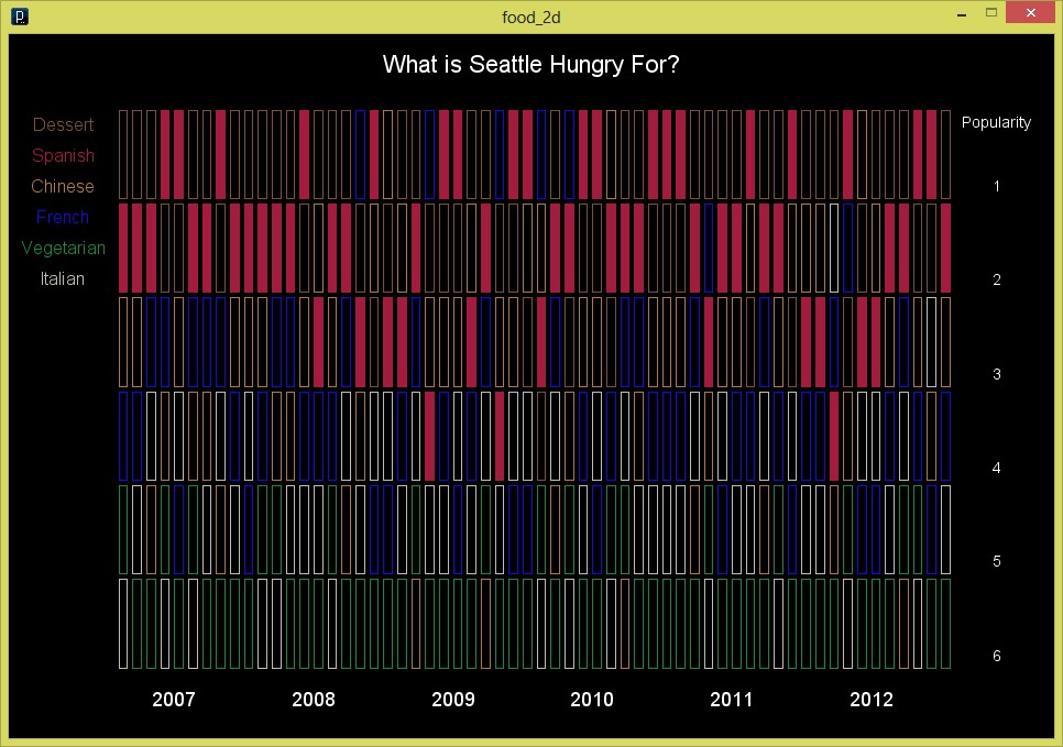
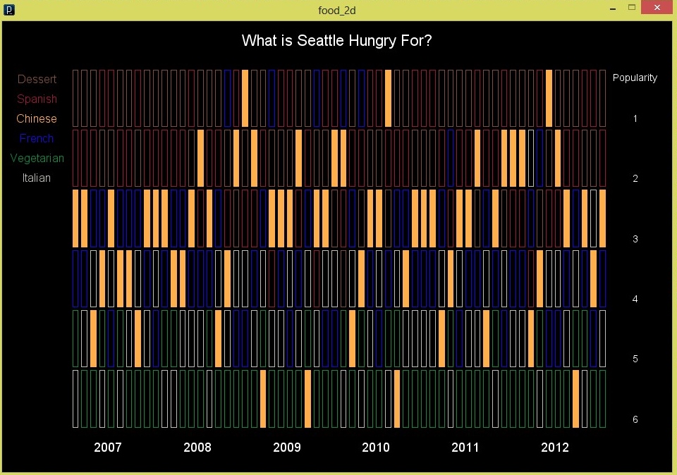
The following visualization is an interactive ranking of the top six food cuisines at the Seattle Public Library by month. For example, the first month desert was the most popular food item followed by Spanish, Chinese, French, Vegetarian, and then Italian food. If you hover over a rectangle it displays the rank for that food cuisine over the 5 years so you can more easily see the changes in ranking over the months.
The following visualization is an interactive ranking of the top six food cuisines at the Seattle Public Library by month. For example, the first month desert was the most popular food item followed by Spanish, Chinese, French, Vegetarian, and then Italian food. If you hover over a rectangle it displays the rank for that food cuisine over the 5 years so you can more easily see the changes in ranking over the months.
Background
and Sketches
and Sketches
Query
SELECT day(cout) as Days, month(cout) as Months, cout as Dates, itemtype,
SUM(case When subj like '%chinese%' and subj like '%food%' Then 1 Else 0 End) as chinese,
SUM(case When subj like '%vegetarian%' and subj like '%food%' Then 1 Else 0 End) as vegetarian,
SUM(case When subj like '%spanish%' and subj like '%food%' Then 1 Else 0 End) as spanish,
SUM(case When subj like '%Italian%' and subj like '%food%' Then 1 Else 0 End) as italian,
SUM(case When subj like '%french%' and subj like '%food%' Then 1 Else 0 End) as french,
SUM(case When subj like '%dessert%' and subj like '%food%' Then 1 Else 0 End) as dessert
FROM inraw where year(cout)= ('2007') or year(cout)= ('2008') or year(cout)= ('2009') or year(cout)= ('2010') or year(cout)= ('2011')
GROUP BY month(cout), year(cout);
Query Explanation
Results and Analysis
Overall I learned a lot from this project but I need to work on my coloring/visualization/representation of data from a design point of view.
Code