Linear Frequency
MAT 259, 2013
Scott Bcesar
Introduction
visualization of checkout rates of the game of thrones series:
using a query which pulls data on checkouts in four categories by month and by year; I propose to create a linear visualization of the data by use of interpretation of space and color.
using a query which pulls data on checkouts in four categories by month and by year; I propose to create a linear visualization of the data by use of interpretation of space and color.
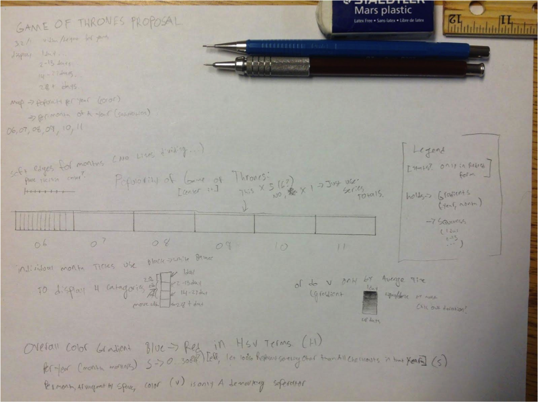
Background
and Sketches
and Sketches
Query
Analysis
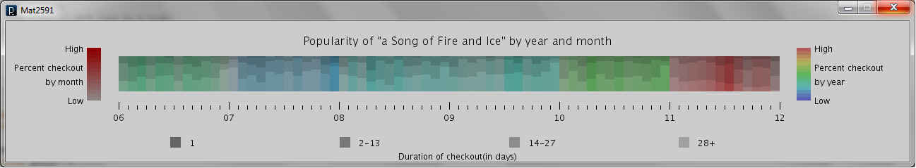
This is the finished linear graph of checkout interest in game of thrones, which captures a few points of interest, First, the increased popularity of the series in 2006, tailing off towards 2007 following the Release of Feast for Crows, then it regains popularity starting 2010 in April, just one month after the hit hbo series was announced. The spike in July and August of 2011 likely correlates with the release of the fifth novel, Dance with Dragons, as well as the airing of the premiere of the HBO series.
The graph visualizes the popularity of the books each year, as well as the popularity of the books per month each year.
The project visualizes the popularity of the series for each month between 2006 and 2012.
The graph visualizes the popularity of the books each year, as well as the popularity of the books per month each year.
The project visualizes the popularity of the series for each month between 2006 and 2012.
Code