Linear Frequency - Version.1
MAT 259, 2013
Saeed Mahani
Introduction
Question:
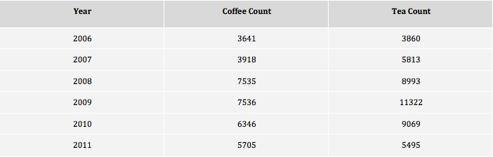
How has interest in items relating to coffee changed in comparison with tea between 2006 and 2011?
My goal was to retrieve every record relating to coffee or tea, so I thought the ‘title’ and ‘subj’ fields were approriate to search for the keywords tea and coffee. Since the SPL system became operational in 2005, I limited the date range to 2006 and onward to not have any incomplete years. I wanted to compare the popularity of coffee versus tea over time, so I summed up the number of records relating to each seperately, and displayed the result in two seperate columns, ordered by year.
Background
and Sketches
and Sketches
Query
SELECT
year(cout) as 'Year',
sum(case when (title like '%coffee%' or subj like '%coffee%') then 1 else 0 end) as 'Coffee Count',
sum(case when (title like '% tea %' or title like '% tea' or title like 'tea %' or subj like '% tea %' or subj like '% tea' or subj like 'tea %') then 1 else 0 end) as 'Tea Count'
FROM
inraw
WHERE
(title like '%coffee%' or subj like '%coffee%' or title like '% tea %' or title like '% tea' or title like 'tea %' or subj like '% tea %' or subj like '% tea' or subj like 'tea %') and year(cout) >= 2006
GROUP BY
year(cout)
ORDER BY
year(cout) asc;
Process
Processing time: 258.598 seconds duration, 0.0 seconds fetch time
Analysis
The results seen in the table below show coffee and tea at a similar level of popularity in 2006. In the following 3 years, both surged in popularity, but tea’s surge was greater, beating coffee by a significant margin every year (about 20%-50%). In 2011 the two returned back to a similar lower level.
Visualization Concept
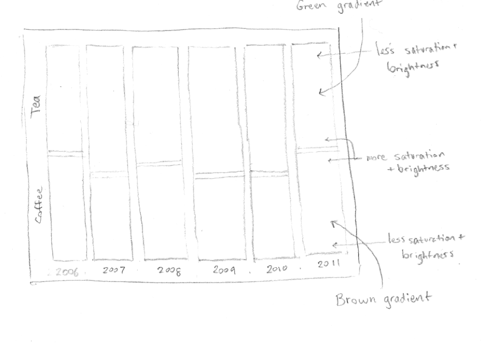
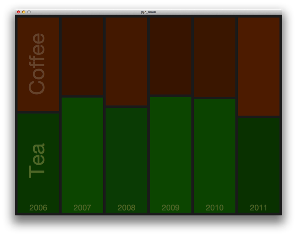
I want to highlight the change in popularity between tea and coffee, so rather than show exact numbers I will show a normalized set of bars showing the proportion of coffee items vs tea items. Just to clarify: in 2006, coffee and tea iteams were equally popular in the library, so the meeting point for the 2006 bar is roughly in the middle (vertically). However, the following four years tea was more popular, and is shown below by more of the bar area given to the tea side. Each side of the bars will be appropriately colored; green for tea, brown for coffee. Time goes from left to right be general convention. I may have more granularity in the time axis if I find certain peaks and dips meaningful and worth showing (perhaps due to some world event relating to coffee/tea).
Code
Linear Frequency - Version 2.
MAT 259, 2013
Saeed Mahani
Introduction
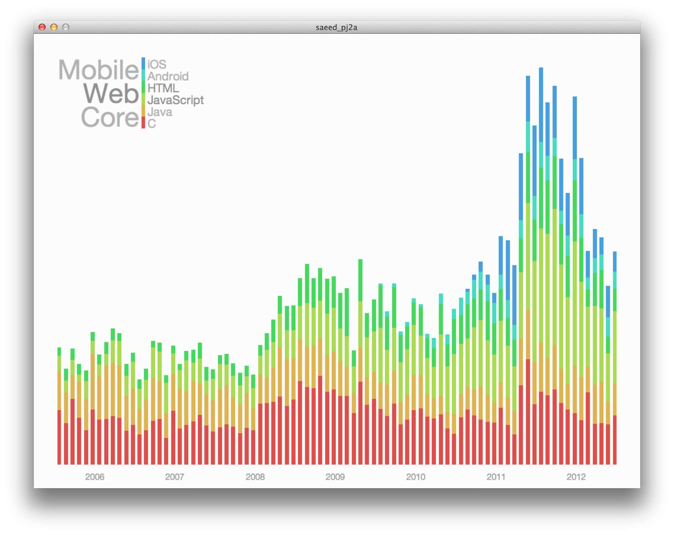
I was curious to see how the SPL reflected the shifts in programming language preferences in the past few years. I knew mobile programming was on the rise, as well as web, but didn't quite know how core languages like Java and C++ were doing. I picked the two most popular languages from each category to observe.
Query
select
year(activity.o) as 'Year',
month(activity.o) as 'Month',
sum(case when (keyword.keyword = 'c') then 1 else 0 end) as 'C',
sum(case when (keyword.keyword = 'java') then 1 else 0 end) as 'Java',
sum(case when (keyword.keyword = 'javascript') then 1 else 0 end) as 'JavaScript',
sum(case when (keyword.keyword = 'html') then 1 else 0 end) as 'HTML',
sum(case when (keyword.keyword = 'android') then 1 else 0 end) as 'Android',
sum(case when (keyword.keyword = 'ios') then 1 else 0 end) as 'iOS'
from
keyword, title, collection, item, subject, activity
where
keyword.bib = title.bib and
item.bib = title.bib and
item.item = collection.item and
item.bib = subject.bib and
activity.bib = item.bib and
(subject.subject like '%programming%' or subject.subject like '%computer%' or subject.subject like '%software%' or subject.subject like '%development%') and
(keyword.keyword = 'java' or keyword.keyword = 'javascript' or keyword.keyword = 'python' or keyword.keyword = 'android' or keyword.keyword = 'ios' or keyword.keyword = 'c' or keyword.keyword = 'html') and
year(activity.o) >= 2006 and year(activity.o) <= 2012
group by year(activity.o), month(activity.o);
Query Explanation
The query searches for checkout events that contain programming language names in the subject or title and are categorized as a programming/software item. I only look in the years for which we have complete SPL data, and group the results by month.
Though this query uses expensive SQL operators ('like', 'sum'), it completes in just a few seconds.
Results Analysis
I wanted to visualize the individual rise/fall in popularity of these popular programming languages while still showing the general trend in programming related checkouts at the library. A segmented bar graph was ideal for this. The number of languages I was examining was small enough to assign a unique color to each. It was then simply a matter of adjusting the saturation and brightness (and keeping it consistent for each color) to find colors that delimitated the languages enough but were also easy on the eyes. The results make clear a few interesting points in the data. For one, the mobile platform begins to appear in checkouts in early 2010 with the first Android books. Second, core languages seem to remain at a fairly constant level despite the increase in the other categories. Lastly, though web languages have been around for a couple decades, they are recently experiencing an upward surge, possibly due to the radical changes in website architecture visible in complex websites like Facebook.
Code