External Correlation
MAT 259, 2012
David Gordon
Introduction
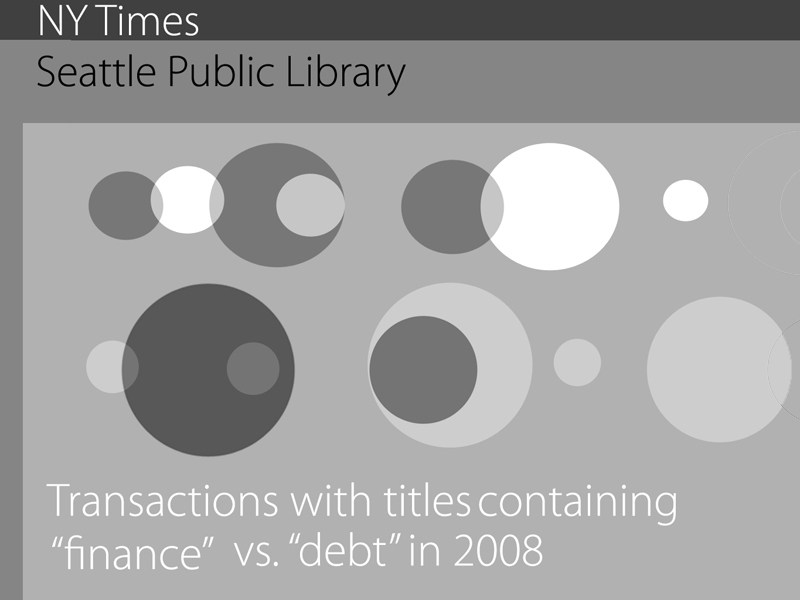
In Project 1, I found a decreasing interest in SPL titles containing "Real Estate" corresponded to the timeline of the US mortgage collapse. For this project, I wanted to continue studying the recent global financial downturn by correlating SPL transactions with New York Times (NYT) article trends. The interactive graphic correlates SPL transactions for titles containing "Real Estate" with NYT articles containing the term "Greece." I hypothesized that the decrease in interest in real estate library titles would correspond to an increased NYT focus on Greece during the ensuing European financial crisis.
Background
and Sketches
and Sketches
I was interested whether a decreasing interest in real estate, likely due to the US mortgage collapse, coincided with a focus on Greece during the European financial crisis. I used a Library SQL query to search for the number of checkout transactions with titles containing "Real Estate:"
Query
select year(cout), month(cout), count(*) from inraw where title like '%real estate%' and cout > '2006-01-01' and cout < '2012-01-01' and deweyClass != 'null' and year(cout) >= '2006' group by year(cout), month(cout) order by year(cout), month(cout);
Explanation
This query selects titles containing "Real Estate" between 2006 and 2011, returning the results grouped and ordered by year and month. I also used a New York Times API query to search for the number of articles each month containing "Greece."
Process
I chose circles to represent SPL and NYT transaction frequencies per month, since a bar graph showing two datasets with 60 data points each might be difficult to read. I experimented with different color and labeling schemes, ending up with a grayscale graph. In the final version, I moved the labels from the center to the upper left, to focus the viewer's attention on the visualization.
Result and
Analysis
Analysis
Each month appears as a circle on the graph, with larger circles representing higher counts. The SPL transactions appear as black circles, while NYT articles appear as white circles with black dots representing the front page articles for that month.
Code
Control
Clicking the mouse displays the first NYT front page article title for that month. The spacebar toggles the grid on and off.