Predictions of Book Checkouts
MAT 259, 2016
Guanyu Chen
Concept
For Project 2, it was a extension of my project 1 that building time-series models to make predictions of numbers of checkouts in different dewey classes (total classes are 10). The primary model used in project is ARIMA which is a classical predictive model in statistics.
Due to consistent time factor, the predicting process is to use numbers of checkouts in different dewey classes from 2006 to 2010 as training sets and build ARIMA models based on the original training set. Then, I applied model to make a prediction for Jan.2011. After that, I add true number of checkout in Jan.2011 into the training set and make a prediction for Feb.2011. So on and so forth, it is possible for me to collect comparsions of predicted data and true data points. During this process, I found that there were two missing values and one outlier in 2018. To deal with missing problems, I used Kalman Smoothing to perform imputation.
Due to consistent time factor, the predicting process is to use numbers of checkouts in different dewey classes from 2006 to 2010 as training sets and build ARIMA models based on the original training set. Then, I applied model to make a prediction for Jan.2011. After that, I add true number of checkout in Jan.2011 into the training set and make a prediction for Feb.2011. So on and so forth, it is possible for me to collect comparsions of predicted data and true data points. During this process, I found that there were two missing values and one outlier in 2018. To deal with missing problems, I used Kalman Smoothing to perform imputation.
Query
Please put the queries or codes to grab the data here.
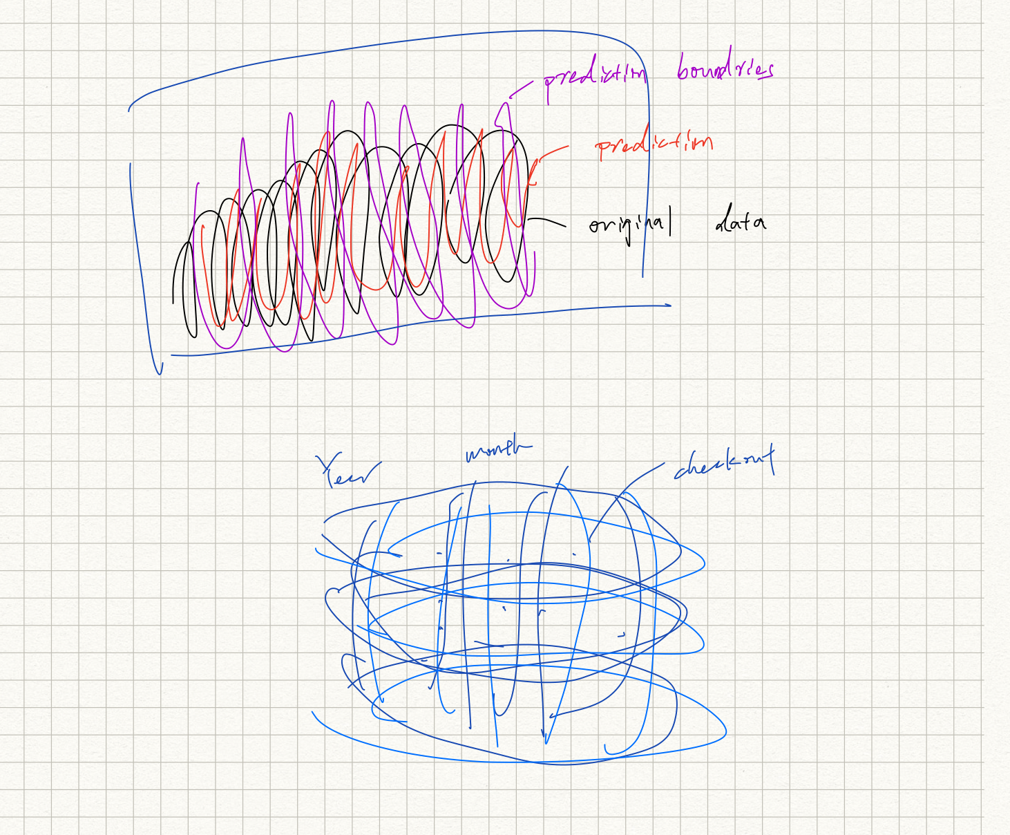
Preliminary sketches
My first sketch of imaging plot is all circle lines of true data and prediction data with prediction boundaries. After discussing with Prof.Legrady, I decided to create the shape from the second plot. It is kind of like a sphere. We can map all data points in 3D space and connect them with lines.
Process
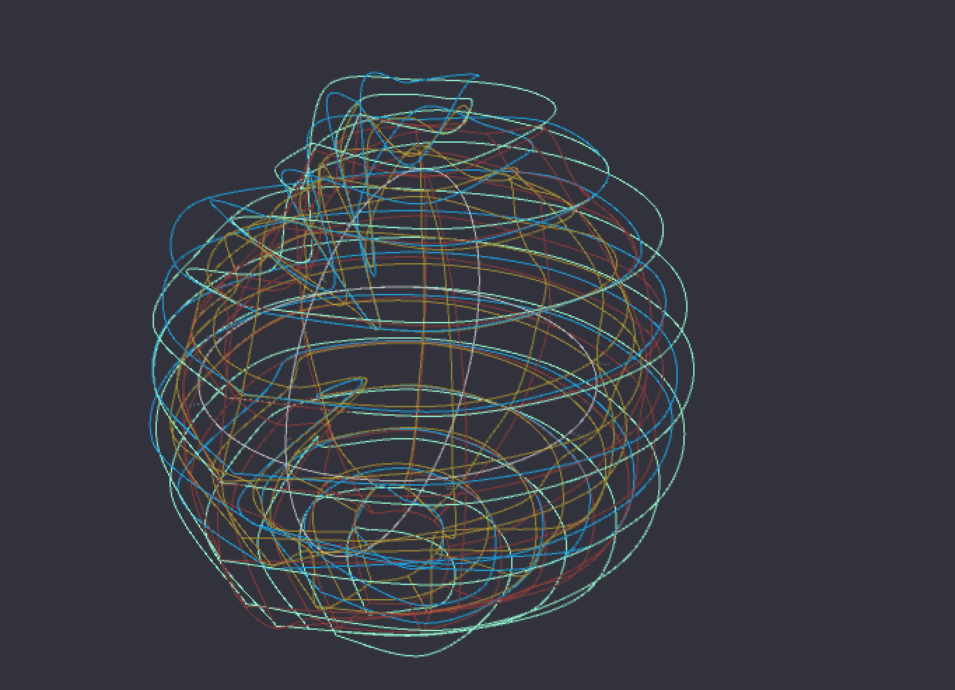
I did not save too many drafts when processing my graph. At the begining of drawing curves, I only used line to connect different points. However, it is too ugly to compare predicted checkouts and true checkouts. Thus, to use curveVextex() function jumped into my mind. The plot shown below is my first successful draw with smoothing curves.
Final result
I mapped my data into a sphere with coordinates X(Year), Y(Month), Z(Counts). Based on all data points, it is possible to draw smooth curves of points for months and years in order to see how differences/closeness between true checkouts and predicted checkouts over time. During drawing data, I redesigned ranges of values from different dewey classes to make sure mapping them into similar dimensions.
Some final graphs are shown below:
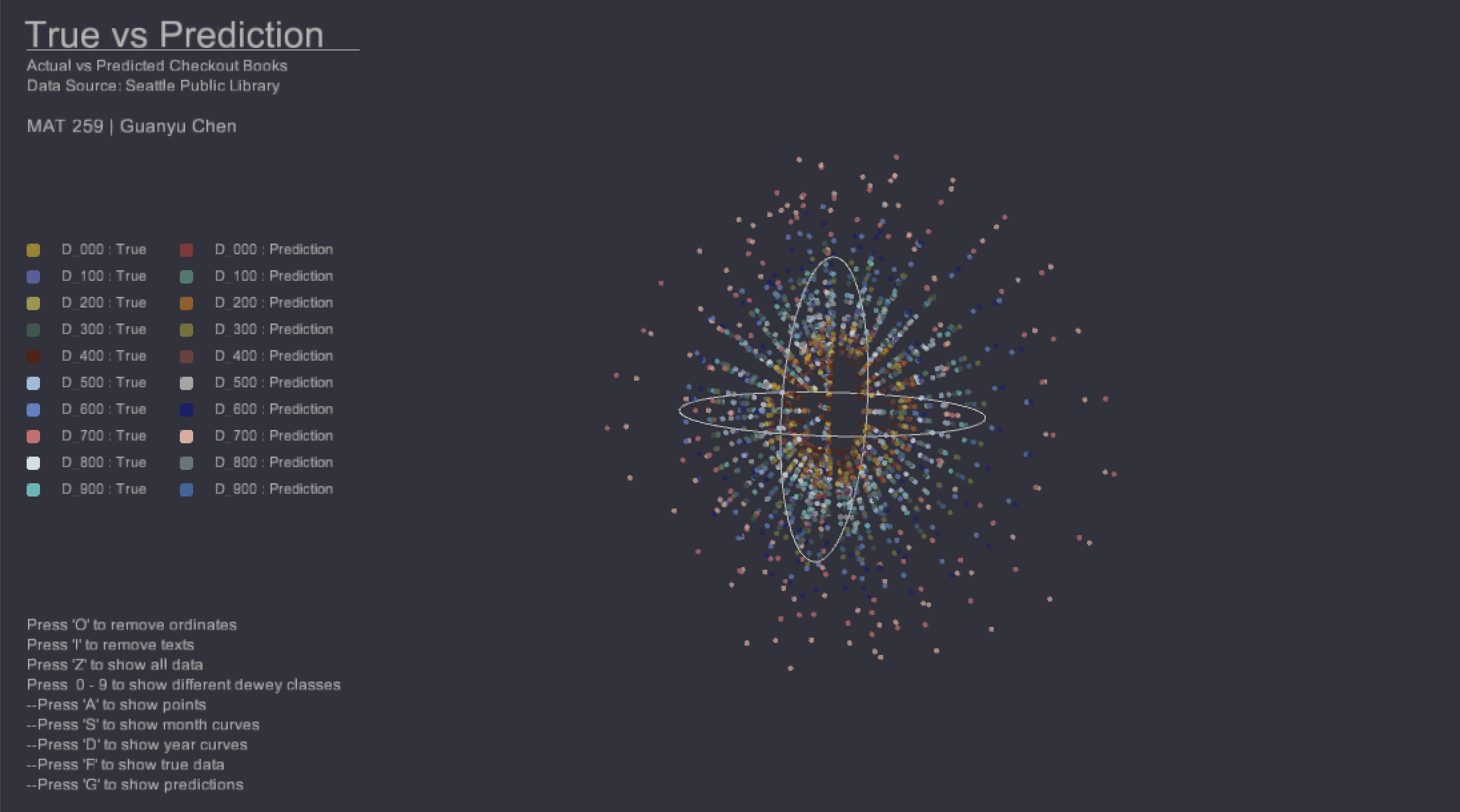
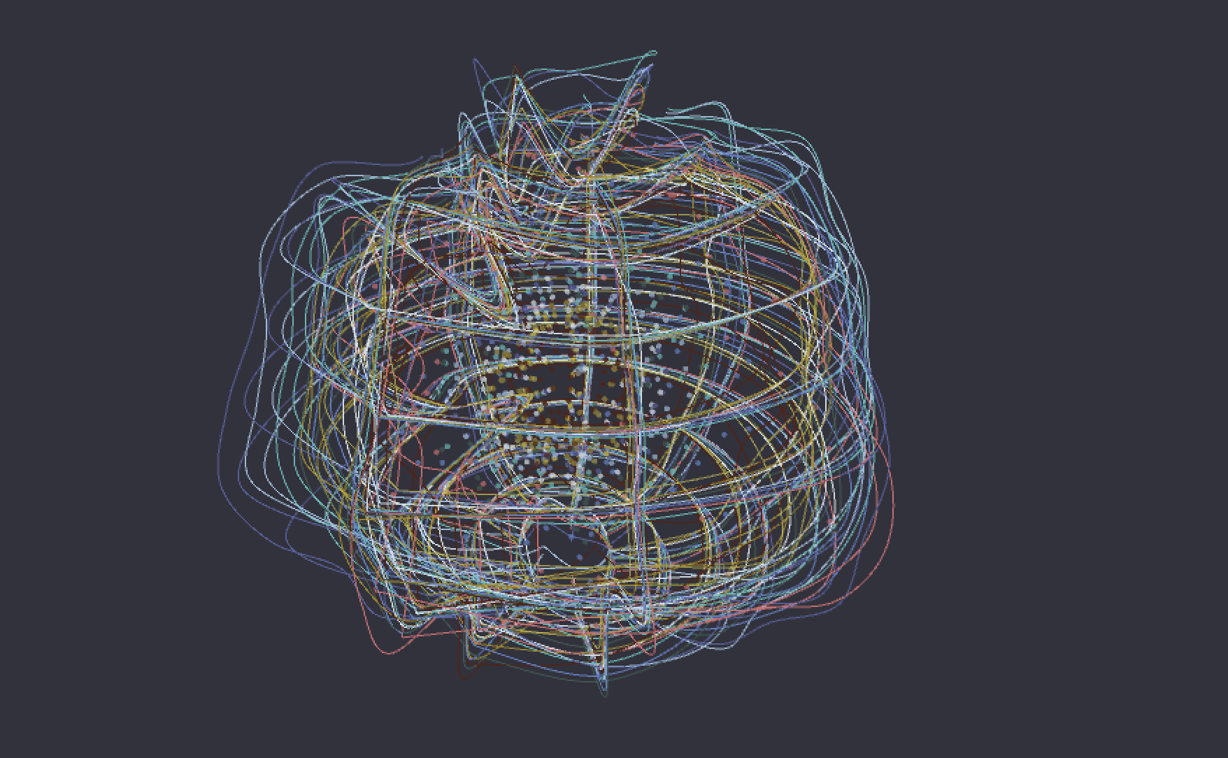
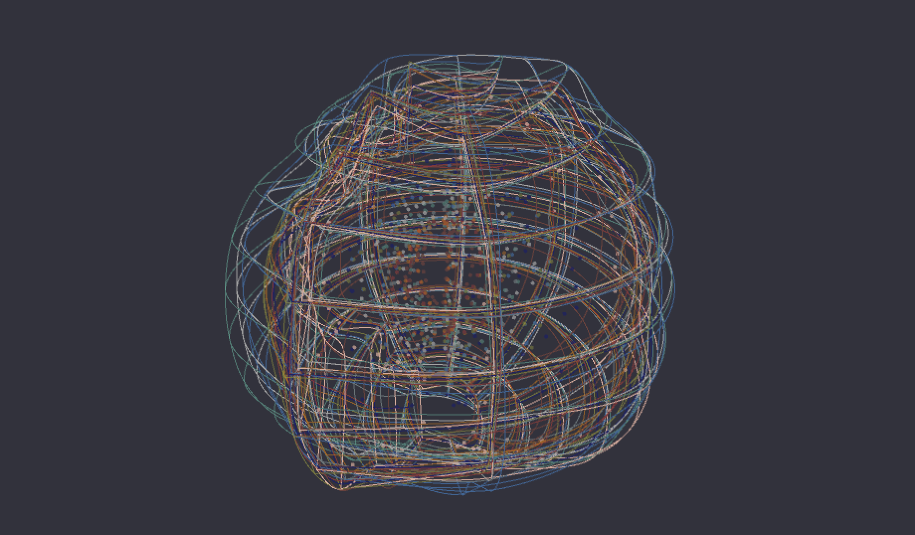
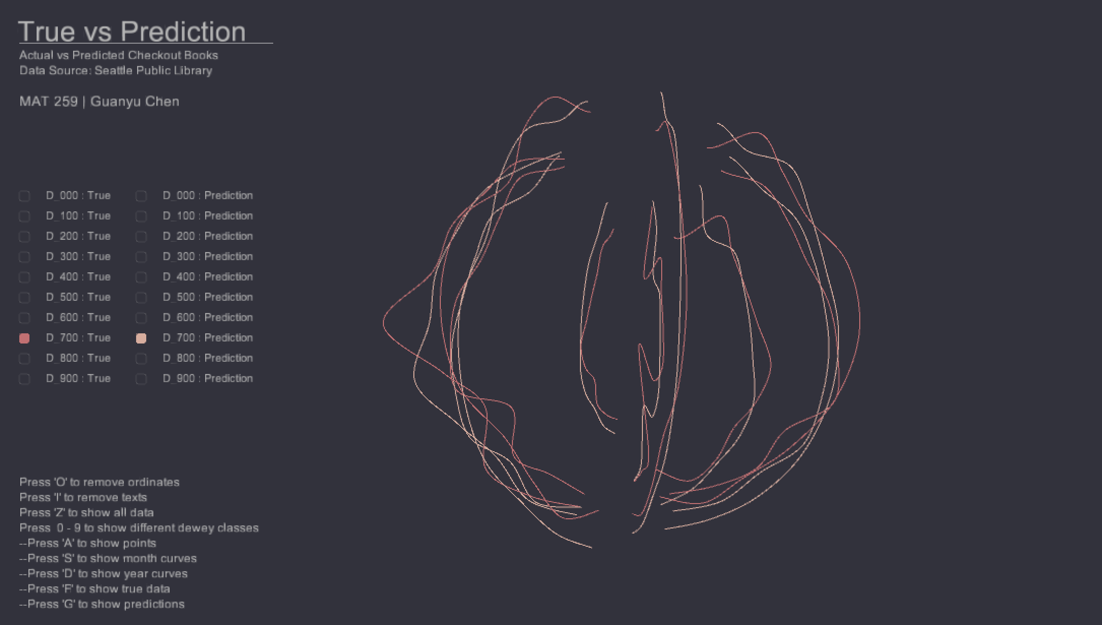
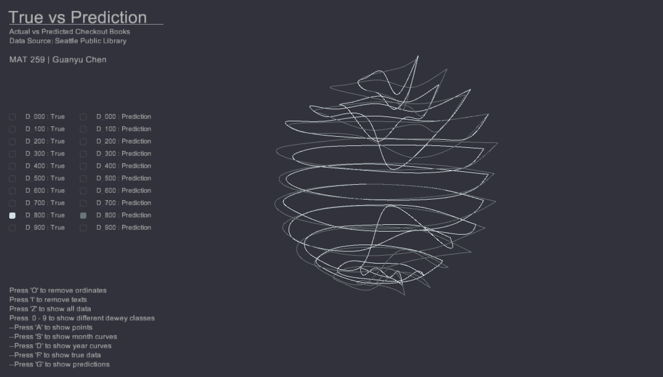
By observing all predicted data points and true data points in first graph, it is hard for us to figure out how predictions and ture data are close or far away each other. Thus, with drawing all curves, the shape of predicted sphere is a more round graph over true data since almost prediction values are more smooth/average values based on historical true data. Also, we can easily check the difference between year and months in different dewey classes to see the accuracy of ARIMA models. The last plot shows an unstable curve in the bottom, which indicates the outlier in Sep. 2018.
Code