Gallery
MAT 259, 2018
Chantel Chan
Concept
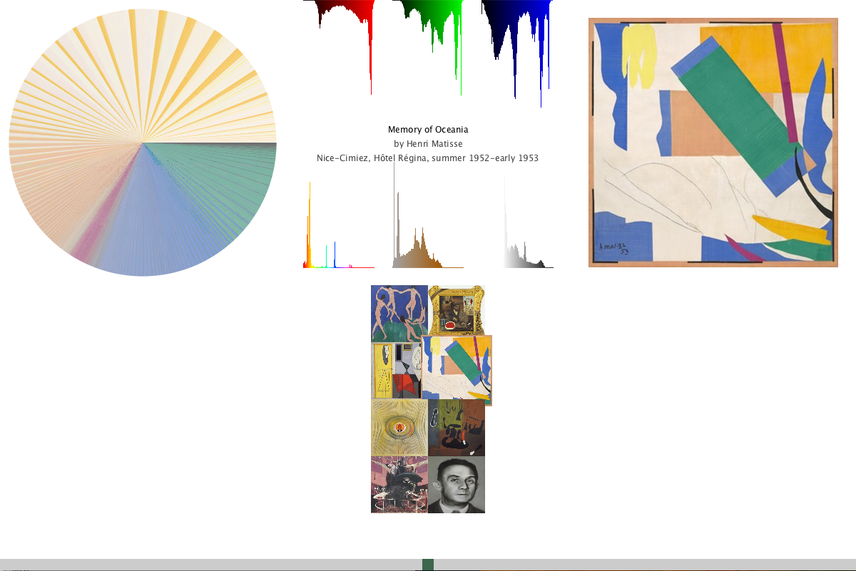
In my engineering classes, we studied up on image analysis and what information we can get from a digital image. There are many applications of that use this process today, such as Photoshop which obtains the RGB histogram from the photo. I always wondered what were the main colors used in an artwork, and was curious what percentage each color actually made up the artwork. I decided to create a pie chart that would take all the pixel values in the image, and section a piece of it in the circle.
Dataset
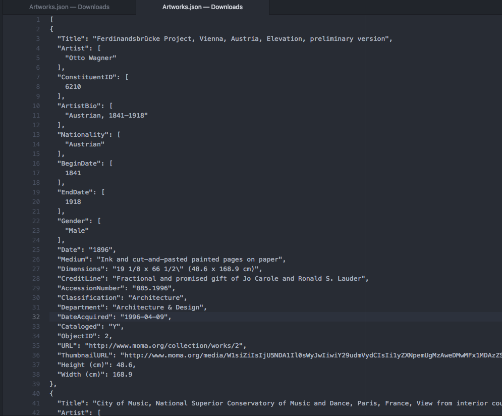
My dataset comes from the Museum of Modern Art's API on GitHub. They contain JSON files from over 200,000 artworks which contains attributes of each artwork from Title, Artist, Nationality, Year, Medium, etc. I only used the title, artist, and year in my project.
Information Extraction
Because 200,000 artworks is very large to process, I shortened it to contain only 101 Most Important Western Painters according to "The Art Wolf." I created a code that would compile a new JSON file for me that contain these painters in "filter.js" that produces "data_compressed.json." This file contains 3,970 artworks.
Part of my code also downloads the image and saves it into my local directory, so that the processing time is shorter. Instead of retrieving the image for the URL, and retrieves it locally and cuts down on time.
Because we are looking at "modern art," not every artist on the list will be shown. However other notable artists such as Pablo Picasso, Roy Lichtenstein, and Marcel Duchamp are included.
In my project, I was able to browse through all artworks and see their large scaled image as well. However, when drawing the Pie Chart, the code takes more processing time, and thus I had to shorten the number of results to prevent excessive lag. On top of that, adding the histograms values of red, green, blue, hue, saturation, value would add more processing power, and thus I had to shorten the number of results again. Although my functions work, my laptop's processing power limits me from easily browsing through all the artworks while getting information about the pie chart and histograms as well.
Final result
Users are able to use the scrollbar on the bottom to look at catalog of art. In addition, when the user hovers over a square image of the art piece, a larger view of the artwork is scaled to size along with its title, artist, and year that was made.
The color wheel is not smoothly transitioning, and I want to believe that when I sorted the color values, it does it by hue first, and then brightness. This would then cause it to be more patchy, making it harder to get the bigger image of what percentage of the color makes up the artwork.
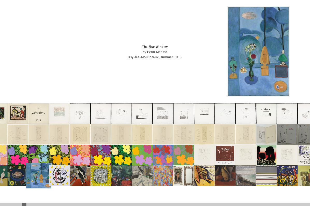
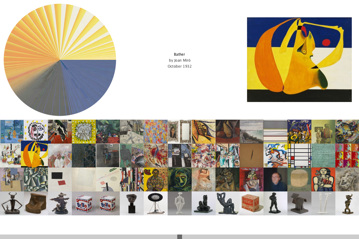
The color wheel is not smoothly transitioning, and I want to believe that when I sorted the color values, it does it by hue first, and then brightness. This would then cause it to be more patchy, making it harder to get the bigger image of what percentage of the color makes up the artwork.
Future Implementation
I created another code called "unique.js" that compiles a string array of unique elements. For example, with "unique.js," I created "uniqNationality.json" that has every unique nationality mentioned in the "data_compressed.json" file.
I would have wanted to continue filtering the artworks in my code so that those artworks are grouped together according to their respective category. Users could click on buttons that would sort them together. But because the processing power limits the capacity to run smoothly, it was frustrating to implement. Maybe I can develop a much faster algorithm to retrieve this kind of information for future use.
I would have wanted to continue filtering the artworks in my code so that those artworks are grouped together according to their respective category. Users could click on buttons that would sort them together. But because the processing power limits the capacity to run smoothly, it was frustrating to implement. Maybe I can develop a much faster algorithm to retrieve this kind of information for future use.
Code