2D Visualization of popularity of sci-fi movies
MAT 259, 2018
Qiaodong
Concept
I’m interested in the popularity of four sci-fi movies: Star Trek Into Darkness, Cloud Atlas, Gravity and Prometheus. So I’d like to create a visualization which shows the popularity of those four movies over time. To measure the popularity, I divide the time into months, and retrieve how many times the movie is borrowed in one month. The more times the movie is borrowed, the more popular they are. I decide to use bar graph to visualize the result.
Query
To query the dataset, I use the following scripts:
                SELECT YEAR(cout) AS Year, MONTH(cout) AS Month,
                SUM(CASE

                WHEN title = 'Star Trek Into Darkness' Then 1

                ELSE 0 END) AS 'Cloud Atlas',

                SUM(CASE

                WHEN title = 'gravity' Then 1

                ELSE 0 END) AS 'gravity',
                SUM(CASE

                WHEN title = 'prometheus' Then 1

                ELSE 0 END) AS 'prometheus'

                FROM spl_2016.inraw

                WHERE
                (itemtype = 'acdvd' OR itemtype = 'acvhs')
                AND YEAR(cout) >= '2011'

                GROUP BY MONTH(cout),  YEAR(cout)
                ORDER BY YEAR(cout) , MONTH(cout)
Preliminary sketches
The query takes about 20 seconds. And the results look like:
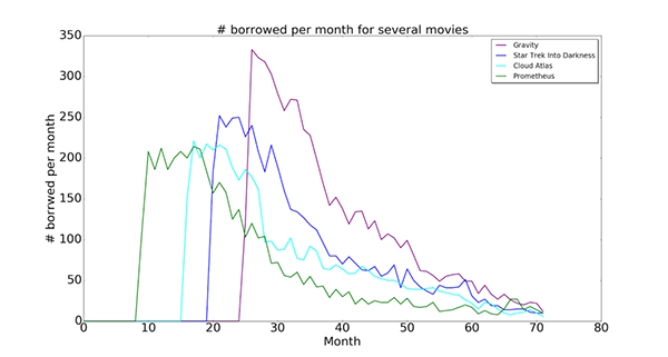
Here is my initial bar graph: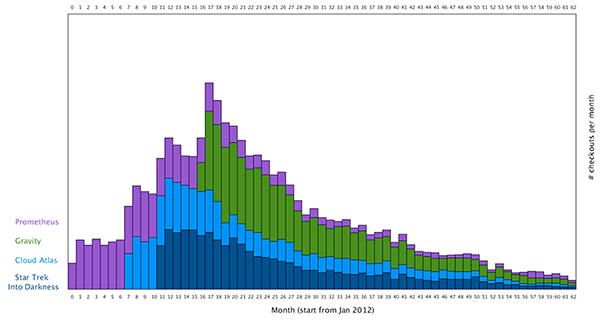
Here is my initial bar graph:
Process
After this, in order to figure out the relationship of each dataset, I think It may be better to show
the trend of individual movie, compared to the rest of the movie. To do this, I think maybe it’s better to show the trend of an individual movie on the top of the screen, and the show the trend of rest of three movies in the bottom.
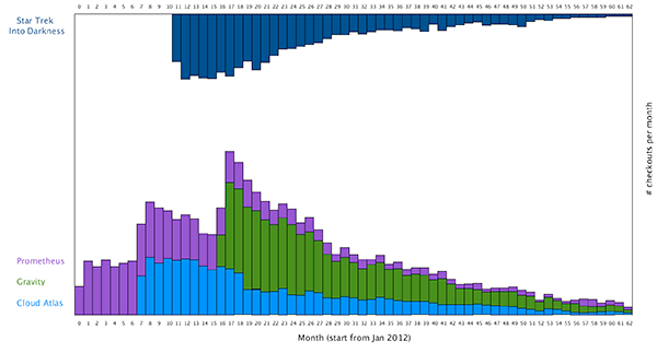
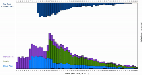
This way the users can isolate the individual movie they are interested in. To create a smooth transition between the movie from which all the movies are cluster together, to a stage where one movie is isolated, I want to create a smooth animation for this. To do this, we can think the individual rectangles of bar graph move vertically along y axis. The result looks like this: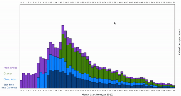
Also, I’d like to restore the initial arrangement of the data set when user desired. Here is the result: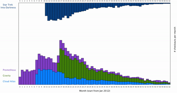
Finally, I think another indication of popularity of a certain move is how long people borrow them. To do this, I want to figure out how long people keep a particular movie during a particular month. It’s unclear how to do this in sql, so I just grabbed all the borrowing record from the dataset, and then save the result to a .csv file, and then use python to compute the average time people borrowing the movie. The query part for this is easy: SELECT title, cout, cin from spl_2016.inraw Where title = “Star Trek Into Darkness” AND year(cout) > 2011 After this, I save the result to a csv file, and use the python scripts in the project to compute the average borrowing time for each movie during a particular month. It can be easily done by compute cin - count and aggregate them to each month.
Final result
Some final animation
To map how long the movie is borrowed into the visualization, I decided to color map them to the color of each bar. Here is the final result after color mapping the average borrowing time for a movie: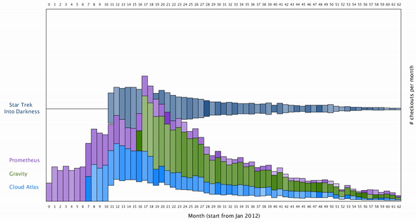
We can see generally if more movies are borrowed each month, people tend to keep them shorter. It’s however unclear how the popularity of each movie are related to each other, as the distribution of each movie over the month seems to be uncorrelated.
Code