Charlie and the Chocolate Factory
MAT 259, 2018
Chantel Chan
Concept
The Charlie and the Chocolate Factory franchise has been a popular story that has consistently been checked out of the Seattle Public Library each month, excluding VHS. This visualization will look at the different item types (books, CDs, DVDs, and VHS) in regards to number of copies available, and the number of times a unique item has been checked out. By doing so, analysis and estimations can be inferred.
Originally, I wanted there to be parabola-like shapes sticking out of the circle, but because there were too many data points, they would end up looking like lines anyway. Pie charts are a great way to compare the percentage makeup of each item type, which would be distinguished by different colors. Outlined circles will trace the max, average, and median data values.
Originally, I wanted there to be parabola-like shapes sticking out of the circle, but because there were too many data points, they would end up looking like lines anyway. Pie charts are a great way to compare the percentage makeup of each item type, which would be distinguished by different colors. Outlined circles will trace the max, average, and median data values.
Query
My code only outputs the itemType, itemNumber, and the number of times that item has been checked out.
SELECT
ORDER BY Counts DESC
SELECT
itemType, itemNumber, COUNT(bibNumber) AS Counts
FROM
spl_2016.inraw
WHERE
(title = 'Charlie and the Chocolate Factory'
OR title = 'Willy Wonka and the Chocolate Factory')
AND (itemType LIKE '%jcvhs%'
OR itemType LIKE '%jcdvd%'
OR itemType LIKE '%jcbk%'
OR itemType LIKE '%jccd%')
GROUP BY itemType, itemNumber ORDER BY Counts DESC
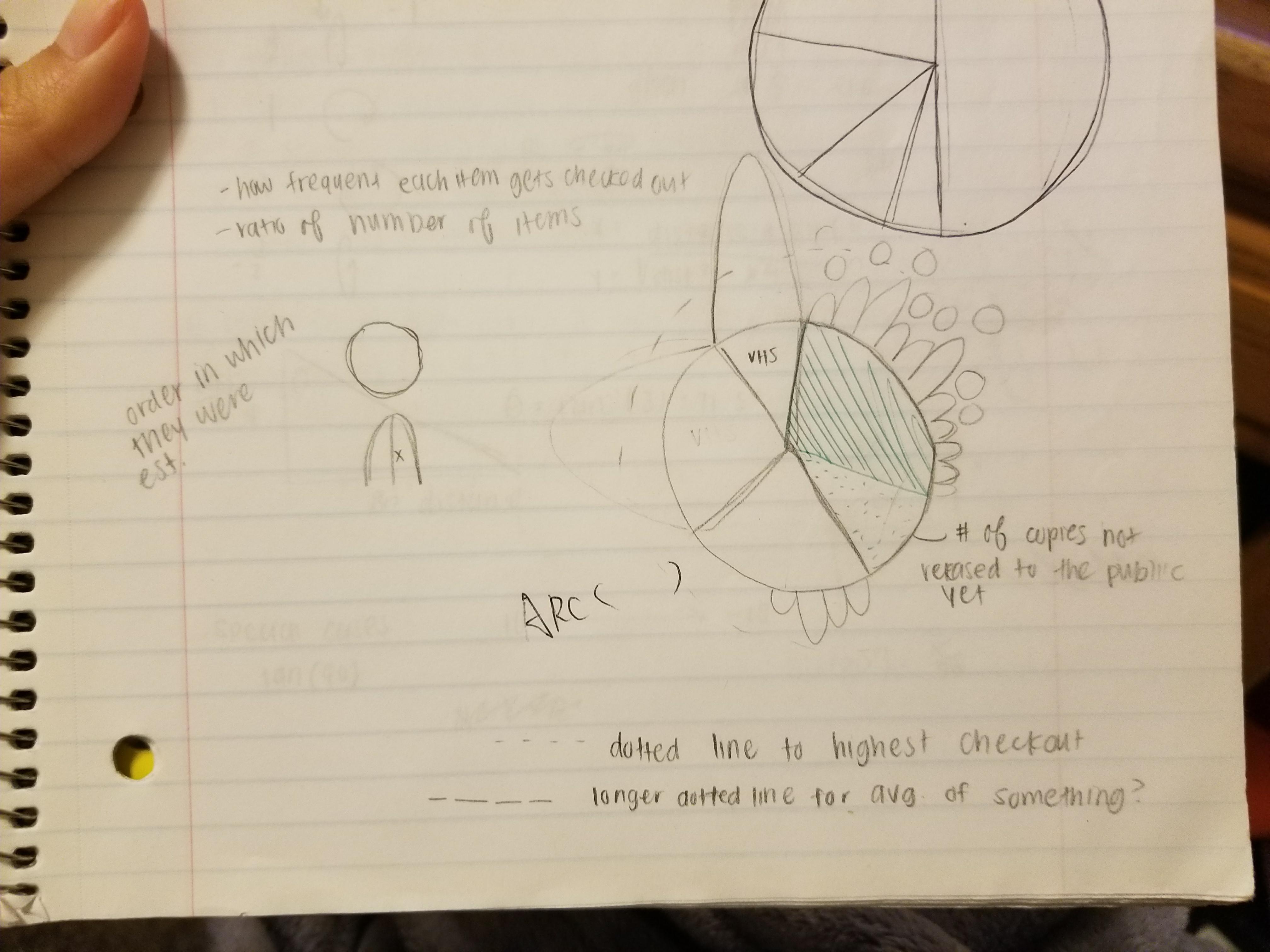
Preliminary sketches
Originally, I wanted there to be parabola-like shapes sticking out of the circle, but because there were too many data points, they would end up looking like lines anyway. Pie charts are a great way to compare the percentage makeup of each item type, which would be distinguished by different colors. Outlined circles will trace the max, average, and median data values.
Process
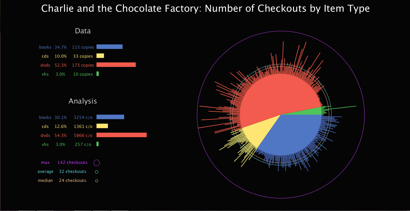
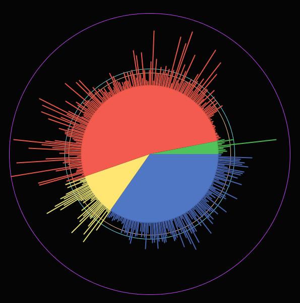
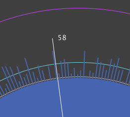
In my first rough draft, I created the pie chart with four different sections. In my code, I hard coded the index values so that it went according to the CSV file. I knew that this would not make my code robust if there were more values added to the file later on. The interface was not interactive and was presented more as a picture to the viewer. The lines that were popping out of the pie chart corresponded to the number of checkouts each item had. There is no reference as to what the exact value of each item was, except the outer circle which showed the max, average, and median checkouts.
Final result
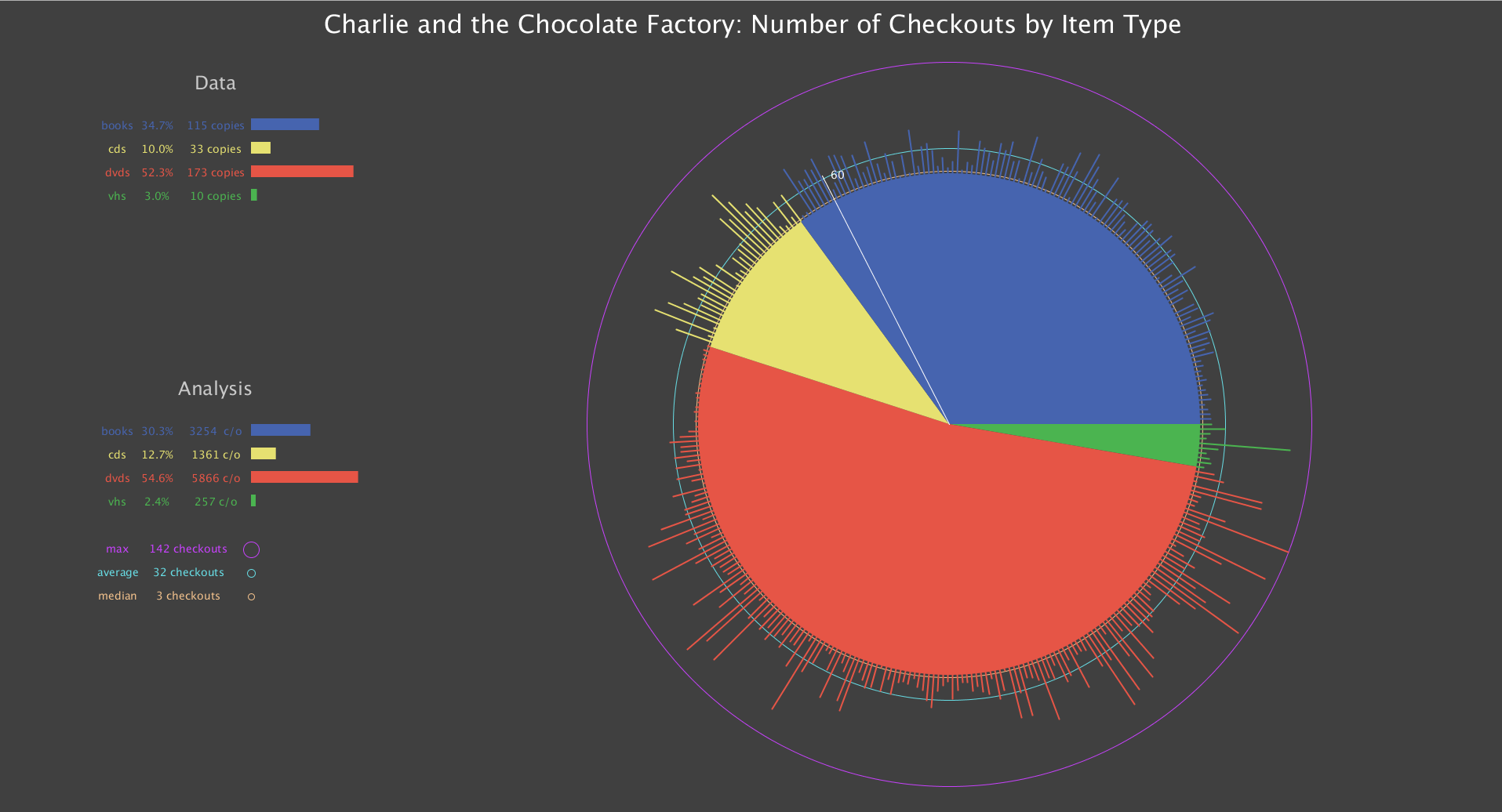
My latest code now creates the environment with a gray background, smaller text, and a larger visualization of the data. Also, interactivity is included so that when the cursor moves, it creates a line that provides information about the number of checkouts from an item that is positioned at that angle relative to the center of the circle. Not only that, but my code is now able to dynamically change if more information was added to the CSV file.
Code