The Artist Network
MAT 259, 2017
Chris Chen
Concept
My goal for this project was looking at interesting ways to create connections within a set of data. I knew from the start, I wanted to do something with music as I have a somewhat familiar relationship with it. At first, I looked at iTunes data, but
it ultimately did not prove interesting enough. Instead, I turned towards Spotify – a music streaming/social media platform because it had an interesting feature I had previous taken for granted when using the application: the related artists
tab.
When you look at an artist’s in Spotify, you might notice a feature called “Related artists” in which the application compiles a list of 20 artists that are connected to the original musician – handy for letting users find new music that they might like. According to their posts online, these connections are made through user-created playlists. If Artist A is placed in many different playlists with Artist B, those links are established. (Of course there are some odd recommendations that may be made in such a system – one user complained about how their mild Christian rock was apparently similar to death metal). For our purposes we’re using a well-known artist with well established links: Radiohead, so such anomalies are not going to be shown.
When you look at an artist’s in Spotify, you might notice a feature called “Related artists” in which the application compiles a list of 20 artists that are connected to the original musician – handy for letting users find new music that they might like. According to their posts online, these connections are made through user-created playlists. If Artist A is placed in many different playlists with Artist B, those links are established. (Of course there are some odd recommendations that may be made in such a system – one user complained about how their mild Christian rock was apparently similar to death metal). For our purposes we’re using a well-known artist with well established links: Radiohead, so such anomalies are not going to be shown.
Query
First, the gathering of the data: I wrote some Javascript to gather the information. I knew it had to be in a JSON format and I knew I would have to make recursive searches – one query would lead to 20 more, added to the end of an array. So I created
an array and added the information for the first artist: Radiohead. From my first search I got 20 results which were pushed to the end of the array. Then, I selected the next item in order to get 20 more and added those subsequent results
to the end (array.push). I found fetch() hugely useful. Once I got the desired amount of results, I copied the results into a JSON file. While I know I could have easily used and cleaned out the JSON file, I instead opted for a CSV file.
Code to Get Data
Code to Get Data
Preliminary sketches
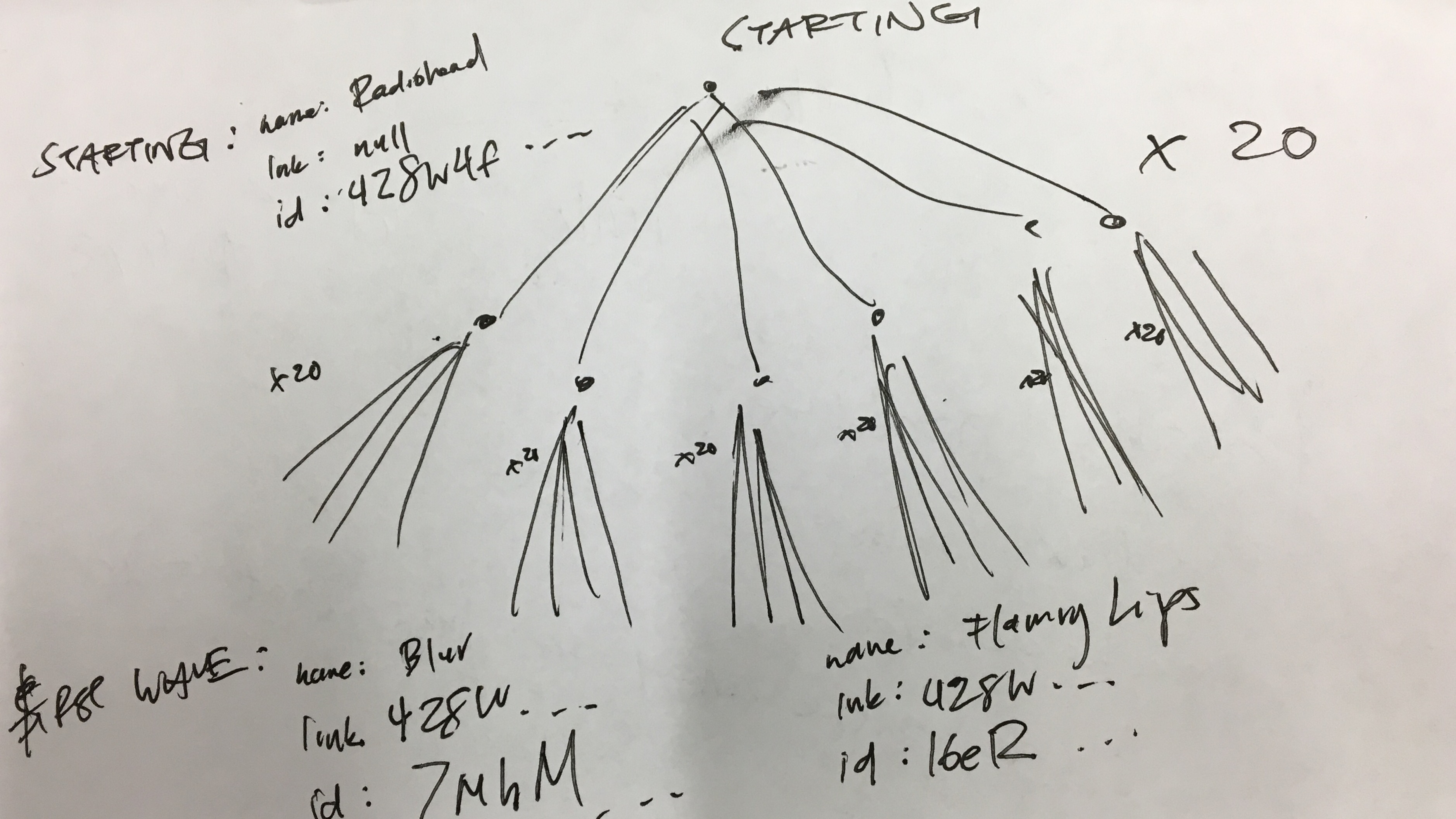
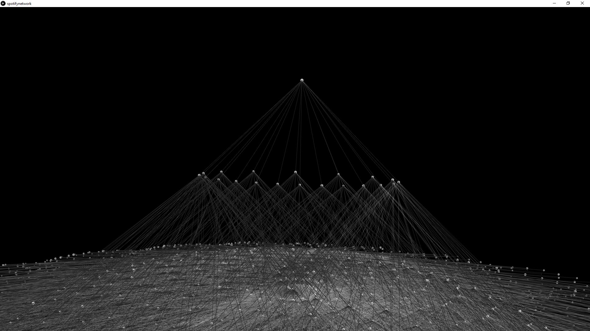
I played around with a number of ideas, and at first I was afraid of using simple lines and dots because it did not seem as visually stimulating - both from an individual and aggregate perspective. But settling on a conical helped address some of these concerns. Spotify returns 20 related artists for each artist you search. A cone shape displays this information clearly and distinctly. From one artist, 20 points representing each artist are drawn below it, along with lines connecting the original search to the related artists. So each individual artist forms the pointy top of a cone, while the circular base is formed by the 20 related artists.
Here is what one artist search looks like:
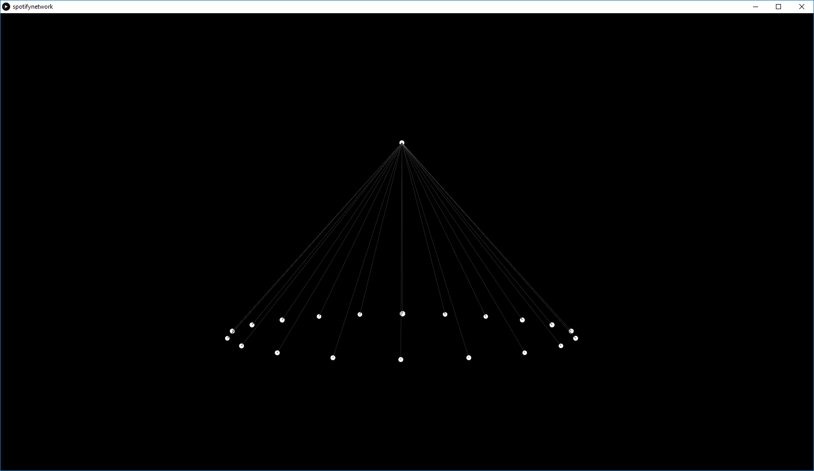
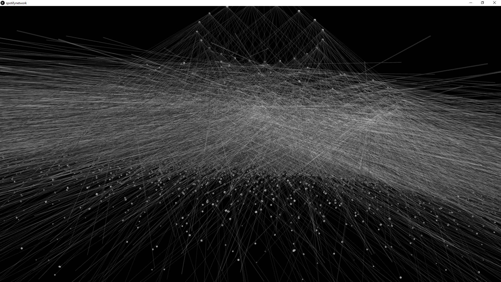
As you can see, 1 point positioned higher up on the screen is connected to 20 lower points, forming a cone; one artist returns 20 similar artists. Now this is what happens when each of those 20 results return their own 20 results:

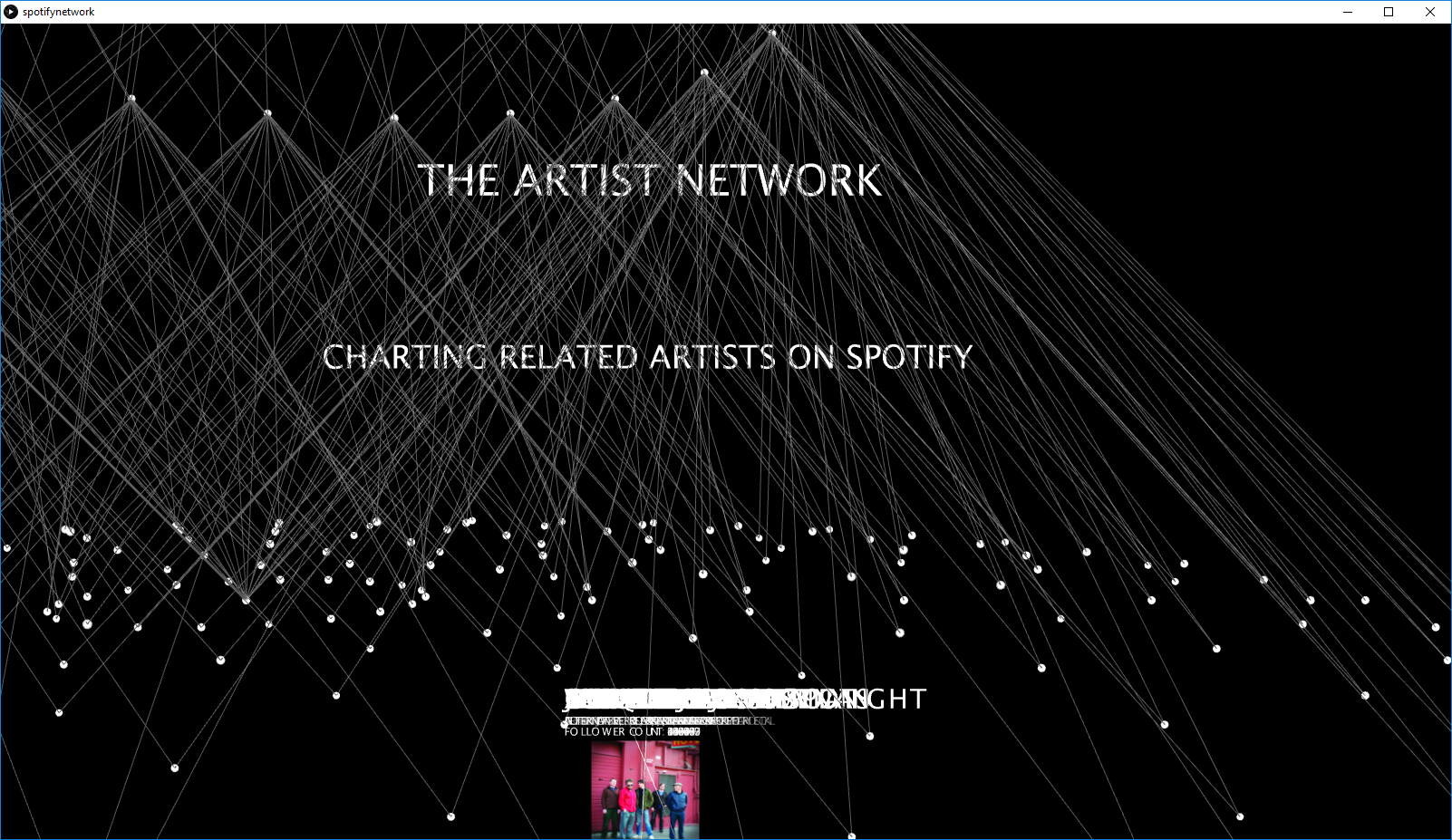
Process
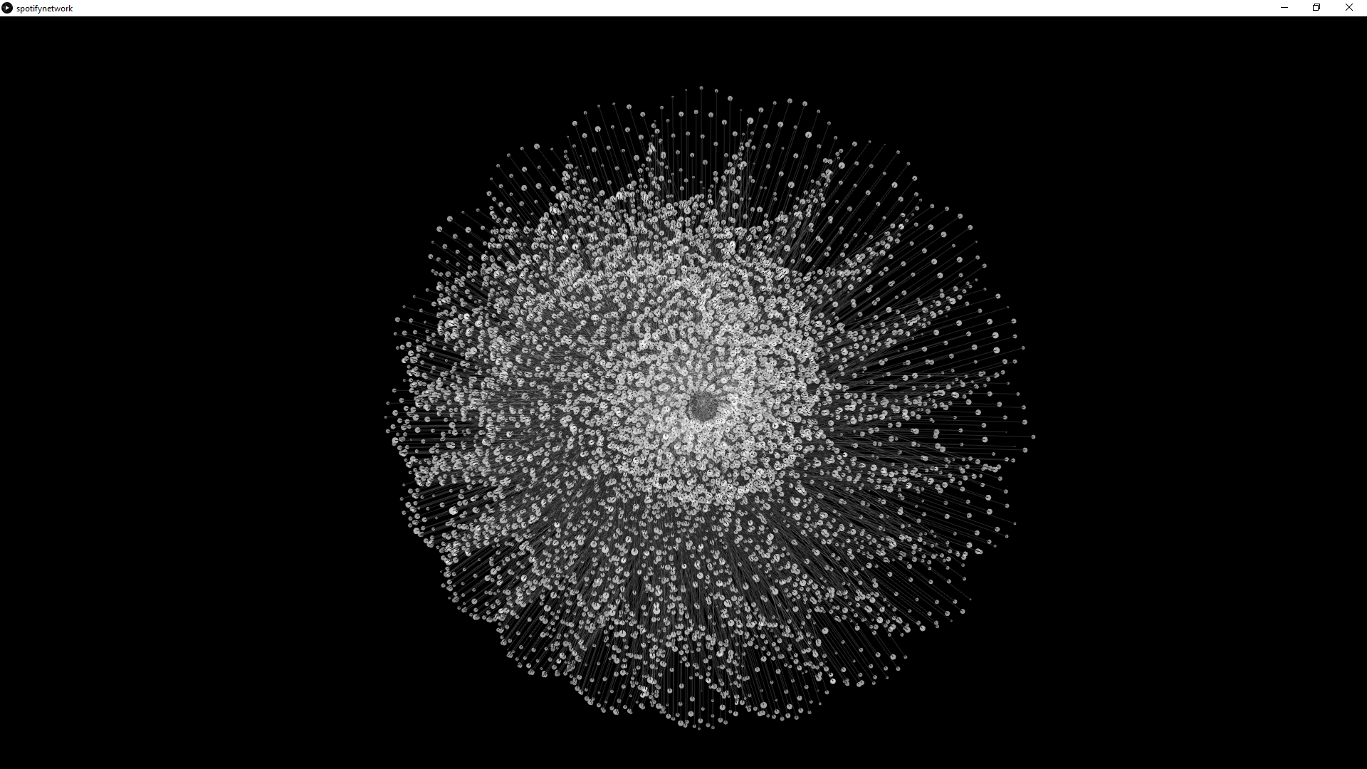
In the end my project had 4 successive layers of points (1, then 20, then 400, then 8000). With each new cone, the base (flat circular bottom of the cone) must fan out an increasing amount. Why not keep the same sized circle on the bottom of the circle?
Because eventually over different iterations, those points will converge (the natural symmetry of stacked cones just creates these). In the picture below, I edited the sketch so you can see what it might look like if I kept the base the same
every time:
If you notice the lines coming down, a lot of them are joining up at the same points. And to make it even more clear, I hover over a point, and you'll see that there are 2 different artists stacked on top of each other at the exact coordinates. That's a problem; this confuses the entire point of the design, especially when some of the artists do not share the same similar artists.
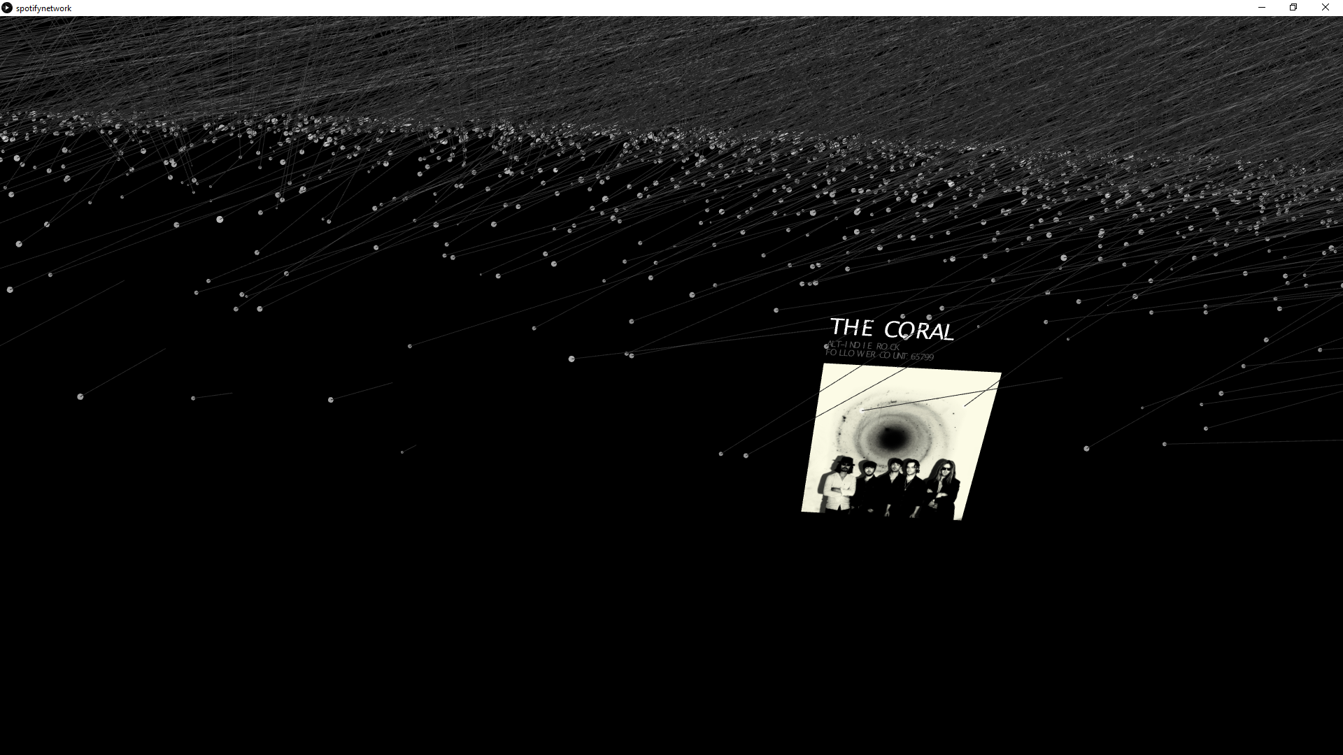
Finally, I added a dynamic element to the points which indicated the artists. The data itself came with a host of useful information: artist names, image URLS, genres, follower counts, popularity, etc. Their transparency correlates to their follower count on Spotify, and the point sizes themselves correspond to their current popularity, according to Spotify. I then added roll-over effects. Upon hovering over a given point, it displays the artist names, in addition to genre(s), follower count, and their primary image in Spotify.
If you notice the lines coming down, a lot of them are joining up at the same points. And to make it even more clear, I hover over a point, and you'll see that there are 2 different artists stacked on top of each other at the exact coordinates. That's a problem; this confuses the entire point of the design, especially when some of the artists do not share the same similar artists.
Finally, I added a dynamic element to the points which indicated the artists. The data itself came with a host of useful information: artist names, image URLS, genres, follower counts, popularity, etc. Their transparency correlates to their follower count on Spotify, and the point sizes themselves correspond to their current popularity, according to Spotify. I then added roll-over effects. Upon hovering over a given point, it displays the artist names, in addition to genre(s), follower count, and their primary image in Spotify.
Final result
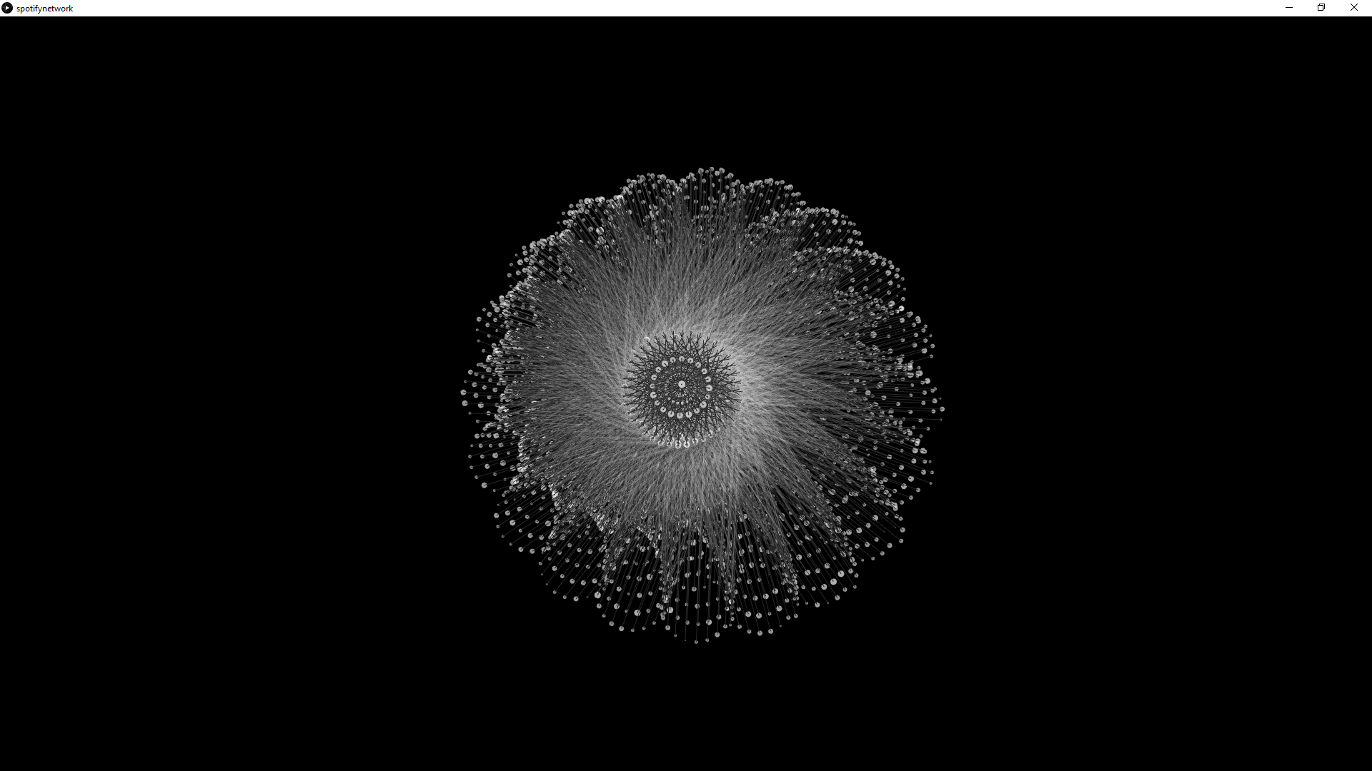
By fanning out the base of each cone, the entire shape looks conical from the side – though the bottom looks almost spiral-galaxy-like, with arms stretching out from the cluster in the middle. NOTE: When navigating my project, it might be very handy to have a mouse with a scroll wheel…it will be helpful to click down on middle mouse and drag in order to pan in a given direction.
From the inside of the mass, the lines may appear wildly chaotic, but from further out - especially looking either straight down or straight up at the shape will result in some interesting patterns.
Evaluation/Analysis
Overall I believe my project went through some vital changes. While I did spend some time trying to get the data in the first place, the main challenge was in deciding how to display it properly. I think it achieved the level of granularity and complexity that I wanted from the start. At the same time, the resulting Processing visualization is not very good at displaying information in a more user-friendly way: in order to see the 20 results from a given artist, you manually have to hover over each one. While it is possible the resulting 20 data points, the performance issues make themselves very apparent because of the text and picture displays. I believe there is more exploration in this regard. In the end, however, I think it is revealing in showing different artists and their many connections.
Code