Visualizing Seattle Public Library's Book Adoption and Popularity [Part III]
MAT 259, 2016
Thomas Hervey
Concept
Finishing out this third project in my series of exploring adoption and checkout popularity of books at
the Seattle Public Library, I wanted to integrate statistics as well as a new general view into this
visualization. Designed to be more than aesthetics, this project focuses on allowing a user to explore all
1607 records, or only a handful based on the time period that they're most interested in. To address my
primary initial question, Does a title's age affect its checkout frequency (ie. same book in 2006 v 2015)?
I have opted to display publication order along the x-axis as the mort relevant driver. But, since my discoveries in
project one and project two,
adoption has been a more interesting focus. Please explore the source code below and see what questions you can develop.
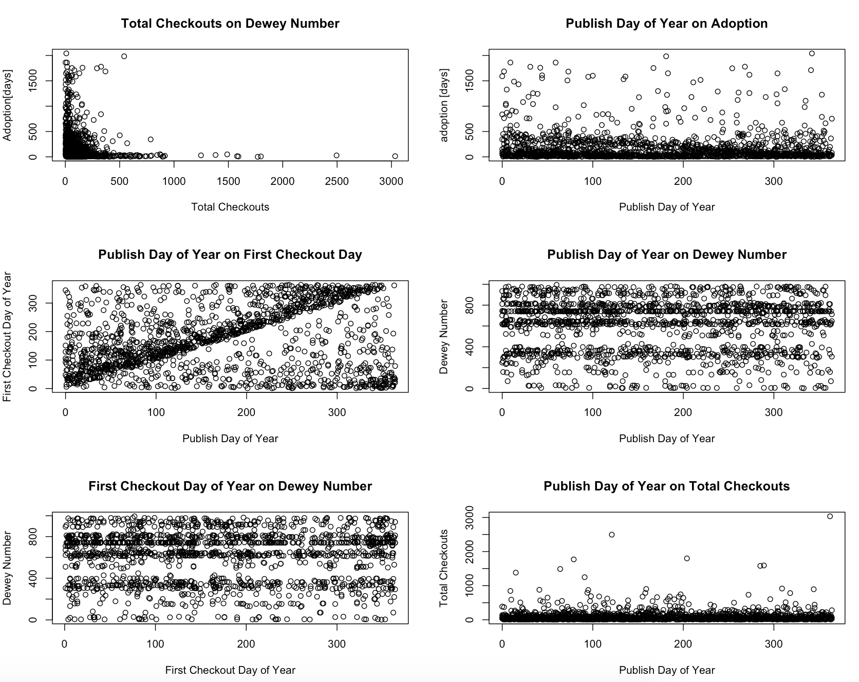
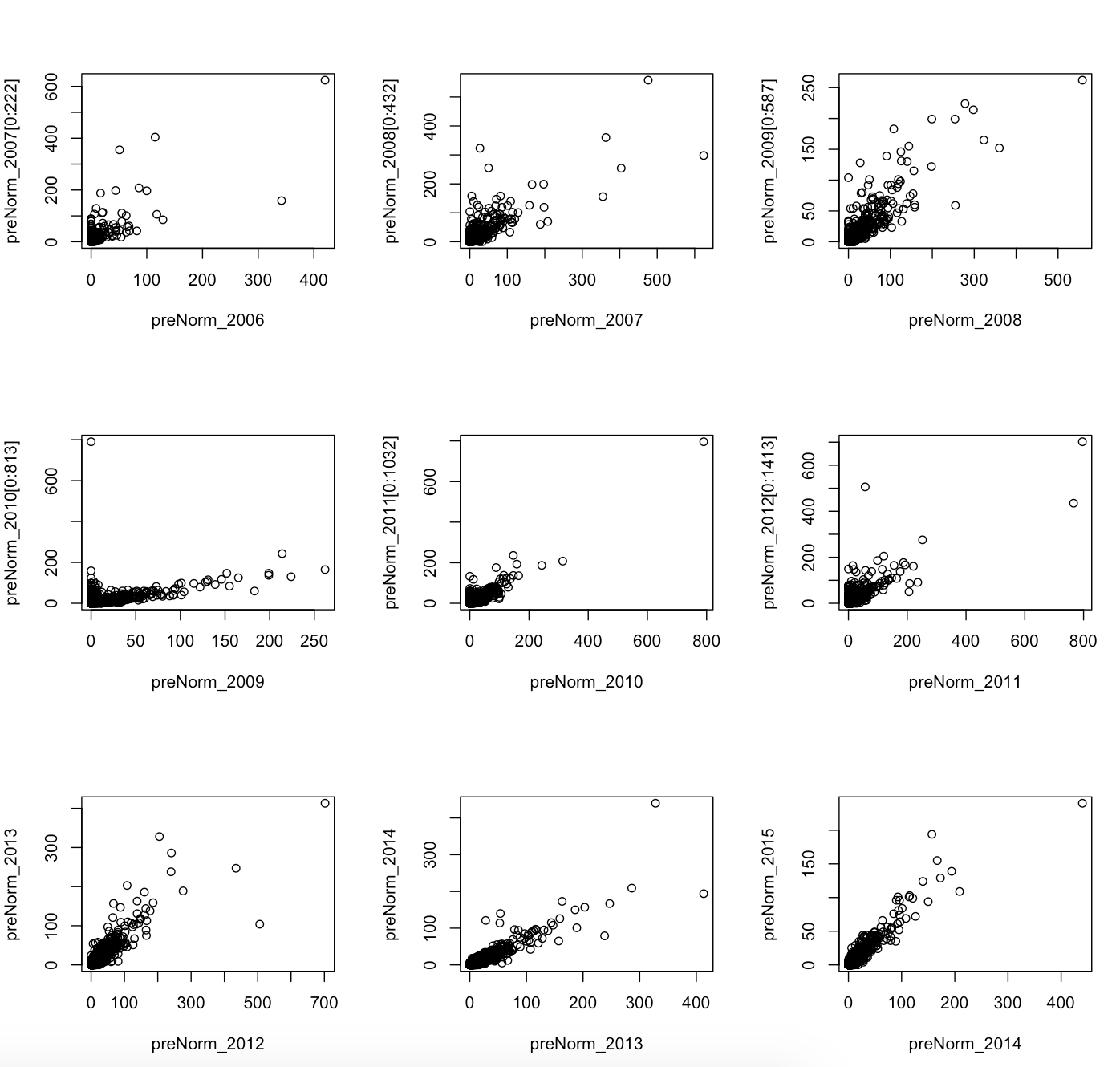
Statistics
Instead of querying any extra or external data, I employed R to explore and test my questions
at a stronger quantitative level. The following are code snippets that explore correlation,
variance, significance, plots and summaries between multiple variables in my dataset.
Preliminary sketches
Since this project built on my second project,
instead of redesigning my layout, I found it more imporant to explore the statistics behind my data
and expand the visualization accordingly. Unfortunately, as many data driven projects discover, my data
did not reveal any significant trends as the following sketch reveals. This sketch below, along with others
not included, show that many times it's better to let the data show you significance in the absence of
correlation rather than force positive results. Because of this, while the results are important, there
was not too much to add to the visualization. [please see source code for details on these plots]
Process
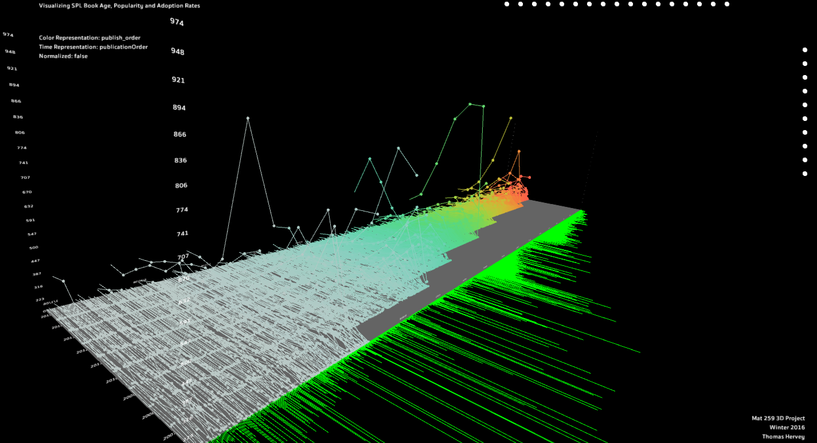
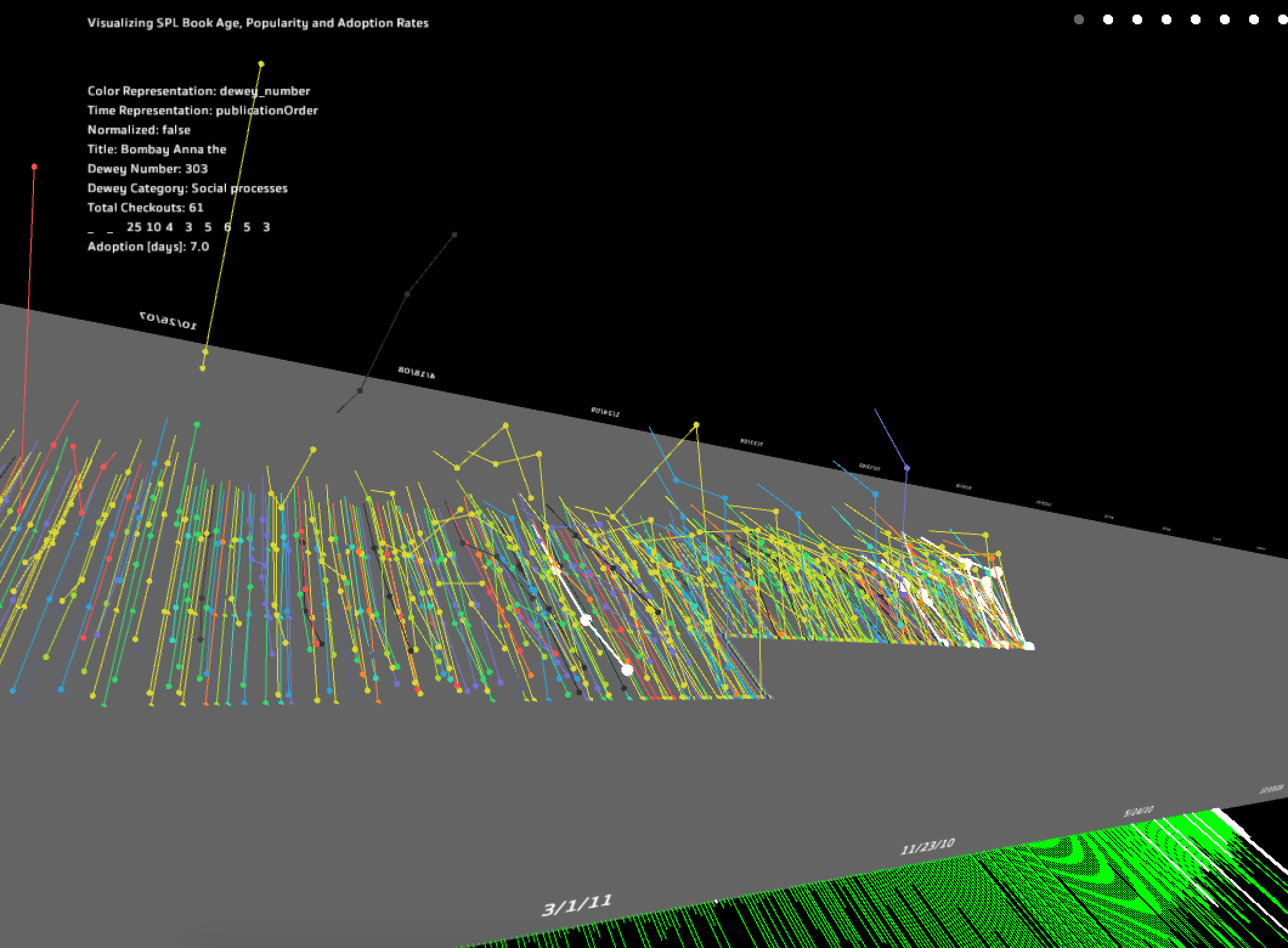
This project saw faster positive progress than my previous two.
I was able to reduce memory load, adjust color schemes for clarity, and allow data normalization [square root] for
closer exploration than before. At this point, I was also able to display attributes of highlighted records through
the HUD so that a user can see changes between neighboring records as well as get details that aren't immediately
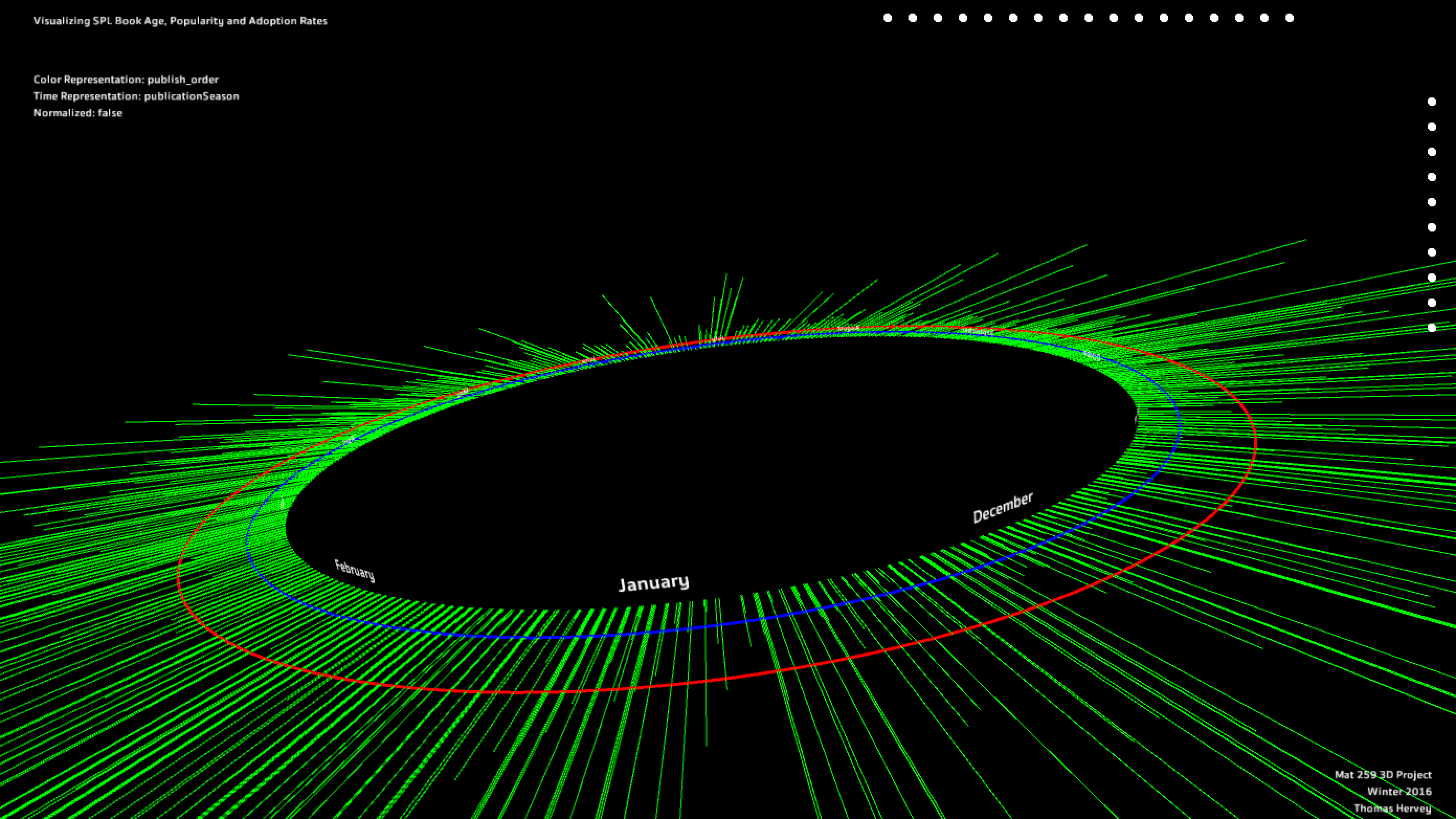
obvious. Shown below is the default color scheme [publication order] with all records showing. It
is initially clear that there are some visual data anomalies in both the publication data [green lines], and the
checkout records ["peaks"].
Final result
The final visualization employs several interaction types (publication date range manipulation, annual checkout range
manipulation, color scheme change, main temporal representation, highlighting) as well as a clean minimalist interface
to draw attention to and lead the eye through the visualization chronologically. Due to time and coding limitations,
I was not able to expand on the second temporal representation of the visualization [second figure; monthly representation],
however it still gives users a sense of adoption distribution throughout the calendar year.
To expand on this project, I would like to further explore the statistical relationships between vriables and see if I can overcome my initial limitations. If successful, I would add new modes that adjust records' color and size to reflect these new findings. Still experimental, I have several hidden features that allow for the visualization to "breathe", moving the records slightly and pulsing to make the visualization feel more alive.
To expand on this project, I would like to further explore the statistical relationships between vriables and see if I can overcome my initial limitations. If successful, I would add new modes that adjust records' color and size to reflect these new findings. Still experimental, I have several hidden features that allow for the visualization to "breathe", moving the records slightly and pulsing to make the visualization feel more alive.
Code