Visualizing Seattle Public Library's Book Adoption and Popularity [Part II]
MAT 259, 2016
Thomas Hervey
Concept
With the addition of a new database for the course, I was able to investigate more relevant information
including annual checkouts. Instead of focusing directly on particular genres or correlations, I decided
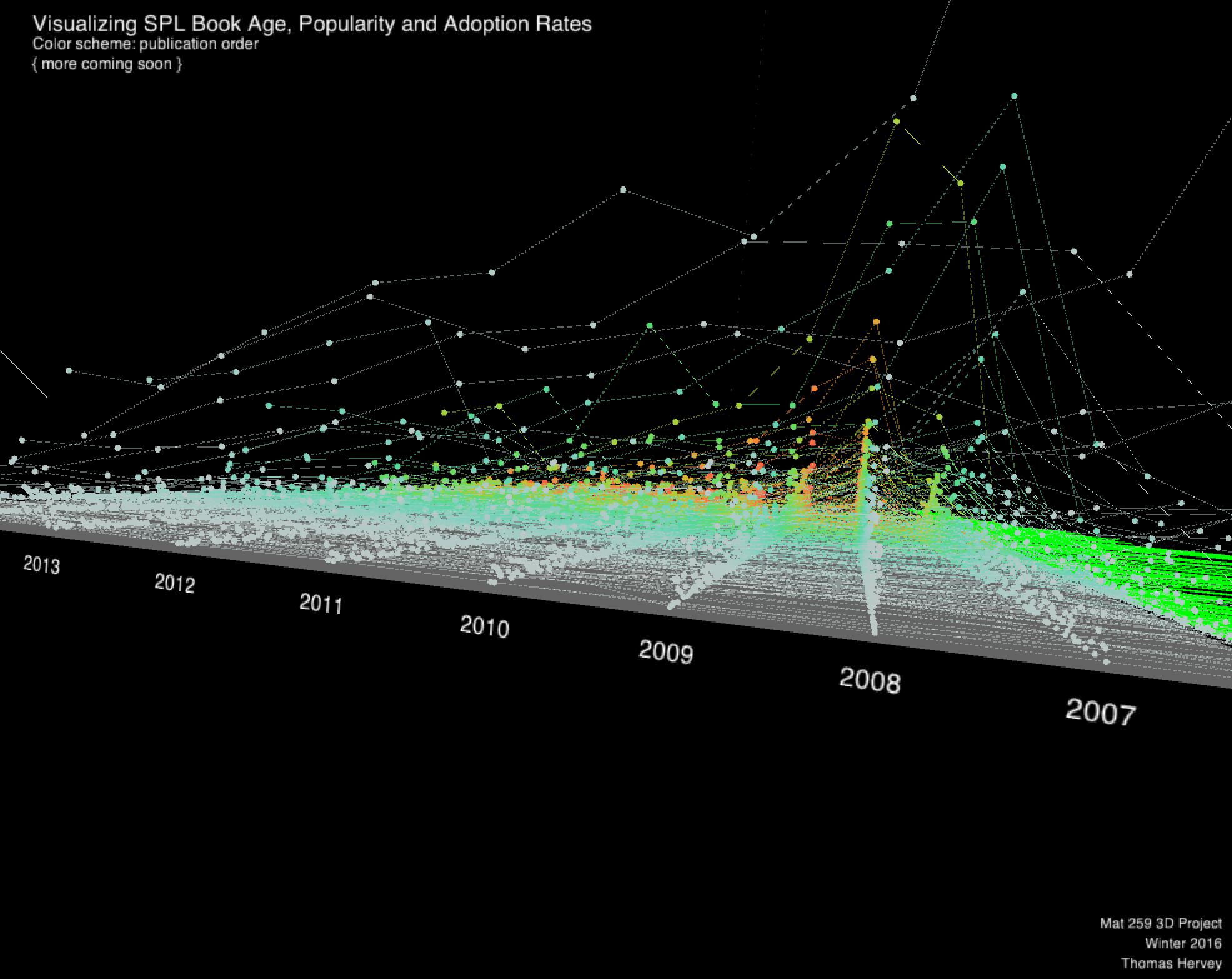
to visualize the data first and see what it can tell me before making inferences. The following shows a
preliminary result of my final 3D visualization in my third project. Here, a user is able to rotate and
move the visualization so that they can explore the main three variables, publication order, checkout count,
and year.
The results are intriguing. Unlike my sketch, while I didn't expect the publicationOrder (x-axis) to be as long as it was (the longest axis), this design wound up being the best choice since a user can explore a record and manipulate it without reorienting the camera. The majority of the data needed to be normalized on the y-axis since most checkouts were low from year to year. For many years, the checkout values were 0.
The results are intriguing. Unlike my sketch, while I didn't expect the publicationOrder (x-axis) to be as long as it was (the longest axis), this design wound up being the best choice since a user can explore a record and manipulate it without reorienting the camera. The majority of the data needed to be normalized on the y-axis since most checkouts were low from year to year. For many years, the checkout values were 0.
Query
As previously mentioned, since our course was given access to a new database, which had checkout information
up through 2015, I created an additional query to pull both new checkout information as well as new
characteristics, such as dewey number and category.
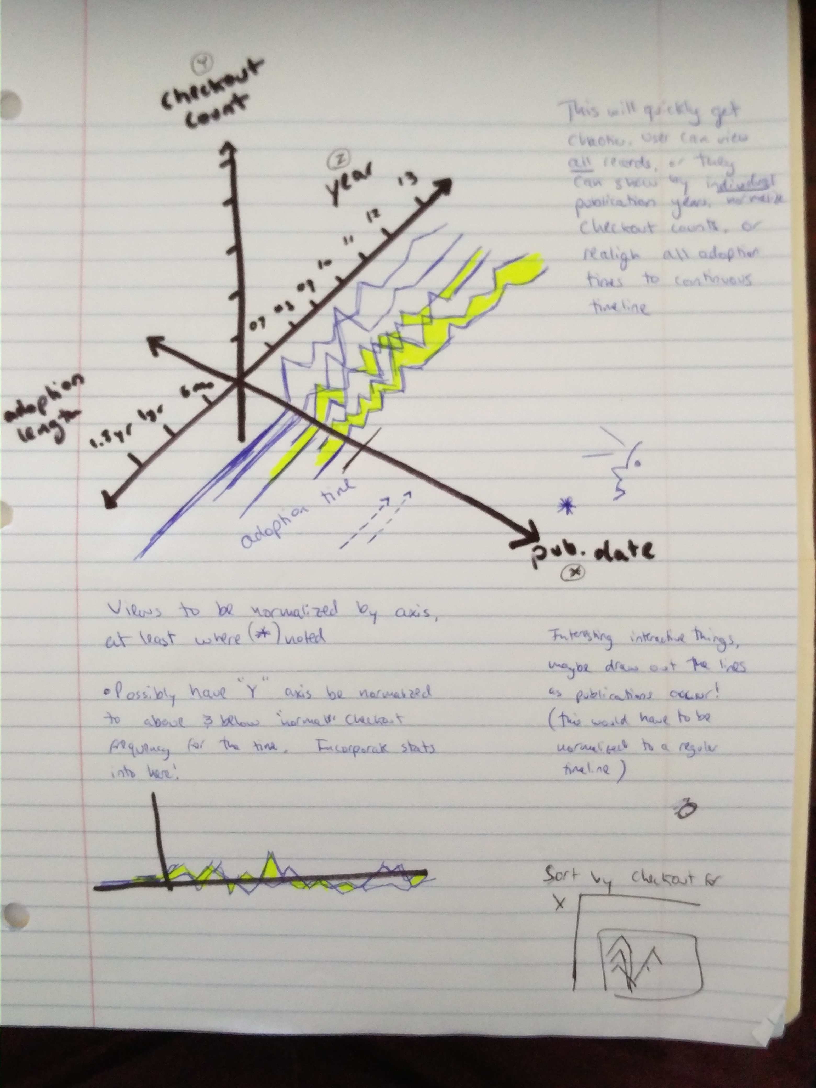
Preliminary sketches
Compared to my first project, the addition of 3D gave the opportunity to visualize more information,
as well as make discovery easier for users. I invisioned the user switching between
common view points as well as freely exploring a 3D 'platform' of data. Based on the sketches below,
representing changes in checkout by year as 'peaks' would allow for quick 'eyeballing' of the data and
would allow a user to quickly visually sort through the records. Allowing for different z-axis alignment
would help compare checkouts vs. adoption rates. Ultimately, the purpose of this 'platform' design was
to break down time into multiple dimensions that could be easily 'chunked' and explored.
Process
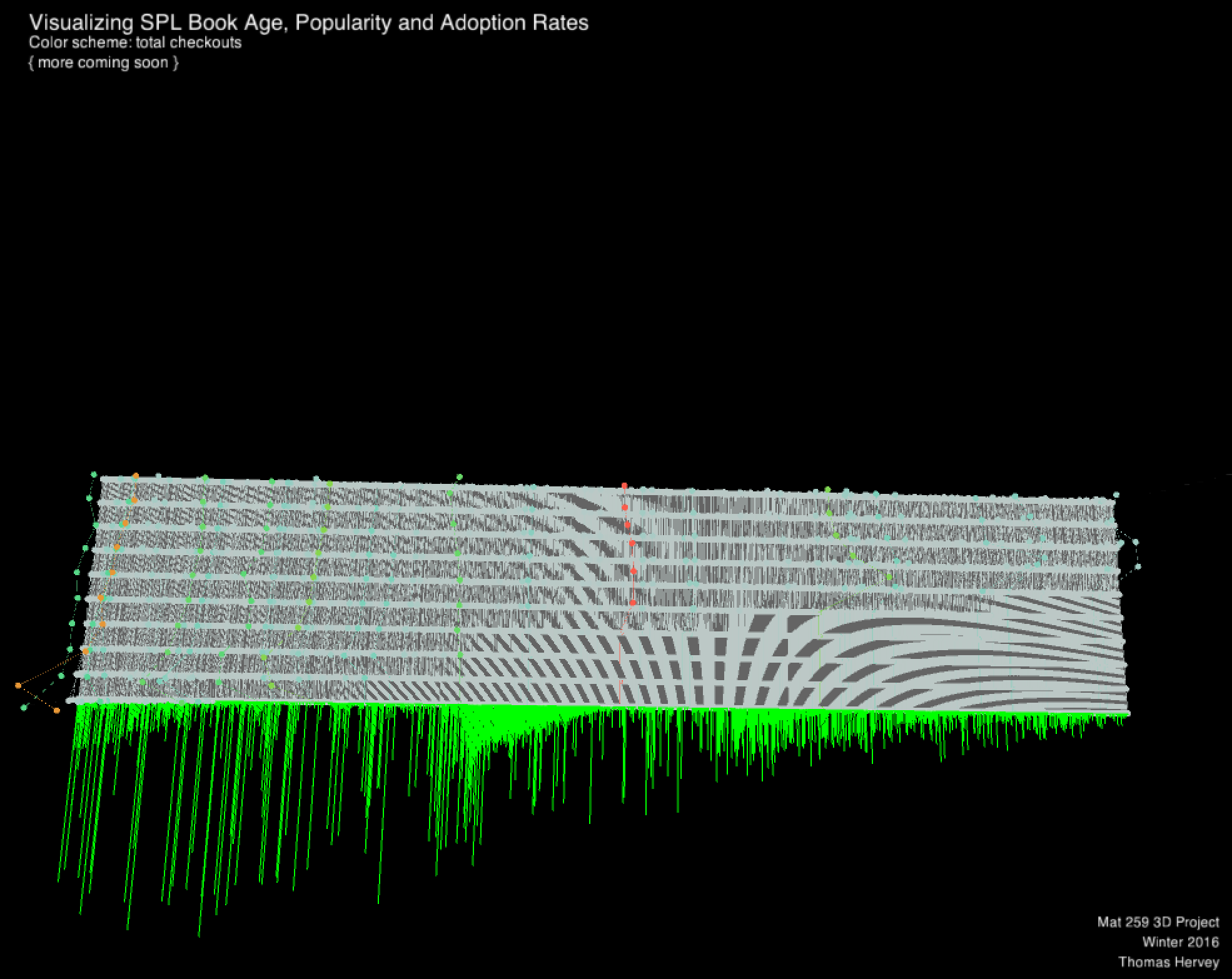
The work in progress results were reassuring. I was able to create interaction by changing the color
scheme to represent total checkouts, publication order (redundant for better visual clarity), as well
as draw records over time, giving the user a sense of some publication trends. While the color schemes
needed some refining, the bold adoption green color highlights its importance in the visualization and
sets a foundation for an alternative represtation expanded upon in my third project.
Final result
The final visualization results were strong, but the statistical inference and interaction were a bit
lacking. Addressed in my third project, this visualization needed to remove some code inefficiencies
and better handle user limitations of what records are displayed. The minimalist design with limited
HUD elements aimed to draw the user to the adoptions (which are chronologically first for each record)
followed by the strong colors of high total checkouts and large peaks of large annual instance checkouts.
Code