Awake ReOrdered - Clustering of Library Hours by Weekday
MAT 259, 2015
Olaf Menzer
Concept
This re-ordering exercise is based on the previous visualization project that mapped the awake time of the library directly on diurnal and seasonal cycles (example shown in Viz. 1). Starting from the observation that highest activity seemed to occur more often during mid week and mid year, I decided to explore this relationship with time in more detail by re-ordering dimensions and exploring emerging patterns. The re-ordering exercise was done in three steps as described below.
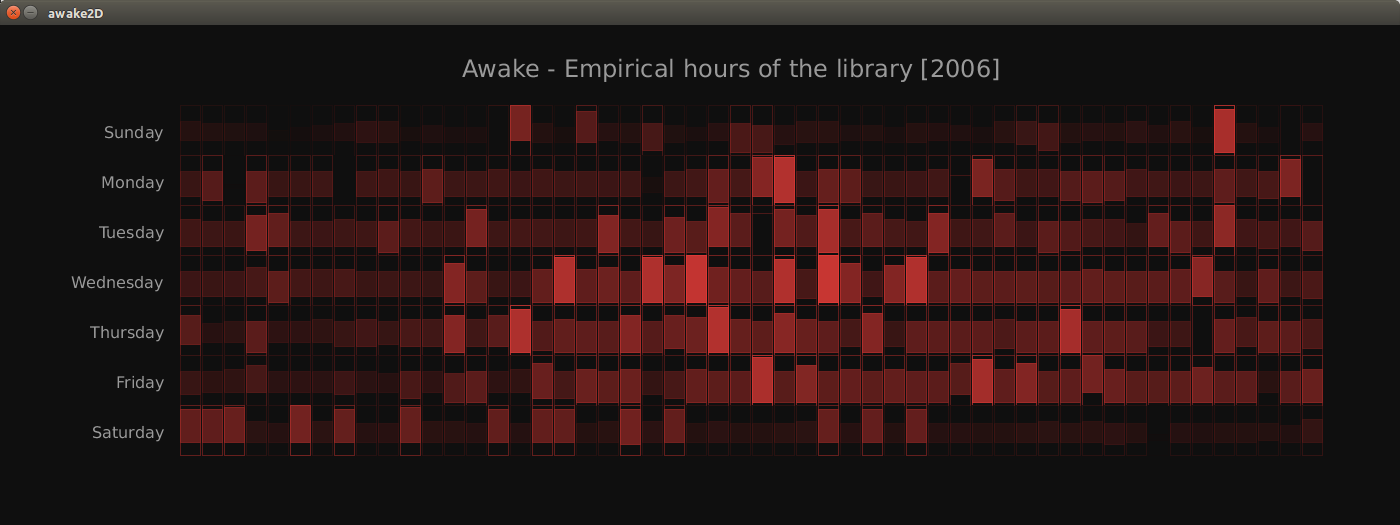
Viz.1: Original Data Matrix showing awake time in minutes projected on day of week (vertical) and week of year (horizontal).
Viz.1: Original Data Matrix showing awake time in minutes projected on day of week (vertical) and week of year (horizontal).
Visual Design
(1) Sort the values in the matrix by the awake time in minutes irrespective of weekday and week of year, starting at the upper left corner progressing through the matrix row by row. This is a magnitude based clustering approach in the form of a look-up table. Viz. 2 is a simple visualization of the matrix re-ordered in that way, note that the size of the boxes still correspond to observed awake time period and so do the brightness and transparency of the boxes.
(2) The re-ordering essentially performed a clustering by awake time, so now we can use the look-up table to visualize corresponding information on day of week that are emerging from the re-ordered awake time. I visualized day of week with an RGB multi-hue color pattern from colorbrewer using red for Wednesday and coral for both Saturday and Sunday, thus accounting for the circular nature of the weekday index. This allows for discerning weekday-weekend effects while still showing smooth gradients between adjacent days (Viz. 3).
(2) The re-ordering essentially performed a clustering by awake time, so now we can use the look-up table to visualize corresponding information on day of week that are emerging from the re-ordered awake time. I visualized day of week with an RGB multi-hue color pattern from colorbrewer using red for Wednesday and coral for both Saturday and Sunday, thus accounting for the circular nature of the weekday index. This allows for discerning weekday-weekend effects while still showing smooth gradients between adjacent days (Viz. 3).
Query
#QUERY 2 ran separately for every year existing in the SPL data set
SELECT barcode, itemtype,deweyClass, cout, DATE_FORMAT(cout, '%Y-%m-%d') as day_cout, DAYNAME(cout) as weekday, DAYOFWEEK(cout) as weekday_num, DAYOFYEAR(cout) as doy, MIN(cout) as earliest_cout, MAX(cout) as latest_cout, MAX(cin) AS latest_cin, MIN(cin) AS earliest_cin, DATE_FORMAT(MIN(cout), '%H') as earliest_cout_hour, DATE_FORMAT(MAX(cout), '%H') as latest_cout_hour, TIMESTAMPDIFF(MINUTE, MIN(cout), MAX(cout)) as awake FROM (SELECT barcode, itemtype, cout, cin, deweyClass FROM spl2.inraw WHERE TIME_TO_SEC(cout) > 0 and deweyClass <> '') as db1 WHERE date(cout) >= '2006-01-01' and date(cout) <= '2006-12-31' GROUP BY day_cout ORDER BY awake ASC LIMIT 10000#)
SELECT barcode, itemtype,deweyClass, cout, DATE_FORMAT(cout, '%Y-%m-%d') as day_cout, DAYNAME(cout) as weekday, DAYOFWEEK(cout) as weekday_num, DAYOFYEAR(cout) as doy, MIN(cout) as earliest_cout, MAX(cout) as latest_cout, MAX(cin) AS latest_cin, MIN(cin) AS earliest_cin, DATE_FORMAT(MIN(cout), '%H') as earliest_cout_hour, DATE_FORMAT(MAX(cout), '%H') as latest_cout_hour, TIMESTAMPDIFF(MINUTE, MIN(cout), MAX(cout)) as awake FROM (SELECT barcode, itemtype, cout, cin, deweyClass FROM spl2.inraw WHERE TIME_TO_SEC(cout) > 0 and deweyClass <> '') as db1 WHERE date(cout) >= '2006-01-01' and date(cout) <= '2006-12-31' GROUP BY day_cout ORDER BY awake ASC LIMIT 10000#)
Preliminary sketches
Initially, I only re-ordered the matrix by awake time without indicating another variable through color coding.
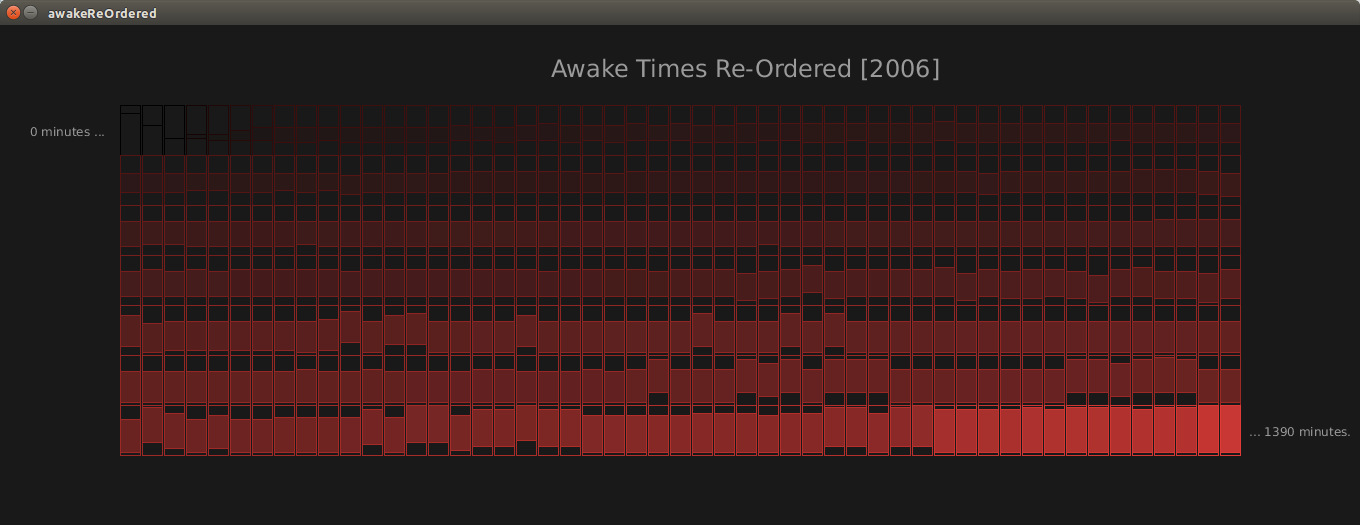
Viz.2: Data Matrix re-ordered by the awake time in minutes starting in the upper left corner and progressing by row.
Viz.2: Data Matrix re-ordered by the awake time in minutes starting in the upper left corner and progressing by row.
Final result
There are two main outcomes from the final visualization:
(1) The weekdays explain most of the variability in the awake times. As such, we observe almost exclusively coral colored boxes (weekends) in the top two rows. Wednesday turns out to be the most active day - making up for six out of the eight longest awake times. In general, the change in color is very gradual and smooth. From a design point of view, this can only be achieved when using a circular color scale. If one was to use a continuous color scale that uses a very different color or brightness for Saturday compared to Sunday, this the clustered boxes would not follow a continuous pattern.
(2) The simple sorting algorithm worked well for this application of studying weekday-weekend patterns in the awake data set in more depth. Since the data is re-ordered still in its original matrix shape, the only means for the user to discern the clustered classes are the colors as a guidance. Running a smoothing algorithm on top of the cells would make the picture even clearer if needed. One could also use other unsupervised clustering techniques such as k-means or tree based algorithms and compare the outputs.
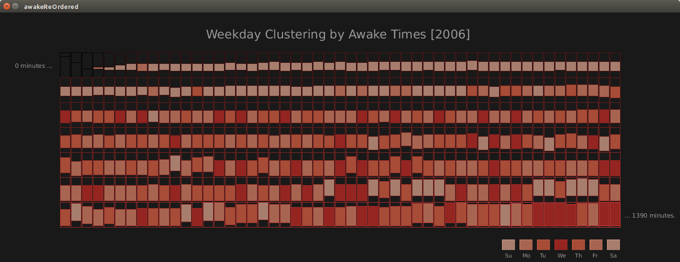
Viz.3: Re-ordered matrix based on the sorting in Viz. 2, and also indicating weekdays using a circular color scheme.
(1) The weekdays explain most of the variability in the awake times. As such, we observe almost exclusively coral colored boxes (weekends) in the top two rows. Wednesday turns out to be the most active day - making up for six out of the eight longest awake times. In general, the change in color is very gradual and smooth. From a design point of view, this can only be achieved when using a circular color scale. If one was to use a continuous color scale that uses a very different color or brightness for Saturday compared to Sunday, this the clustered boxes would not follow a continuous pattern.
(2) The simple sorting algorithm worked well for this application of studying weekday-weekend patterns in the awake data set in more depth. Since the data is re-ordered still in its original matrix shape, the only means for the user to discern the clustered classes are the colors as a guidance. Running a smoothing algorithm on top of the cells would make the picture even clearer if needed. One could also use other unsupervised clustering techniques such as k-means or tree based algorithms and compare the outputs.
Viz.3: Re-ordered matrix based on the sorting in Viz. 2, and also indicating weekdays using a circular color scheme.
Code