Awake - Empirical Hours of a Library
MAT 259, 2015
Olaf Menzer
Concept
This visualization exercise explores the active hours of the Seattle Public Library. Based on the time differences between the latest and the earliest check out of a day, the daily awake time in minutes is calculated. This time measure is generally related to the opening hours of the library, but also influenced by activities such as online reservations, interlibrary loans, transfers and removal of books. By mapping the daily awake time onto a 2D matrix indicating weekday and week of year, temporal patterns of such events altogether can be explored. If daily awake time and/or renewal activity is well constrained, this visualization can show behavioral patterns of different associated with user groups of the library.
Visual Design
For the design of the 2D matrix I relied on representation of the data using only one single color and scaling the brightness and transparency factors of the HSB color ranges. I also explored different color schemes throughout the visualization. Daily awake times smaller than 200 minutes resulting from national holidays were removed from the data set to improve visibility of patterns. In another visualization approach, the cell sizes are directly determined by the observed awake hours. Here, I used the maximum awake value across the whole time range from 2005-2013, but the matrixes could also be plotted for each year separately or into an animation or 3D cube in the future. The current form of visualization could be a useful diagnostic for the quality of filtering approaches that can help identify library activity patterns, such as awake/asleep times and activity categories (first time check-outs, renewals, online loans/renewals, transfers).
Query
#QUERY 2 adapted to yield only variables directly needed for the visualization
SELECT barcode, deweyClass,
DAYOFWEEK(cout) as weekday_num,
WEEK(cout,1) as week_num,
TIMESTAMPDIFF(MINUTE,
MIN(cout),
MAX(cout)) as awake,
DATE_FORMAT(MIN(cout), '%H') as earliest_cout_hour,
DATE_FORMAT(MAX(cout), '%H') as latest_cout_hour,
DATE_FORMAT(cout, '%Y-%m-%d') as day_cout
FROM
(SELECT barcode, itemtype, cout, cin, deweyClass
FROM spl2.inraw
WHERE
TIME_TO_SEC(cout) > 0
and deweyClass <> '') as db1
WHERE
date(cout) >= '2005-02-23'
and date(cout) <= '2014-01-05'
GROUP BY day_cout
ORDER BY weekday_num;
Preliminary sketches
Initially, I only visualized the awake time in minutes in a simple 2D matrix, with brighter cells corresponding to longer daily awake times and using one single hue with equal cell sizes.
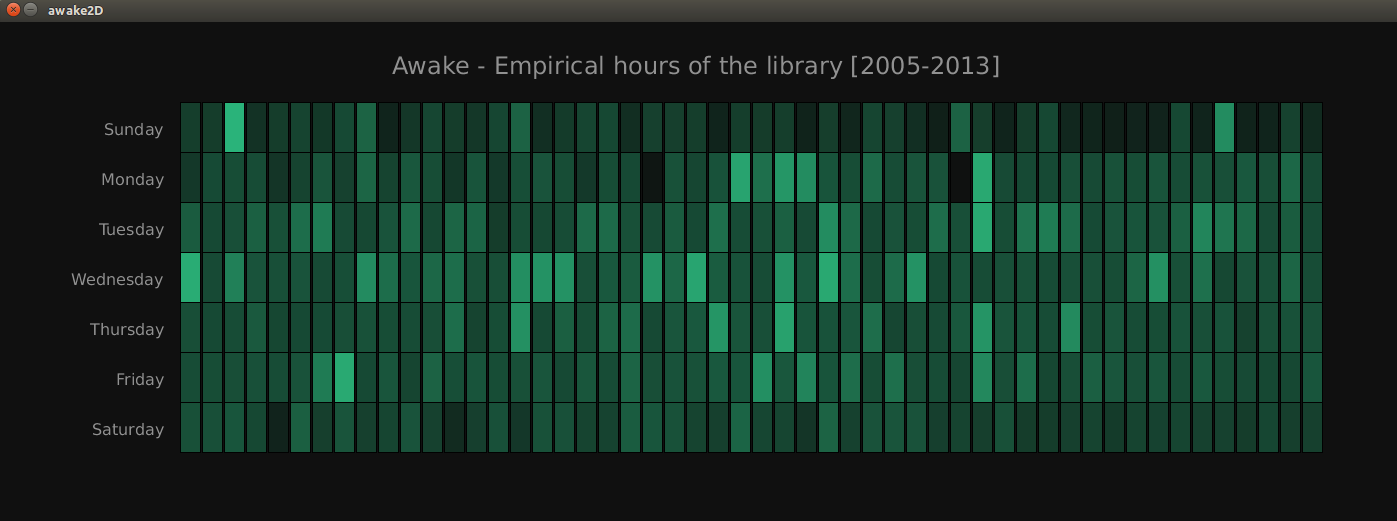
Viz.1: The awake time in minutes, brighter cells correspond to longer daily awake times.
Viz.1: The awake time in minutes, brighter cells correspond to longer daily awake times.
Process
The main creative step for making this visualization compelling and interesting was to introduce a feature that relates the size of the cells to the actual awake time, the first checkout of a day and the last checkout of the day. While the awake time in minutes determine the color brightness and how much of the cell is filled, the timing determines the vertical position of the filling.
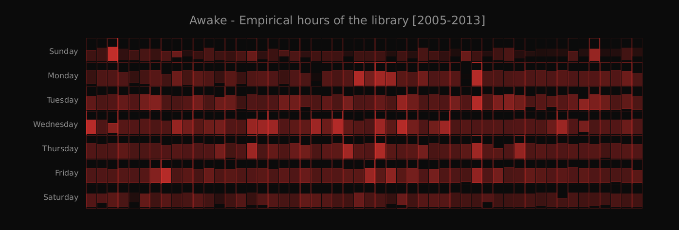
Viz.2: The awake time in minutes, cell size adjusted to hourly observed awake time.
Viz.2: The awake time in minutes, cell size adjusted to hourly observed awake time.
Final result
Besides the weekday-weekend differences that show up in a film tape fashion in the initial visualization, we also note the following:
(1) There seems to be a seasonal cycle of the awake hours that is lined up with hours of daylight throughout the year.
(2) Library activities in the data base occur all the way to the end of a day beyond opening hours until midnight, but only rarely between 12am and 10am (background colored gaps in Viz. 2).
(3) There is year to year variability among the check out activities, as can be seen when comparing the visualization for data from 2013 only compared to the visualization of all 8 years in conjunction.
(4) Diurnal, weekly and seasonal cycles of awake hours will be more pronounced if corrections can be made for data base entries that are not directly associated with user activity. By using more advanced SQL queries that incorporate data flags from inlog and outlog different activities can be disentangled and then re-mapped using the visualisation concepts presented here.
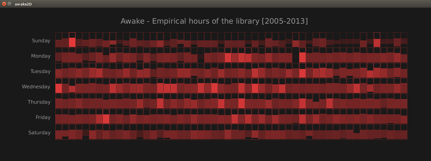
Viz.3: The final product, awake time in minutes, cell size adjusted to hourly observed awake time. (captured and processed using a different screenshot software, likely leading to different appearance on different screens or monitors)
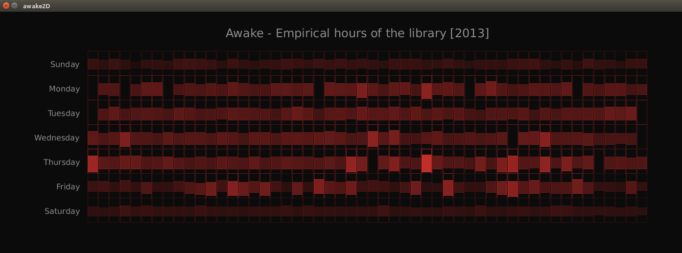
Viz.4: The awake time in minutes, data from 2013 only.
(1) There seems to be a seasonal cycle of the awake hours that is lined up with hours of daylight throughout the year.
(2) Library activities in the data base occur all the way to the end of a day beyond opening hours until midnight, but only rarely between 12am and 10am (background colored gaps in Viz. 2).
(3) There is year to year variability among the check out activities, as can be seen when comparing the visualization for data from 2013 only compared to the visualization of all 8 years in conjunction.
(4) Diurnal, weekly and seasonal cycles of awake hours will be more pronounced if corrections can be made for data base entries that are not directly associated with user activity. By using more advanced SQL queries that incorporate data flags from inlog and outlog different activities can be disentangled and then re-mapped using the visualisation concepts presented here.
Viz.3: The final product, awake time in minutes, cell size adjusted to hourly observed awake time. (captured and processed using a different screenshot software, likely leading to different appearance on different screens or monitors)
Viz.4: The awake time in minutes, data from 2013 only.
Code