Final Project
MAT 259, 2015
Matthias Wagner
Concept
A 3D visualization/sonification of New York Times articles in the music section since WWII. Results are filtered into categories of musical genres, publication date and/or article length.
Query
Sample query for the pop category for the year 1986:
http://api.nytimes.com/svc/search/v2/articlesearch.json?q=pop&fq=subject%3Dmusic&begin_date=19860101&end_date=19861231&fl=word_count%2Cpub_date%2Clead_paragraph&api-key=sample-key
http://api.nytimes.com/svc/search/v2/articlesearch.json?q=pop&fq=subject%3Dmusic&begin_date=19860101&end_date=19861231&fl=word_count%2Cpub_date%2Clead_paragraph&api-key=sample-key
Process
Coming from a music background, I had a natural motivation for making my final data visualization about music and sound. In this sense, my final project is a visualization, as well as a sonification. There are a several excellent music APIs out there, which I tried out. Perhaps most notably EchoNest API, which sports a wide array of search criteria for music and music metadata. Unfortunately, all of the music APIs with solid databases that I encountered offered only queries about the present moment, but not how data evolved over time. For this reason, I decided to go with the New York Times API, which, as it turns out, proved quite satisfactory for my research. The JSON query is included in the Processing sketch, but it was performed separately, since it took quite some time. I saved JSON files in the data folder, from which the program reads.
I enquired about the development of specific music genres since WWII in the following ways:
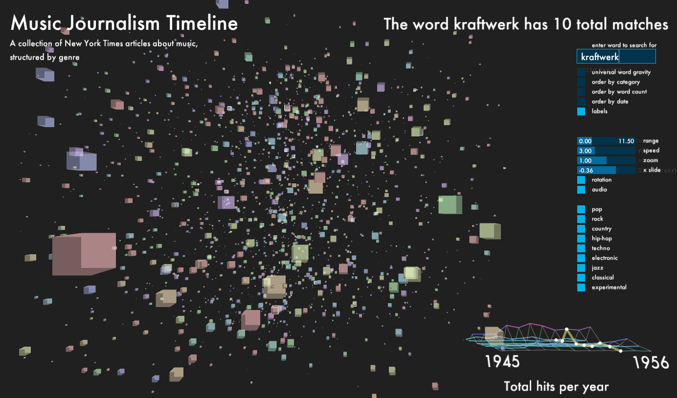
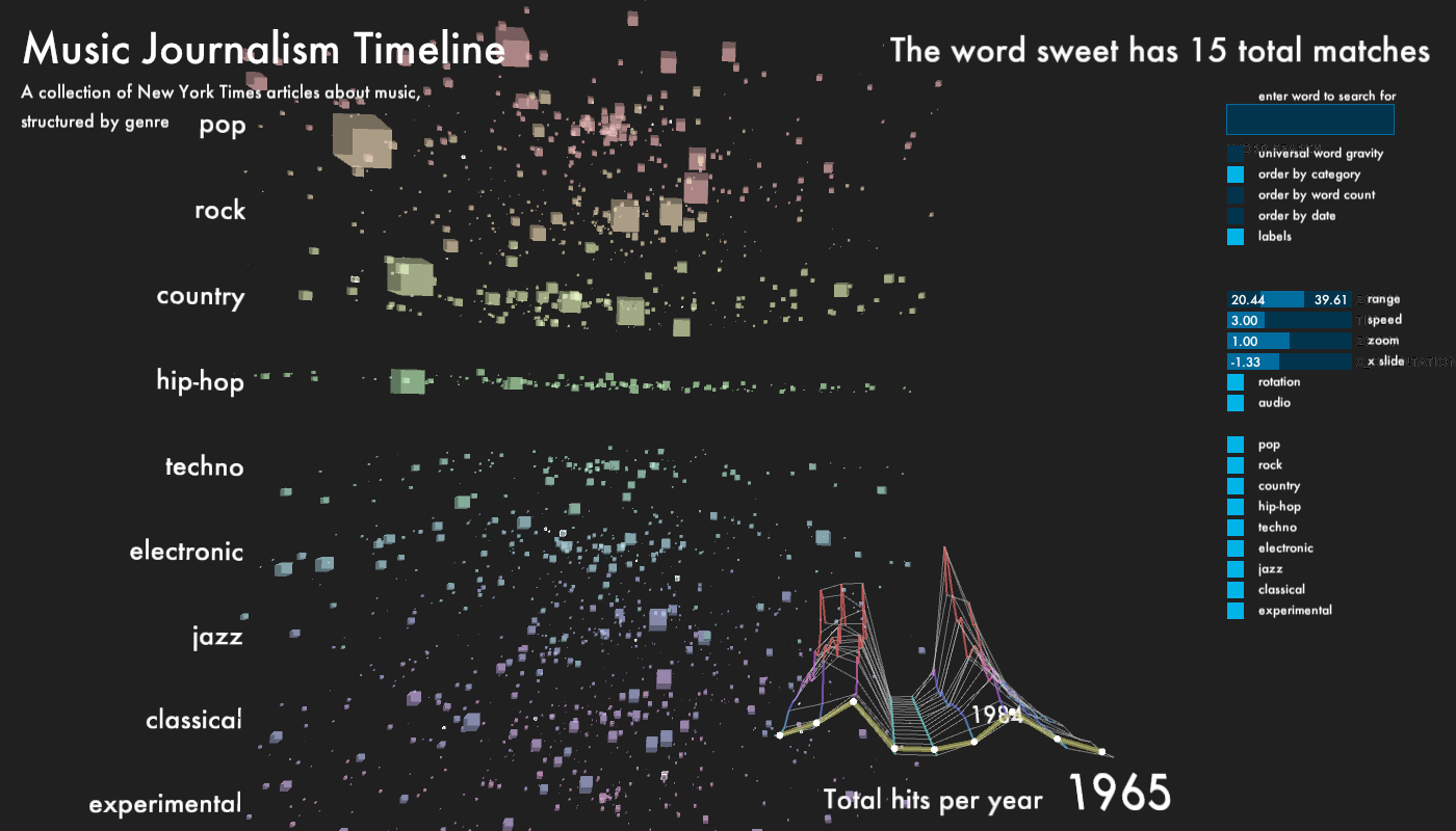
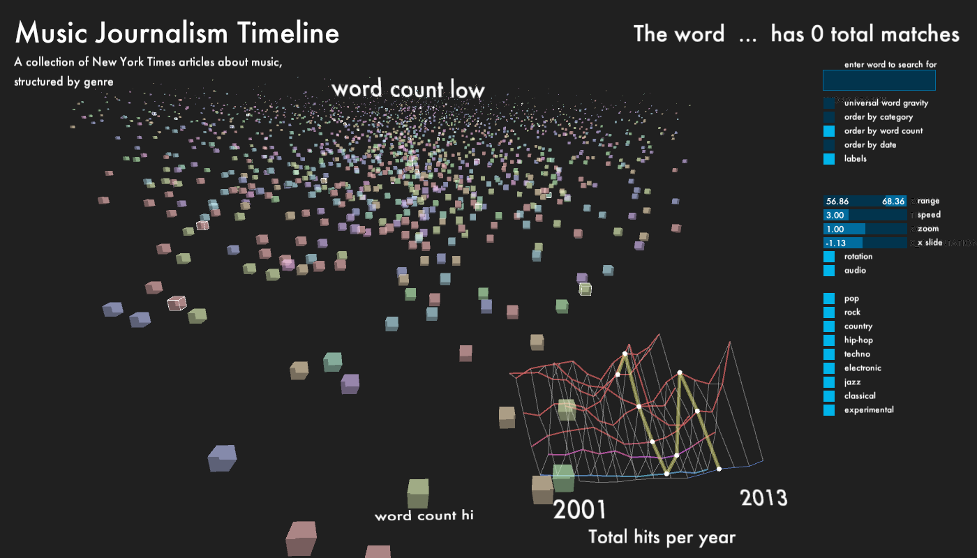
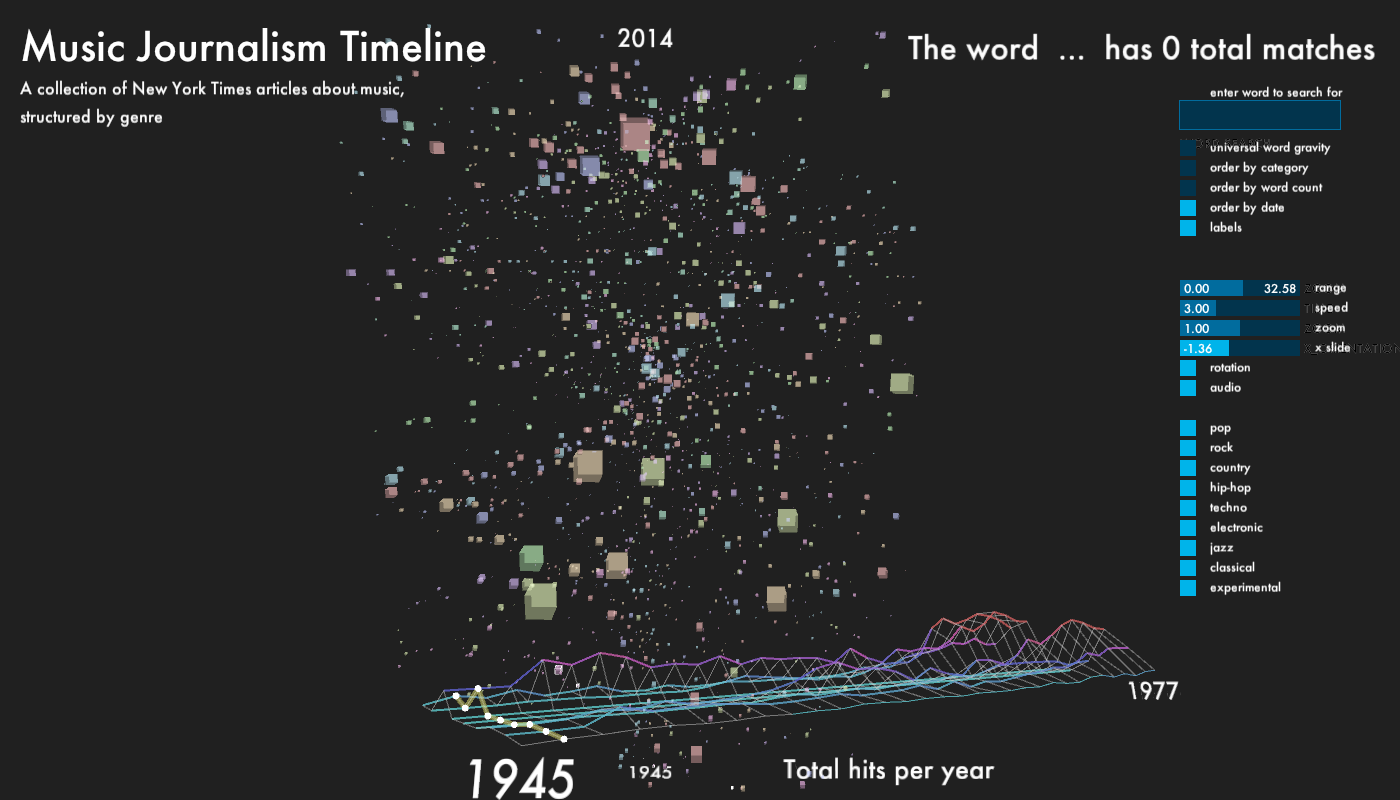
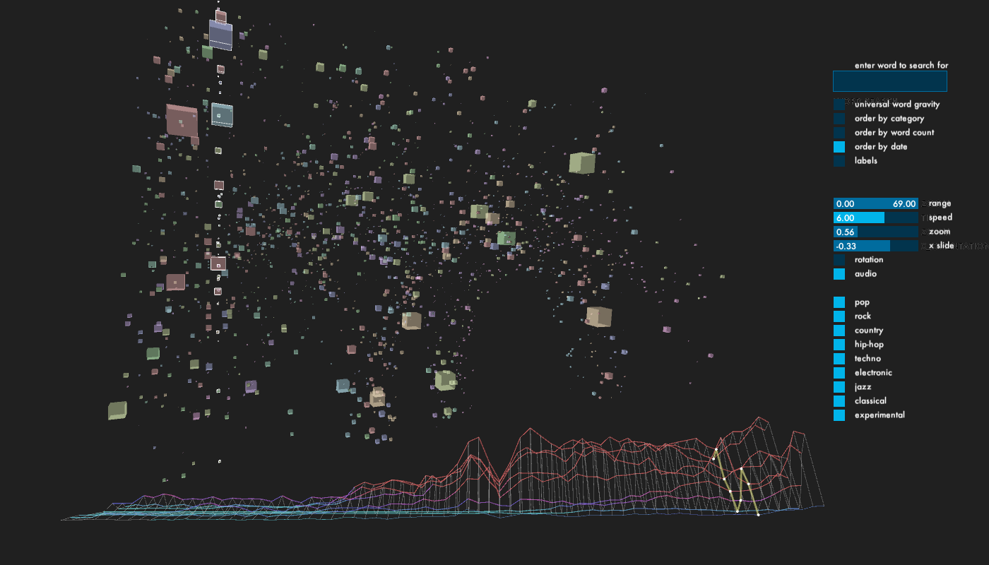
For the main part of the window, I displayed every article, which returned from the database as a cube. Depending on which genre, each cube has one of 9 colors, equally mapped over HSV color range. The size of the cubes is determined by the word count of its content. The cubes, which start out in random positions, can be organized according to category, publication date and word count. The outline of each cube lights up, when it matches the category and year of the histogram scrubber. This way, it is possible to get different perspectives on how the writing about each genre changes over time.
Lastly, since I gathered a significant amount of content, I did not want to leave it untouched. The user can type a word into a field near the upper right corner of the screen. The program checks in each article, how many times the word appeared and adds the total amount of occurrences together and displays it on the screen. Every cube object stores its own number of occurrences. This number is then used to generate a gravitational pull with all other objects, in which the word appeared. This leads to the possibility to observe how certain words have an impact on genre and time, and vice-versa. The user can activate the gravity via a toggle, which is off by default.
WARNING!!! Due to the significant computational work, this might slow down or even freeze the program, depending on the machine it is running on.
I enquired about the development of specific music genres since WWII in the following ways:
- frequency of total number of occurrences per year per genre
- specific articles including:
- word length
- publication date
- content (of lead paragraph)
For the main part of the window, I displayed every article, which returned from the database as a cube. Depending on which genre, each cube has one of 9 colors, equally mapped over HSV color range. The size of the cubes is determined by the word count of its content. The cubes, which start out in random positions, can be organized according to category, publication date and word count. The outline of each cube lights up, when it matches the category and year of the histogram scrubber. This way, it is possible to get different perspectives on how the writing about each genre changes over time.
Lastly, since I gathered a significant amount of content, I did not want to leave it untouched. The user can type a word into a field near the upper right corner of the screen. The program checks in each article, how many times the word appeared and adds the total amount of occurrences together and displays it on the screen. Every cube object stores its own number of occurrences. This number is then used to generate a gravitational pull with all other objects, in which the word appeared. This leads to the possibility to observe how certain words have an impact on genre and time, and vice-versa. The user can activate the gravity via a toggle, which is off by default.
WARNING!!! Due to the significant computational work, this might slow down or even freeze the program, depending on the machine it is running on.
Final result
Code
I used Processing.
Control: (via controlP5 panel and PeasyCam)
enter word to search for in articles
toggle universal word gravity (read warning above!)
order agents by category, word count or publication date
toggle labels on/off
change date range, speed, zoom and location of graph
toggle audio on/off
toggle categories on/off
Source Code + Data