Urban Agriculture in Seattle with Polar Area Diagram
MAT 259, 2015
Kurt Kaminski
Concept
Continuing with my previous project's query, I was interested in visualizing Seattle's widespread community gardening practice through the Seattle Public Library's database of checkouts within the Dewey class 630: Agriculture. MySQL was used to accumulate the number of Agriculture checkouts per month across 8 years, from 2006 to 2013.
Query
SELECT
MONTH(cout),
YEAR(cout),
COUNT(IF( deweyClass >=630 AND deweyClass < 631, 1, NULL)) as "630",
COUNT(IF( deweyClass >=631 AND deweyClass < 632, 1, NULL)) as "631",
COUNT(IF( deweyClass >=632 AND deweyClass < 633, 1, NULL)) as "632",
COUNT(IF( deweyClass >=633 AND deweyClass < 634, 1, NULL)) as "633",
COUNT(IF( deweyClass >=634 AND deweyClass < 635, 1, NULL)) as "634",
COUNT(IF( deweyClass >=635 AND deweyClass < 636, 1, NULL)) as "635",
COUNT(IF( deweyClass >=636 AND deweyClass < 637, 1, NULL)) as "636",
COUNT(IF( deweyClass >=637 AND deweyClass < 638, 1, NULL)) as "637",
COUNT(IF( deweyClass >=638 AND deweyClass < 639, 1, NULL)) as "638",
COUNT(IF( deweyClass >=639 AND deweyClass < 640, 1, NULL)) as "639"
FROM
spl2.inraw
WHERE
deweyClass >= 630 AND deweyClass < 640
AND DATE(cout) >= '20060101'
AND DATE(cout) <= '20131231'
AND (itemtype = "acbk" OR itemtype = "arbk")
GROUP BY MONTH(cout), YEAR(cout)
ORDER BY YEAR(cout), MONTH(cout)
Preliminary sketches
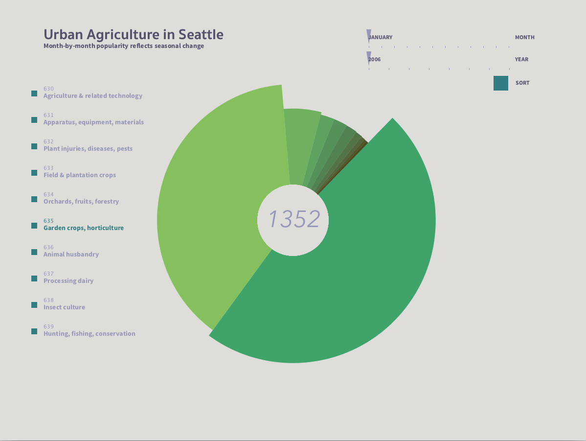
In this sketch, I am thinking about how to sort and scale the information based on its value. I wanted not only each dewey class to represent one slice of a pie chart, but to also for its radius to modulate. This I learned is called a polar area diagram.

Process
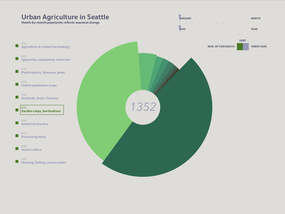
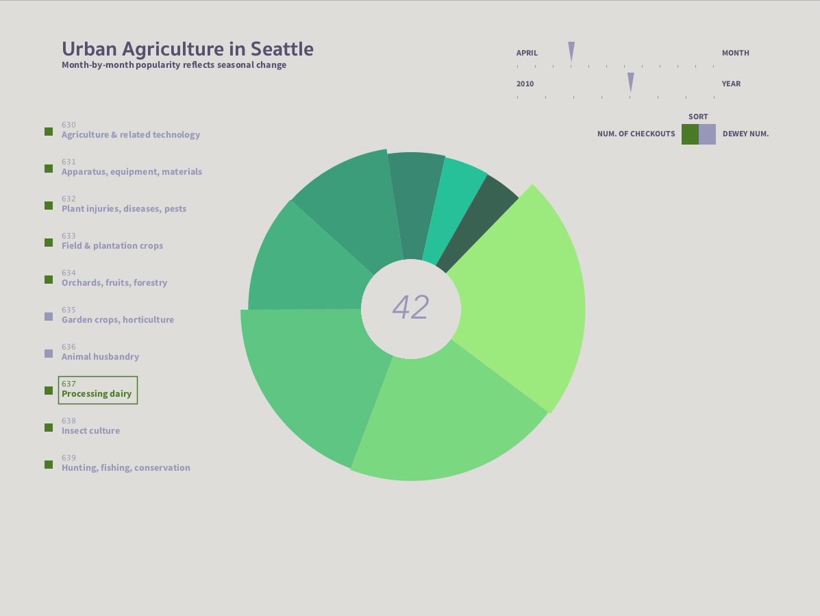
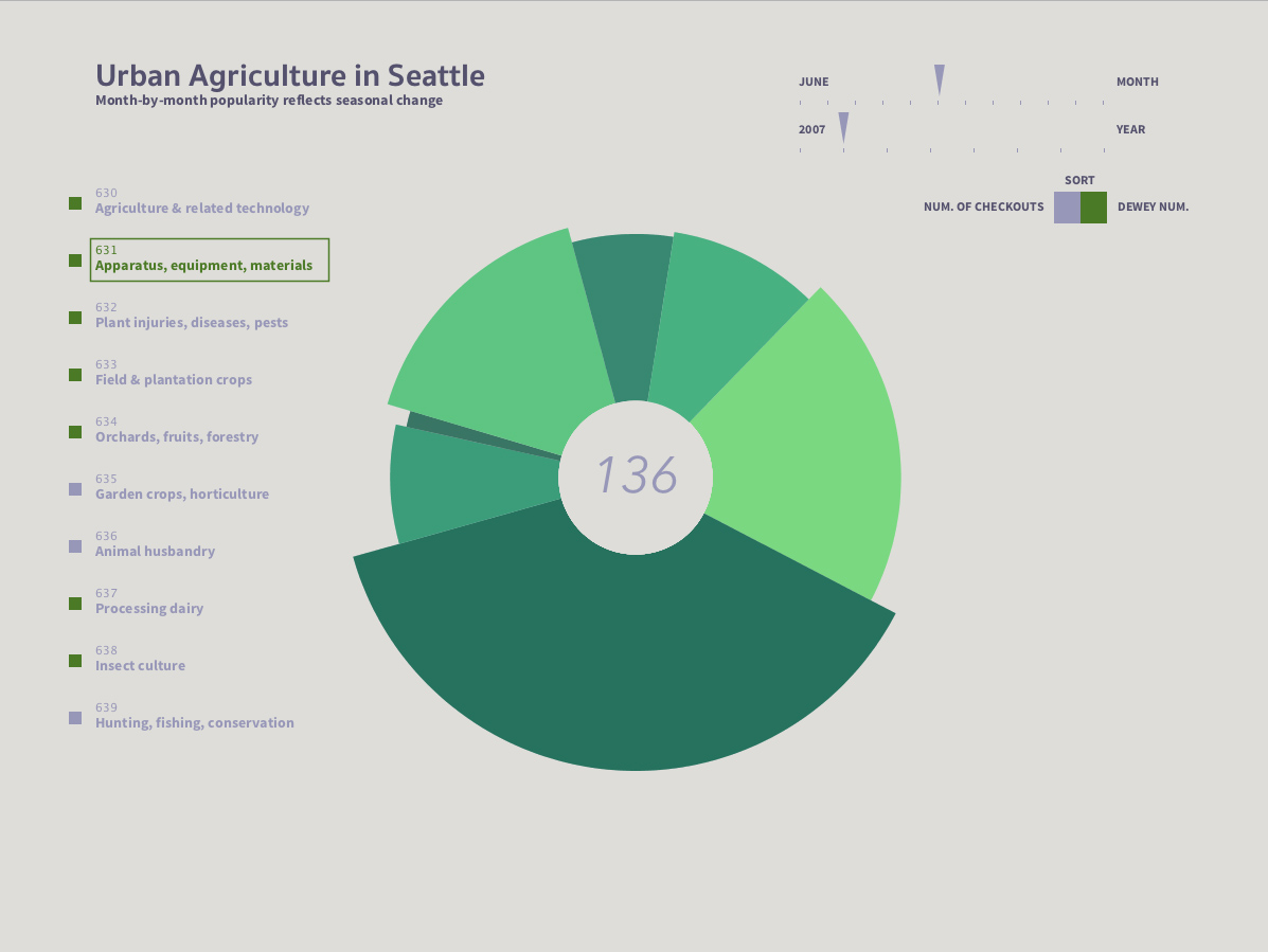
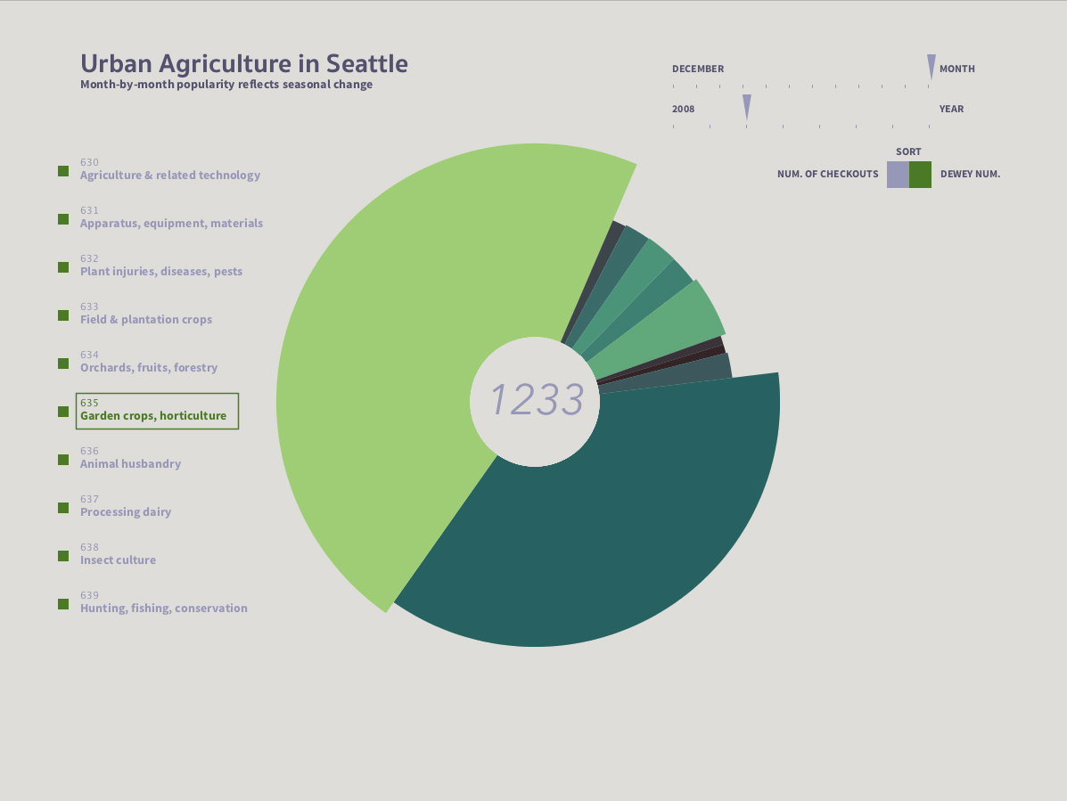
I used the same CSV data as my 2d matrix to create a polar area diagram of each month, with controls to change the date and turn on or off Dewey categories. Hovering over a section of the diagram reveals the number of items checked out that month at the center and also highlights the corresponding Dewey number. There is an option to toggle sorting the diagram clockwise by number of checkouts (on by default) or by Dewey number.
Colors relate to the number of checkouts- brighter is more and darker is less. There is a secondary color scheme acting on the graph which tints the entire month according to how active it was compared to that year- more active months are tinted with bright, saturated blue/green while less activity is indicated by darker reds and oranges.
This was the first version which was mostly there, it just needed some additional visual cues and color adjustments to make the data more salient.
Final result
The interactive polar area diagram is more useful at comparing arbitrary dewey classes to one another than my static 2d matrix. This is particularly handy for the less-frequented categories which can easily get crowded out by Garden crops/Horticulture and Animal husbandry. While large scale changes are less immediately apparent, they can be revealed by changing the date and paying attention to the scale and color changes through the year and across years.
Code
I used Processing.
Control: Click the boxes next to the dewey classes to include or exclude them from the visualization. Drag the sliders on the top right to change the month and year, and click the toggle to change how the data is ordered in the chart.
Source Code + Data
Control: Click the boxes next to the dewey classes to include or exclude them from the visualization. Drag the sliders on the top right to change the month and year, and click the toggle to change how the data is ordered in the chart.
Source Code + Data