I’ve always seen this period of time at MAT as an opportunity to make a pause -at least in the beginning- and redirect my efforts in a more conscious way. By pause I don’t mean stopping work at all, but the forging of a necessary recognition of one’s own context. This is: knowing more than vaguely the history of the field, its key players, crucial works and then -perhaps, aided by intuition- being able to make a contribution within the field.
This project (using the NYTimes API and the Google's Ngram database) search for mentions of previously curated key topics and people since the previous century. This data is then located into a data visualization for further analysis.
The project aims going beyond the visualization aspect. It aims to be as well a study about the history about our -not that young by now- “new media/electronic art” field - - > A map of our current territory. How else can we keep going on this journey?
// **************************************************
// ** SEGMENTED related operations ******************
// **************************************************
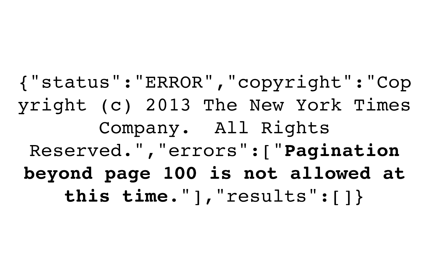
// This function has been implemented to over-come the NYTimes functionality of segmenting data after the 100 page.
int fechaMinima = 1900;
int fechaMaxima = 2015;
int fechaActual = 0;
// Next variables declared in the MAIN tab
//int intervaloSegmentosFecha = 10; // This is if we're going to divide the intel by decade or every year, or so.
// *********************************************
Boolean segmentedMode = false;
// Remember oldest must be turned on!!!
//-----------------------------------------------------------------------
// SEGMENTED MODE FUNCTION
void APICallSegmented(int pagina) {
// 0. We re-Arrange the term
String termino = reemplazarEspacios(busquedas[busquedaActual]);
termino = "%22"+termino+"%22";// This is to make it an exact search
// 00. Feedback
println(">> SEGMENTED Starting call no. "+callsTotales+" Term: "+termino+" | item: "+itemActual+"/("+itemsTotales+")");
println(" >> DATES: "+fechaMinima+"-"+fechaMinima+10);
callsTotales++;
// 000. New start dates
String fechaInicioS = fechaActual+"0101"; // Segmented date
String fechaFinS = (fechaActual+10)+"1231"; // Segmented date
// A. We build our request/query
query = NYTimesURL+tipoQuery+"?q="+termino+"&page="+pagina+"&begin_date="+fechaInicioS+"&end_date="+fechaFinS+"&sort="+sort+"&api-key="+APIArticleKey;
// B. We'll make the request now or catch an excetion:
try {
//1. We create the request
objetoJSON = loadJSONObject(query);
println(">> SEGMENTED Query deseada: ");
//println(query);
// 2. Vamos a establecer el "PARSING"
JSONObject response = objetoJSON.getJSONObject("response");
JSONObject meta = response.getJSONObject("meta");
JSONArray resultados = response.getJSONArray("docs");
//println(">> META");
//println(meta);
//println(">> RESULTADOS");
//println(resultados);
println("- - - - - - - - - - - - - - - - - - - - - - - - - - - - - - - - - - ");
// 3. Revisamos los totales
itemsTotales = meta.getInt("hits");
//println(">> Totales: "+itemsTotales);
println("- - - - - - - - - - - - - - - - - - - - - - - - - - - - - - - - - - ");
// 4. Vamos a obtener los valores de cada item
for (int i = 0; i < itemsTotales && i < 10 && itemActual < itemsTotales; i++) { // 10 son los resultados que obtenemos
// 4 - 1 Creamos un item por cada noticia
JSONObject itemExclusivo = resultados.getJSONObject(i);
// 4 - 2 Vamos con la fecha
String fecha = itemExclusivo.getString("pub_date");
String [] fechaSeparada = fecha.split("-");
int ano = int(fechaSeparada[0]);
anosFinales += ano+" xxyxx "; // We add the year to our long string
println(" Fecha ["+i+"] = "+ano);
// 4 - 3 El titulo del articulo
JSONObject headlineObject = itemExclusivo.getJSONObject("headline");
String titulo = headlineObject.getString("main");
//println(" TITLE >> "+titulo);
titulosFinales += titulo+" xxyxx "; // We add this year to our long list
//4 - 4 La url
String vinculo = itemExclusivo.getString("web_url");
urlsFinales += vinculo+" xxyxx "; // We add this year to our long list
// 4 - 5 We add the item
itemActual++;
}
// 5. We stop the whole thing if we've reached our limit or... ask for more!
if (itemActual >= itemsTotales) {
incrementarFecha();
} else {
// We search again
paginaActual++;
//APICall(paginaActual);
}
}
catch(Exception x) {
// Fail Switch
println(" >> Something really bad happened bro :( SEGMENTED :(");
println(">> FAIL SEGMENTED QUERY: "+query);
x.printStackTrace();
}
}
//-----------------------------------------------------------------------
void iniciarSegmentedMode() {
// This function will start the segmented mode
fechaActual = fechaMinima; // This is where it all starts.
//paginaActualS = 0;
// - NORMAL RESET OF EVERYTHING
paginaActual = 0;
itemActual = 0;
anosFinales = "";
titulosFinales = "";
urlsFinales = "";
}
// ----------------------------------------------------------------------
void incrementarFecha() {
// We will increment our dates or... end the segmented mode.
fechaActual += intervaloSegmentosFecha;
// Let's see if we are finished
if (fechaActual+10 > fechaMaxima) {
// Nothing to see here folks, it's over, segmented mode OFF
segmentedMode = false;
// Normal change
efectuarCambioNormal();
} else {
// - NORMAL RESET OF EVERYTHING (for internal recursive dates)
paginaActual = 0;
itemActual = 0;
// (We won't reset items here, because we want the arrays to keep on building)
}
}
Complete code to handle the API can be found in the Processing sketch included here.
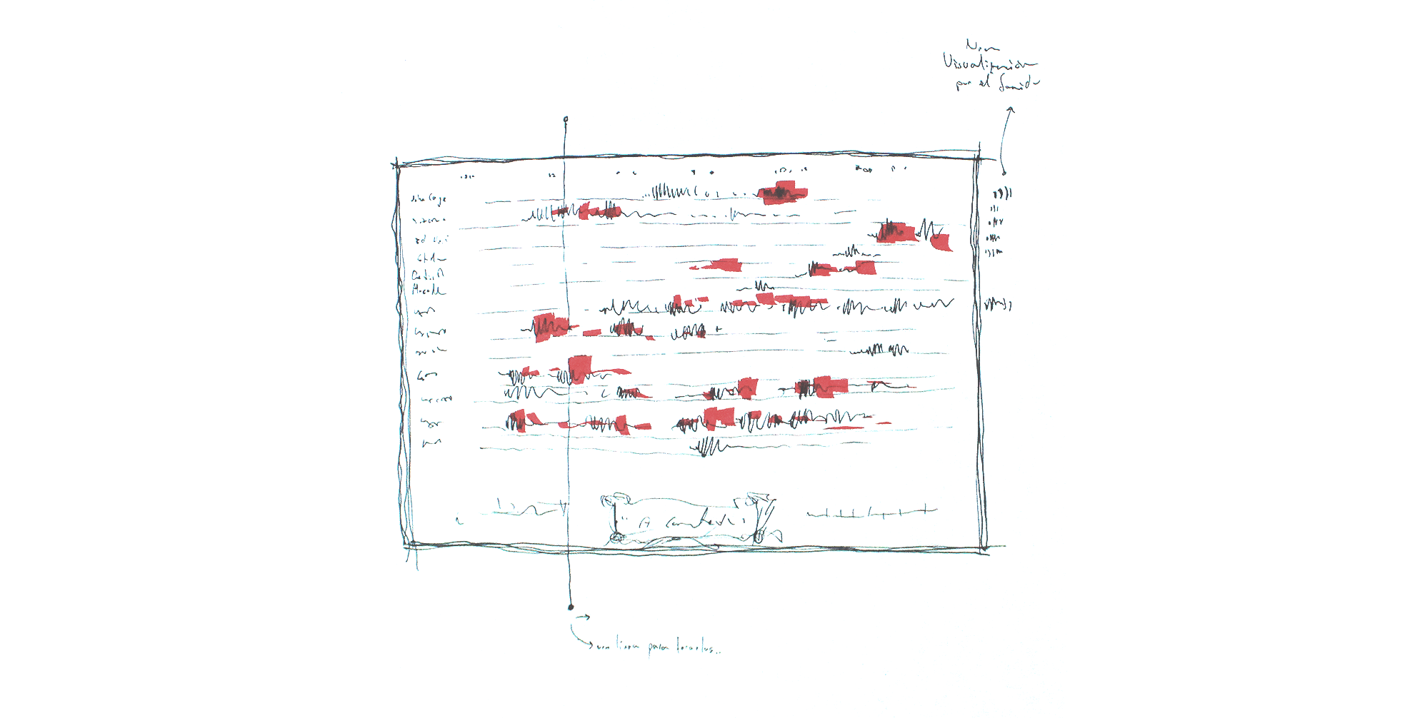
Initial sketch of this visualization. At first, it was conceived as a musical score, where author's data was going to be played as the time increased.
Another idea that was discarded: the scrolling data to the top (as in a movie). This would lose the "full picture image", but on the other side, it would provide a more detailed view of each individual's life.

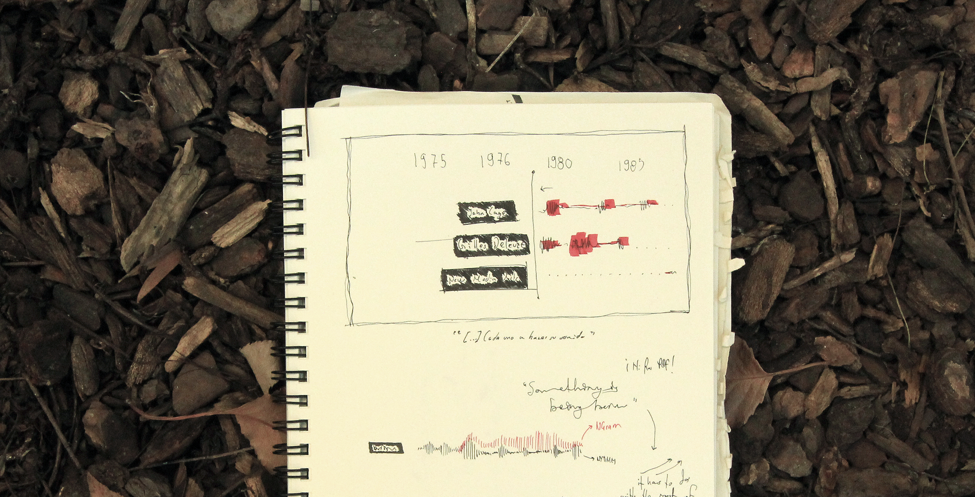
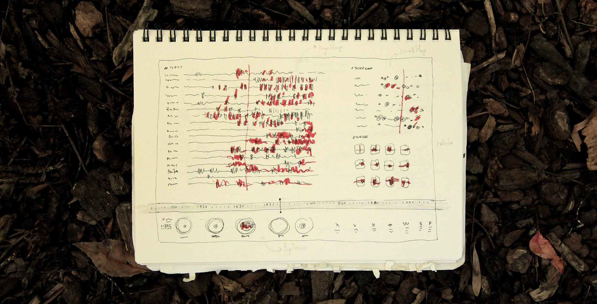
This was the first sketch dashboard. At first, inspired by sci-fi visualizations. But at the same time, showing multiple information could reveal some insights as the user explored the software. The top right circle idea was explored, but later abandoned.
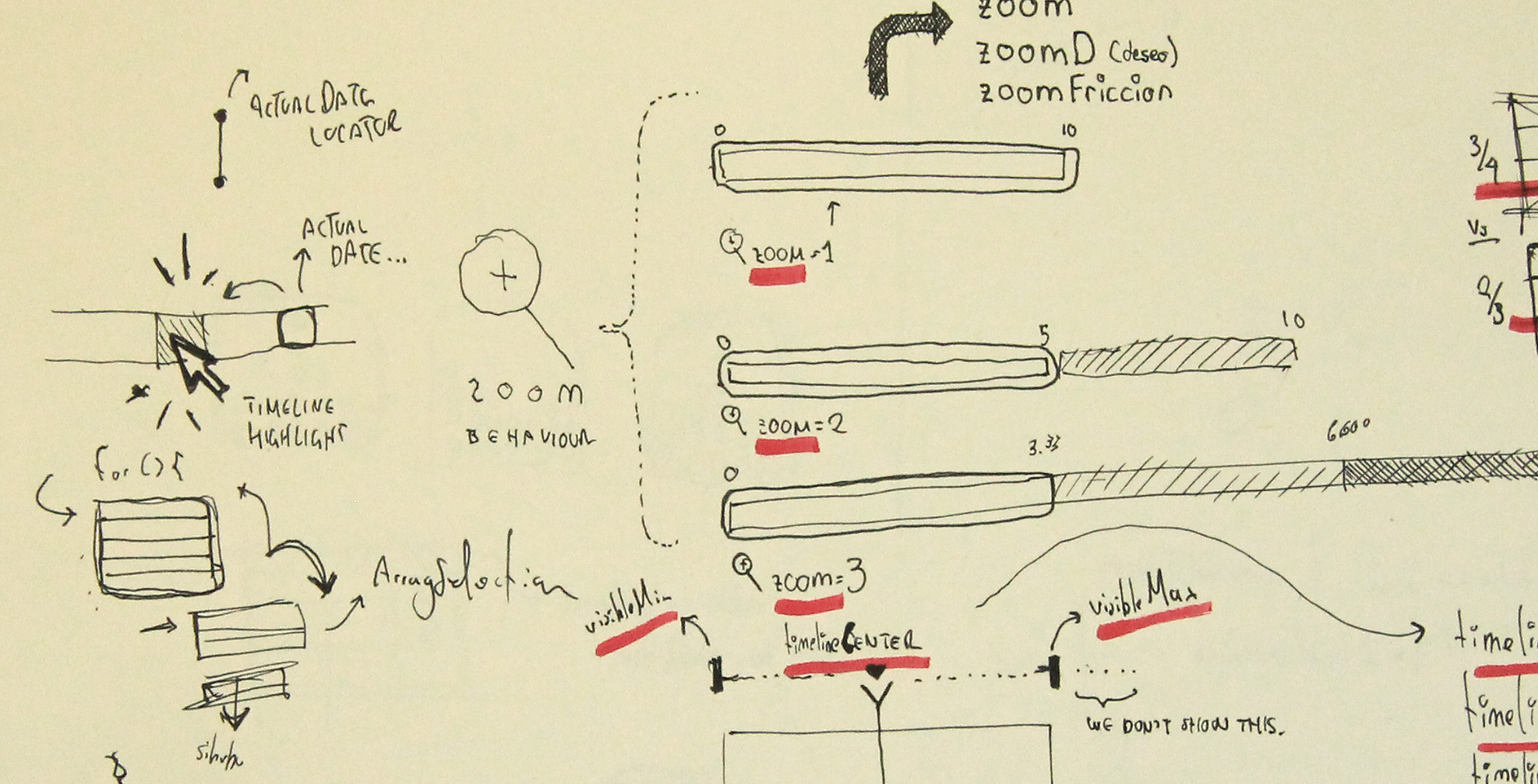
The timeline movement was crucial to solidify the 'feel' of using the app. In this case, a sketch made to understand how to solve the zoom levels using friction.

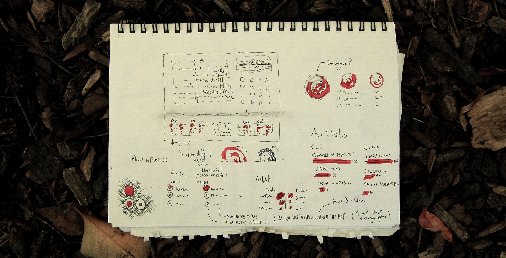
Another abandoned idea: a circling 3D graph.

Sketch made to define the lower panels with TOP 3 data. In this case, trying to stay away from a standard bar graph representation different alternatives were considered.
Final details to be solved before the Beta version of "Rise and Fall".

All of the data was retrieved from two databanks: the New York Times and Google's Ngram. To decrease dependency from a huge query, all of the data was saved in separate *.txt files, one for each author/topic/subject.
A different Processing code was programmed to achieve this task.

Since the NYTimes API does not support gathering data beyond the 100th page a different method was implemented. Instead of making just one call per author/topic, if the results were more than 1000, then the code will execute a segmented query every year. After all the information is gathered, then a txt file is created.
The terms "Software" and "John Cage" were two of the biggest items obtained.
As Google's Ngram data is contained in large files, a separate sketch was prepared to process this information. A short cut was implemented: a screen shot of the capture was taken with the term of interest. Then, that image was cropped and then analyzed within Processing. Procesing calculated the aproximate height of each point in the graphic and translated that data into numbers. After the numbers were retrieved, another TXT file was created.

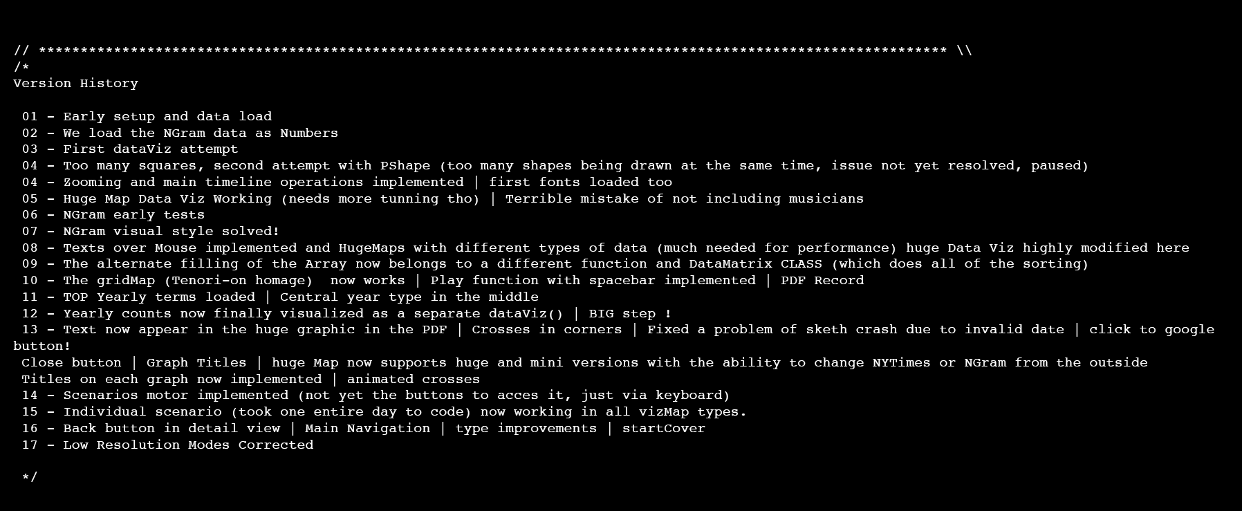
For some time, we keep different versions of our codes. Here is the version history, up to 17 different steps to achieve the final goal.
Color scheme:

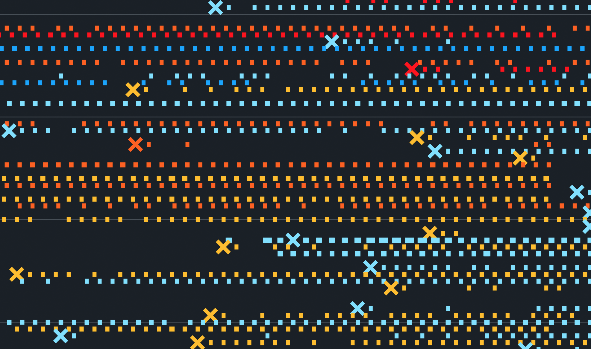
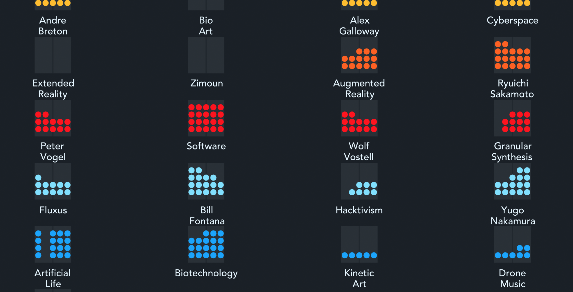
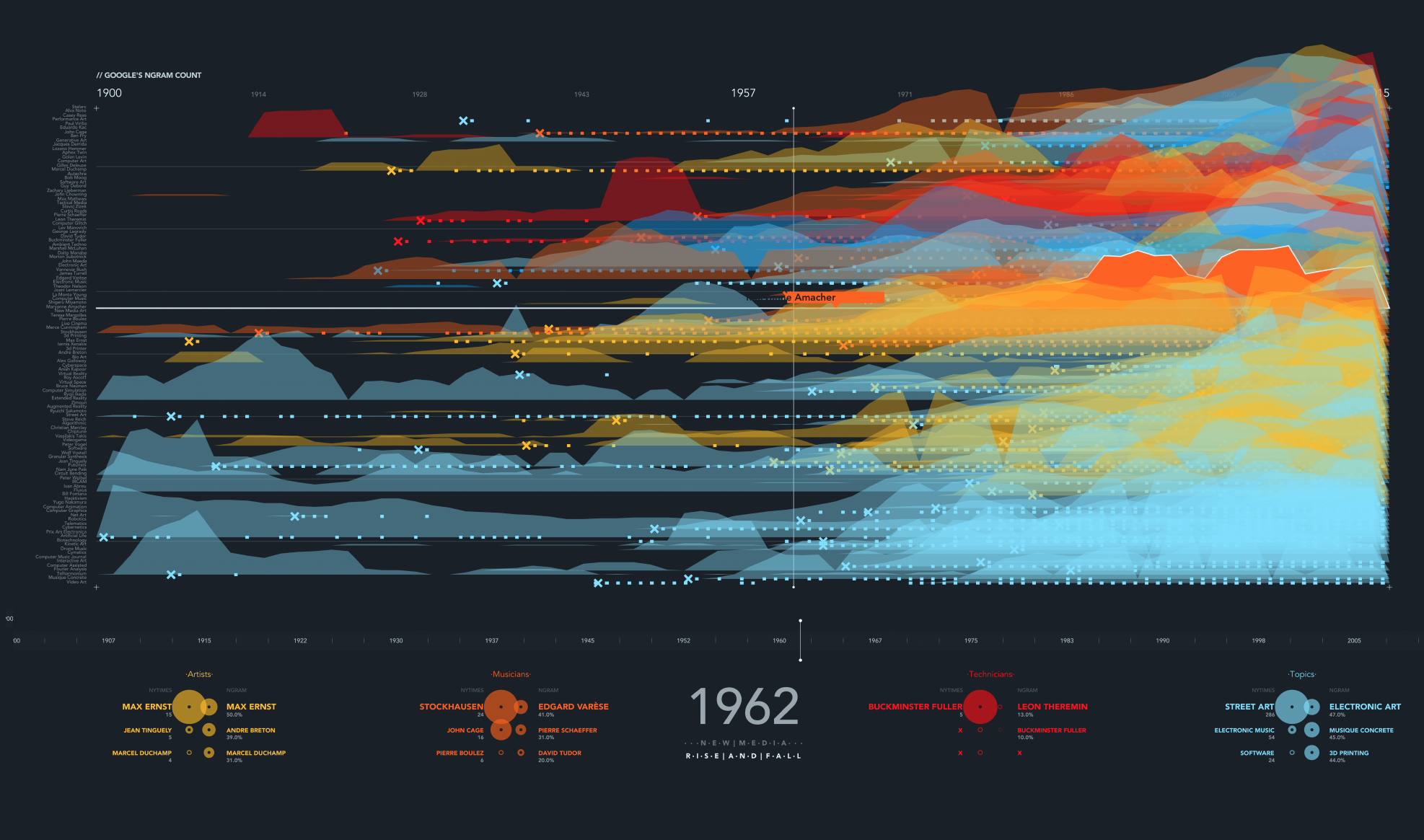
Evolution for the graphical representation of NYTimes mentions. Categories are color coded. This also represented a technical challenge since Processing is not able to render +1000 shapes per frame. The use of PShape() was used to reduce GPU usage.
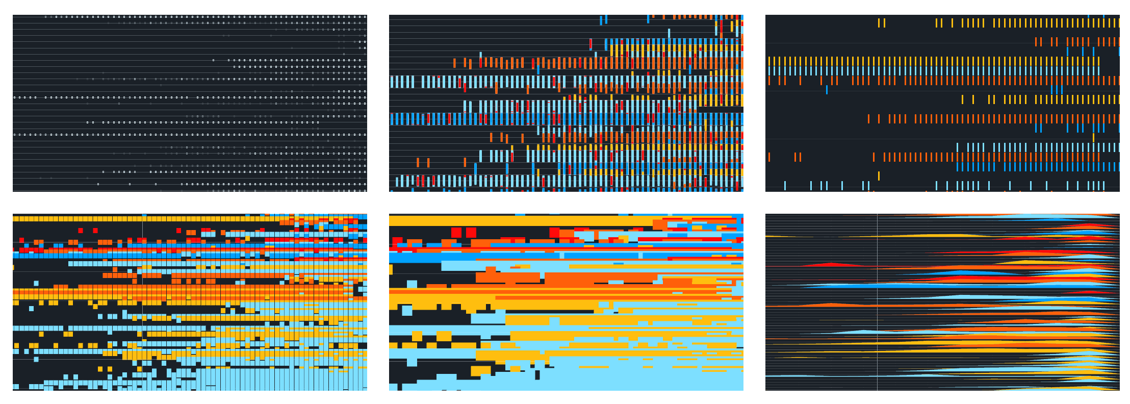
Grid evolution:
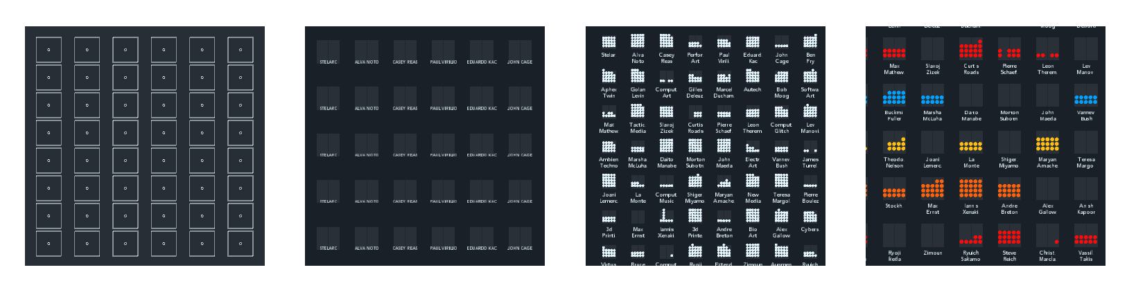
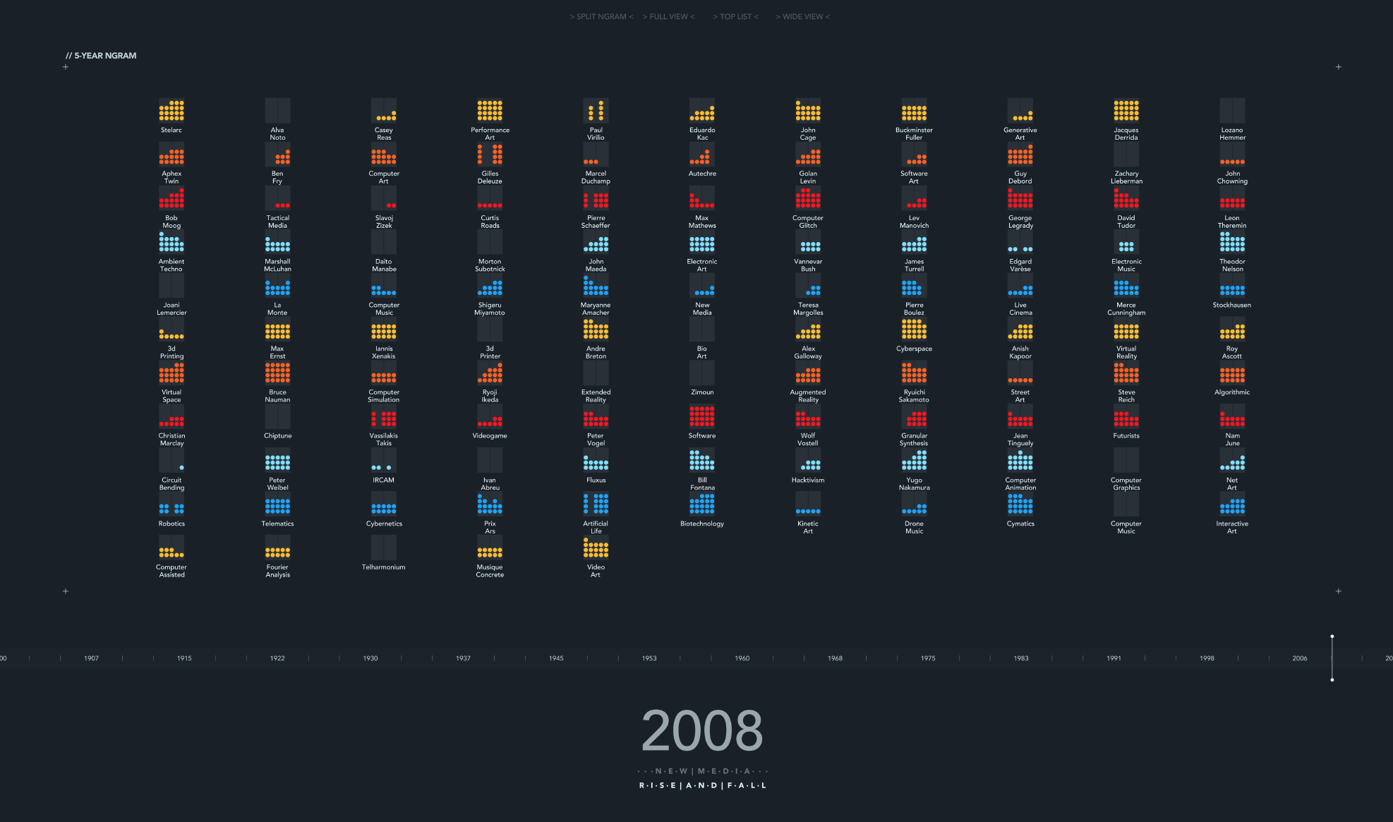
The initial view, top mentions of the year at the bottom (NYT at the left, NGram at the right). This is a bitmap image generated from a HD PDF file. The names on the left side are visible if the image is printed in a large format.
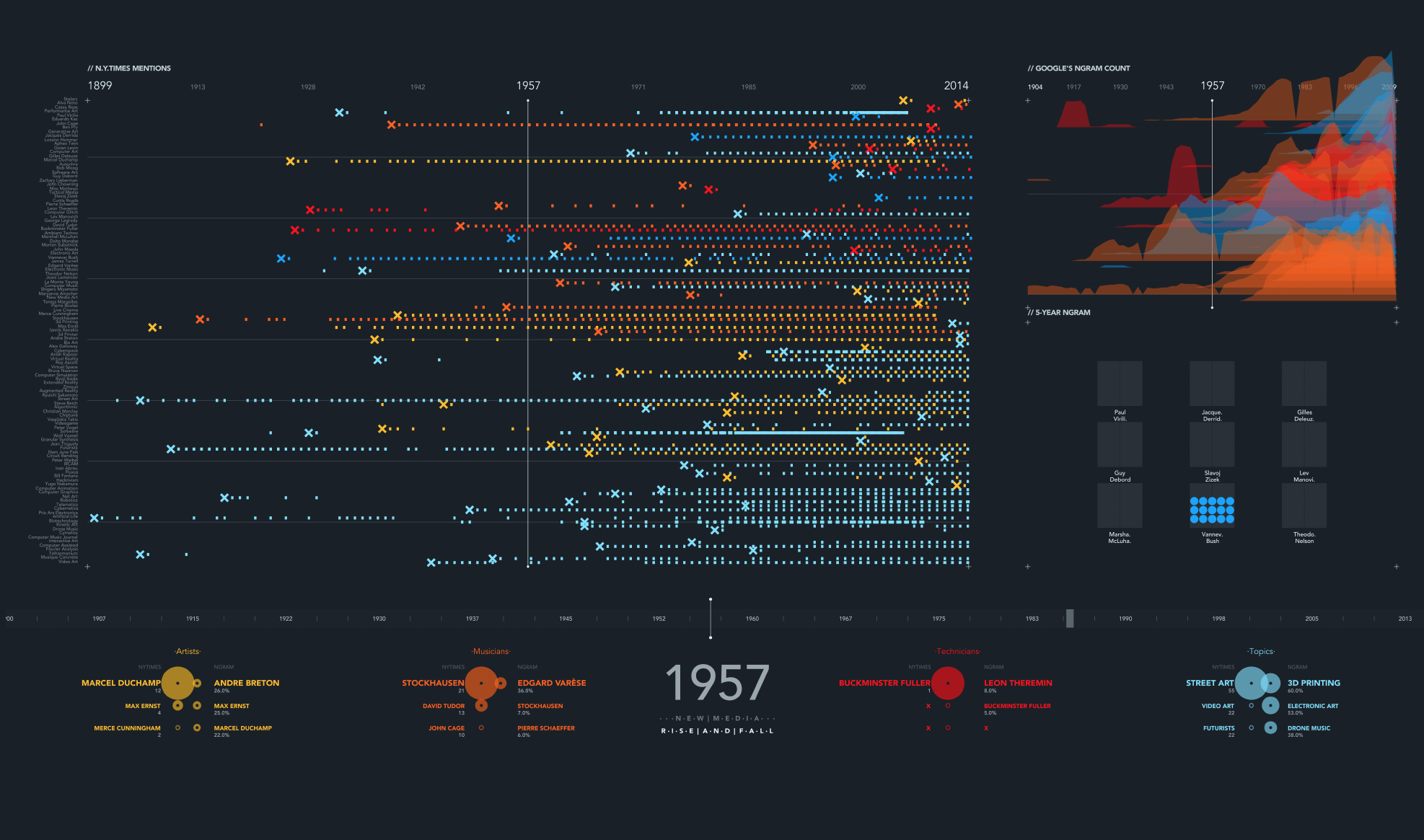
The "X" tells when an item/author/topic is first mentioned in the NYTimes database. It is an easy way to spot this beginnings.
Experimental view, since many topics can be overlaped at the same time, we built this separate alternative to analyze something in detail.
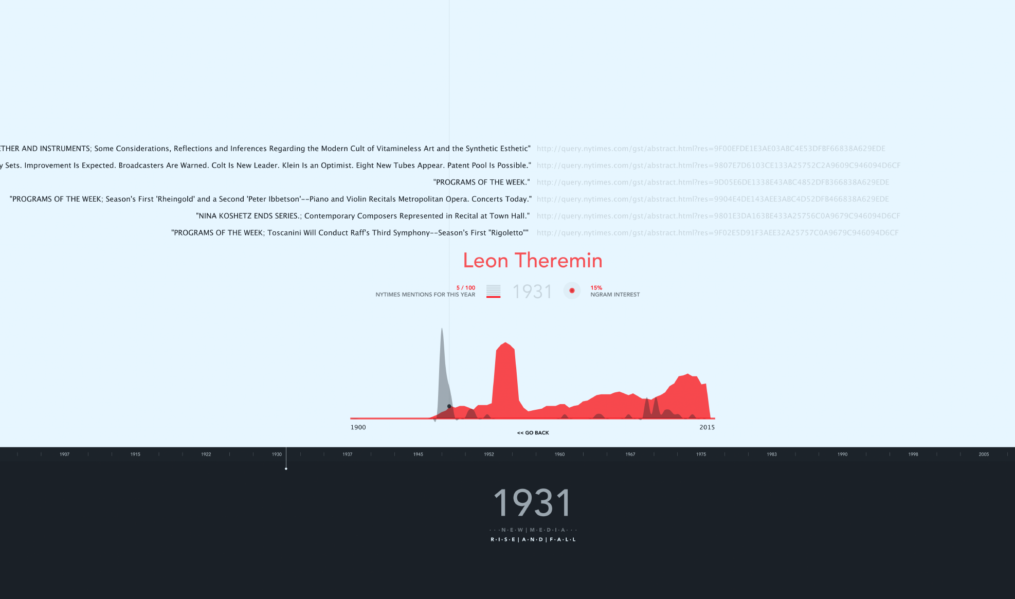
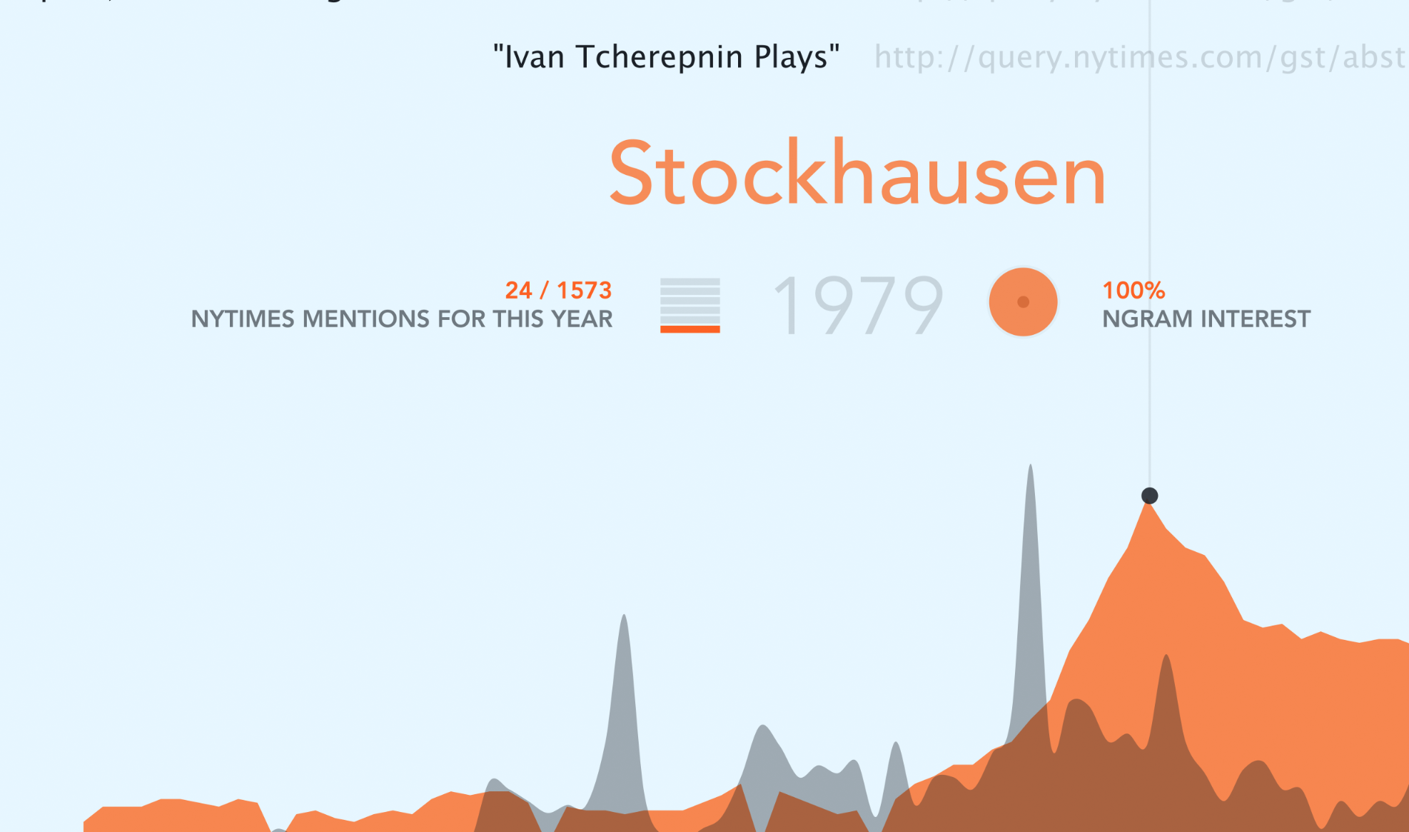
If the user clicks on a subject, then an individual graph is displayed. In this case, the red color represents the NGram mentions. Interesting to mention the case of Leon Theremin, his discrete emmigration from the US can also be noted in book mentions. As time goes forth and back, the NYTimes articles for that specific year appear on the top.
Finally, the NGram mentions graph mixed with the NYTimes data, as an attempt to correlate information.
I used Processing.
Control: All interaction is done with the mouse (except for keys 1, 2 and 3 that set the zoom level).