Visualizing Controversy
MAT 259, 2015
James Schaffer
Concept
Mainstream is boring! Is it possible to use the information in the library database to determine which items are the most controversial? Can we implicitly discover which books or DVDs are strongly loved by few, but detested by many? Is it possible to discover subcultures and gauge people's varying passion for different topics?
I attempt to quantify the above concept by examining variations in durations of checkout and popularity to determine a 'controversy score' for each item. Then, we can plot which subjects are the most controversial, and by inspecting individual item names we can discover which items have the highest variance of holding a reader's interest.
In this iteration, I use the evenly weighted sums of normalized popularity and checkout variance as a proxy for controversy.
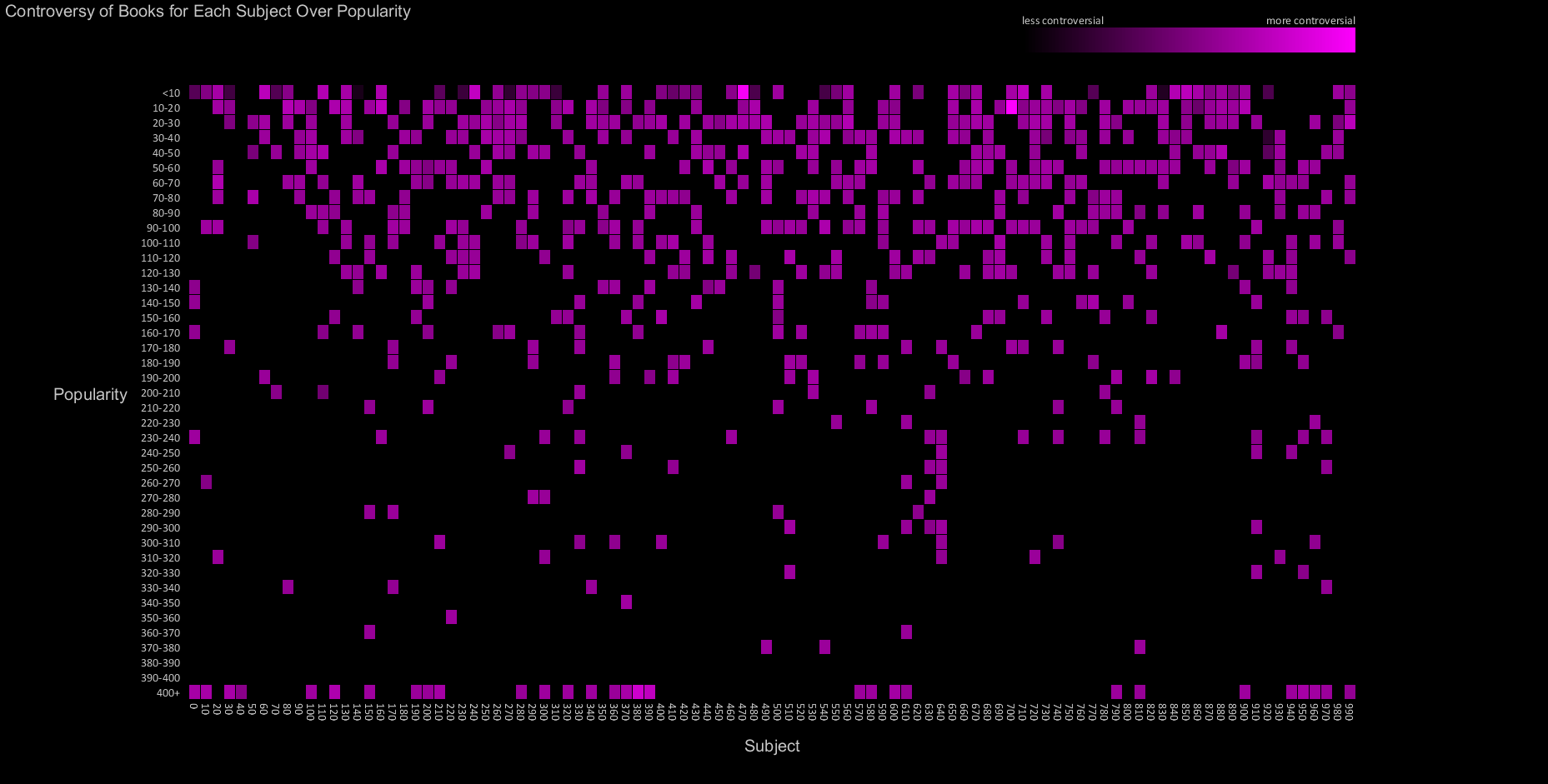
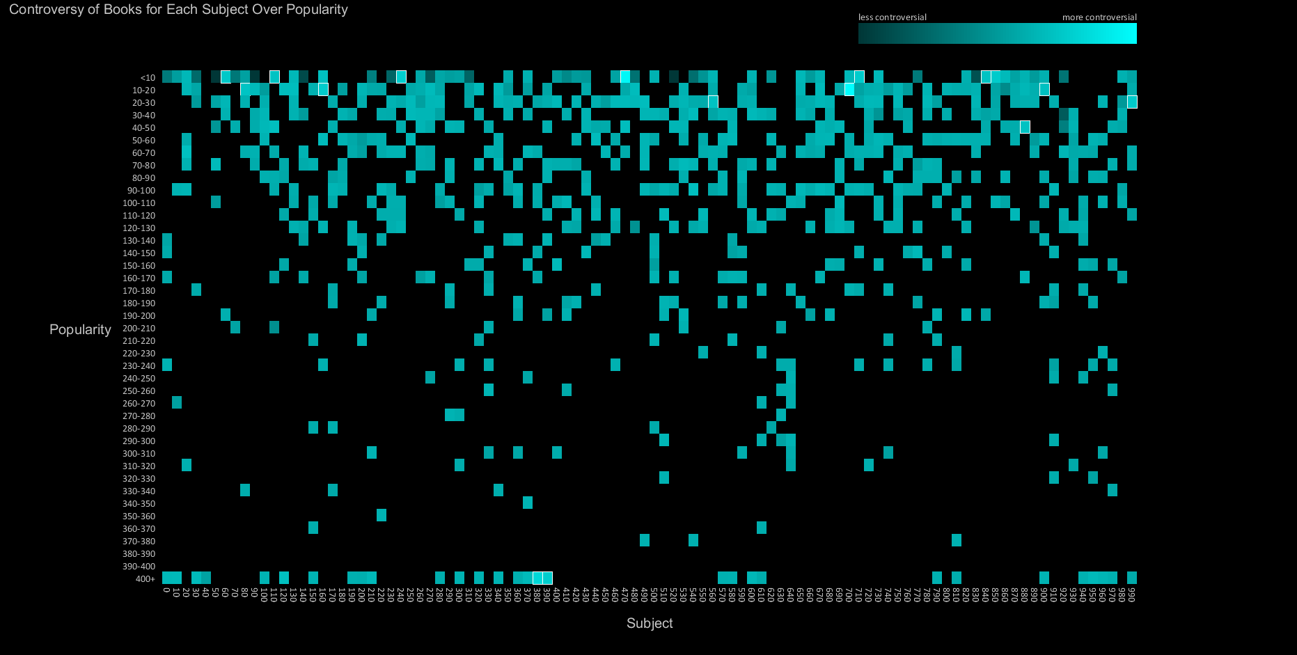
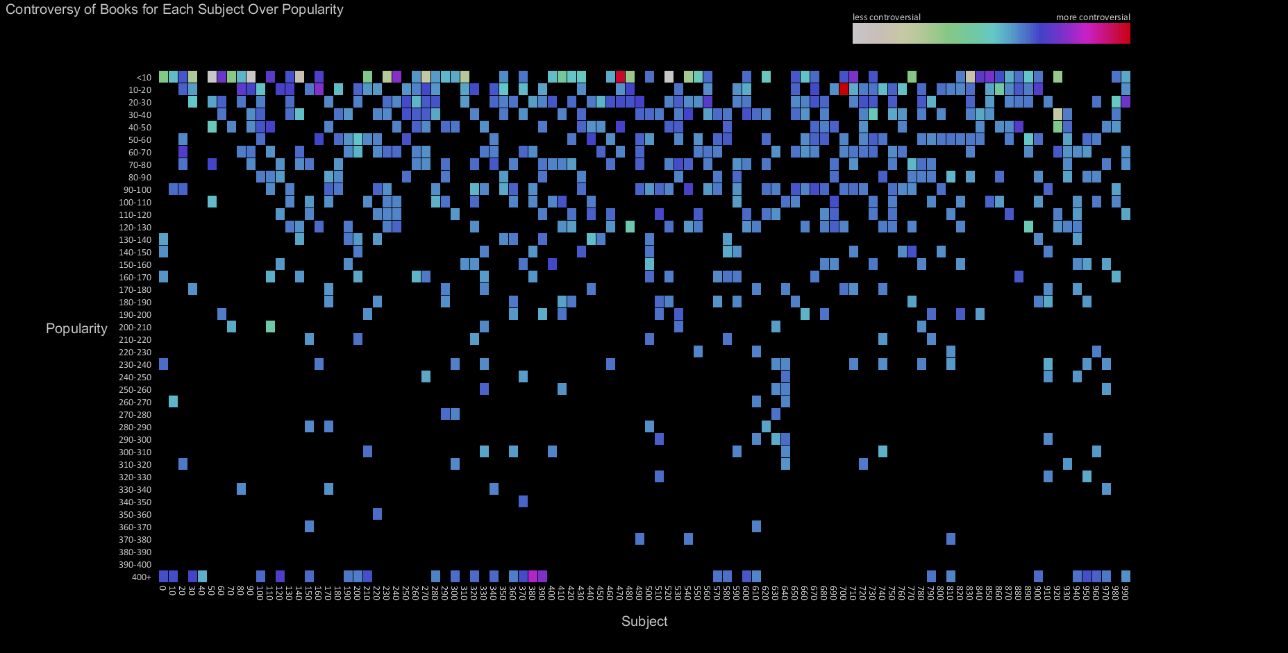
The visualizations below show the controversy score calculated on each item, binned by subject and popularity. Since the data is somewhat sparse, the graphs also indirectly communicate the distribution of popular items by subject (blackspace indicates a lack of data).
I attempt to quantify the above concept by examining variations in durations of checkout and popularity to determine a 'controversy score' for each item. Then, we can plot which subjects are the most controversial, and by inspecting individual item names we can discover which items have the highest variance of holding a reader's interest.
In this iteration, I use the evenly weighted sums of normalized popularity and checkout variance as a proxy for controversy.
The visualizations below show the controversy score calculated on each item, binned by subject and popularity. Since the data is somewhat sparse, the graphs also indirectly communicate the distribution of popular items by subject (blackspace indicates a lack of data).
Query
SELECT
floor(deweyClass) as topic,
AVG(popularity.popularity) / 18552 + (STD(UNIX_TIMESTAMP(inraw.cin) - UNIX_TIMESTAMP(inraw.cout))) / 7775136 AS controversy,
AVG(popularity.popularity) as pops
FROM
spl2.inraw,
spl2.popularity
WHERE
inraw.bibNumber = popularity.bib
AND
(UNIX_TIMESTAMP(inraw.cin) - UNIX_TIMESTAMP(inraw.cout)) > 0
AND
(UNIX_TIMESTAMP(inraw.cin) - UNIX_TIMESTAMP(inraw.cout)) < 7776000
AND deweyClass >= 900
AND deweyClass < 1000
AND itemtype = 'acbk'
GROUP BY floor(deweyClass)
ORDER BY topic ASC;
Preliminary sketches
Unfortunately, scaling the color values does not reveal the differences in value very well. The first attempt at solving this problem was to highlight bins that had high differentials from their neighbors (I also tried a secondary color).
Process
I strongly prefer black backgrounds for content displayed on a monitor. Contrast is really the only component that matters as far as readability is concerned, and black backgrounds lower the amount of light that must enter the eyes. Bold colors and sparse data give the visualization a retro 8-bit look.
Final result
This visualization highlights the few high controversy scores amidst a distribution which does not tend to deviate from the mean. The highest controversy (as determined by our score) subjects were 470 (Latin) and 700 (The Arts). This means that books related to latin or the arts had the highest variance of checkout time, perhaps meaning some people enjoyed or found the book useful, while others checked it back in immediately. Do some people gain and quickly lose enthusiasm for these subjects, while others keep the books close? More investigation would be needed, however, neither of these subjects are very popular. Another interesting data point was the highly popular books in subject 380 (Transportation and Commerce). At this point that data point requires further investigation. The next versions of the visualizations may be able to answer these questions in more detail, perhaps through interaction.
Code
Code can be downloaded by clicking here: Controversy Grid Visualization . Processing and mysql were used for this project.
No interaction in this project.