Spatio-temporal Visualization of Human Development Index
MAT 259, 2015
Bo Yan
Concept
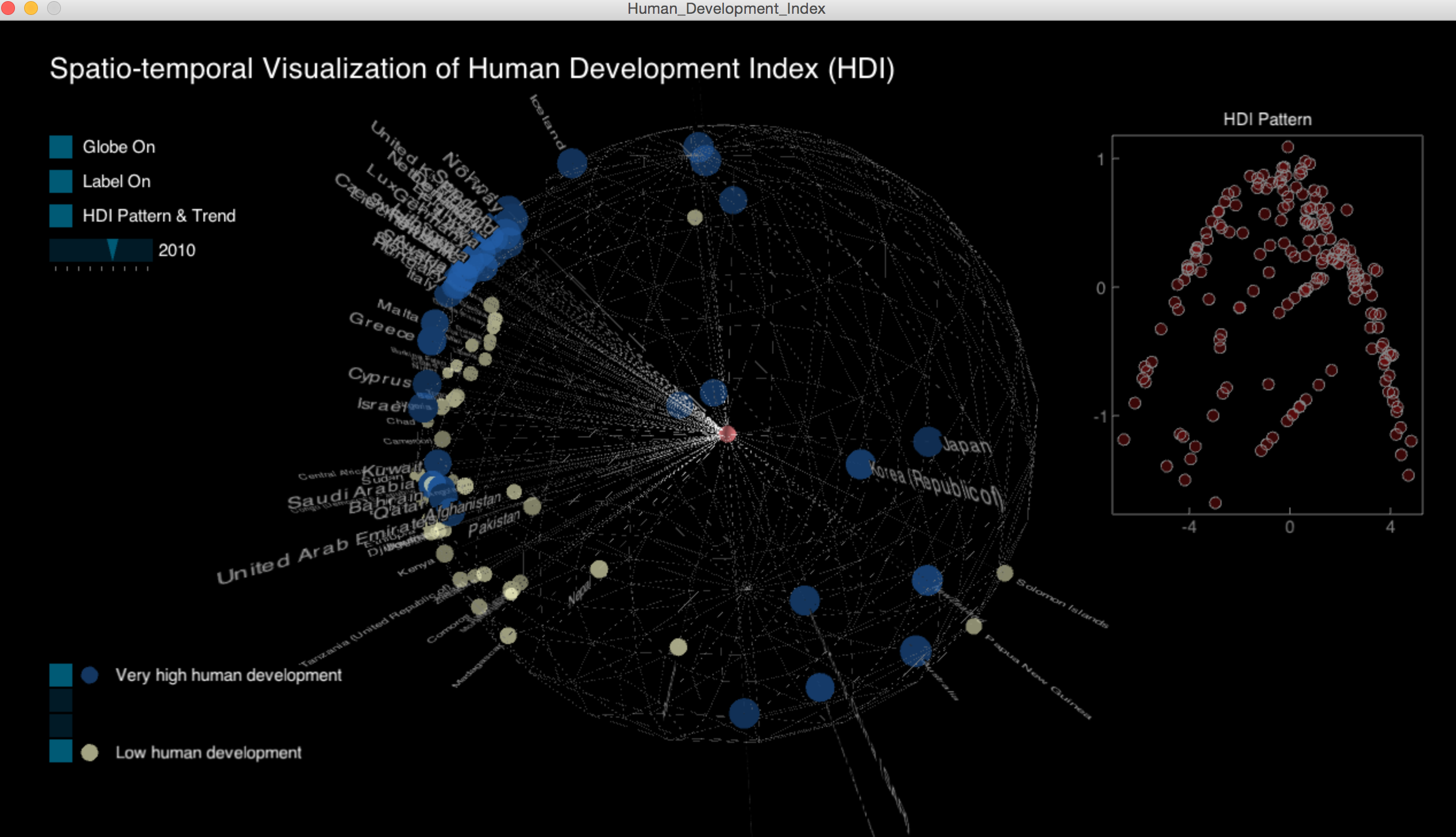
For the final project, I decided to use the Human Development Index data. The United Nations Development Program provides some APIs (http://hdr.undp.org/en/data/api) to query the dataset. There are altogether 187 countries and regions and hdi across 9 years.
Query
United Nations Development Program API (http://hdr.undp.org/en/data/api)
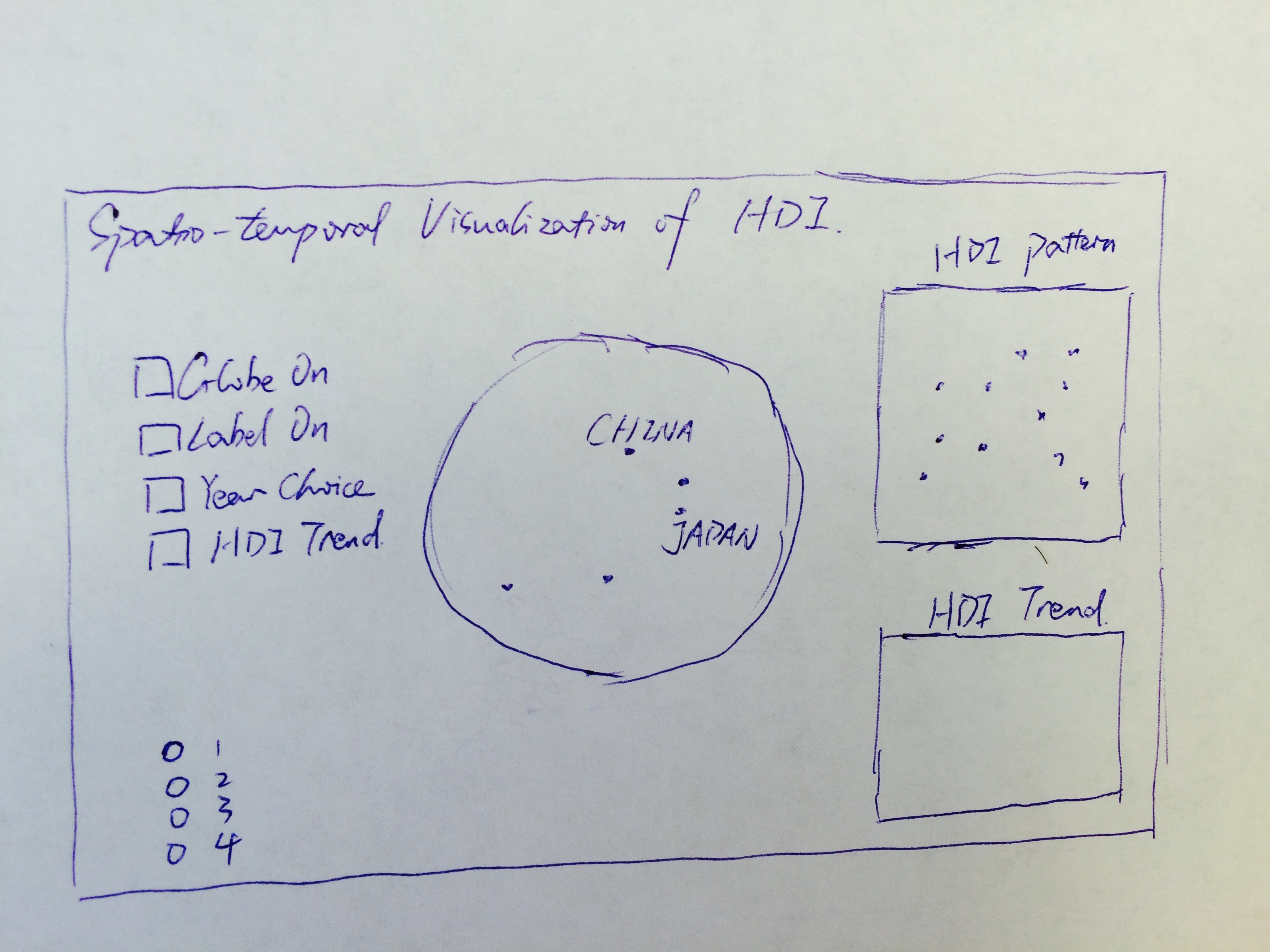
Preliminary sketches
Originally, I wanted to map these countries and regions onto a world map using the Unfolding map library, but after exploring the library for a while, I found the library not really customizable, so I decided to use the 3d visualization I did last time. I found the coordinates of the capital city of every country and geo locate them on the globe.
Process
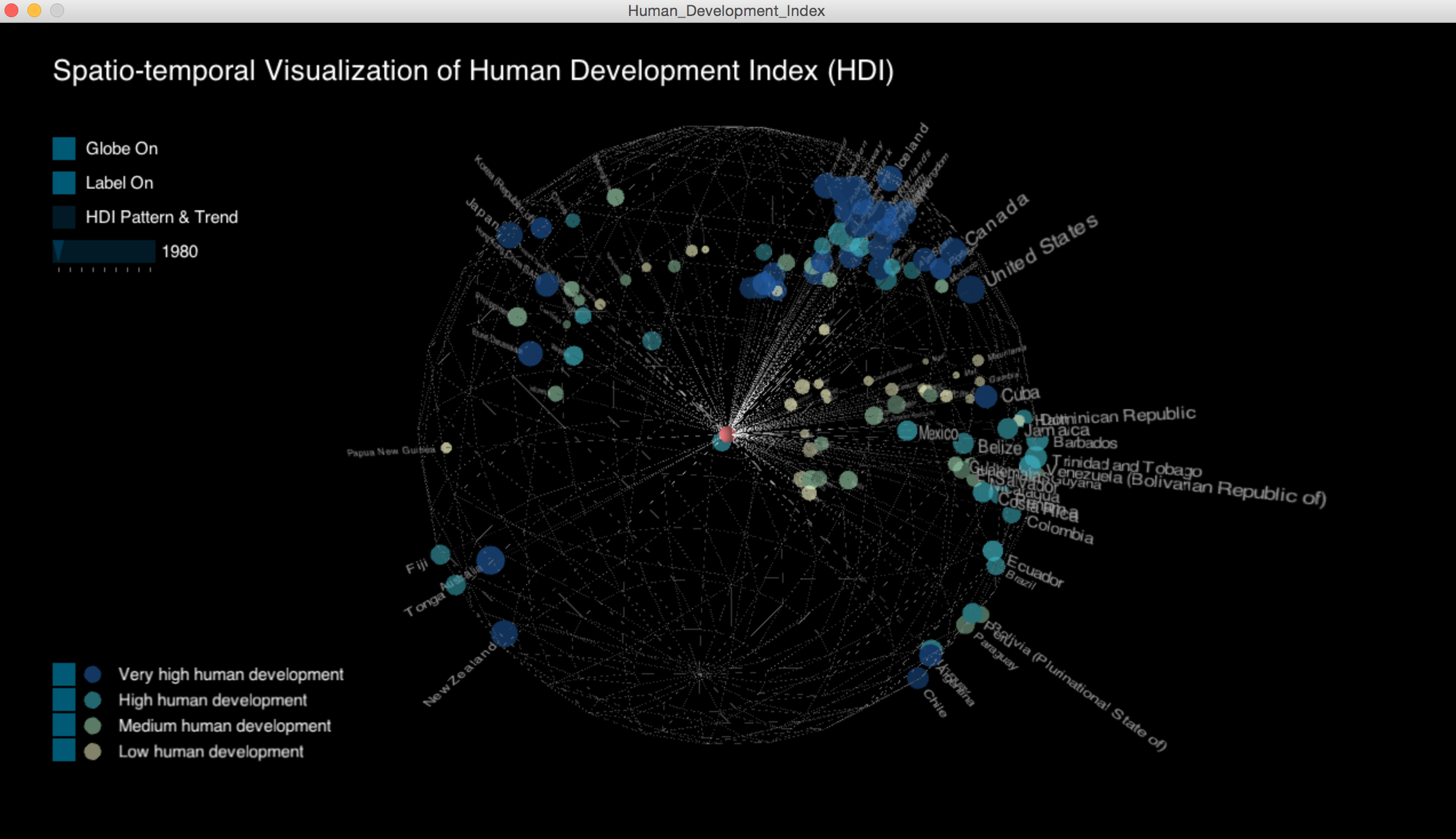
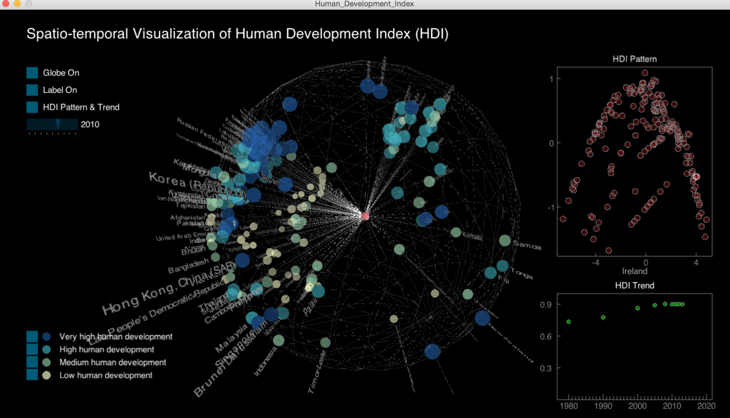
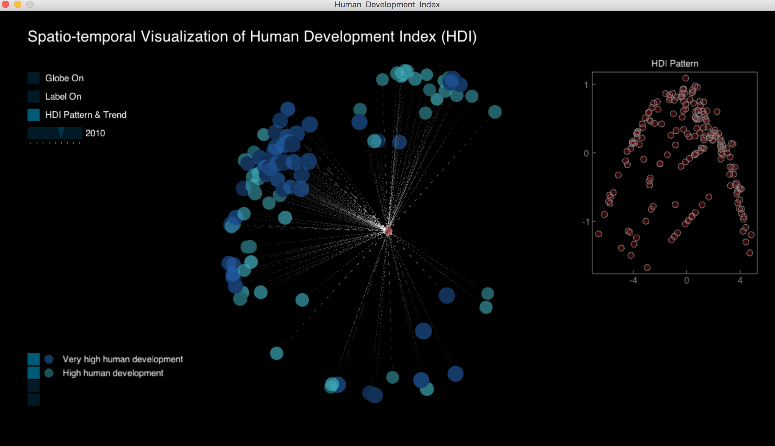
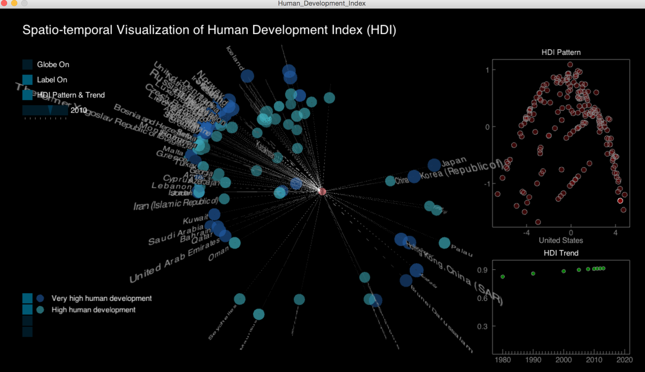
I found the coordinates of the capital city of every country and geo locate them on the globe. I used points to represent the hdi value, the larger the point size, the bigger the hdi value. The points are also categorized into 4 groups based on their hdi values.
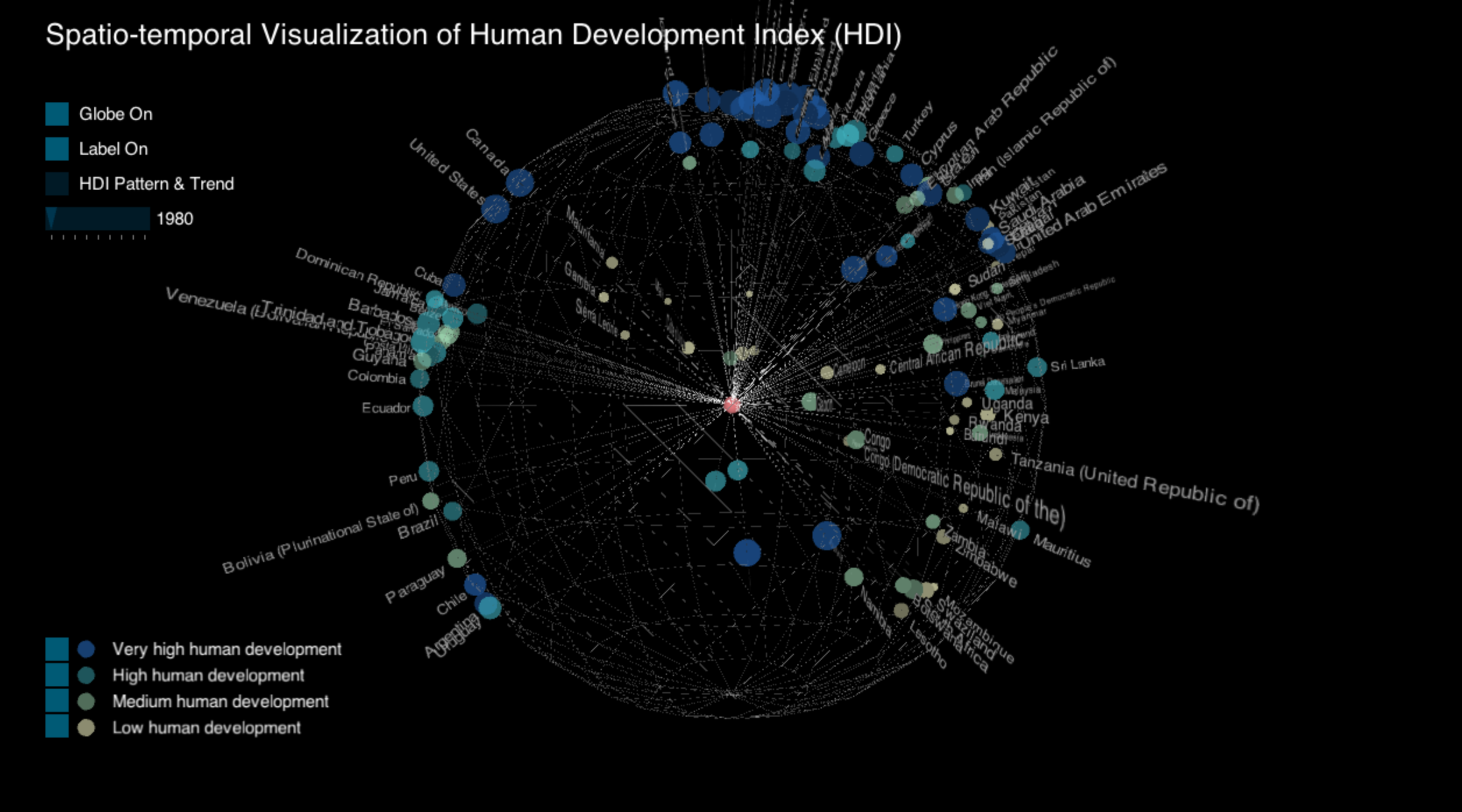
Final result
The second part of this visualization is the HDI trend. Based on the HDI trend data for each country and region, I calculated the distance matrix using standardized euclidean distance. I was going to visualize the similarity (dissimilarity) matrix originally, but a 187*187 matrix is too large to put on the canvas. So I used multidimensional scaling (MDS) (http://en.wikipedia.org/wiki/Multidimensional_scaling) to tranform the data into lower dimensions and then visualized them. In this visualization, the x and y coordinates do not necessarily mean anything, but countries or regions that are similar in terms of their human development are close to each other in this 2d space. I also visualized the hdi trend for each country and region.
Code