Average Checkout Duration of Different Levels of Dewey Classification
MAT 259, 2015
Bo Yan
Concept
I used SQL to retrieve the average and standard deviation of checkout duration from 2006 to 2014. The results show that each of the 10 dewey classes has its distinct checkout duration pattern and the difference among these classes implies some interesting phenomenon. But the result is statistically biased in that the aggregation level shadowed differences among individuals within each class. Inspired by the Modifiable Areal Unit Problem (MAUP), "a problem arising from the imposition of artificial units of spatial reporting on continuous geographical phenomena resulting in the generation of artificial spatial patterns" (Heywood, 1988), I want to know what the checkout duration pattern will look like if I change the scale (aggregation) level.
Query
SELECT
floor(deweyClass/10)*10 AS DeweyDiv,
floor(deweyClass) AS DeweySec,
(TIMESTAMPDIFF(DAY, cout, cin)) AS TimeAvg,
VARIANCE(TIMESTAMPDIFF(DAY, cout, cin)) AS TimeVar
FROM
spl2.inraw
WHERE
YEAR(cout) <= 2014
AND YEAR(cout) >= 2006
AND deweyClass <> ''
AND itemtype = 'acbk'
GROUP BY floor(deweyClass/10)*10 , floor(deweyClass)
SELECT FLOOR(deweyClass / 100) * 100 AS DeweyDiv, AVG(TIMESTAMPDIFF(DAY, cout, cin)) AS TimeAvg, VARIANCE(TIMESTAMPDIFF(DAY, cout, cin)) AS TimeVar FROM spl2.inraw WHERE YEAR(cout) <= 2014 AND YEAR(cout) >= 2006 AND deweyClass <> '' AND itemtype = 'acbk' GROUP BY FLOOR(deweyClass / 100) * 100
SELECT FLOOR(deweyClass / 10) * 10 AS DeweyDiv, AVG(TIMESTAMPDIFF(DAY, cout, cin)) AS TimeAvg, VARIANCE(TIMESTAMPDIFF(DAY, cout, cin)) AS TimeVar FROM spl2.inraw WHERE YEAR(cout) <= 2014 AND YEAR(cout) >= 2006 AND deweyClass <> '' AND itemtype = 'acbk' GROUP BY FLOOR(deweyClass / 10) * 10
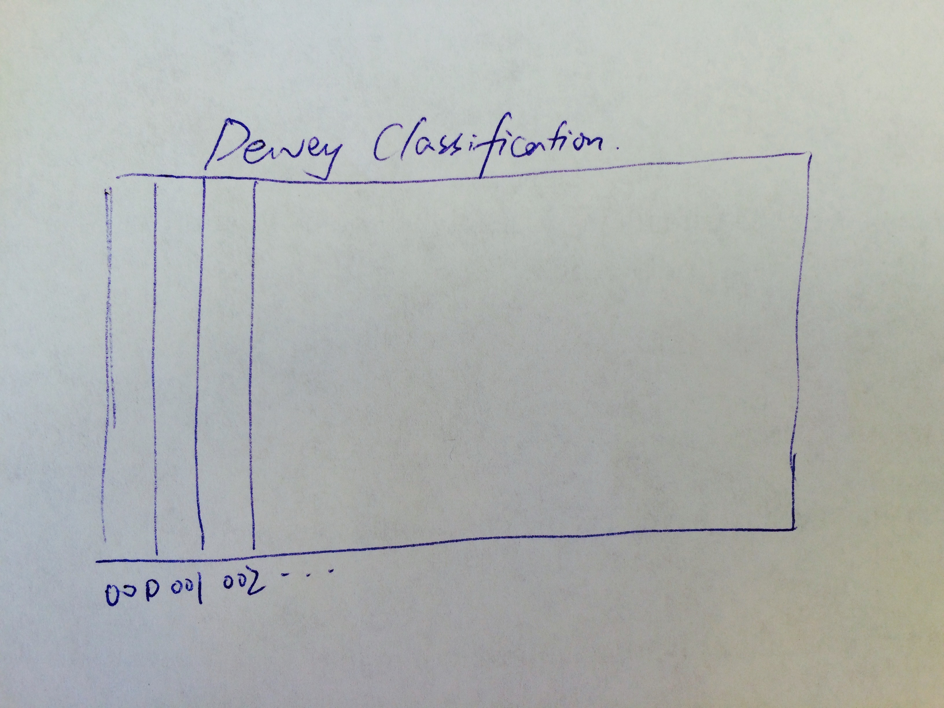
Preliminary sketches
The initial design is to use a 2D matrix to represent the dewey classes and use the color to represent the
checkout duration of each class.
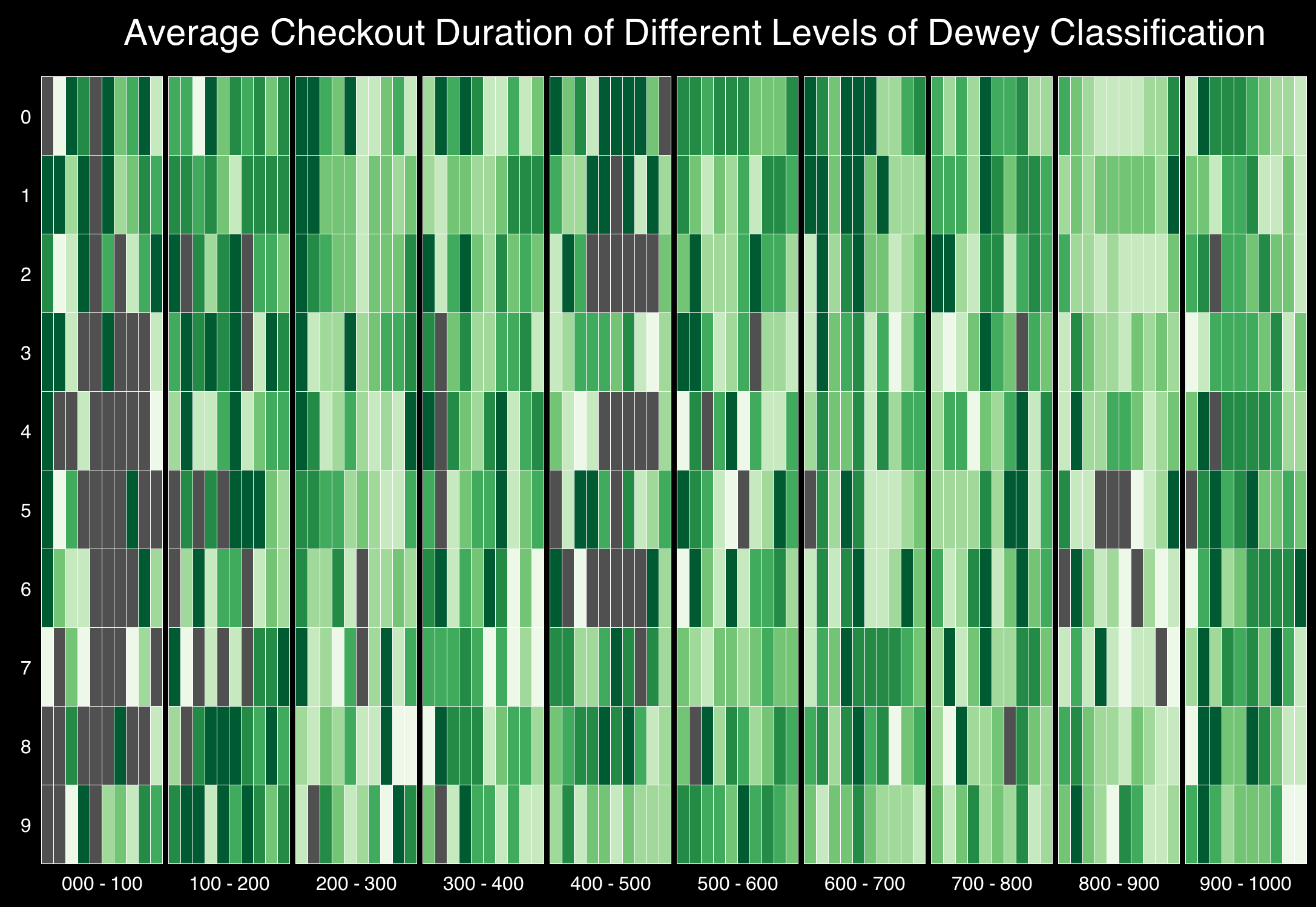
Process
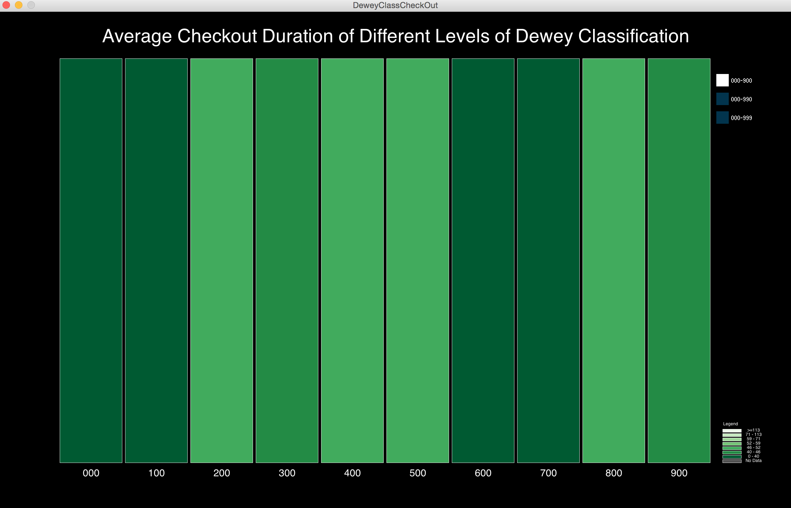
I used the color brewer (http://colorbrewer2.org/) provided by Cynthia Brewer (a geographer at Penn State, known for her work on map design and color theory in cartography). Since the color only symbolizes one variable, namely the average checkout duration, it is better to use single hue to visualize the trend and difference. In order to make the color scheme represent the whole data set instead of focusing on some outliers, I also did some statistical analysis and used what we called Quantile Classification, one of the classification method used to develop choropleth map. The darker the color, the less the duration. This visualization shows the average checkout duration time of each of the 908 dewey sections (there are only 908 of 999 sections in total, as some are no longer in use or have not been assigned). Each column represents one of the 99 dewey divisions and each of this dewey division is divided by 10 (some of them less than 10) sections shown in each row.
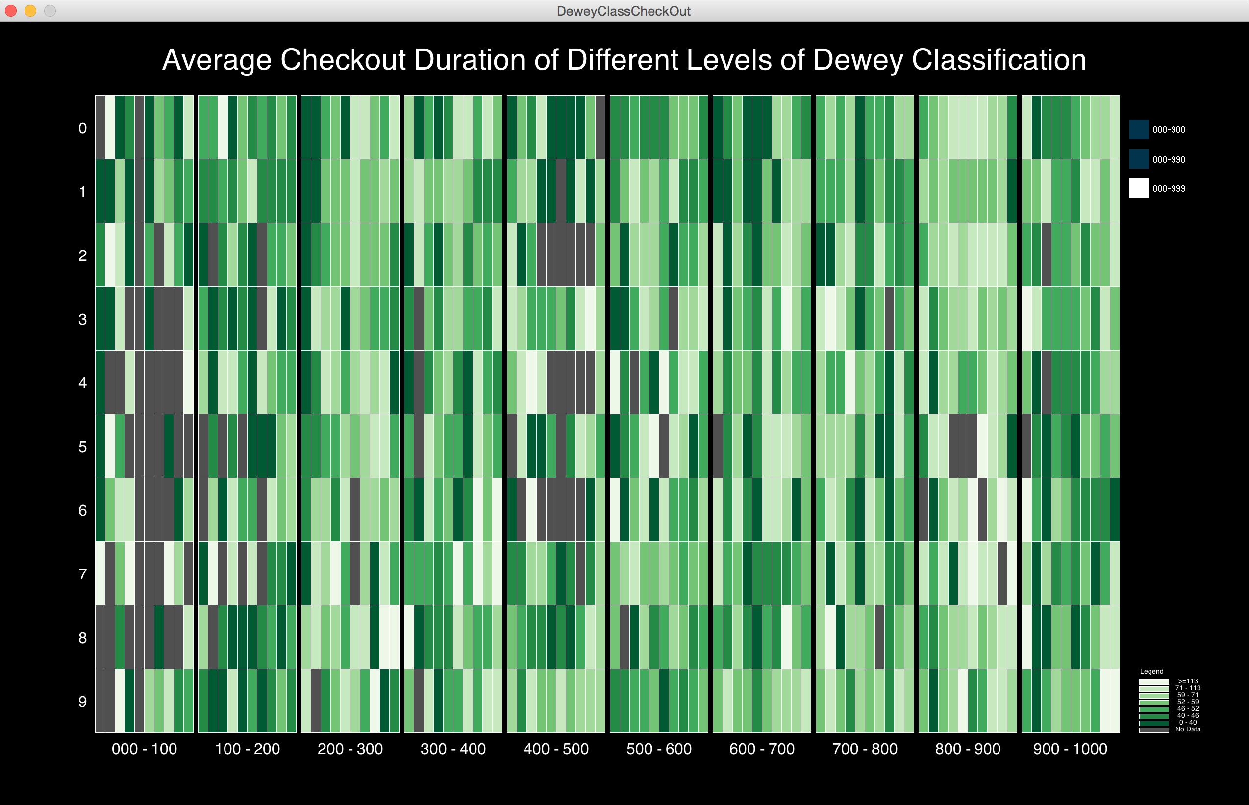
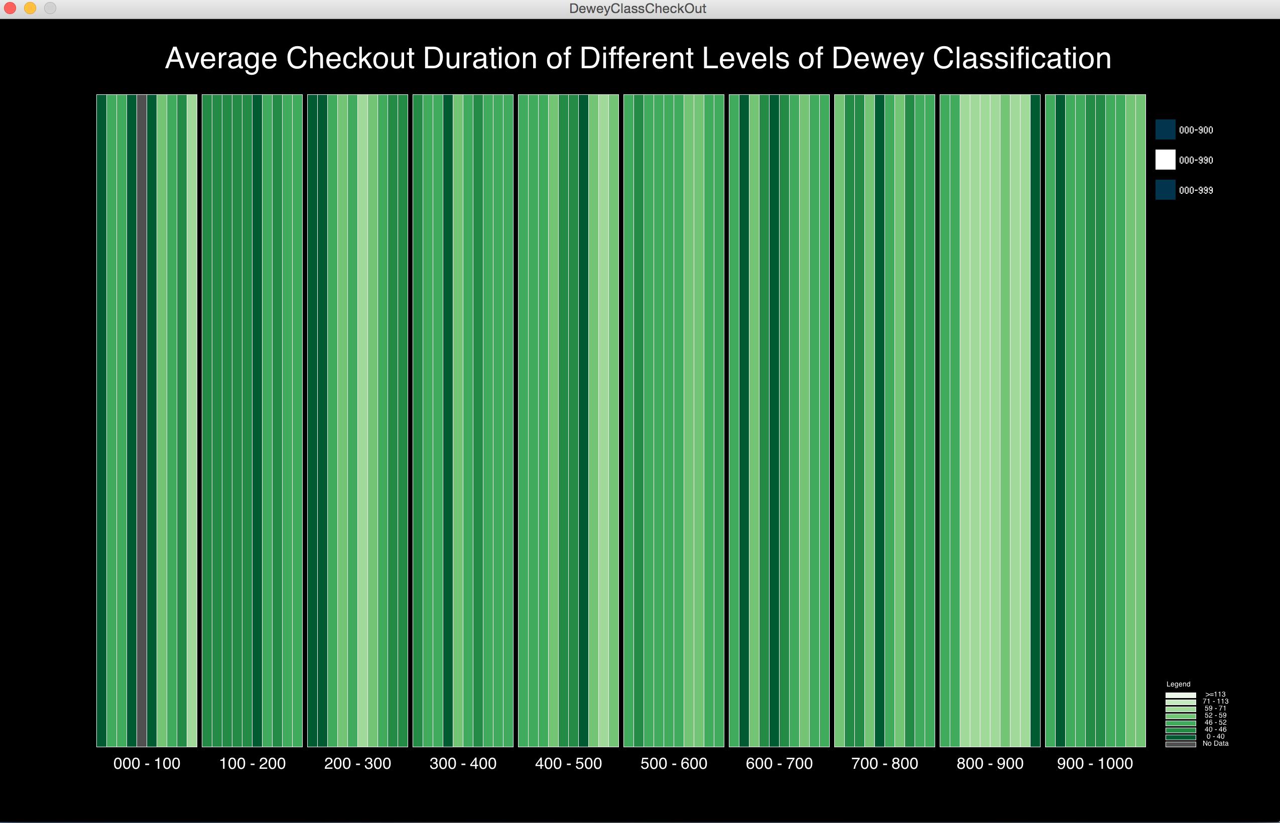
Final result
The final visualization shows the 908 sections in default, but as an interactive feature of this final version, you can choose different levels of classification using the radio button on the right. You can compare the different level of details for three aggregation levels. The visualization result confirms my previous thought that there is a big variance in terms of checkout duration time for Literature books.
Code