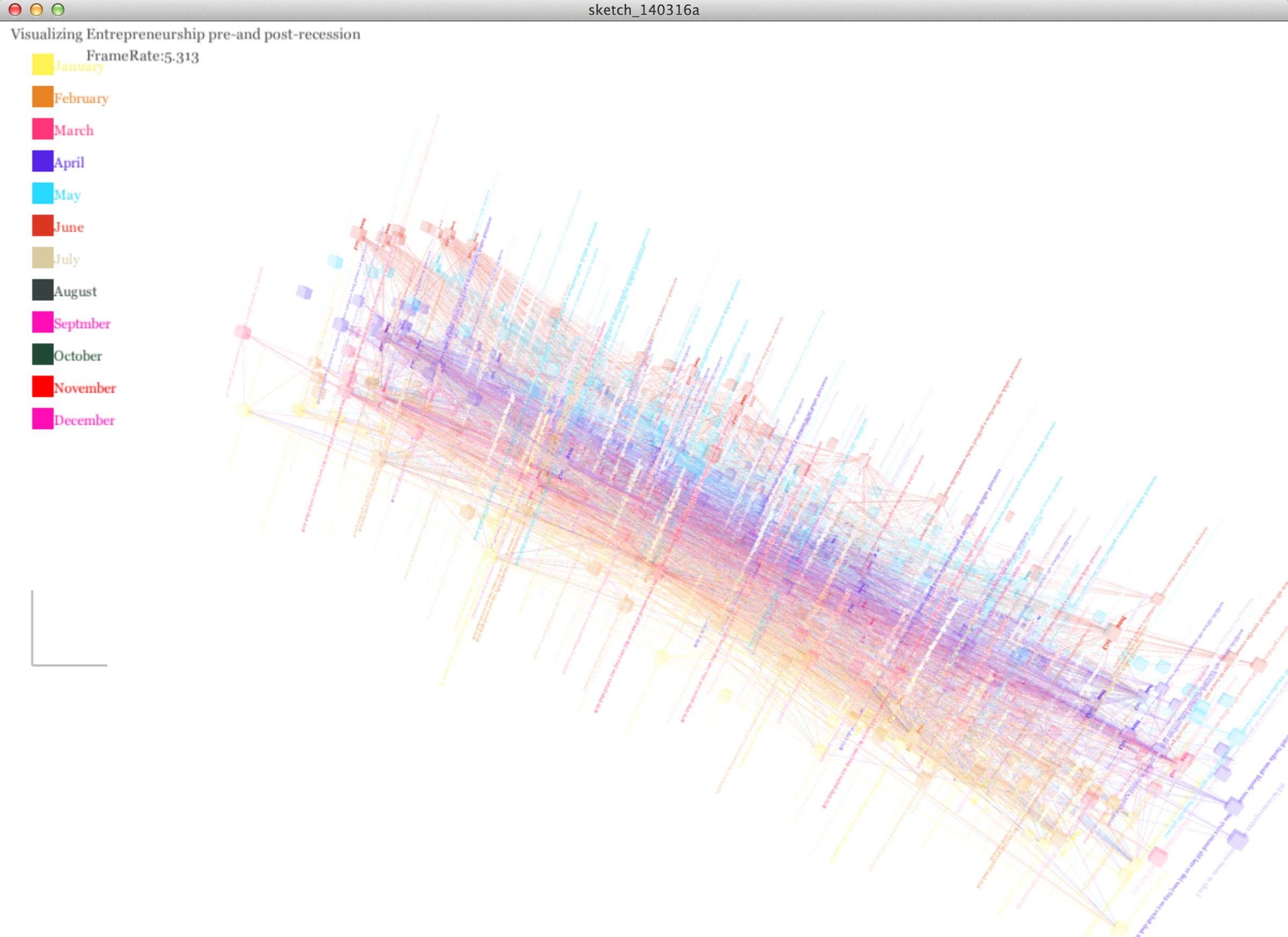
Visualizing emergence in Entrepreneurship and businesses pre and post recession
MAT 259, 2014
Mudit Uppal
Introduction
Concept-
The goal of this was to understand the emergence of Entrepreneurship and individuals businesses post recession. Forbes in 2013 concluded with a study that U.S Entrepreneurship has reached a record high in 2013 since 1999. A whopping 43 percent of Americans believe there are good opportunities for entrepreneurship, up by more than 20 percent since 2011 and the highest level recorded in the history of the study, called the Global Entrepreneurship Monitor U.S. report. Read more here.
In this project, I plan to peruse the topic of Entrepreneurship in the Seattle public library database and the new york times examining how much exactly are the key figures in recent years, specially post-recession and pre-recession.
Plus, if the model can be used to predict future financial crisis.
Background and Sketches
(1) Previous doodle for 2D visualization
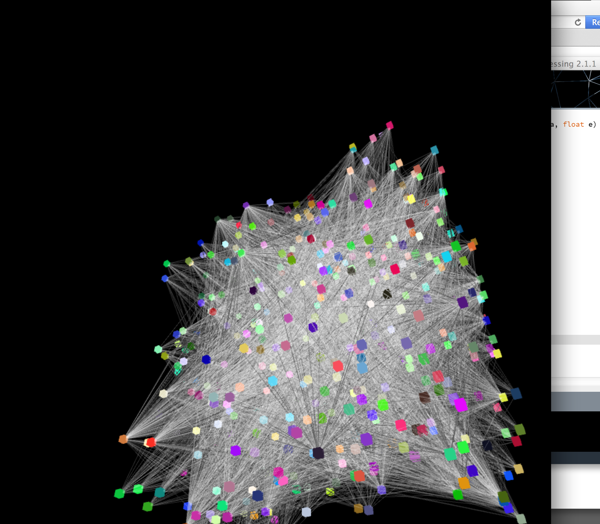
The 3D visualization project is intended to display 2 complex cube-based node graphs. One for pre-recession(2006) and other for post-recession(2009), to see the change of people's mentality to open a new private venture instead of finding a job.'
The 3D visualization project is intended to display 2 complex cube-based node graphs. One for pre-recession(2006) and other for post-recession(2009), to see the change of people's mentality to open a new private venture instead of finding a job.'
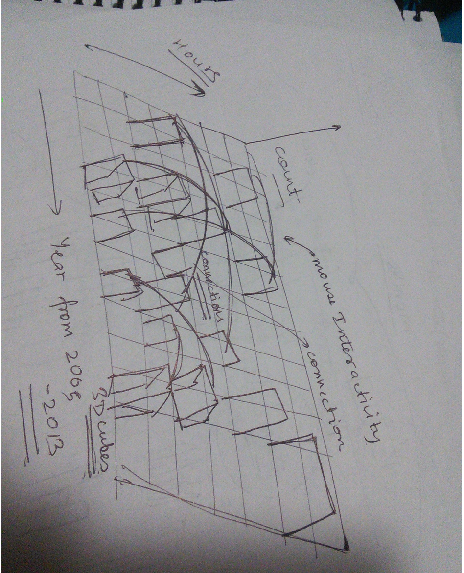
(2) Doodle for 3D visualization
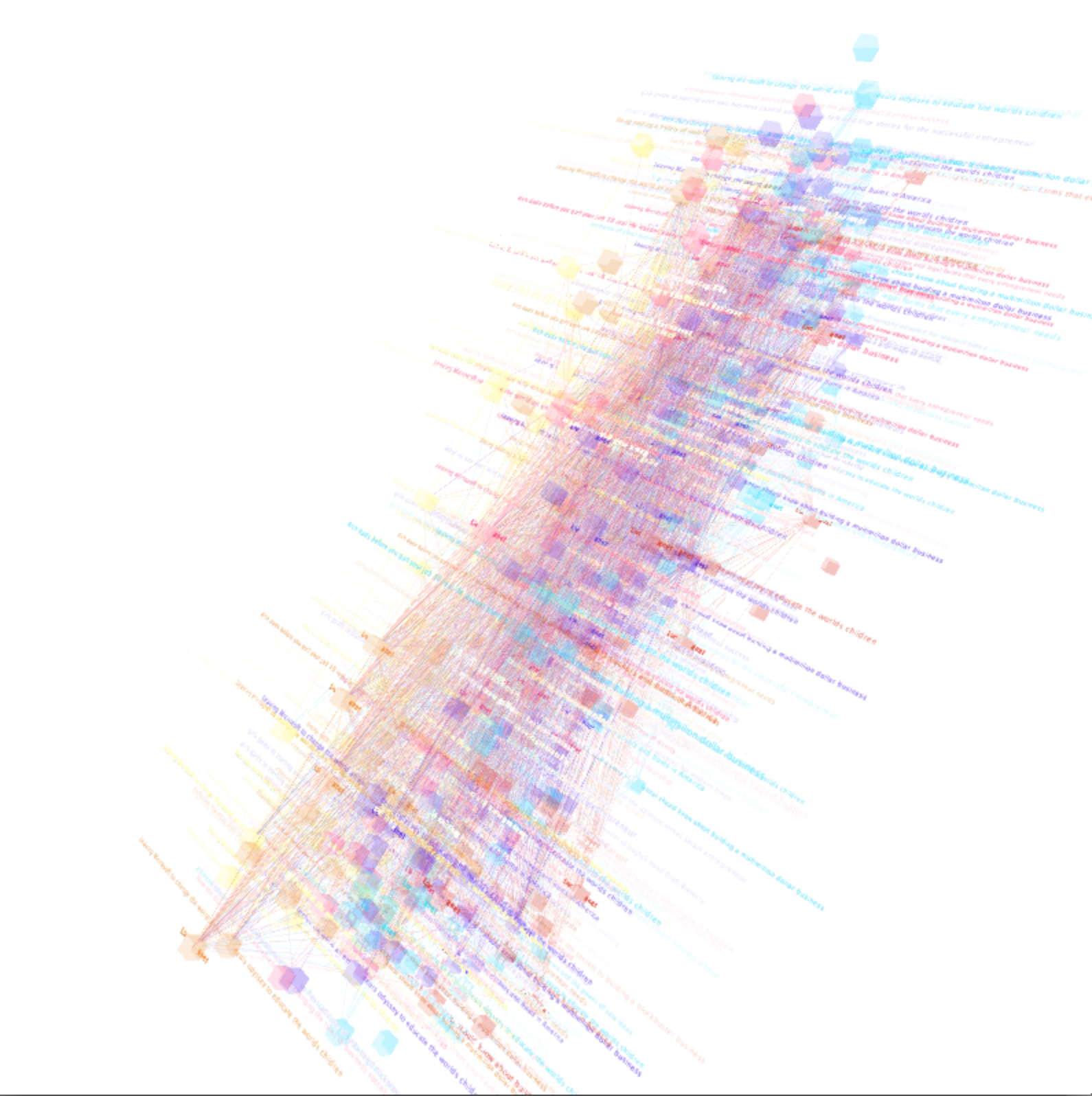
As can be seen in this doodle, I designed to show the histogram of checkouts in the form of a series of cubes stacked on the disk in 3D space. Each cube represents a unit time (each month) with different color intensity or transparency. On the disk, each bar on the rim of the circle represents the sum of transactions of the three data sets in each month.
Query
SELECT title, date(cout),count(*) FROM spl2.inraw where title like "%entrepreneur%" AND year(cout) >='2007' group by year(cout);
        Processing TIme: 60 seconds

        SELECT year(cout) as year, month(cout) as month, hour(cout) as hour, count(*) as count FROM spl2.inraw where (title like "%entrepreneur%" OR title like "%self business%" OR title like "%own business%") AND year(cout) >='2006' group by month(cout),year(cout), hour(cout) order by year(cout), month(cout), hour(cout);

        SELECT title, date(cout),count(*) FROM spl2.inraw where title like "%entrepreneur%" AND year(cout) <='2007' group by year(cout);
            Processing TIme: 78 seconds

            SELECT title, date(cout),count(*) FROM spl2.inraw where title like "%entrepreneurship%" AND year(cout) >='2005' group by year(cout);
Process
The visual aspects of this 3d visualization would be referenced by each cube(each cube representing each year) and put in 3d space like an array of marching bands.
The user can interact with each cube and select any one cube to view that year’s transactions and overview of entrepreneurship in that year. Almost consuming the idea of ‘cube inside a cube inside a cube...’
Using the above query, I was able to fetch each data set upon corresponding keyword related to Entrepreneurship, business and finance.
Results and Analysis
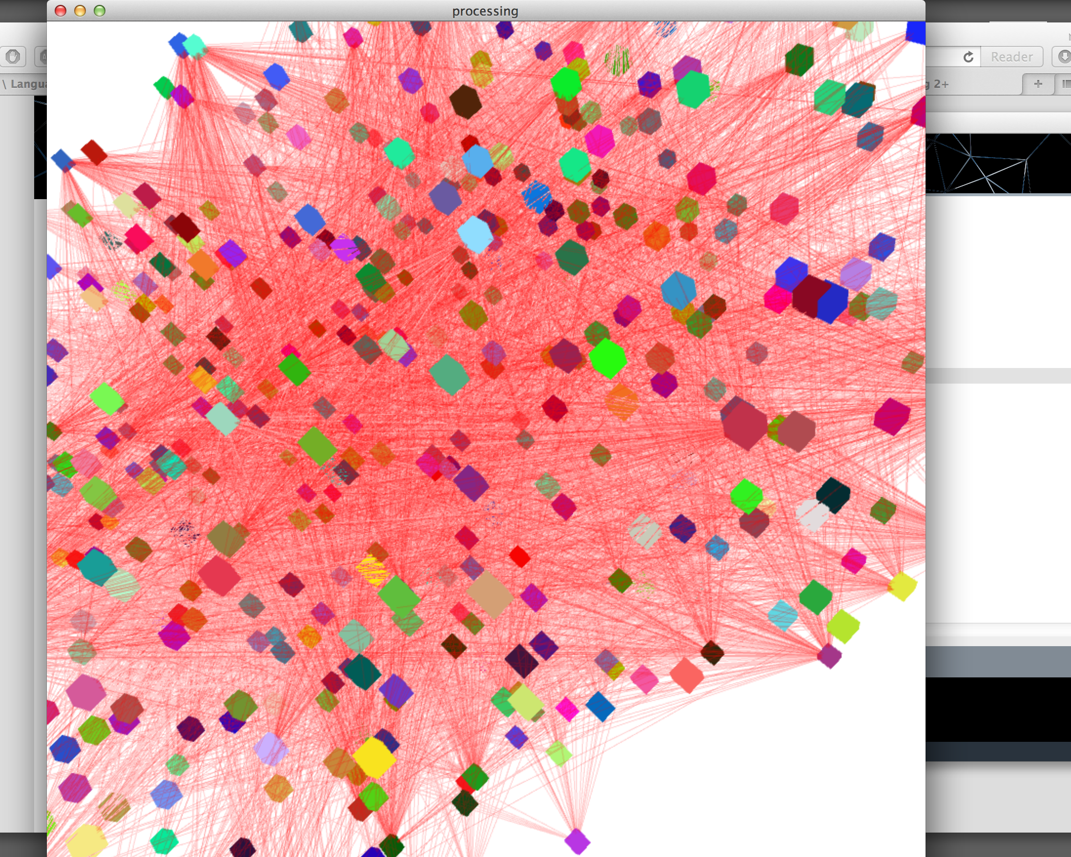
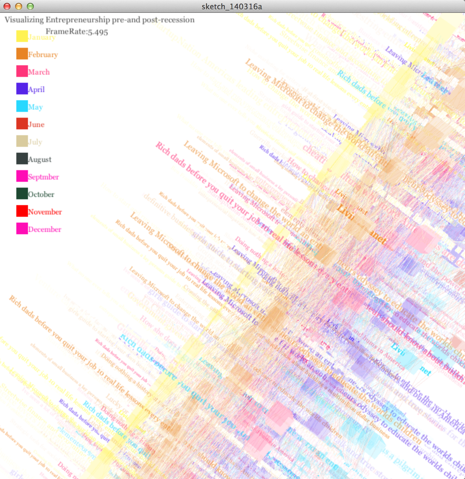
(g) Final visualization with labels, legends and optimized color schemes.
Code
I used Processing, ControlP5 and Peasycam.
A function called ‘diff’ is used. This function is taken from the Java utilities, which calculates the time difference in ms.
Run in Browser
Source Code
A function called ‘diff’ is used. This function is taken from the Java utilities, which calculates the time difference in ms.
Run in Browser
Source Code
Control
Press 1-4 for different camera views
c/x : change to different palette (0 to 10)
l : stroke on / off
s : Stat view on / off
d : dewey particles
p : pyramids on / off (checkouts in each year below the disk)
5: FP-Tree 2
6: Pyramids
7: Side view
c/x : change to different palette (0 to 10)
l : stroke on / off
s : Stat view on / off
d : dewey particles
p : pyramids on / off (checkouts in each year below the disk)
5: FP-Tree 2
6: Pyramids
7: Side view